Chapter 5 Dashboard
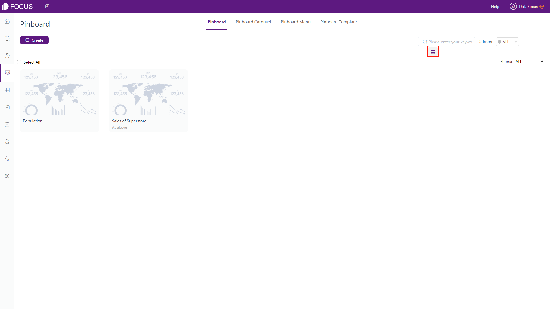
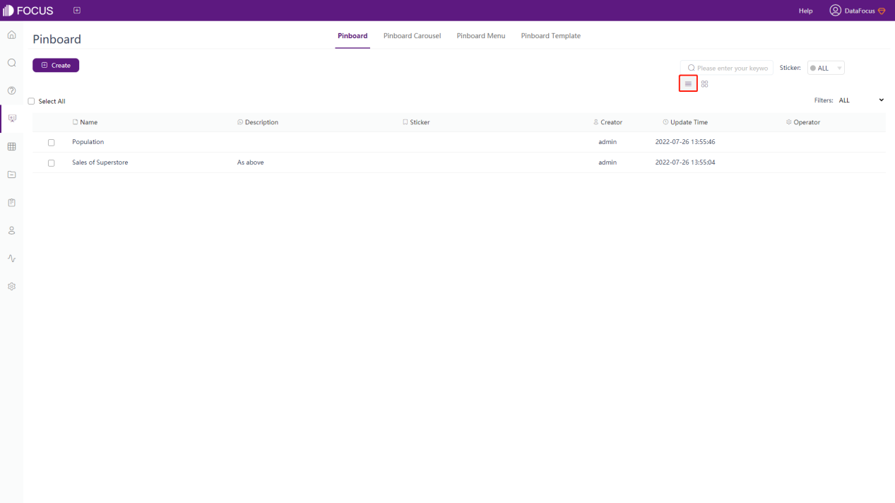
The history answer page has two display modes: thumbnail and list, as shown in figure 5-1-1 and figure 5-1-2.
5.1 Create Dashboard
There are 3 ways to create a dashboard:
-
Detail page of history answer
when adding search results to the dashboard, you will see the “Create new dashboard” button. As shown in figure 5-1-3, click this button to create a new dashboard.
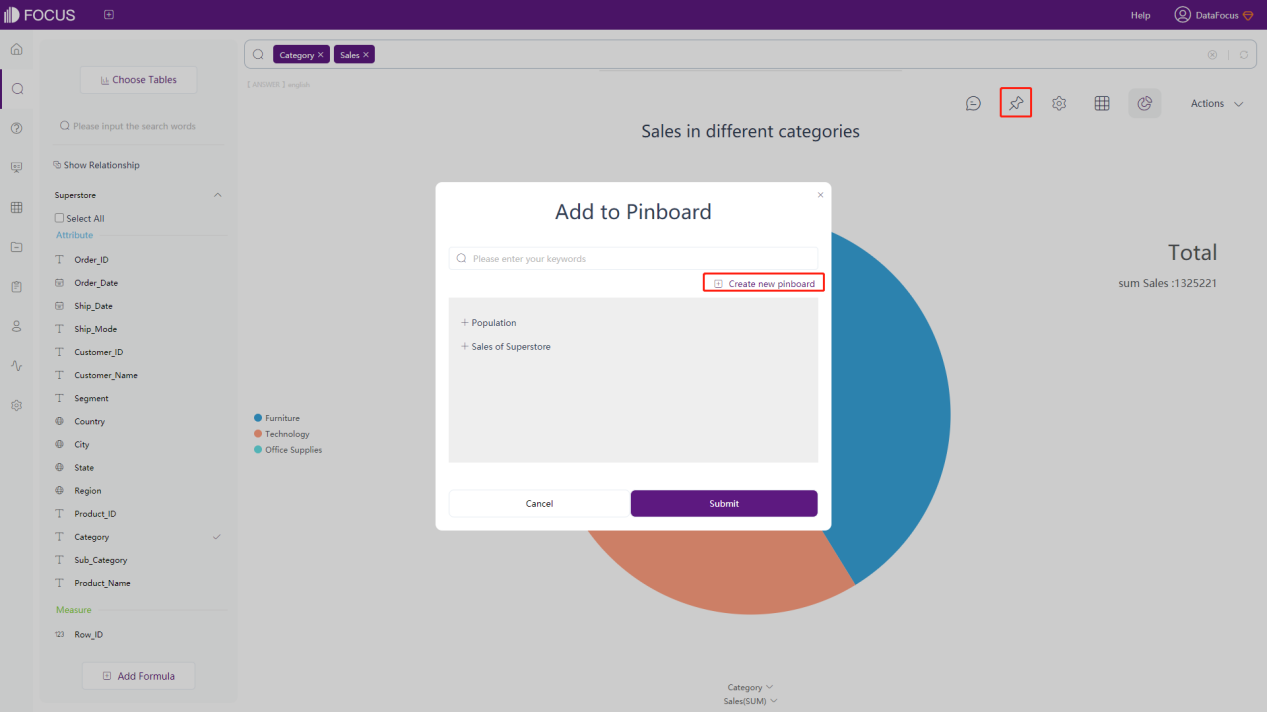
Figure 5-1-3 Create new dashboard - answer -
Dashboard module
Click the “Create” button. On the pop-up window, click the “Pinboard” button, as shown in figure 5-1-4.
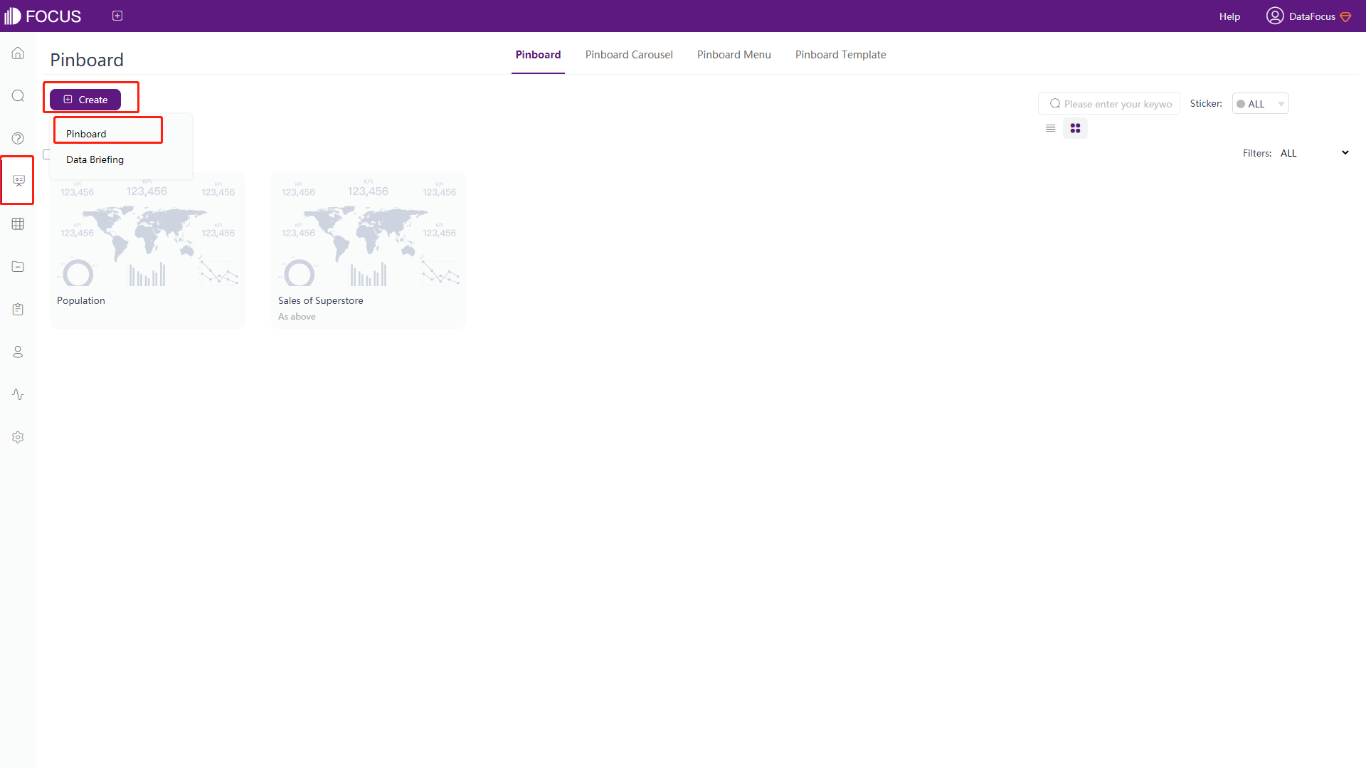
Figure 5-1-4 Create new dashboard - dashboard module -
Resource management module
Click the “Create” button. On the pop-up window, click the “Pinboard” button, as shown in figure 5-1-5.
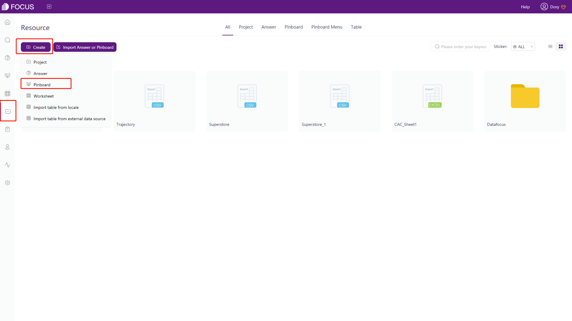
Figure 5-1-5 Create new dashboard - resource management module After jumping into the dashboard creation page, select a dashboard template or under the current “Blank” mode, Then click “Create”, as shown in figure 5-1-6.
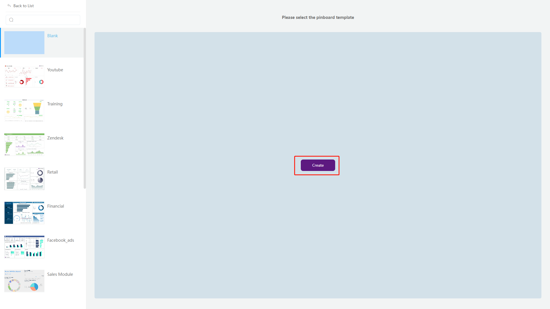
Figure 5-1-6 Create new dashboard - create button In the pop-up window, enter a name (required), a description (optional), and a management item (optional). Then click submit to create a new dashboard, as shown in figure 5-1-7.
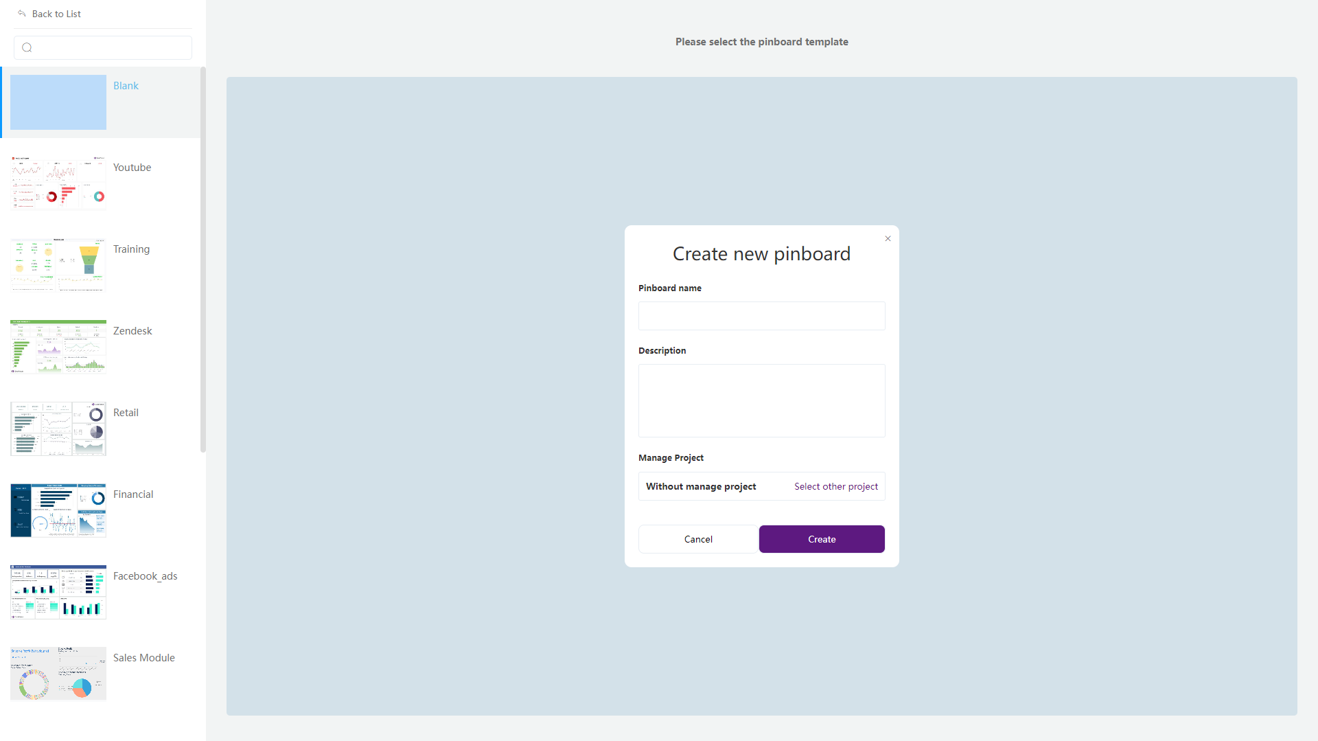
Figure 5-1-7 Create new dashboard
5.2 View Dashboard
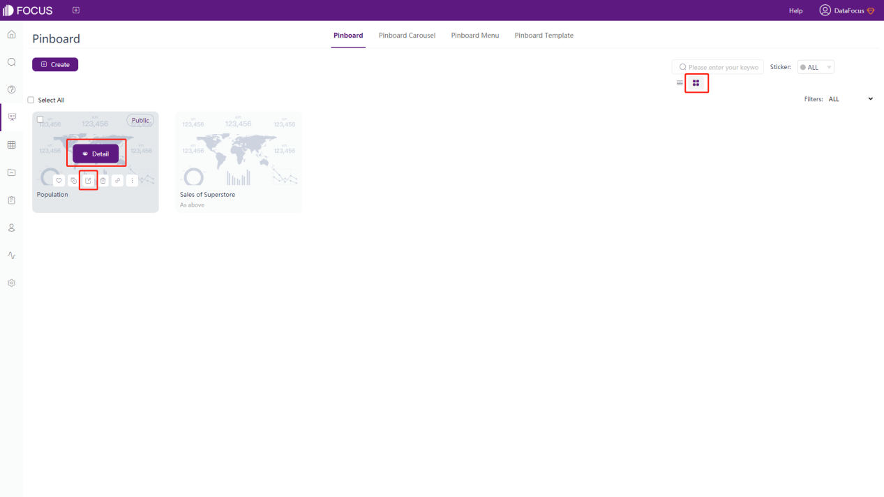
In thumbnail mode, hover over the dashboard, and the corresponding operation items will be displayed. As shown in figure 5-2-1, click “Detail” to view the data board (the data board cannot be edited), and “ ” to enter the editing page;
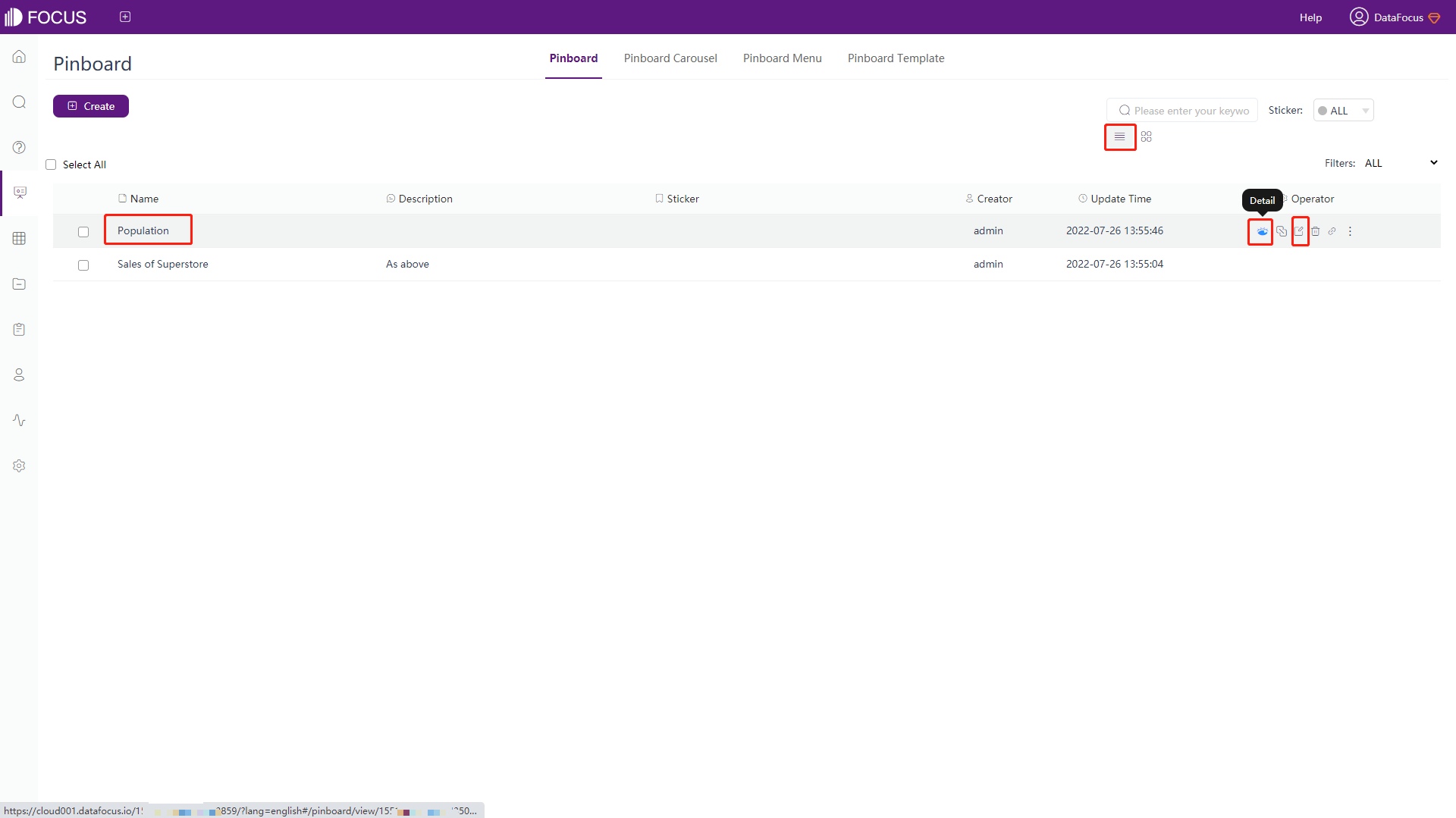
Under list mode, you can also open the data board by clicking the name of the corresponding dashboard or clicking “ ” (detail) or “” (edit) in the operation bar (the icon varies according to the user’s operating permission on the board), as shown in figure 5-2-2.
When viewing the dashboard, you can only link and drill on the board, but cannot modify the content or layout of the answer within the board.
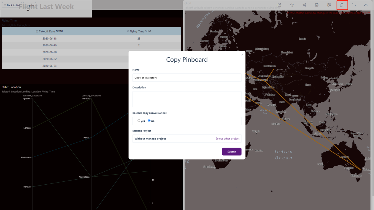
5.2.1 Copy Dashboard
Enter the detail page of dashboard. Copying the dashboard is mainly to copy one, rename it as a new dashboard. The content ad format of the copied data board is consistent with the original one. Move the mouse to the top of the interface and a navigation bar will appear. Click the sixth icon to copy, as shown in figure 5-2-3 below.
On the pop-up window, you can choose whether to copy the answer under “Cascade copy answers or not”. If you choose “yes”, then dashboard with the answer is copied. If you choose “no”, then only the dashboard excluding the answer is copied, such as background, text, pictures, and etc.
5.2.2 Save Dashboard
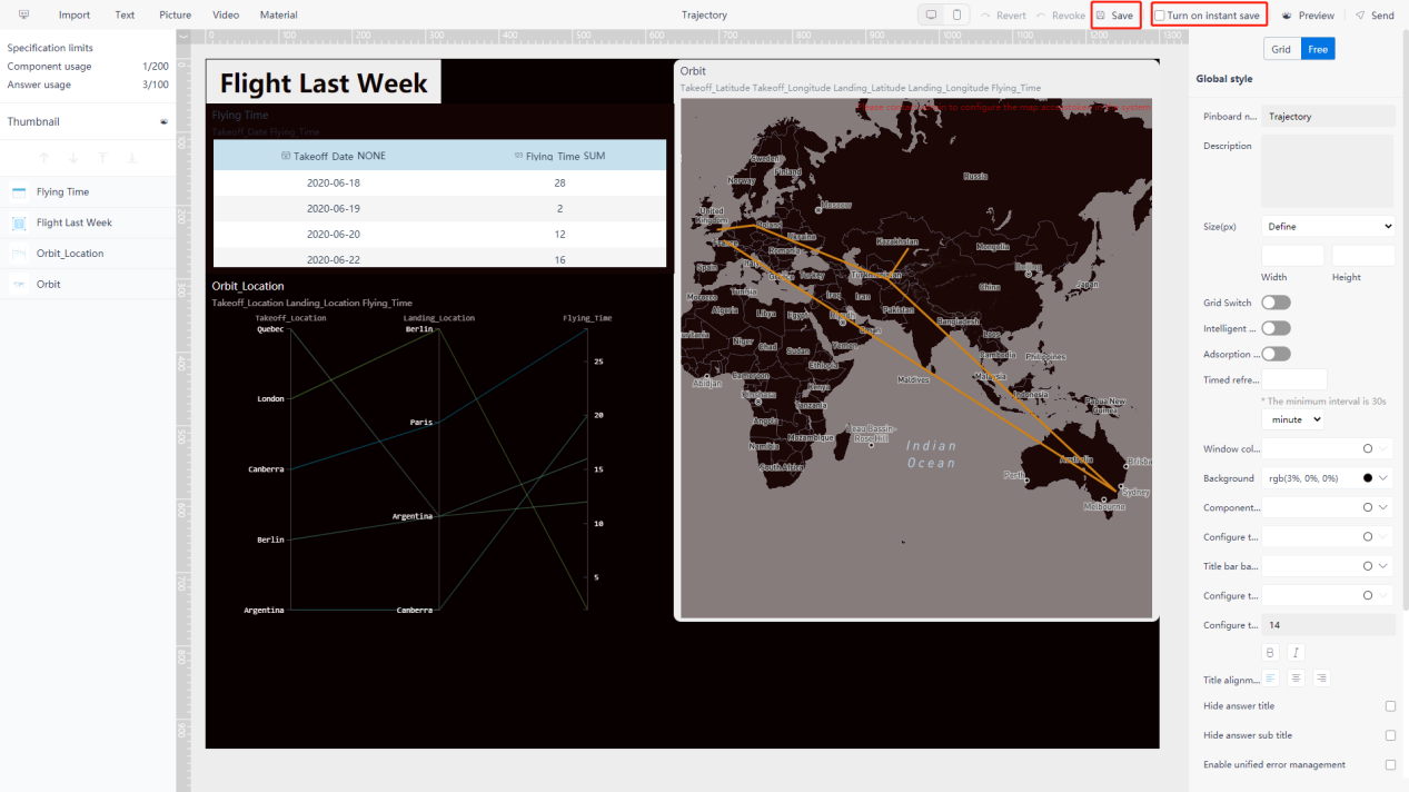
Saving dashboard refers to saving the content of it. On the editing page, you can set the data to save the dashboard in real time after modification, as shown in figure 5-2-4. The saved data board can be previewed, linked and drilled.
5.2.3 Export as PDF
On the viewing page, as shown in figure 5-2-5, click the save as PDF button “ ” in the upper right corner to export the current dashboard as a PDF file and download it to the corresponding folder.

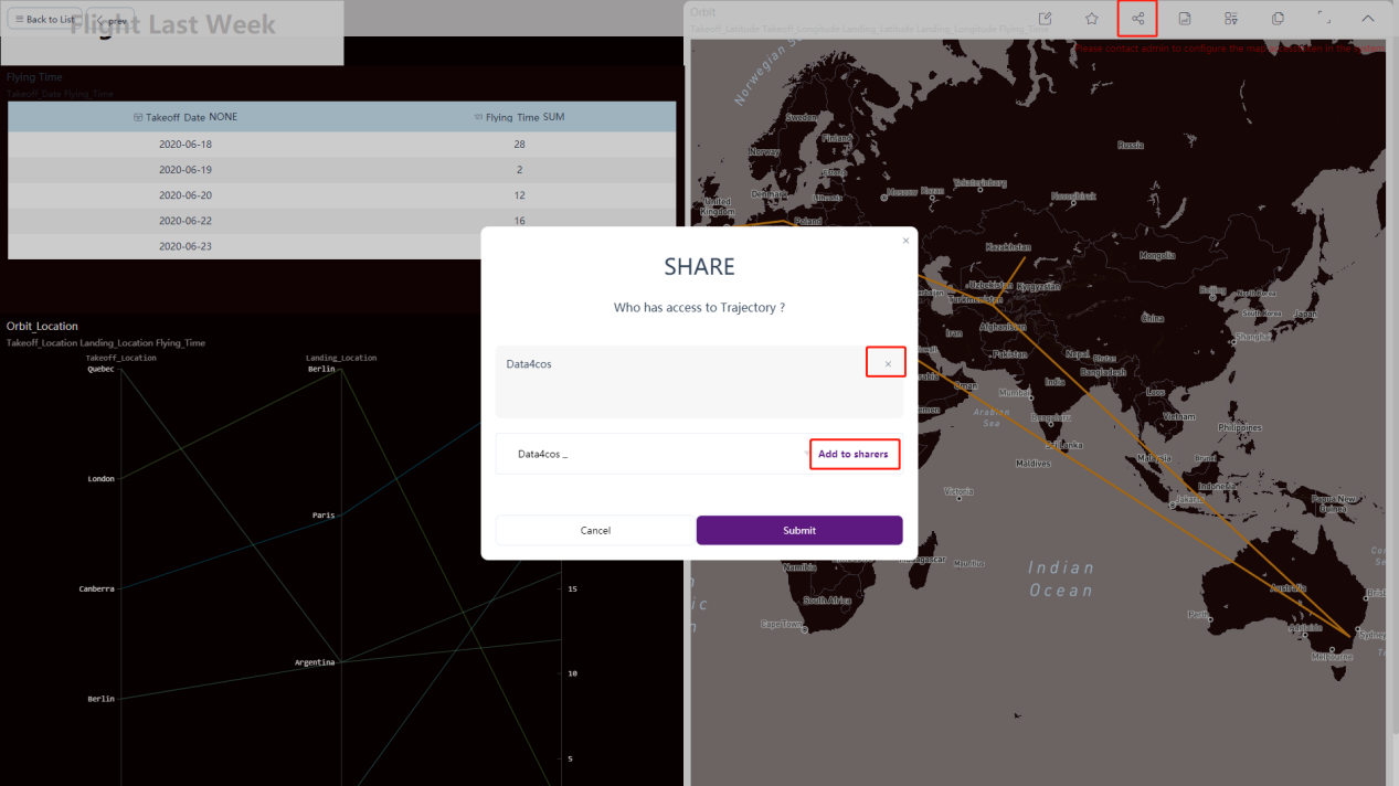
5.2.4 Share Dashboard
On the viewing page, as shown in figure 5-2-6, click the “ ” button in the navigation bar on the upper right corner of the board.
Click “+” in the pop-up box, select the user to share, click the “Add to sharers”, and click the “Submit”, then the board is successfully shared. You can also delete shared users by clicking the “x” button on the back of the user’s name.
5.2.5 Global Filter
On the viewing page, users can click the funnel-shaped action button in the upper right corner, and the filter box will pop up on the left to filter the answer together.
Click the column, the corresponding filter item will appear in the top, and you can filter by condition in the drop-down box, as shown in figure 5-2-7 below.
5.2.6 Edit Graphs
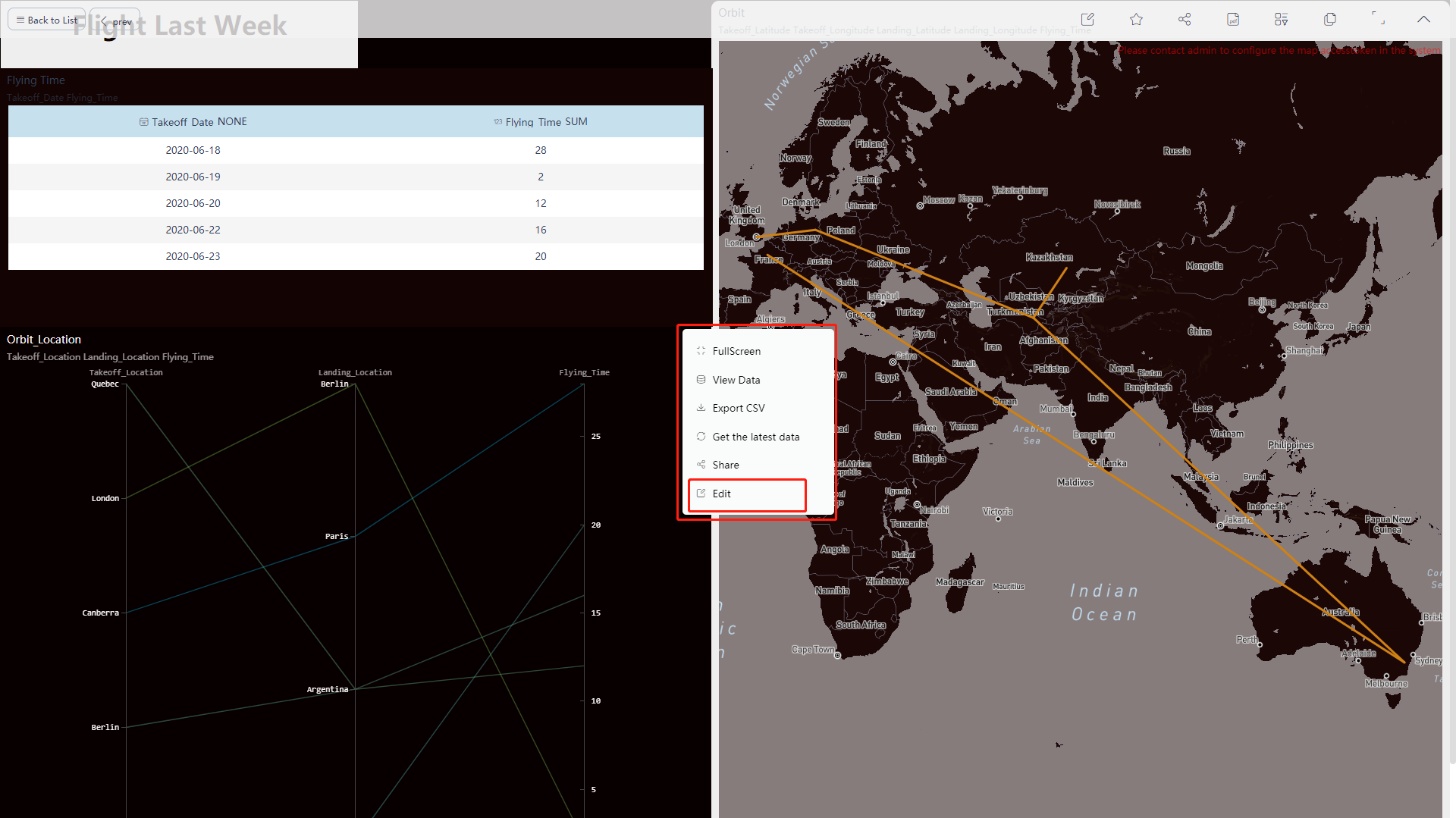
On the viewing page, as shown in figure 5-2-8, click the edit button in the upper right corner of the chart, Then click the “Edit” to jump to the corresponding answer page to interact or edit the chart, as shown in figure 5-2-9.
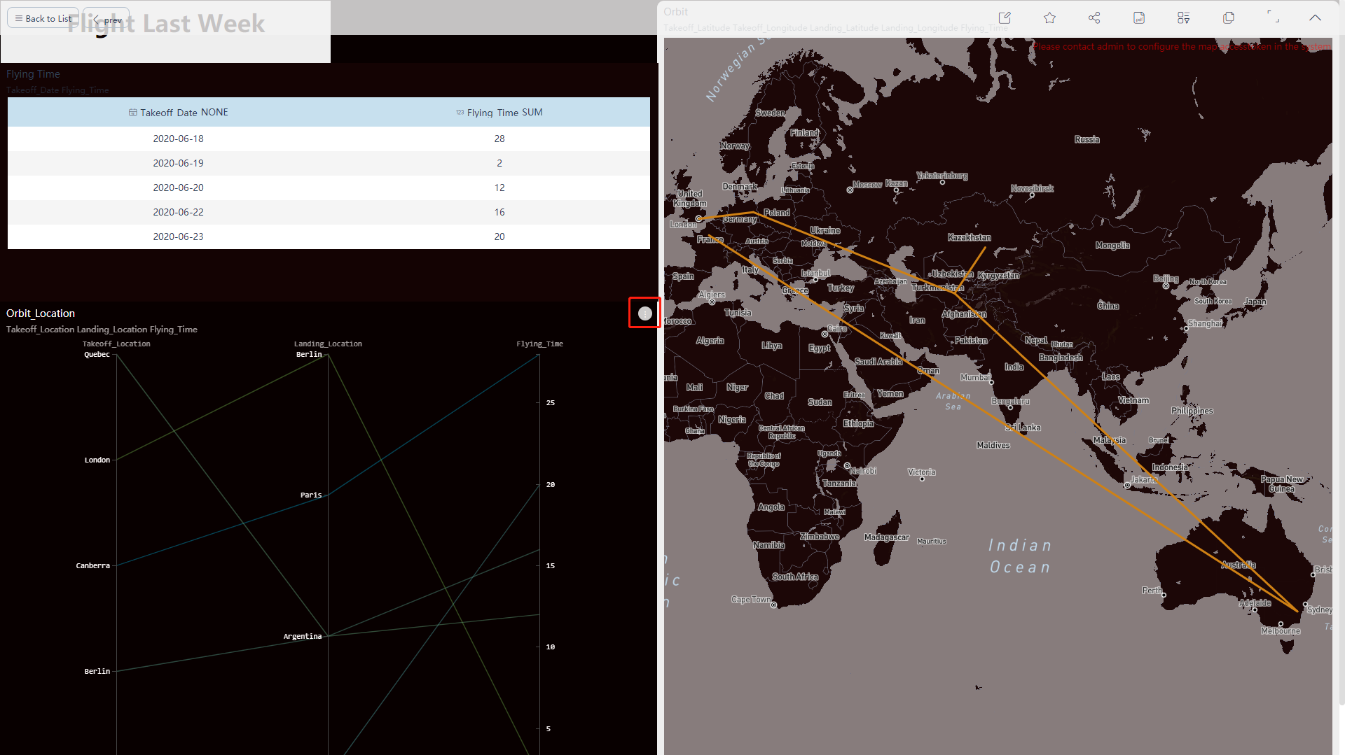
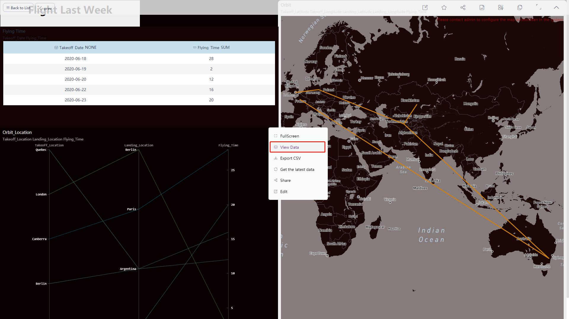
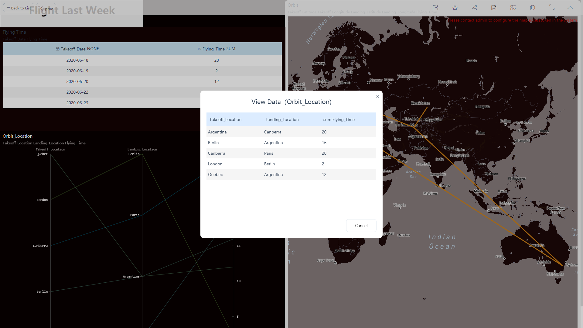
5.2.7 View Data Details
On the viewing page, as shown in figure 5-2-8, click the data details in the button in the upper right corner of the chart, and a pop-up window will pop up, as shown in figure 5-2-10. Click the “View Data” to display the corresponding detailed table of the current answer, as shown in figure 5-2-11.
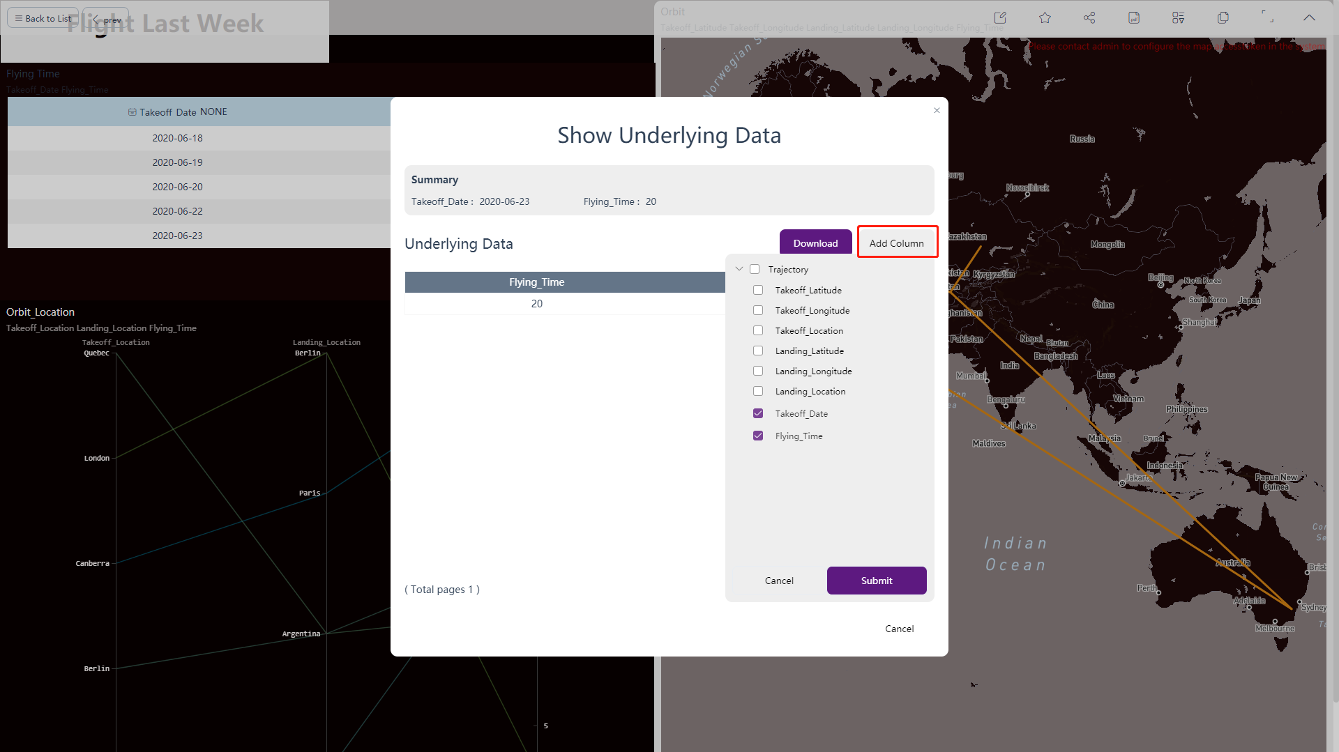
5.2.8 View Data Point Details
On the viewing page, right-click to select a key point of the component you want to view, and then click “Show Underlying Data”, as shown in figure 5-2-12. The pop-up window displays the corresponding data details of the current key point. To facilitate viewing and comparison, you can add relevant columns when displaying data details, as shown in figure 5-2-13.

5.2.9 Dashboard Interactions
-
Pagination
Move the mouse to the chart, if there are more than 1000 rows of data and there are pagination, a red arrow will be displayed. Click the arrow to view the data on the next page, as shown in figure 5-2-14 below.
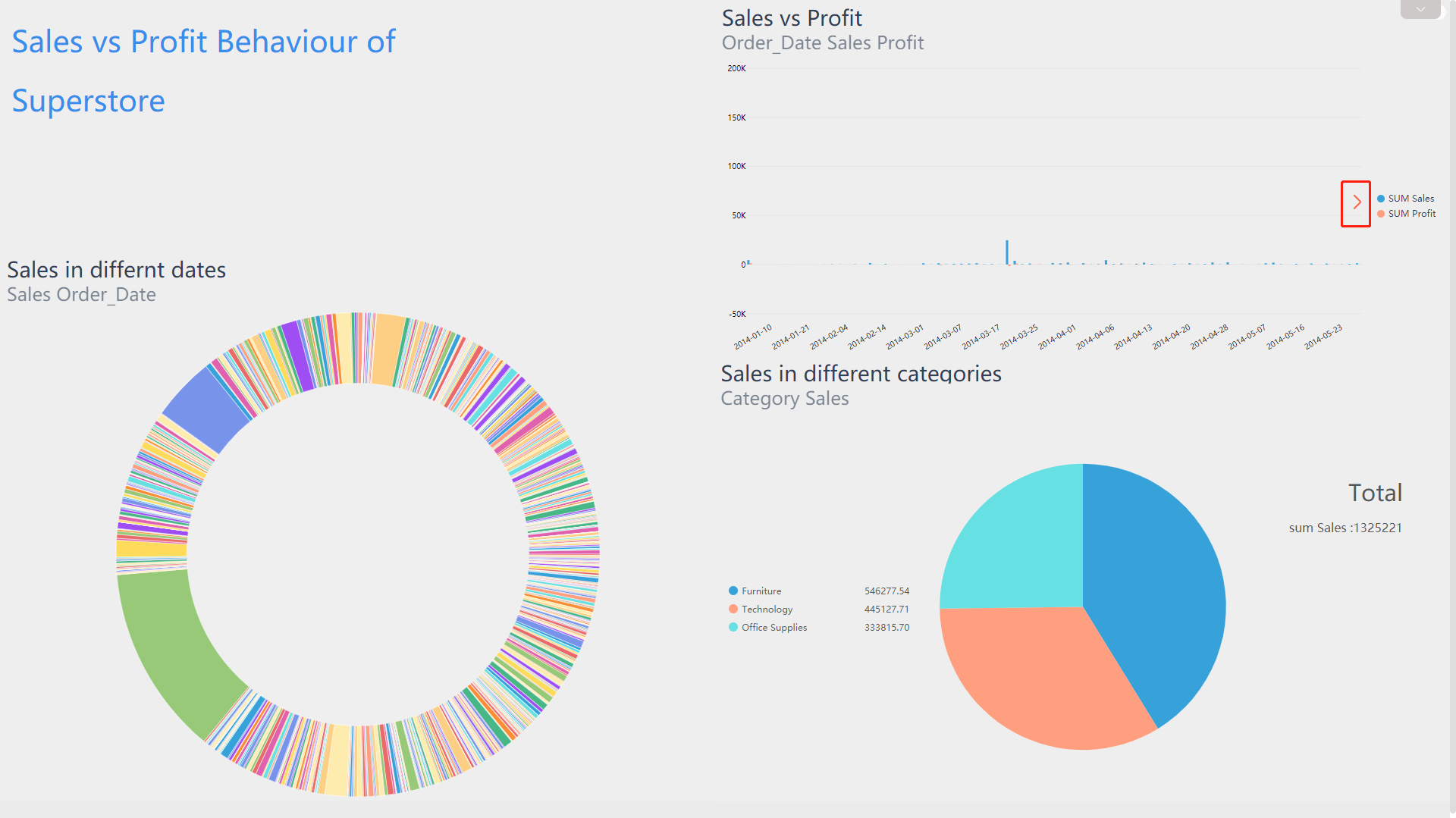
Figure 5-2-14 pagination -
Zoom in
Click and drag over the part you want to zoom in, release the mouse. As shown in figure 5-2-15, the data is zoomed in, and you can see it more clearly; If you want to restore the original state, click the return “ ” button in the upper left corner of the chart, as shown in figure 5-2-16.
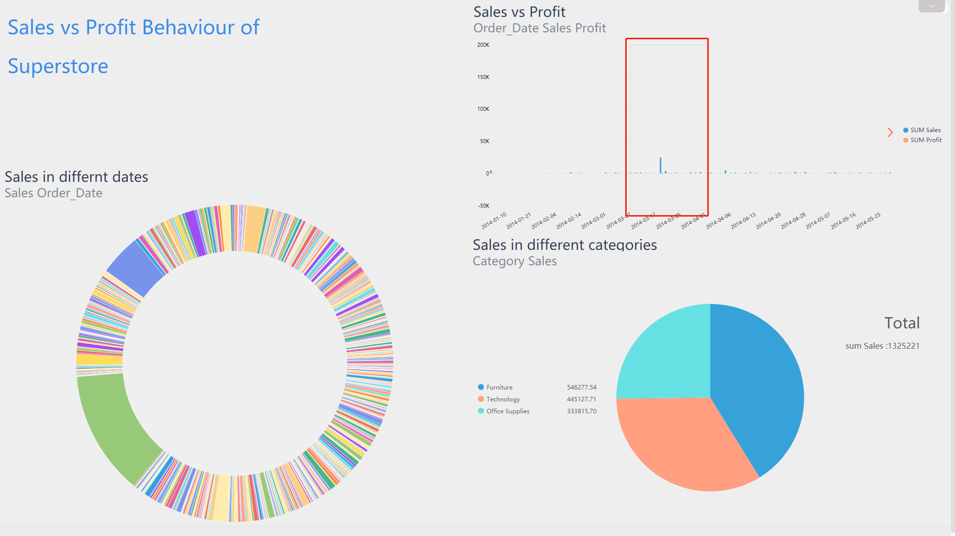
Figure 5-2-15 Zoom in 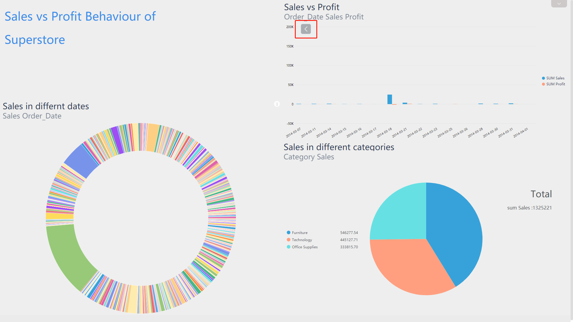
Figure 5-2-16 Restore -
Drill
Drilling on the chart is shown in figure 5-2-17 below. You can drill up or drill down data to expand or narrow the scope of data.
By drilling down and linking, you can link the entire dashboard. For example, if you drill down to the data of US, the entire dashboard will be automatically change.
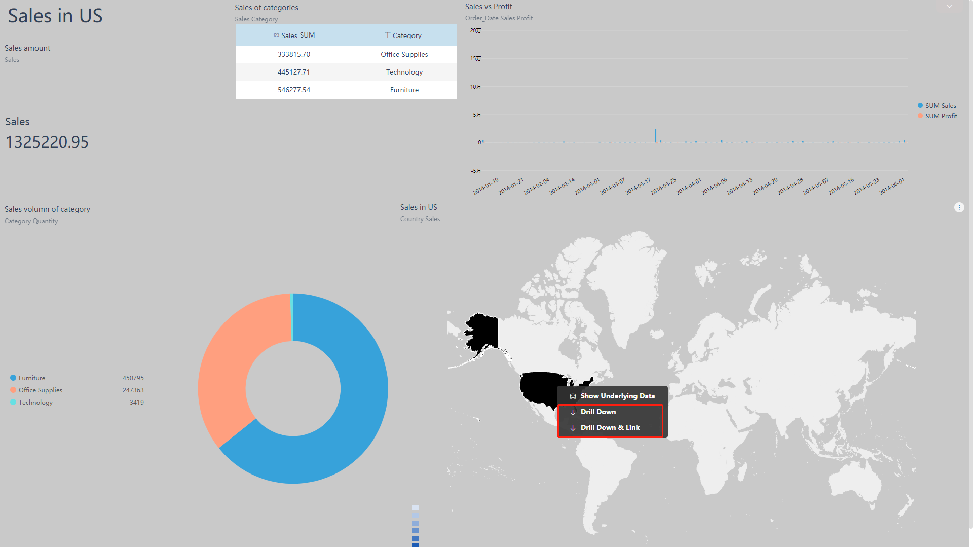
Figure 5-2-17 Drill -
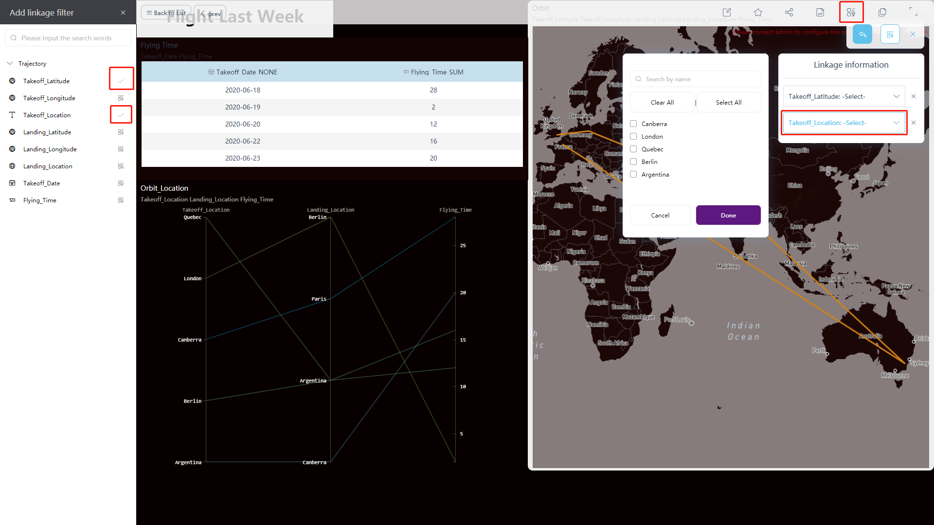
Linkage
If all the charts in the dashboard depend on the same table, or several tables with related relationships, then these charts can be linked.
The specific operations are as follows:
(1) Select a chart, such as a ring chart, and select a date in the chart (such as 2-20-2017, which represents filtering out the data in this column), as shown in figure 5-2-18. Then all charts that meet the conditions will be filtered according to this condition.
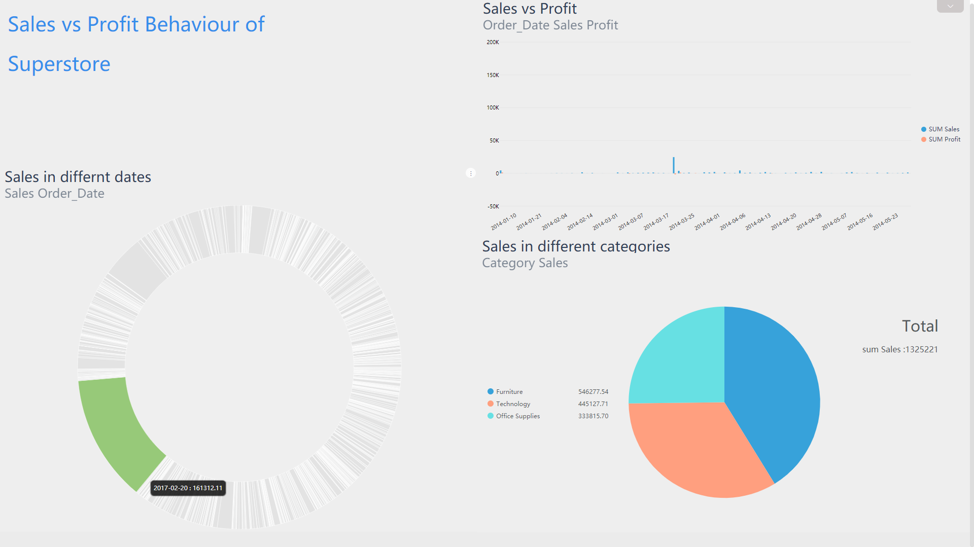
Figure 5-2-18 Linkage - select (2) As shown in figure 5-2-19, at the top of the dashboard, you can view the linkage conditions (i.e., filter conditions);
(3) In the linkage information, click the “X” button on the right of the linkage condition. All charts will be restored, that is, back to when there is no filter.
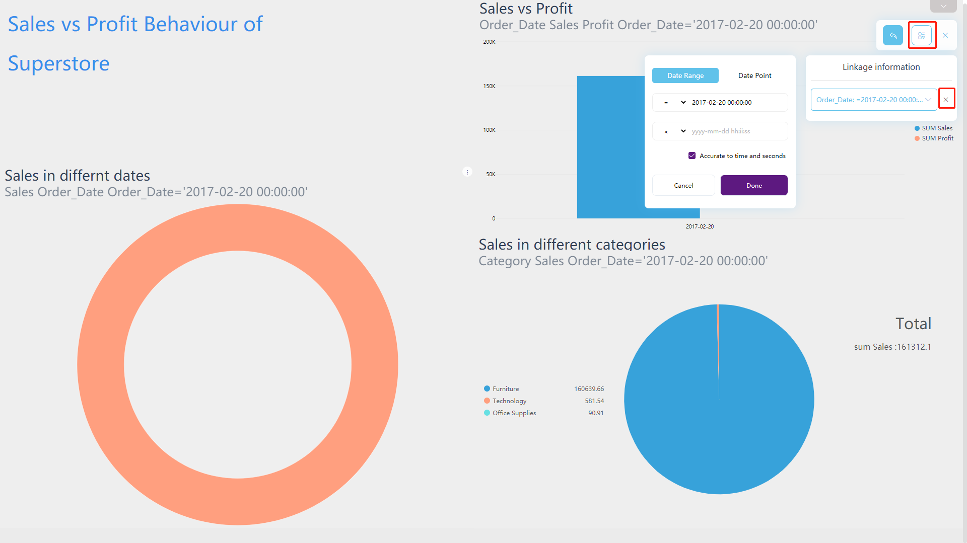
Figure 5-2-19 Linkage - filter info
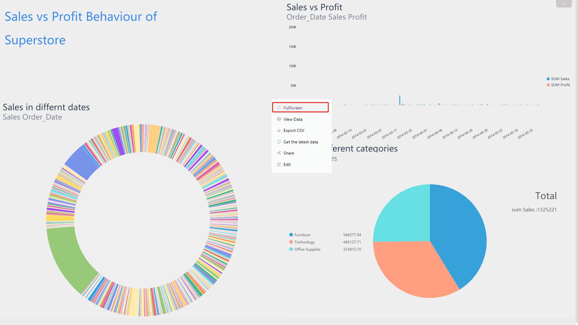
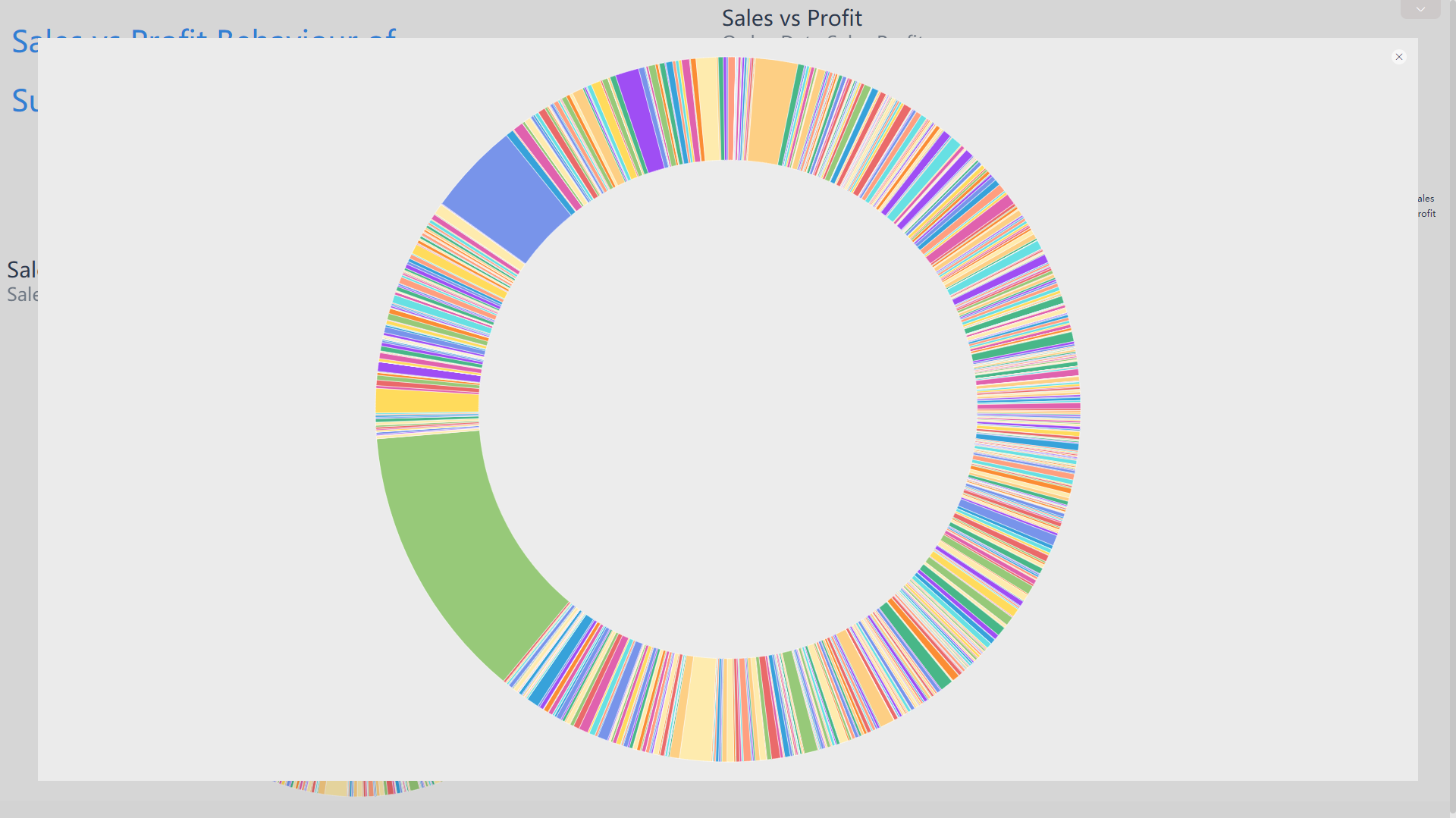
5.2.10 Show in Full Screen
On the viewing page, as shown in figure 5-2-8, click the edit button in the upper right corner of the chart. Then click the “FullScreen” to display the current answer in full screen, as shown in figure 5-2-20 and 5-2-21.
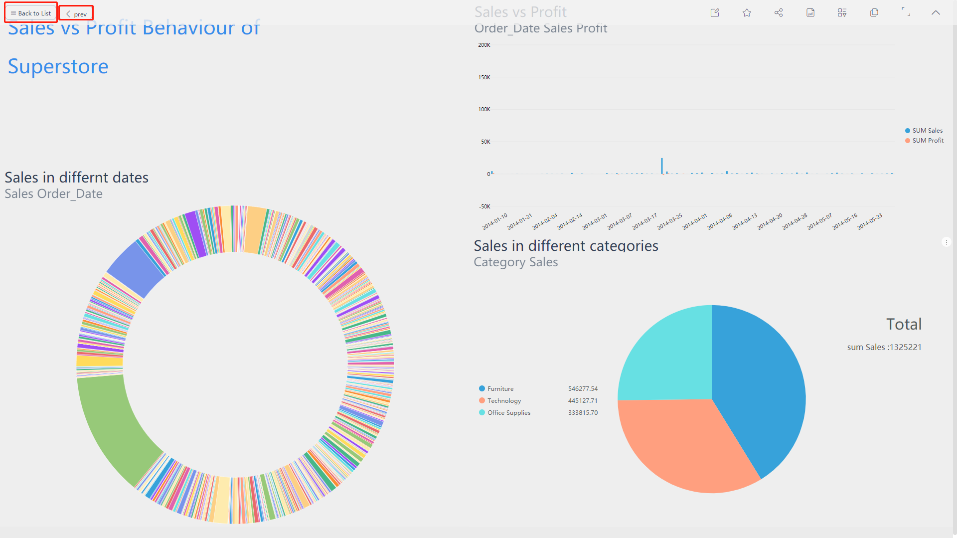
5.2.11 Return Page
You can return to the other interfaces in the upper left corner of the viewing page, as shown in figure 5-2-22.
If the dashboard is set to jump, Then click the “prev” button to return to the previous page.
Clicking the “Back to list” button can directly return to the dashboard module.
5.3 Edit Dashboard
Users who have editing permissions of the dashboard can open and edit the content. On the dashboard module, click on the “” button to enter the editing page.
Through the newly opened page, you can know that the number of answer that the dashboard contains. On this page, you can modify all the displayed charts, such as modifying the layout, size, background color of the chart, and deleting the chart, the background color of the dashboard, the title format, and etc.
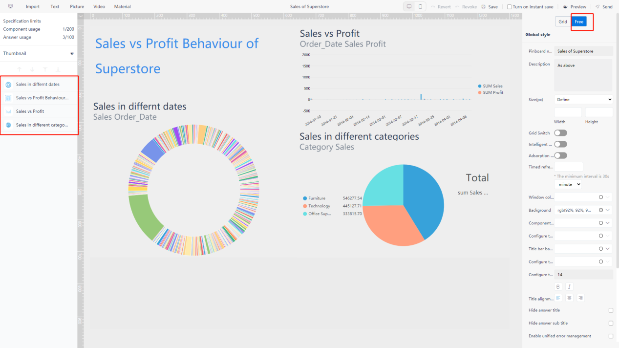
Under the grid layout, as shown in figure 5-3-1, the right side of the dashboard is the style configuration area. When a answer is selected, it is the style configuration of the answer; when no component is selected, it is the global style configuration. The left area is the layer management of all components in the dashboard. The rest is the dashboard display area.

Under the free layout, as shown in figure 5-3-2, the right side of the dashboard is the style configuration area. When a answer is selected, it is the style configuration of the answer; if no component is selected, then it is the global style configuration. The left area is the layer management of all components in the dashboard. The middle part is the dashboard display area.
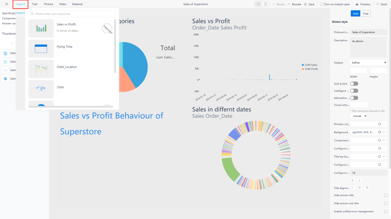
5.3.1 Import answer
Move the mouse to the “Import” button in the upper left corner of the editing page, a window will pop up. All of the answer and corresponding selections as well as abbreviated information will be displayed.
“Imported” means that this answer has already been added to the dashboard, the others are not imported to the data board. Select the answer to add into the dashboard, as shown in figure 5-3-3.
Users can scroll and turn pages to query the answer imported, or enter a keyword query in the search box.
5.3.2 Custom Component
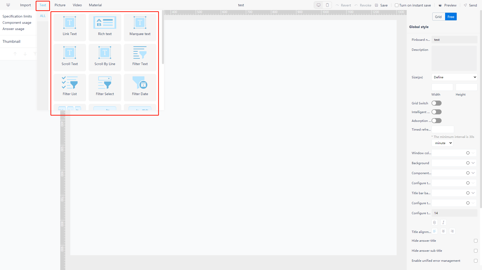
On the editing page, in addition to importing answer, custom components can also be added to the dashboard. There are four types of custom components: text component, image component, video component, and material component.
Text Component
Move to “Text” in the upper left corner of the editing page, and the text component selection window will pop up, as shown in figure 5-3-4. It includes link text, rich text, marquee text, scroll text, carousel text, filter text, filter list, filter drop-down box, date interval, dynamic date, year, quarter, year and month, year and month interval, date, numerical interval, filter button (multiple). For grid layout mode, there is also title text component.
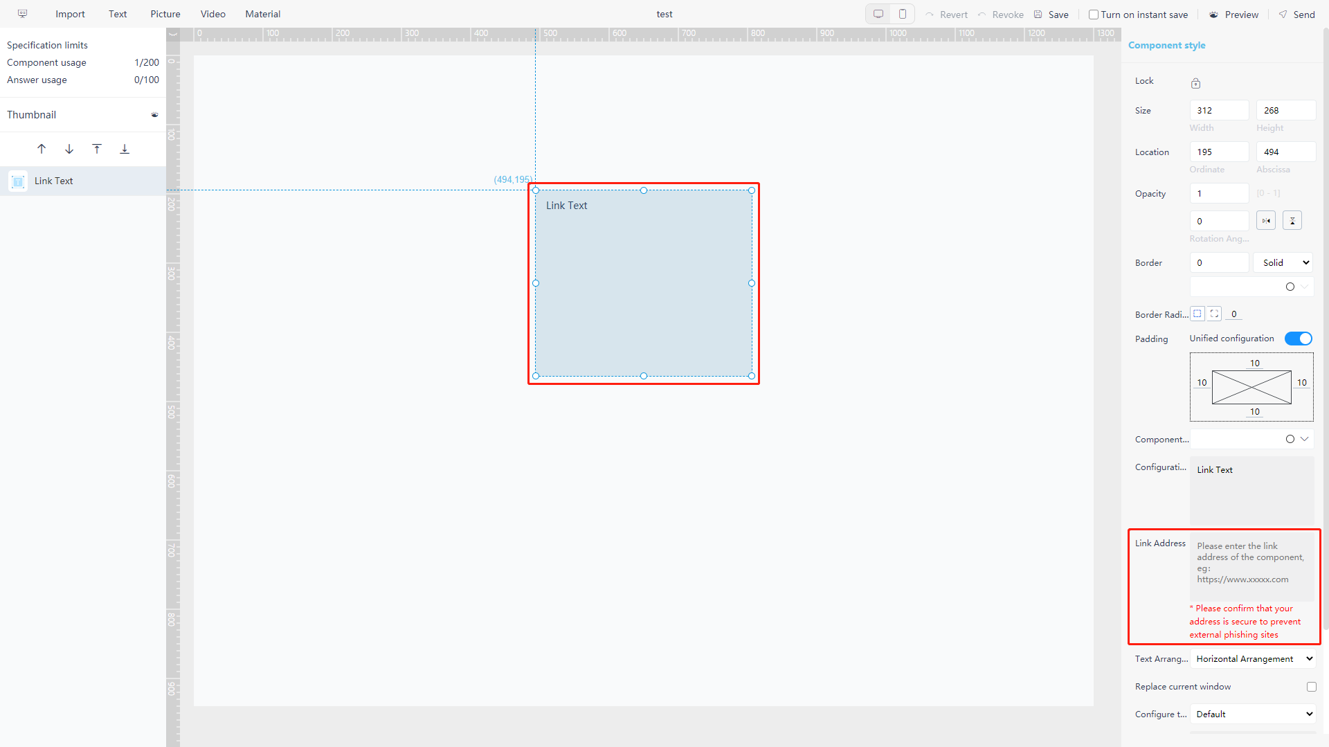
Link text: you can set a jump link to the text, i.e., you can connect it to the dashboard and external links, as shown in figure 5-3-5;
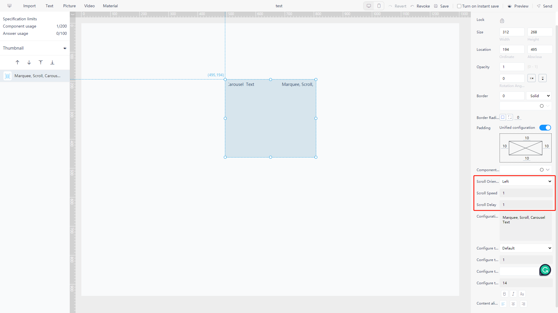
Marquee, scroll, carousel text: you can set a dynamically scroll, as shown in figure 5-3-6;
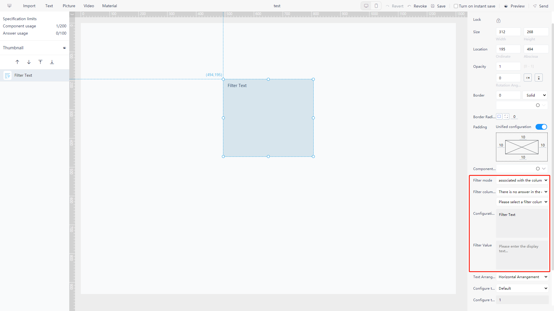
Filter text: click the filter text to jump out filter box where you can filter in a certain column, as shown in figure 5-3-7;
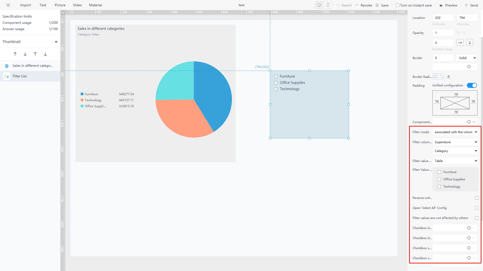
Filter list: create a list of a certain Attribute column which can be chosen freely, as shown in figure 5-3-8;
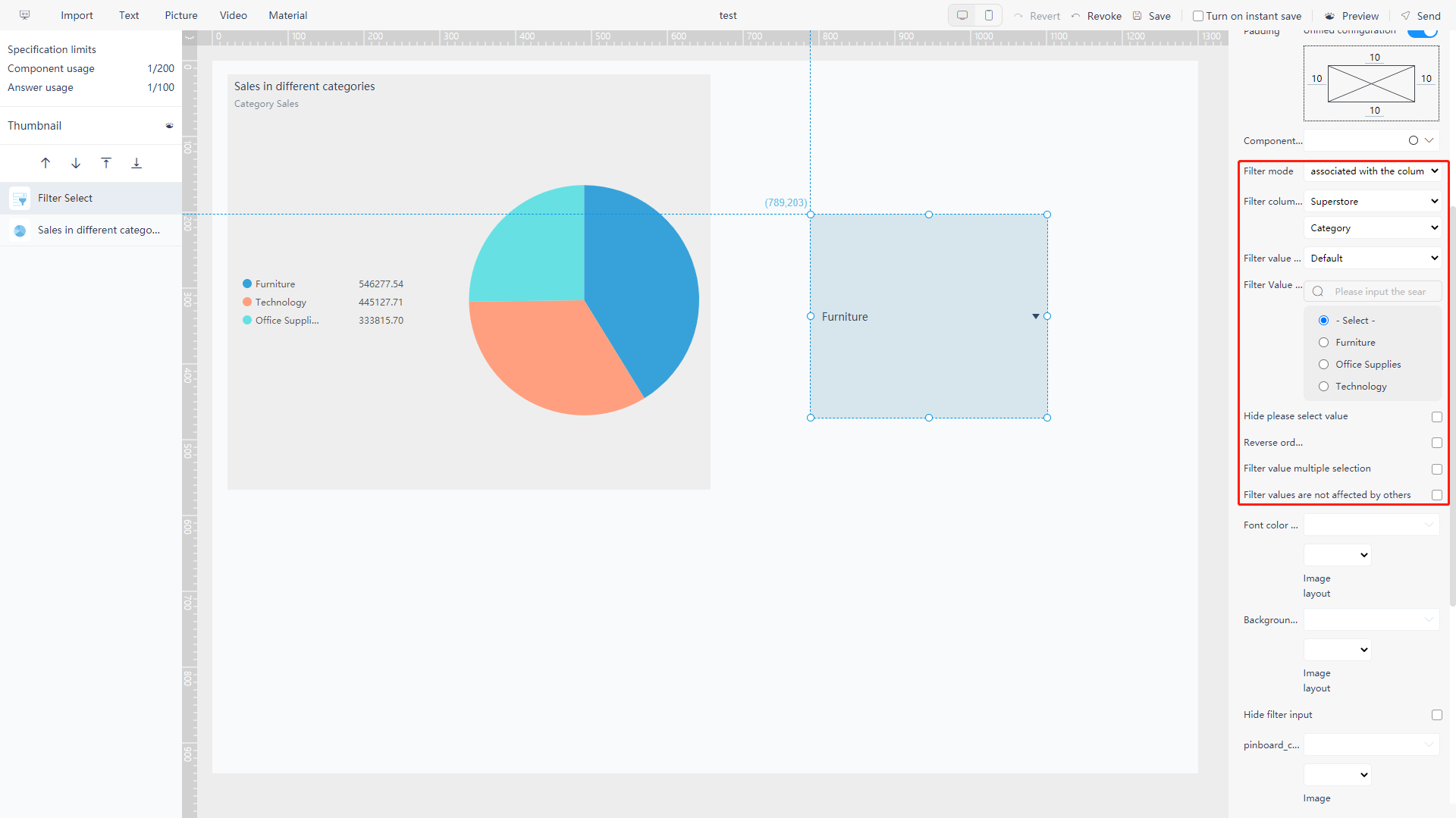
Filter drop-down box: put all characters from a certain Attribute list in the drop-down box to choose freely, as shown in figure 5-3-9;
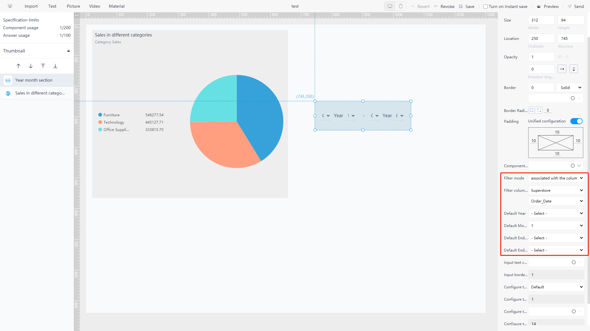
Date interval, dynamic date, year, quarter, year and month, year and month interval, date: filter relevant time/date in the date column, as shown in figure 5-3-10;
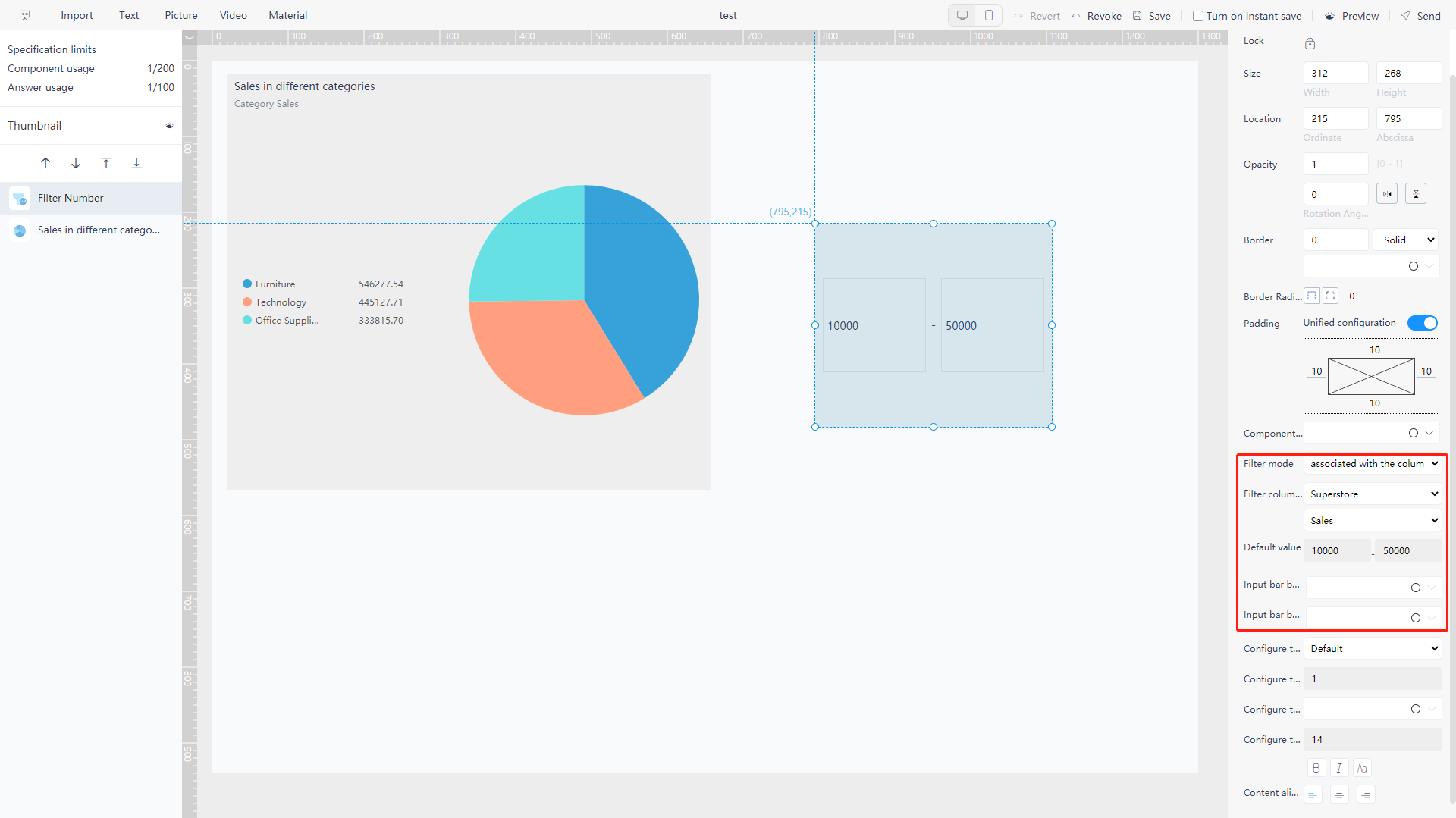
Numerical interval: filter the values in the Measure column, as shown in figure 5-3-11.
Filter button (Multiple): you can set multiple filter conditions for an Attribute column to filter separately, as shown in figure 5-3-12.
.png)
Image Component
Move to “Picture” in the upper left corner of the editing page, and the image component selection window will pop up, as shown in figure 5-3-13.
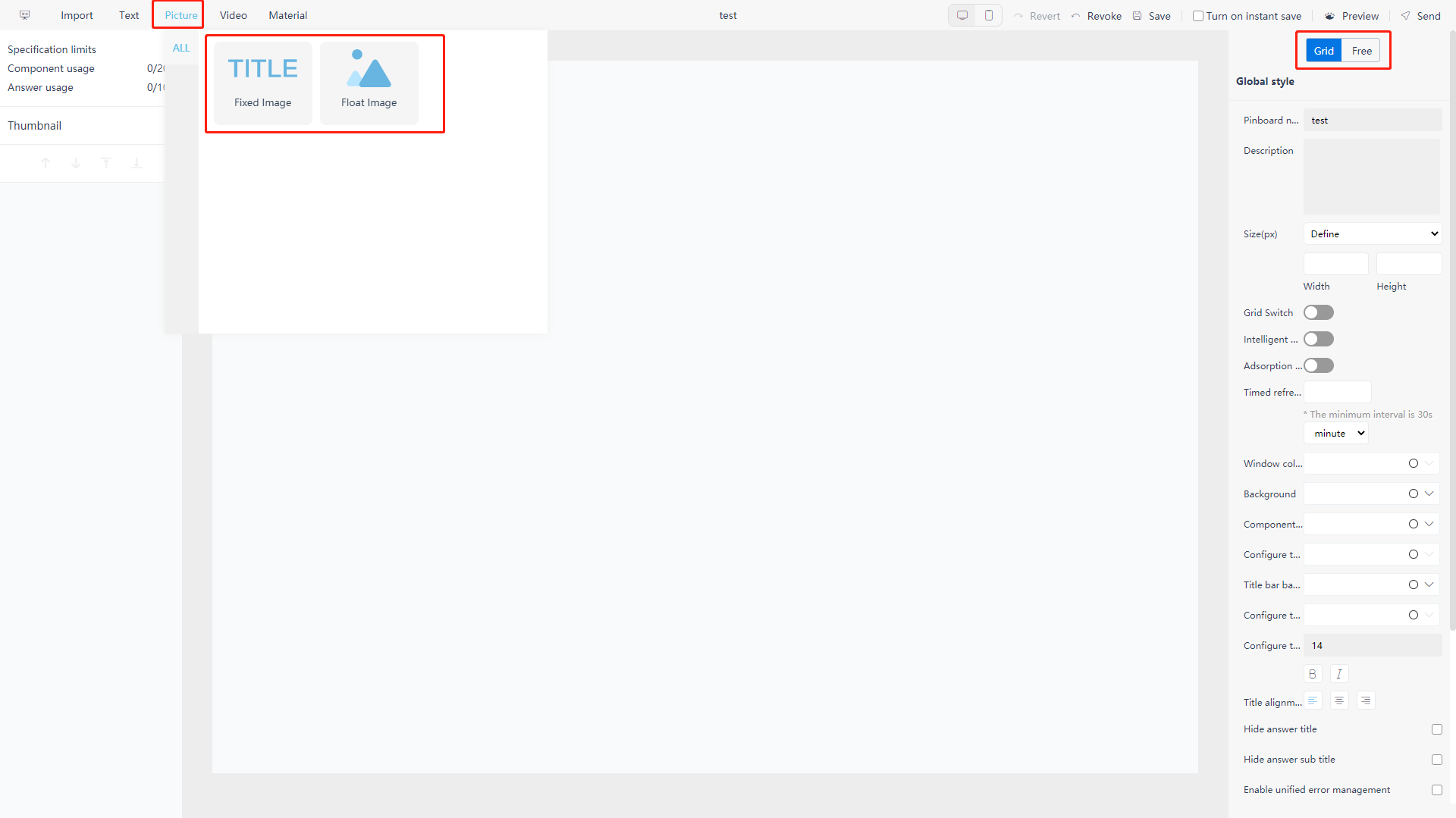
There are two options: title and floating.
The floating component does not occupy the canvas position and can be suspended at any position above other components;
The title component occupies the canvas position, which will affect the order of chart and the layout of the dashboard.
In grid layout mode, both floating and title components can be added, but in free layout mode, only floating components can be added.
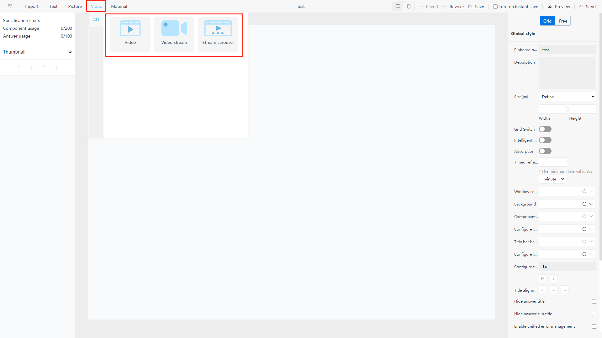
Video Component
Move to “Video” in the upper left corner of the editing page, and the video component selection window will pop up, as shown in figure 5-3-14. You can insert a video, a stream, or a carousel video in the dashboard and set loop playback.
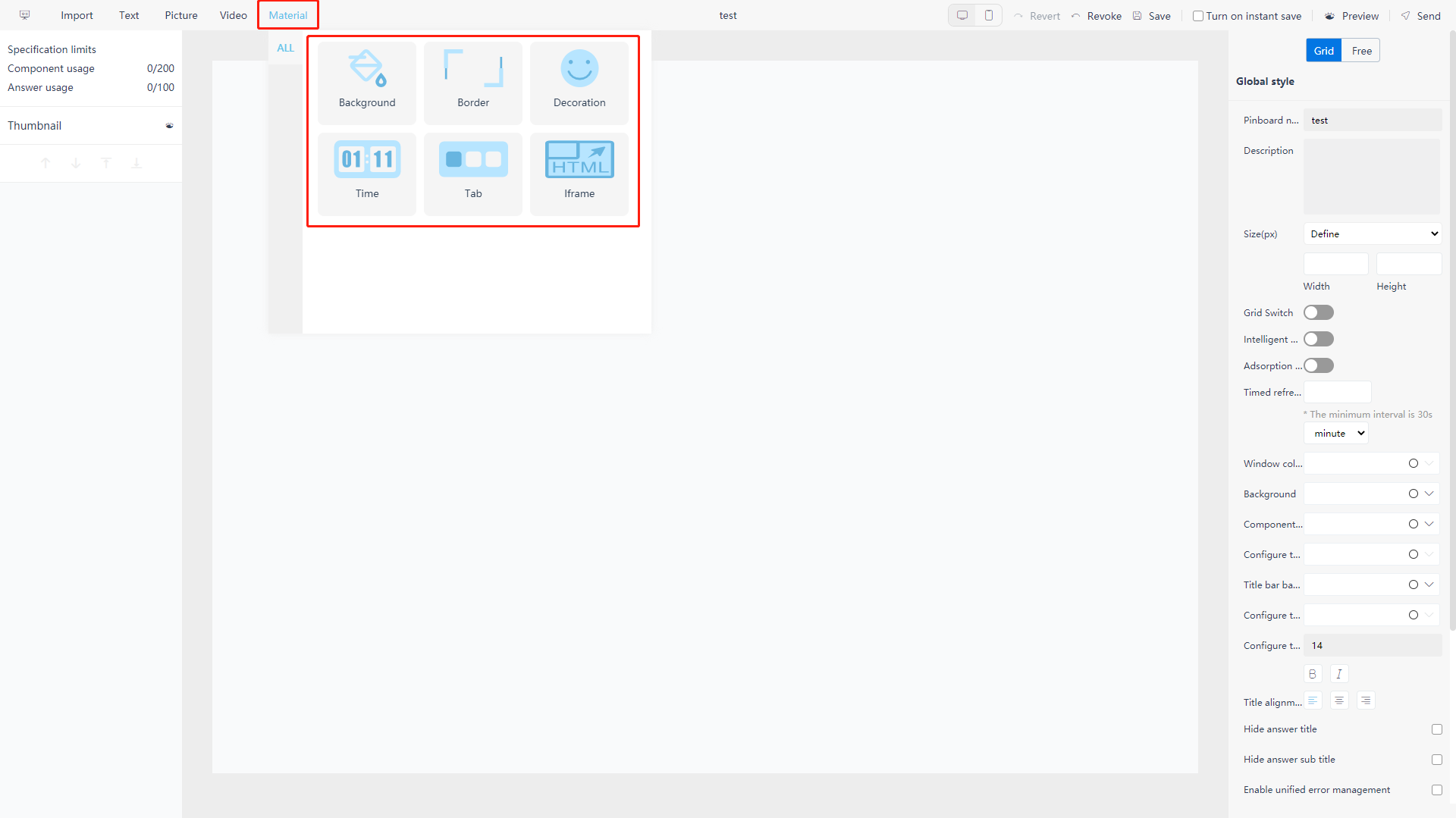
Material Component
Move to “Material” in the upper left corner of the editing page, and the material component selection window will pop up, as shown in figure 5-3-15. There are six types: custom background, border, decoration, timer, tab control, and Iframe components to choose from. Components do not occupy the canvas position and can be suspended anywhere above other components.
Under the grid layout mode, there are only four kinds of materials: decoration, timer, tab control, and Iframe component.
The configuration of custom components is different from that of general chart components.
In addition to size and background, the configuration of image components can only be configured for uploading images. Images need to be imported from local to the system, and up to seven pictures can be imported for carousel.
The text component can configure the background, bold, italics, alignment, text background and hiding, font size and font color of the text input by user.
In addition, under the grid layout mode, there is a smaller text component whose size option can be smaller than 25%. For details, see Section 5.3.11.
5.3.3 Change Layout
On the editing page, when no component is selected, click “Free” or “Grid” in the format bar on the right to switch between free layout and grid layout.
-
Grid layout: charts are arranged in a regular grid, as shown in figure 5-3-16;
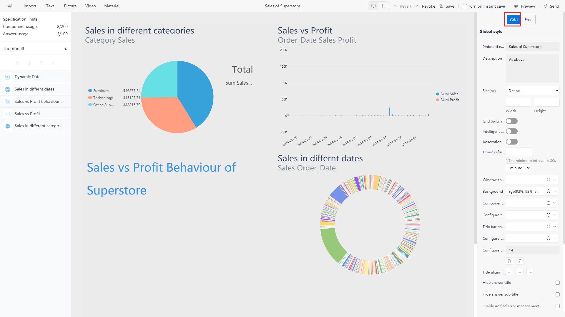
Figure 5-3-16 Grid layout -
Free layout: The position of the chart can be dragged freely, or the coordinate data of the component position can be modified in the format configuration on the right, the effect is shown in figure 5-3-17 below.
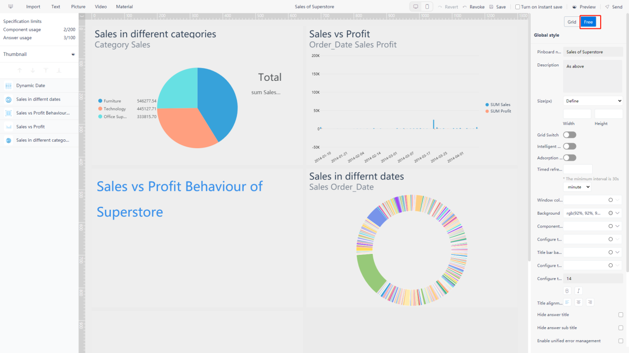
Figure 5-3-17 Free layout
5.3.4 Change Order of Graphs
-
Grid Layout
Click on the component you want to change the order of, hold and drag it to the position you want to place. Limited by the grid arrangement rules, the order of the replaced components will move forward one place in turn;
-
Free Layout
Click on the component you want to change the order of, press and hold to drag it to any position you want without restrictions.
You can also set it in the layer management on the left column. Select a component, and click the “
 ” buttons to adjust the displayed layer priority. When component A with a high priority and component B with a low priority overlap, the overlapping part of B will be covered. Right-click on the corresponding component, and the priority options will also appear, as shown in figure 5-3-18.
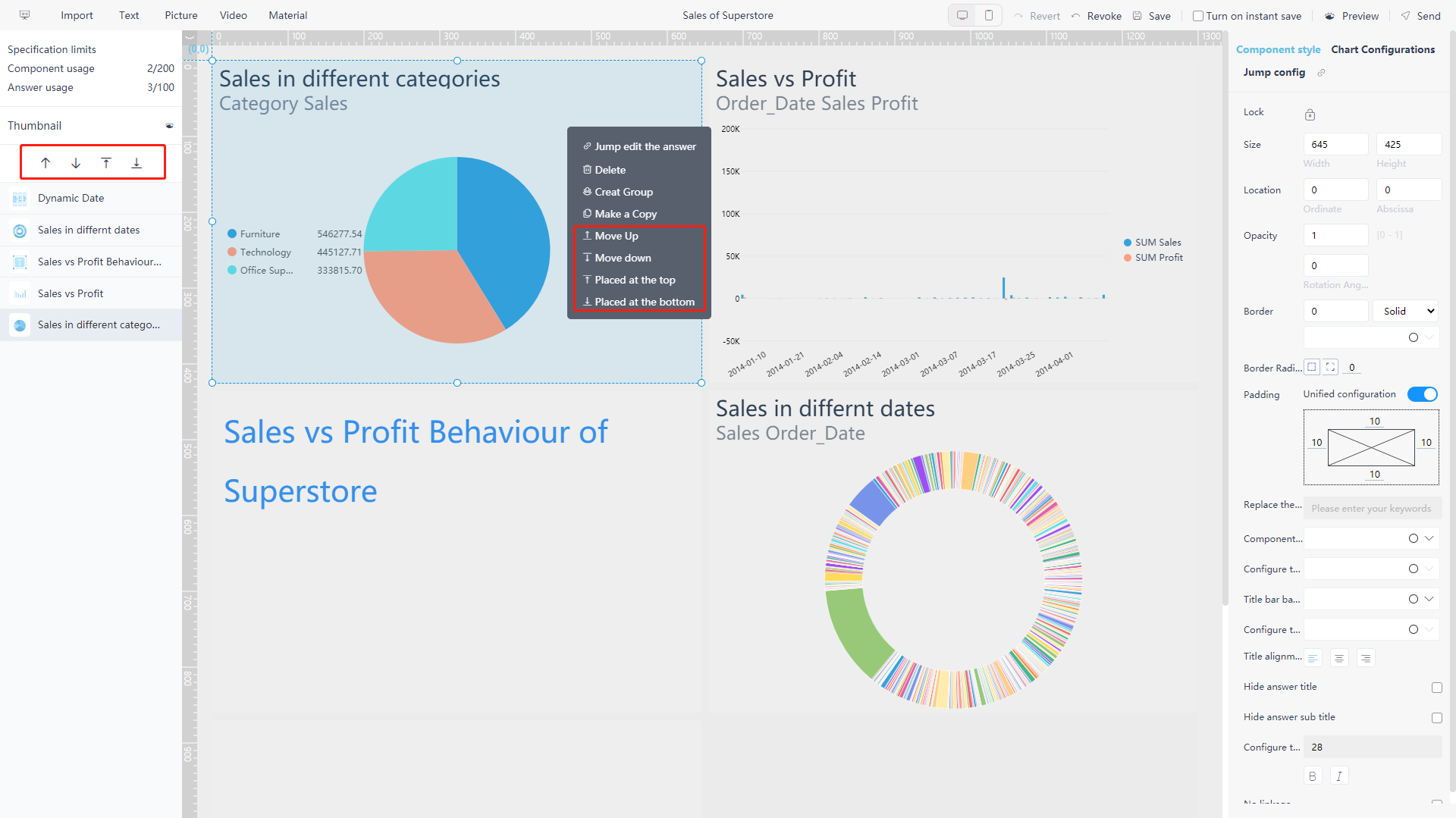
Figure 5-3-18 Change order of graphs
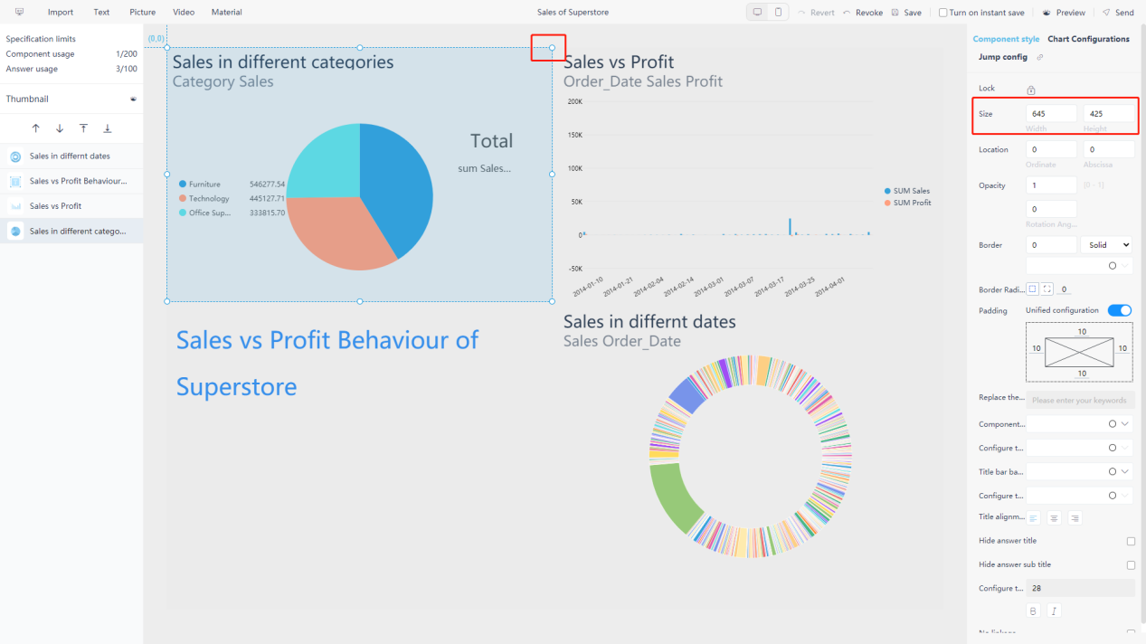
5.3.5 Change Size of Graphs
Under both grid layout and free layout mode, the size of the chart in the dashboard can be adjusted at will without restriction. The specific operations are as follows:
Select the component whose size you want to modify, and when a blue circular sign appears on the borders, you can hold the mouse and drag one of the icons on the chart to adjust the size; Or you can directly modify the width and height in the format configuration on the right, as shown in figure 5-3-19.
5.3.6 Auxiliary Lines
Under the free layout mode, “Auxiliary Line” can be added to help users better place the chart and set the size of chart, as shown in figure 5-3-20.

The specific operations are as follows:
Show/Hide: Click the “” button in the top left corner of the dashboard to display or hide the auxiliary line.
Add: The “” button is displayed, then move the mouse to the left or upper scale, and click at the appropriate position to add an auxiliary line.
Delete: Double-click the auxiliary line.
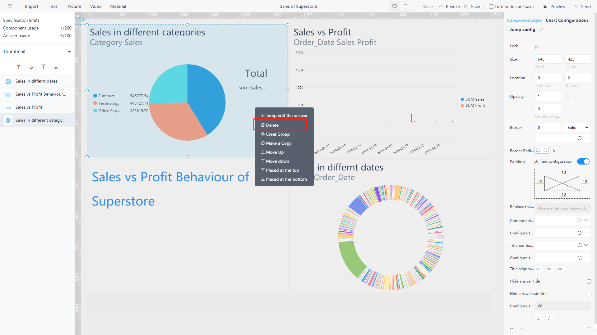
5.3.7 Remove Components
Right-click the corresponding component to pop up the delete option, as shown in figure 5-3-21. The answer still exists in the answer module, so the deletion here only makes it no longer displayed in the dashboard.
5.3.8 Group Components
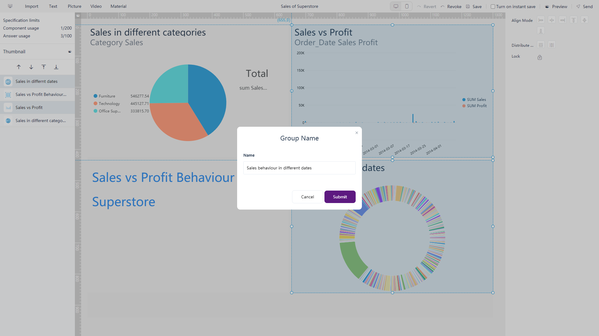
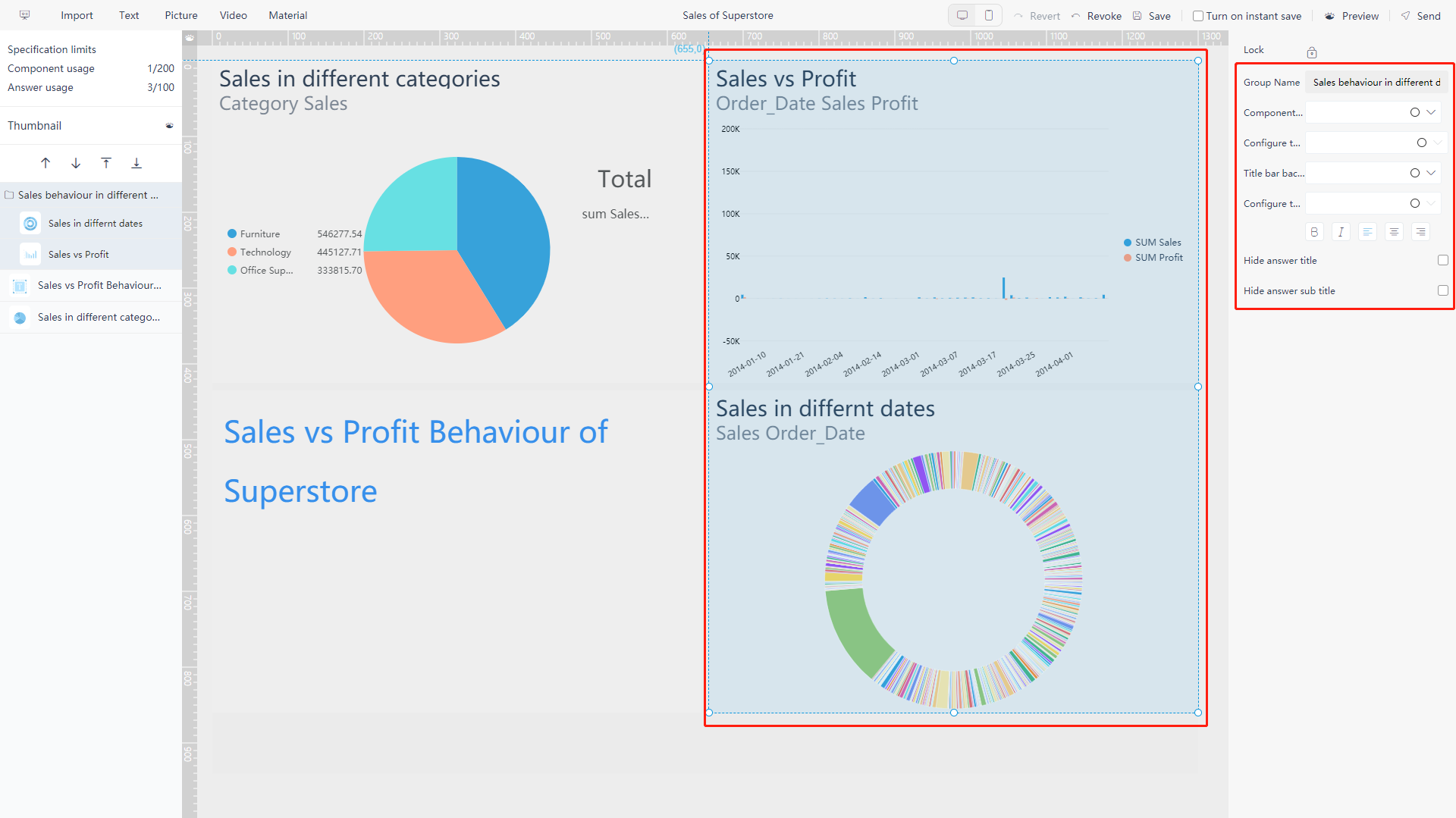
On the editing page, under free layout mode, you can select multiple components (hold “Ctrl” and click Or drag from the blank space, select the components and drop), then right-click and select “Create Group” in the menu, as shown in figure 5-2-22.
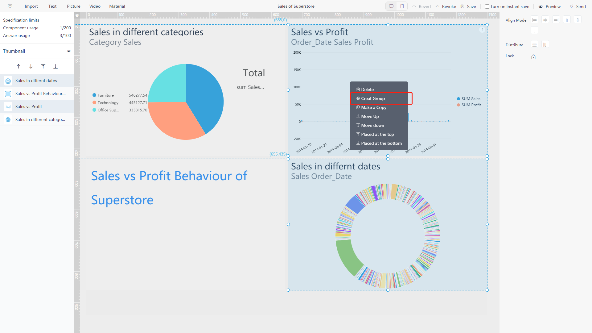
You can combine these components into a custom group, set the position, size, and format together. Afterwards, you need to name the custom group, as shown in figure 5-3-23. The result is shown in figure 5-2-24.
5.3.9 Global Format
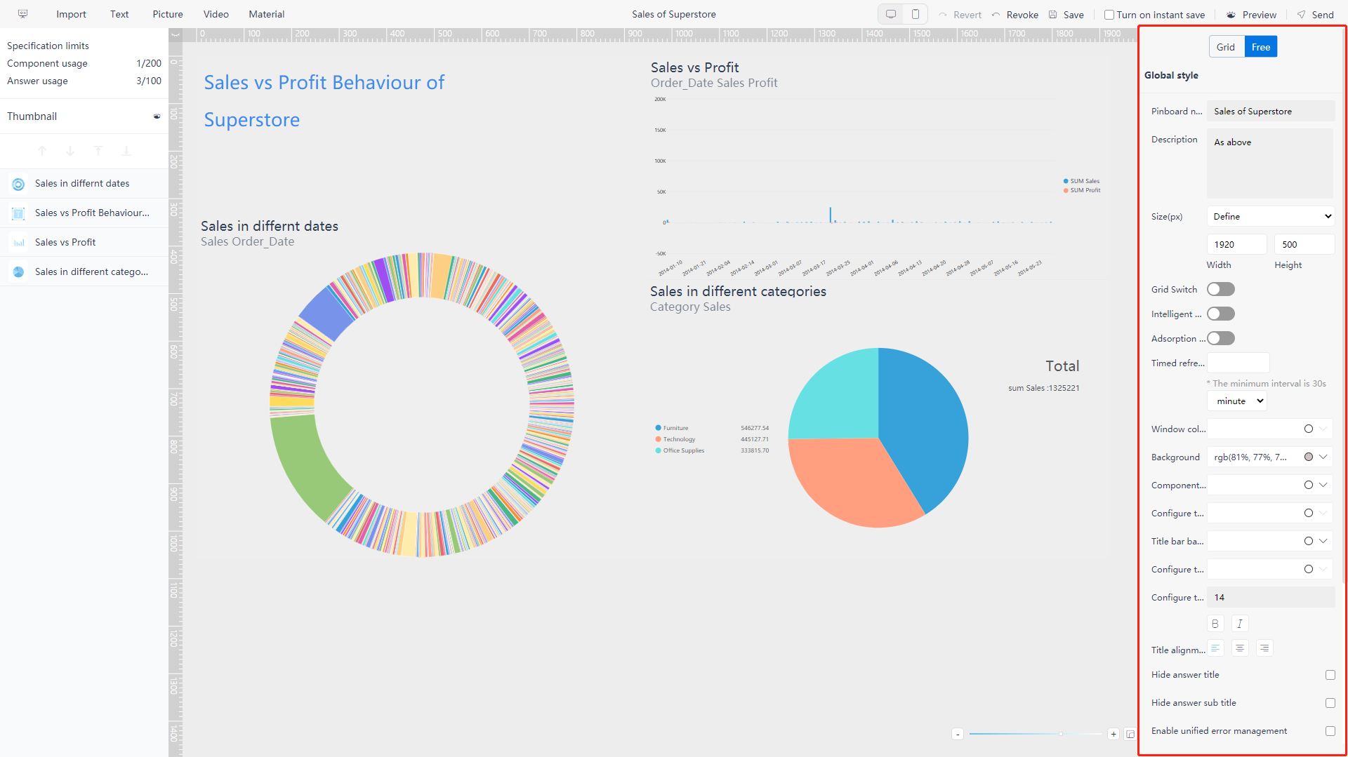
Enter the editing page (or click on the blank space of the dashboard) to display the global format configuration on the right. As shown in figure 5-3-25 below.
-
Dashboard Name
You can enter the name of the dashboard;
-
Description
You can enter the description;
-
Dashboard Size
You can select from the drag-down box or enter the width and height directly;
-
Grid Switch
Turn on the switch, the reference grid appears, and you can set the color and density of the grid;
-
Intelligent Reference
Turn on the switch, when dragging component A, guide lines will appear on the edges of other components that are close to A;
-
Adsorption Effect
Turn on the switch, the intelligent reference function will be enabled by default. When the dragged component A is close to component B, A will attach to B automatically;
-
Regular refresh
The time interval of the refresh can be set, then the dashboard will automatically and regularly refresh;
-
Windows Background
Configure the color of the viewing window, as shown in figure 5-3-26. On the viewing page, when the dashboard configuration size is inconsistent with the viewing window size, the blank space displays this color, as shown in figure 5-3-27;
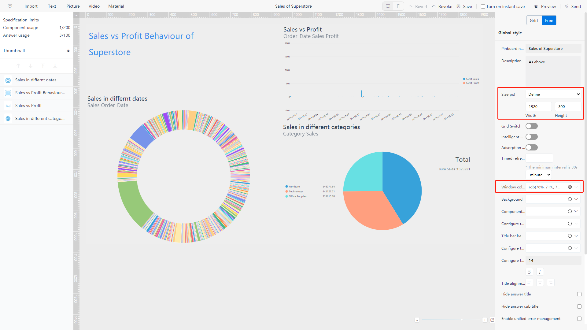
Figure 5-3-26 Global format - windows background 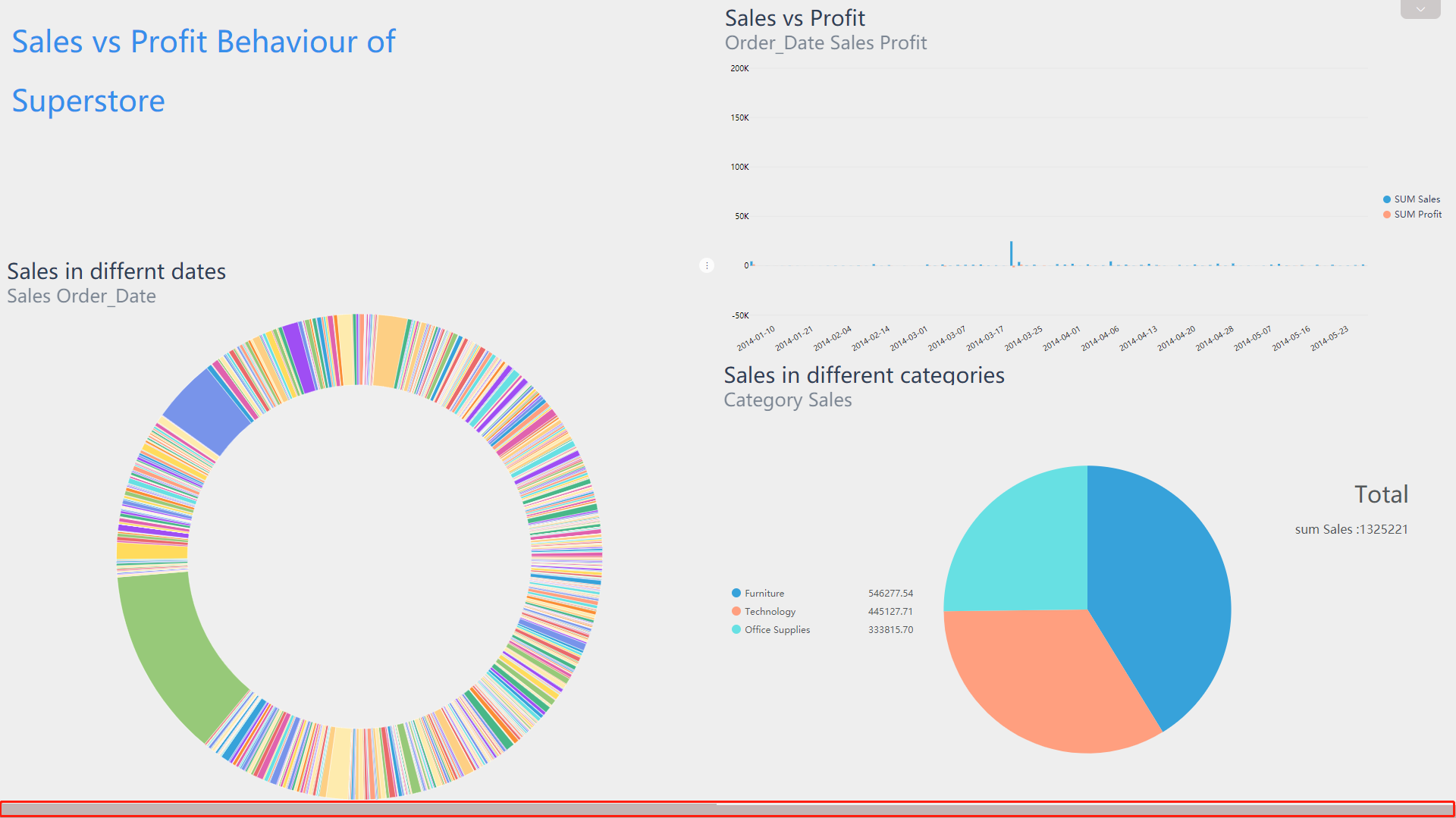
Figure 5-3-27 Global format - windows background result -
Dashboard Background
You can choose to set it as an image or customize the color, as shown in figure 5-3-28;
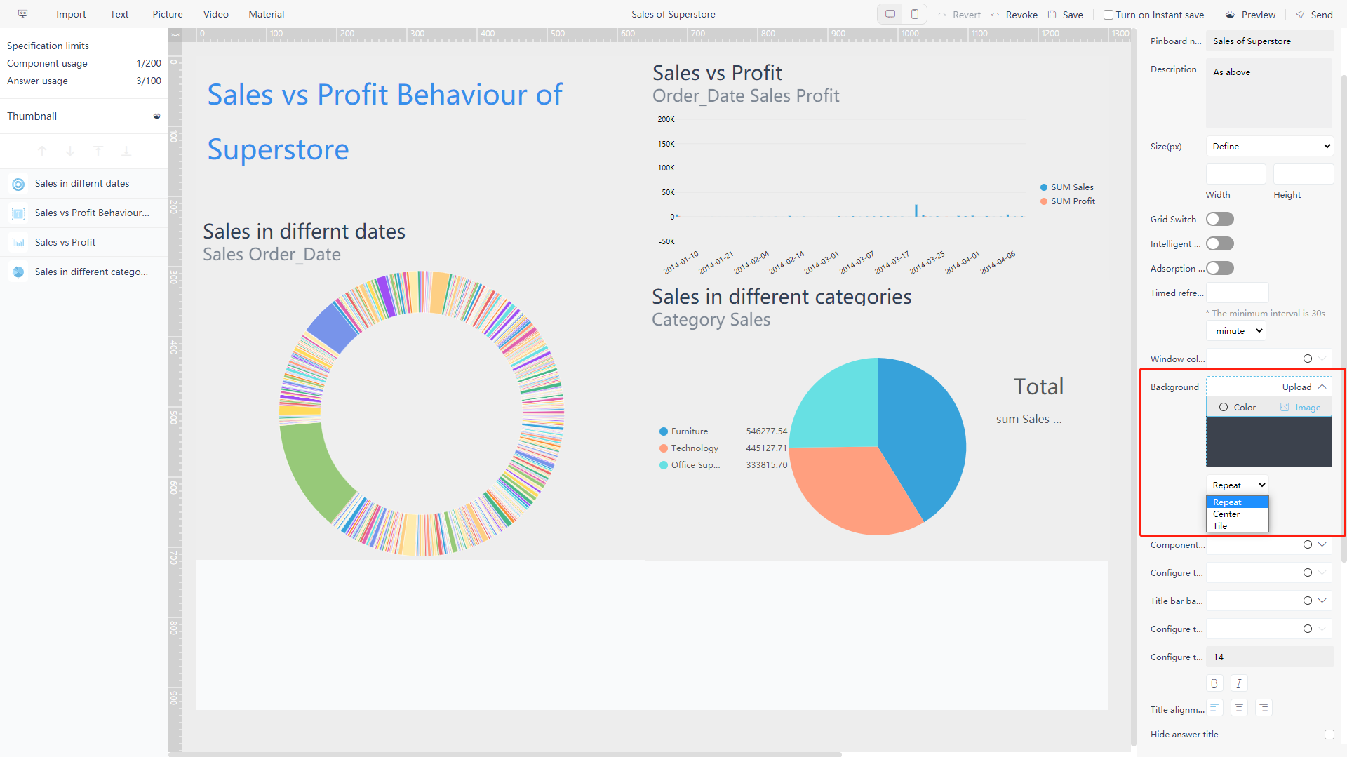
Figure 5-3-28 Global format - dashboard background ● Select an image: On the background color drag-down box, select “Image”, Then click the “upload” to upload the image. Select one of the three layout “Repeat/Tile/Center”, the background will change. If you want to remove the image, click the delete button in the image on the highlighted area;
● Select color: On the background color drag-down box, select “Color”, then select color on the pop-up box;
-
Component Background
Click the component background box to pop out the window and set the color;
-
Text Color of Component
Click the component text color box to pop out the window and set the color;
-
Title Background of Component
Click the component title background box to pop out the color selection window and set the color;
-
Text Color of Title
Click the title text box to pop out the color selection window and set the color;
-
Text Format of Title
button: bold, italic font;
-
Title Alignment
button: left-aligned, centered or right-aligned;
-
Hide Title of answer
Hide the title of the chart when checked;
-
Hide Subtitles of answer
Hide the subtitle of the chart when checked;
-
Unified Management Exception Log
After the box is checked, when the answer in the dashboard starts to report errors, the failure to obtain data for each answer or other abnormal logs will be displayed in a unified manner, and will no longer be distributed in each dashboard;
-
Pure Mode
After the box is checked, on the viewing page, the operation buttons on the dashboard and operation buttons of each answer will be all hidden;
-
Thumbnails
To obtain the cover image on the dashboard module page, click “Generate Thumbnail” to directly obtain the thumbnail of the current dashboard as the cover image. Or you can Click the “Upload Thumbnail” to upload an image as the cover thumbnail. The cover does not change when the dashboard is modified until the next operation on one of the two buttons. If “Generate Thumbnail” or “Upload Thumbnail” is never operated, the cover thumbnail of the dashboard will be the gray default cove;
-
Dashboard/Component Template
A configured layout of component within a dashboard or a dashboard can be saved as a template for multiple use. Click the “Save as Template” button under “Global Format”, set the name, and save the configured dashboard layout as a dashboard template, as shown in figure 5-3-29.
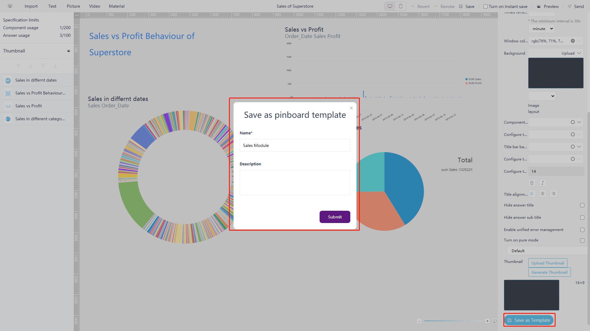
Figure 5-3-29 Global format - dashboard template The created template can be displayed in the dashboard template list on the dashboard management module. It can be set as “Public” or “Private” to choose to share the template with all DataFocus Cloud system users or not, as shown in figure 5-3-30.
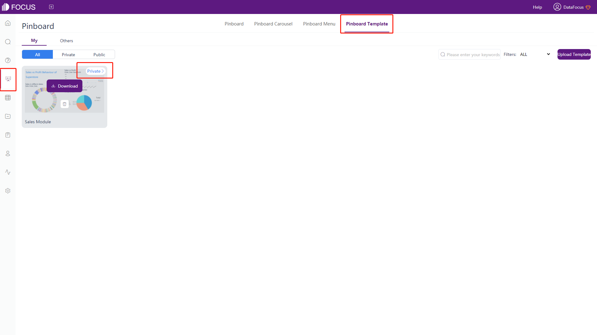
Figure 5-3-30 Global format - template list On the creation page, after selecting the desired dashboard template, click the “Create” button to create a new dashboard, as shown in figure 5-3-31.
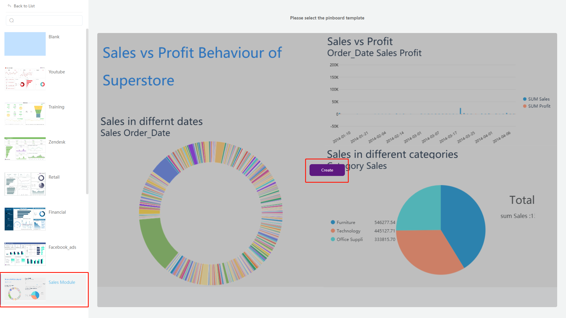
Figure 5-3-31 Global format - template selection
5.3.10 Graph Format
Format configuration of single component can override global format configuration. Click the corresponding component, and the configuration bar on the right changes to the “Component Style” page, as shown in figure 5-3-32.
-
Component Size
Set the size (width and height) of the current component;
-
Position
Set the horizontal and vertical coordinates;
-
Opacity and Rotation Angle
Set the opacity and rotation of the current component;
-
Border
Set the thickness, type, and color of the border line;
-
Rounded Corners
Set the rounded arc of the shape;
-
Padding
Configure the distance of the graphic from the border of the component. Four sides can be configured uniformly or separately;
-
Replace answer
Replace the answer by searching keyword;
-
Component Background
You can choose to set it as an image or customize the color, which is the same as the dashboard background setting;
● Select an image: On the background color drag-down box, select “Image”, Then click the “upload” to upload the image. Select one of the three layout “Repeat/Tile/Center”, the background will change. If you want to remove the image, click the delete button on the image;
● Select color: On the background color drag-down box, select “Color”, then select color on the pop-up box;
-
Text Color
Click the component text color box to pop out the window and set the color;
-
Title Background
Click the title background box to pop up the color selection window and select the color;
-
Text Color of Title
Click the title text box to pop out the color selection window and set the color;
-
Title Alignment
button: left-aligned, centered or right-aligned;
-
Hide Title of answer
Hide the title of the chart when checked;
-
Hide Subtitles of answer
ide the subtitle of the chart when checked;
-
Text Format of Title
You can set the size of the text and the button: bold, italic font;
-
No linkage
If checked, the component will no longer be displayed in linkage.
5.3.11 Material Components
Entering the dashboard editing page, you can add personalized material components to the dashboard, as shown in figure 5-3-15.
-
Background
Click the “Background” button, a pure background component will pop up. Click the component, as shown in figure 5-3-33, the format of the component can be modified on the right side of the page, including size, position, component background (color, image), and etc. Different custom backgrounds can be used for classification according to the analysis themes.
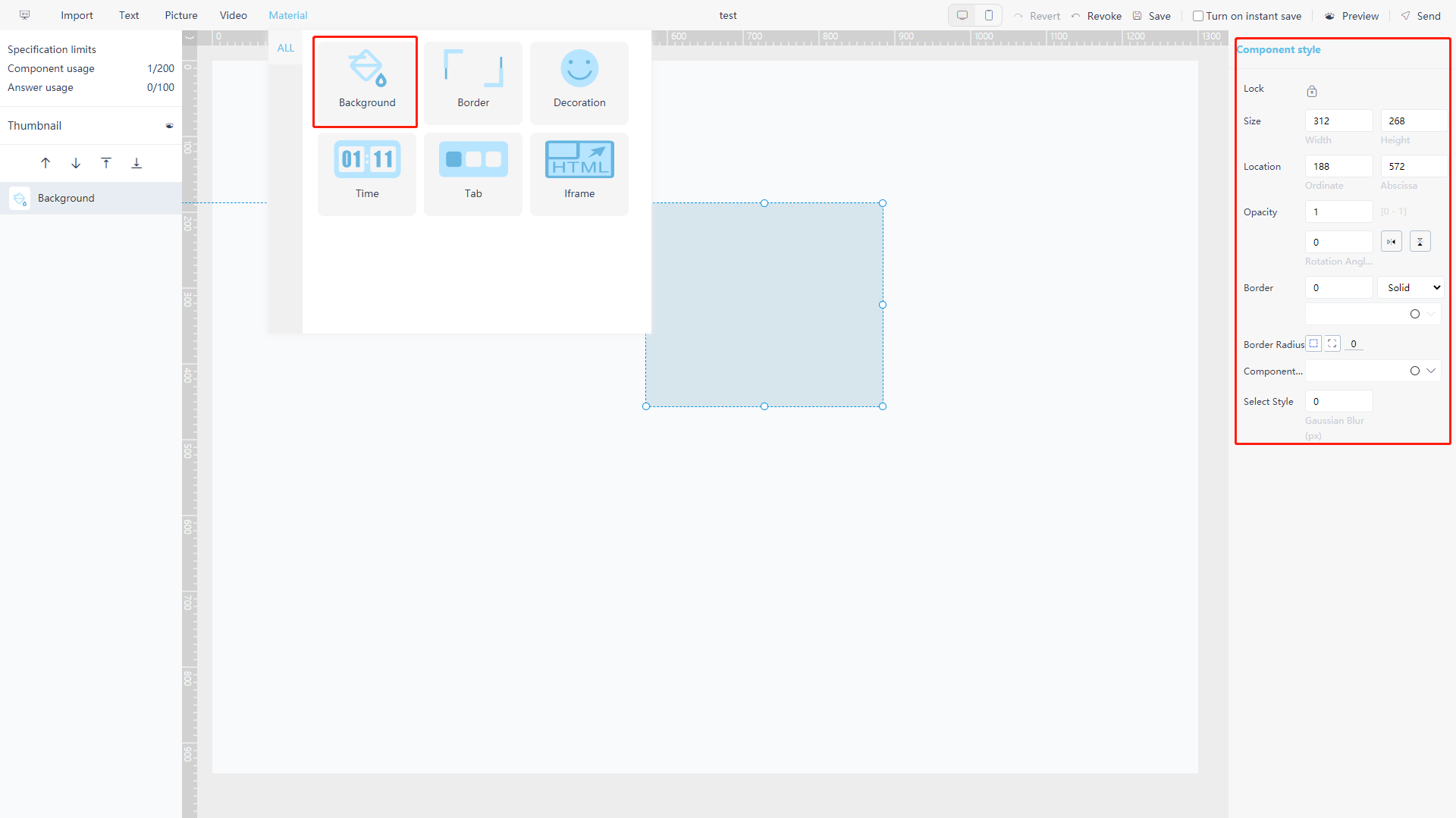
Figure 5-3-33 Material component - background -
Border
Click the “Border” button to pop up the border component. Click the component, as shown in figure 5-3-34, the format of the component can be modified on the right side of the page, including size, position, opacity, border, rotation angle, style, and etc.
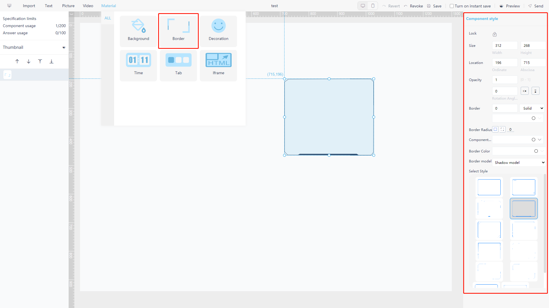
Figure 5-3-34 Material component - border -
Decoration
Click the “Decoration” button, a filled circular decoration will appear on the page by default. As shown in figure 5-3-35, click the component, and the format of the component can be modified on the right side of the page, including the shape, rotation angle, padding, rounded corners and color.
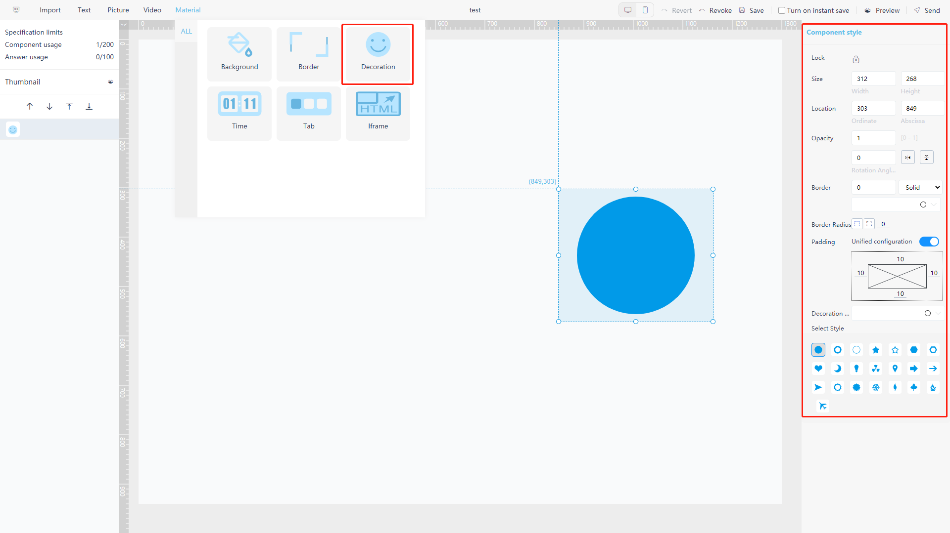
Figure 5-3-35 Material component - decoration -
Timer
Click the “Time” button, the pop-up component will display current time and date. as shown in figure 5-3-36, click the component, and the format of the component can be modified on the right side of the page, including the background, text font, text size, text color, rotation angle and rounded corners, and etc.
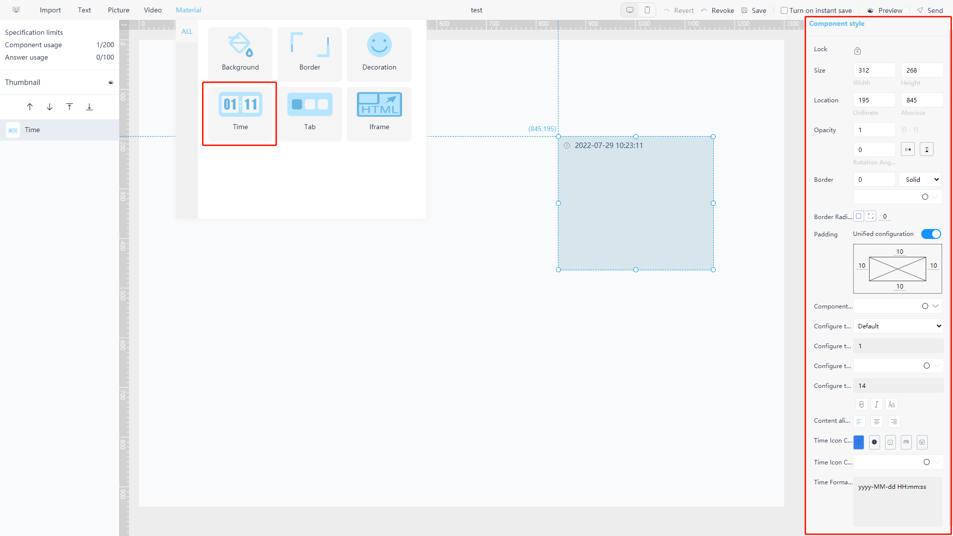
Figure 5-3-36 Material component - timer -
Tab
Tab control is a control used to organize component group. As shown in figure 5-3-37, click the “Tab” button to pop up the tab control, click the component, and you can set the format of the component on the right side of the page. See how to create component group on Section 5.3.8.
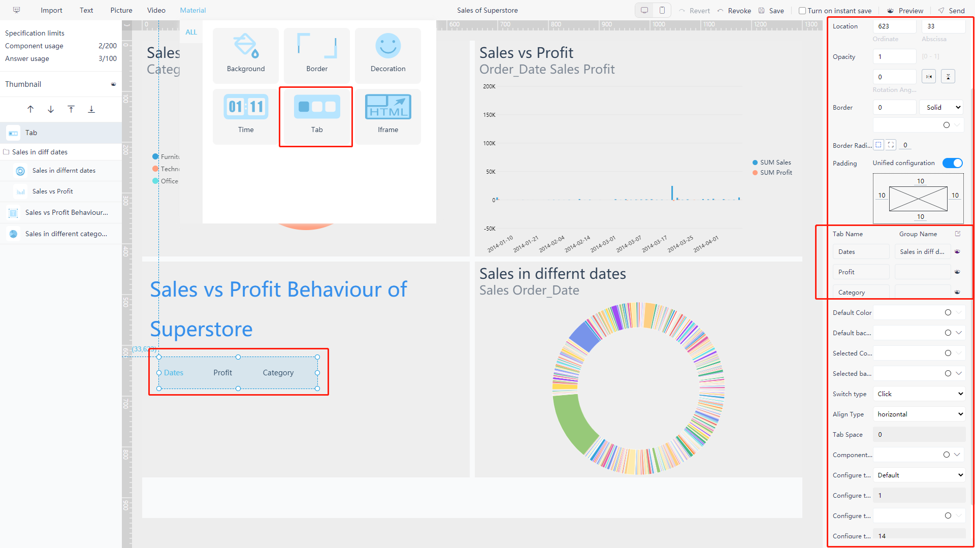
Figure 5-3-37 Material component - tab You can set the name of each button and the name of the component group to associate the tab button with corresponding component group.
Click on the “
” button on the right to display an individual component group. In addition, you can also set the default color, default background, color of button after it is selected, background of button after it is selected, switching mode, arrangement mode, button spacing, component background, component text, and etc.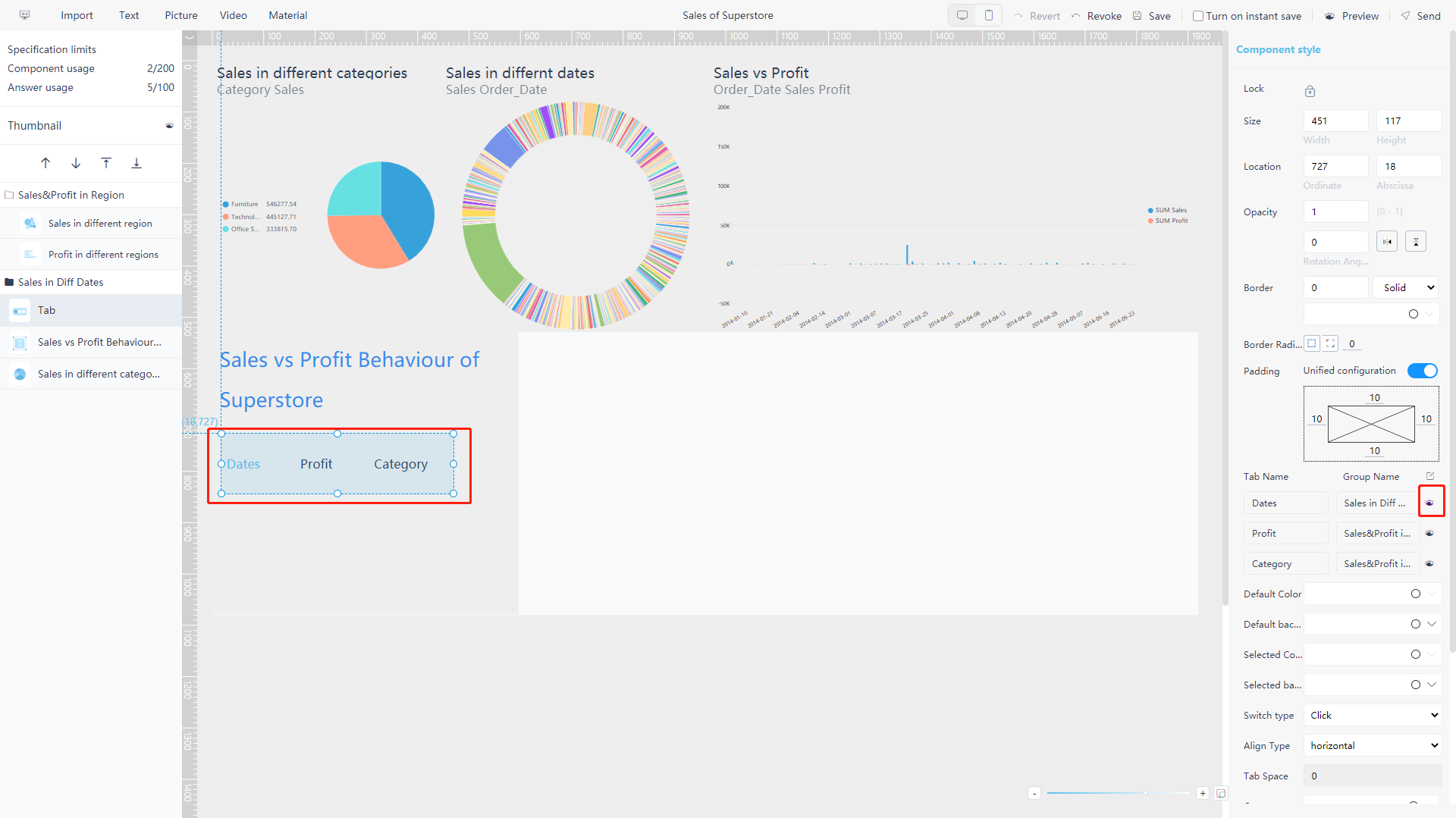
Figure 5-3-38 Material component - tab result -
Iframe
Iframe is a component that can be embedded with a website. For example, if you type in “https://www.datafocus.io/” in the link address, the website page will appear in the component, as shown figure 5-3-39.
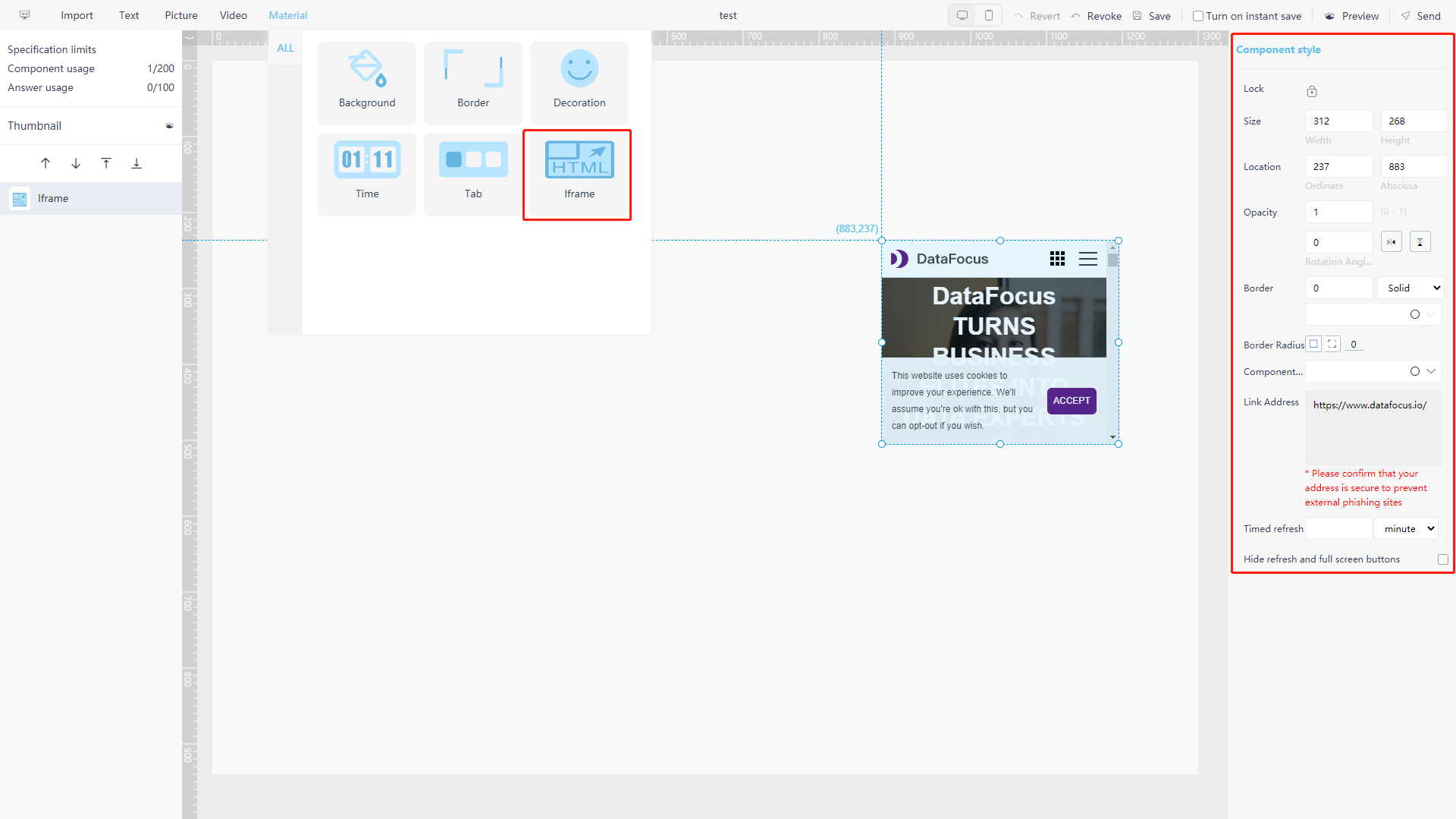
Figure 5-3-39 Material component - Iframe
5.3.12 Graph & Table Attributes
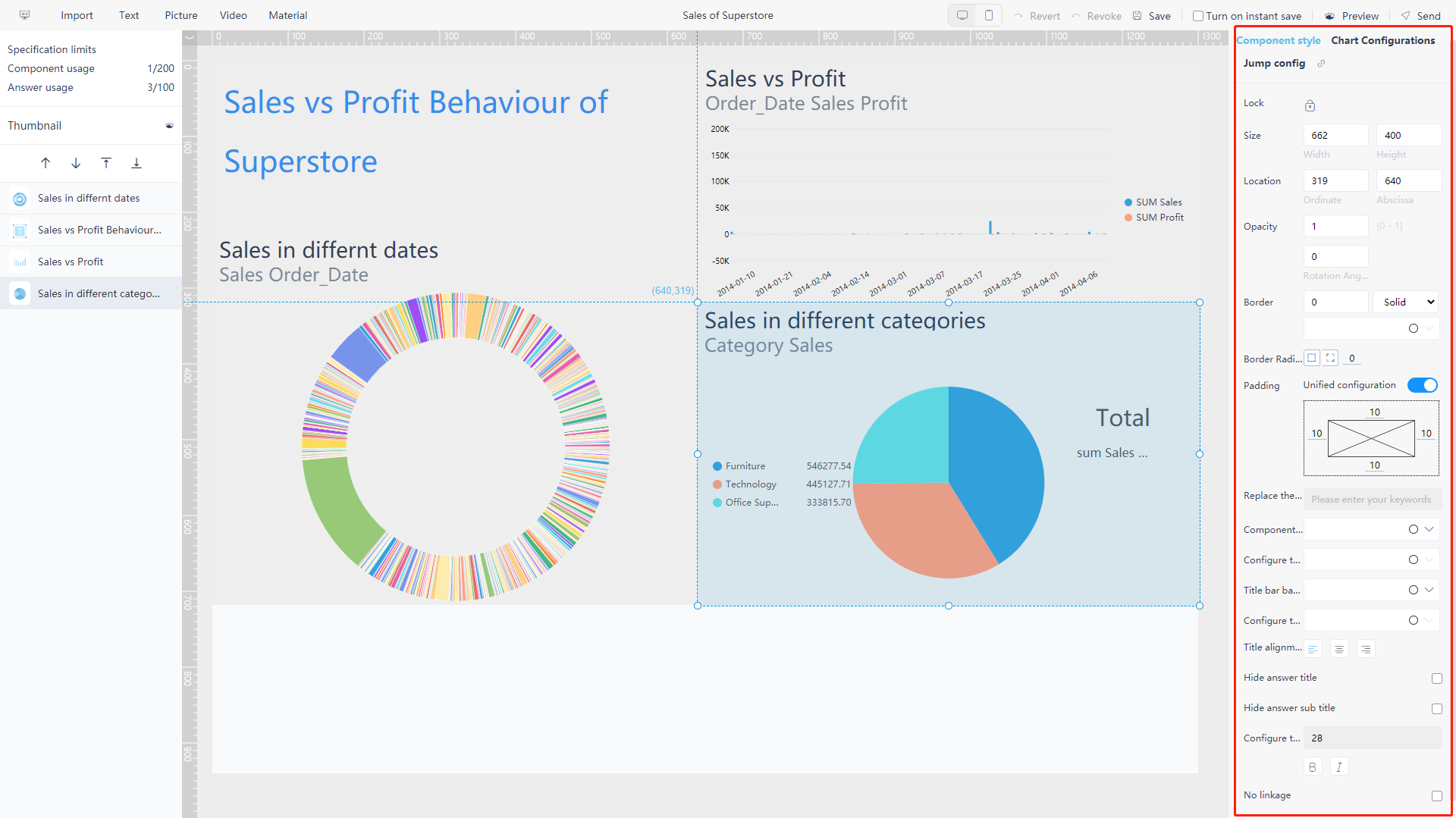
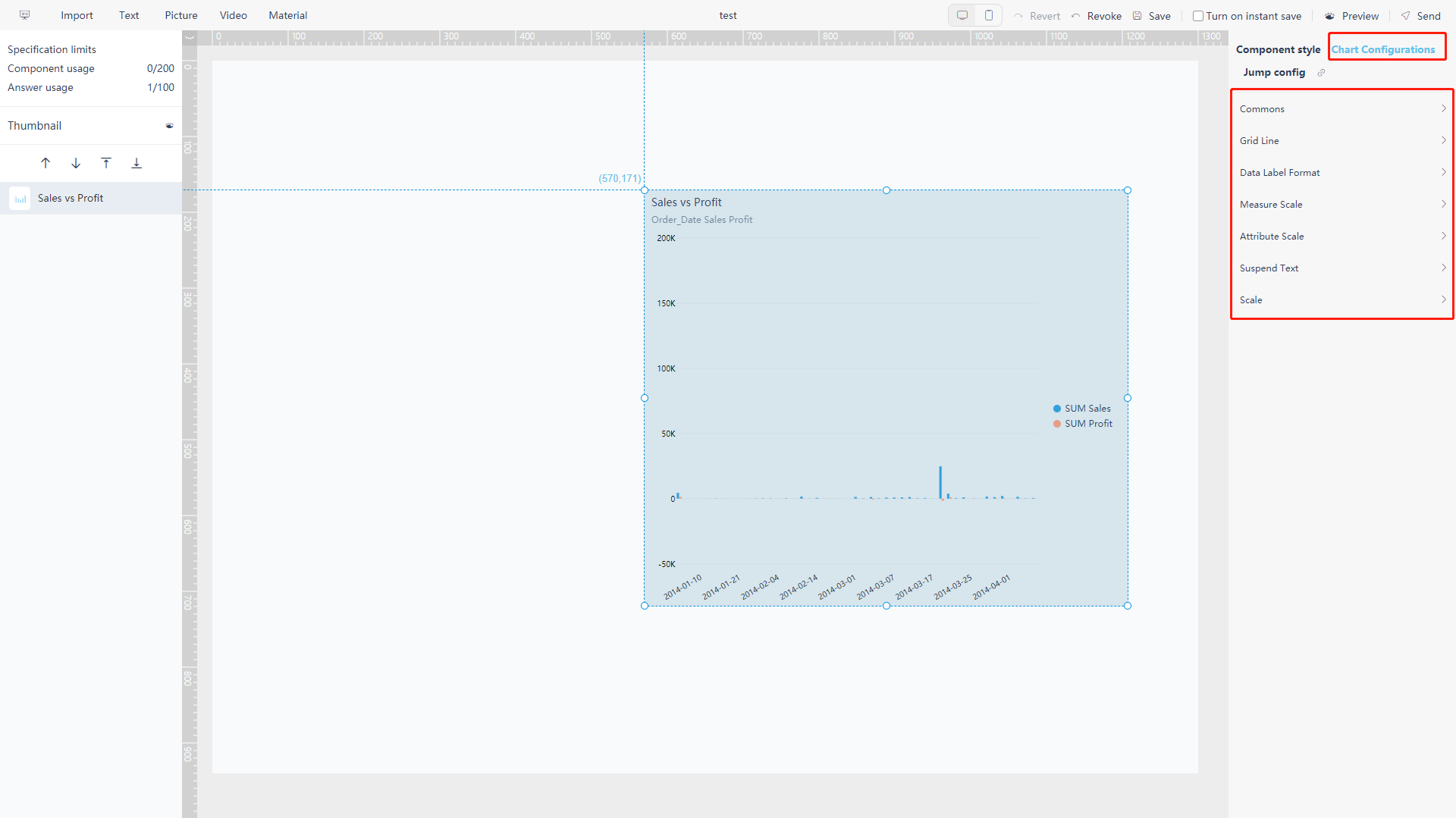
After clicking history answer, you can Click the “Chart Configurations” on the right to modify the chart, as shown in figure 5-3-40. For details, see Section 3.4.4 and Section 3.4.5, which will not be repeated here.
Note: When modifying chart properties on the editing page, the modified property settings will only be applied in the dashboard but not the answer.
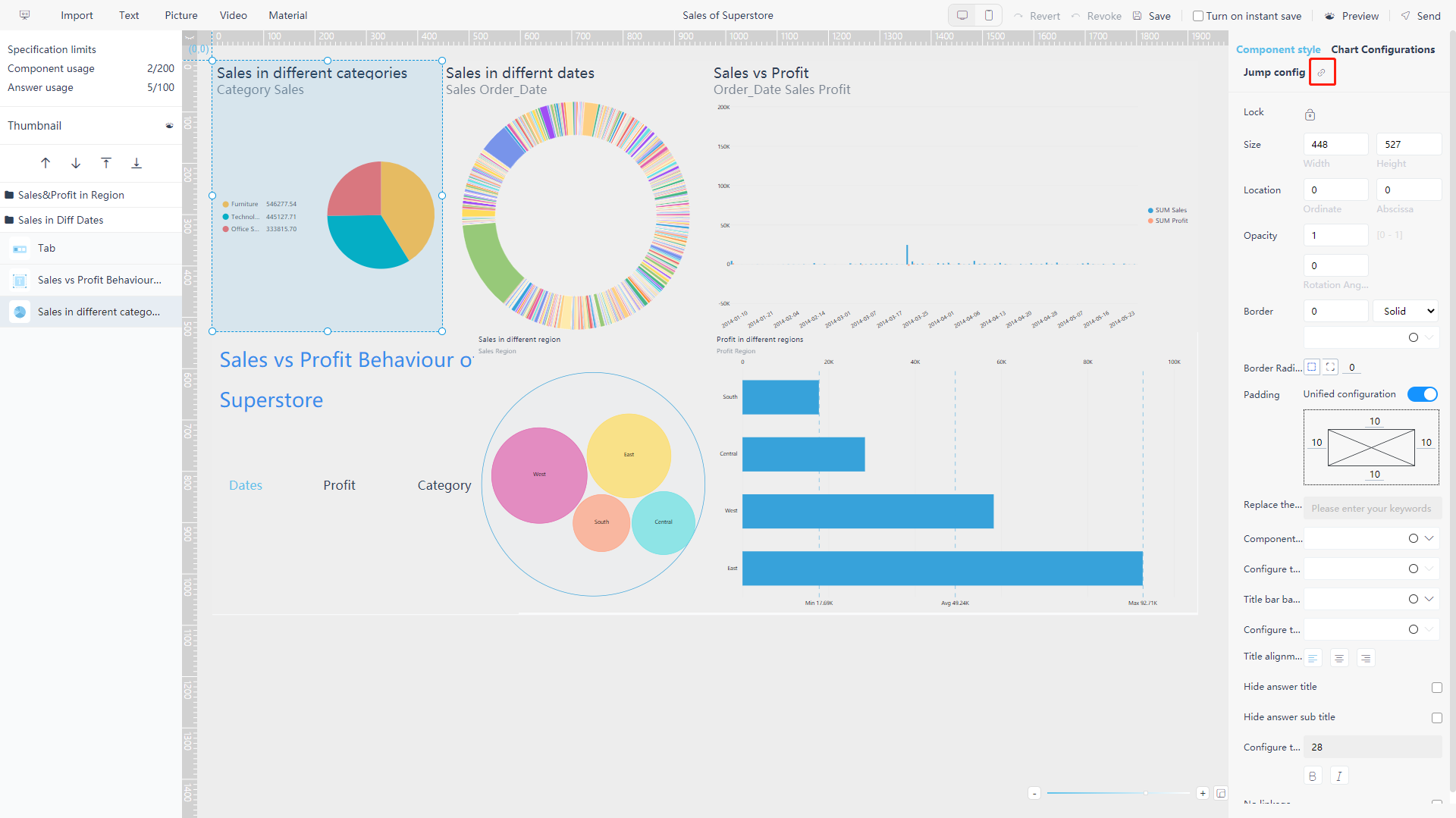
5.3.13 Jump Configuration
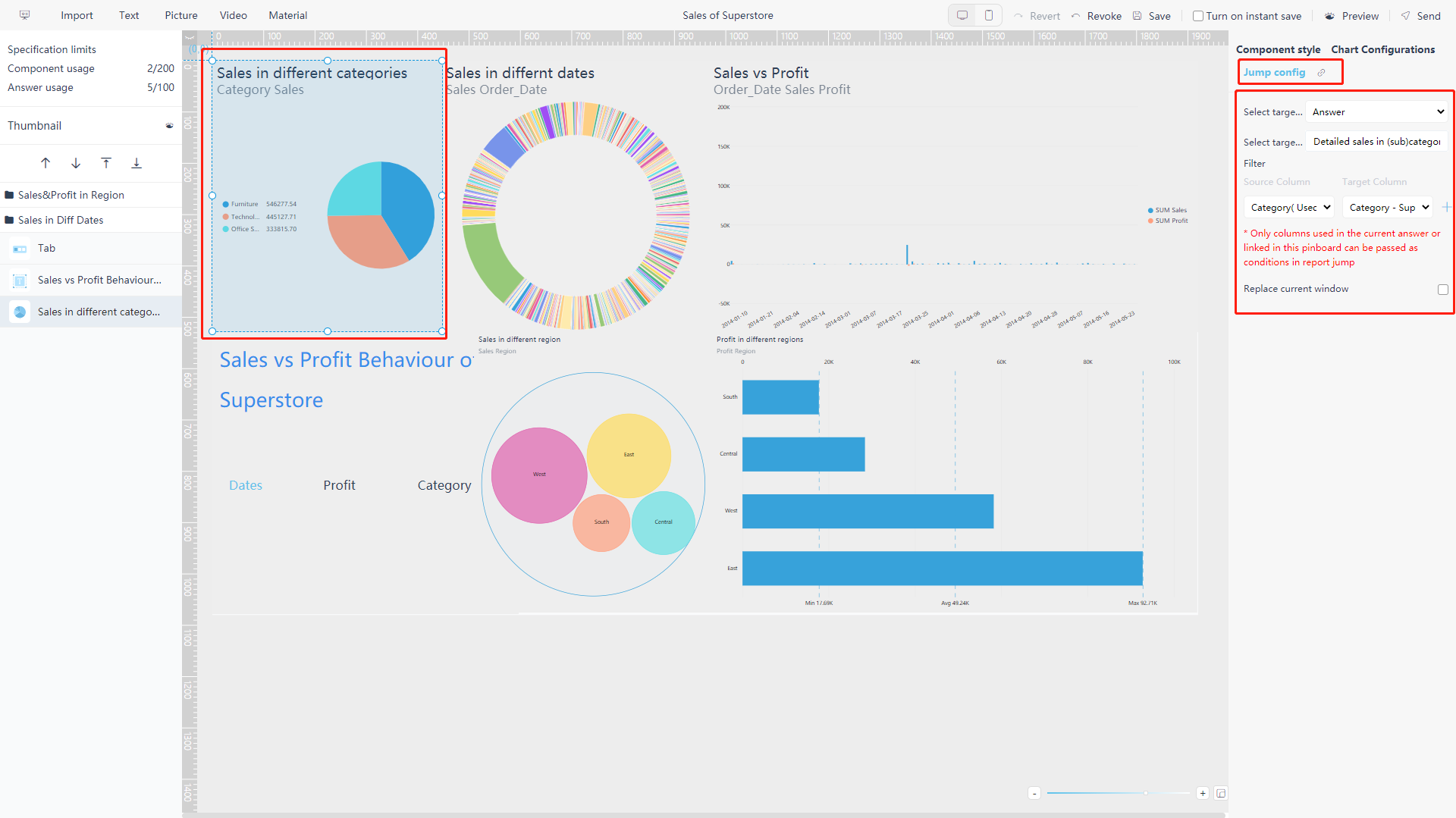
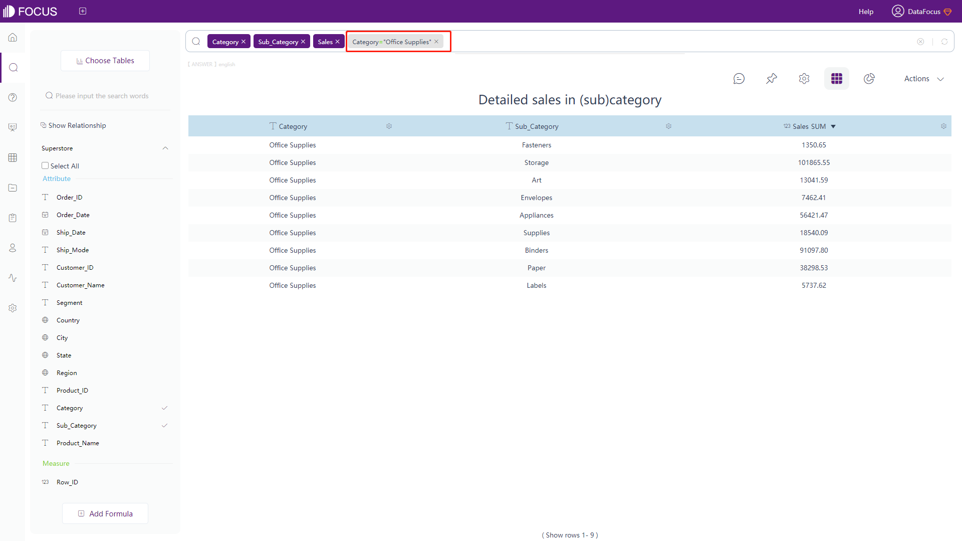
On the editing page, you can configure jumping for each answer, including jumping to answer, dashboard or external position. When setting the filter, if you use the column that has been used in the current answer or the linked column in the dashboard, you can pass it as a condition in the jump. The operation and results of the three jump targets are basically the same. The following is an example of jumping to the answer.
On the editing page, select the answer you want to set, as shown in figure 5-3-41, choose “Jump Config” on the right side of the page. Select the target type as “Answer”, and select the target answer “Detailed sales in (sub)category”. Set the source column of the filter as “Category”, and the target column as “Category”. Then click the “+” button next to it, and save the board to complete the jump setting.
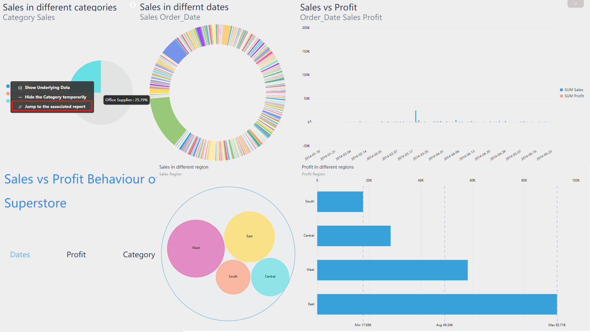
To use the jump, on the viewing page, right-click the specific answer in the dashboard, and the “Jump to the associated report” button will be displayed. Click the button, it will jump to the setting history answer in the form of a new page. The filter conditions are set here, so you can right-click the “Jump to the associated report” button on the data of a certain category (as shown in figure 5-3-42), and the data in the newly opened page will be displayed with this category as the filter condition (as shown in figure 5-3-43).
5.3.14 Jump to answer
Select a answer, as shown in figure 5-3-44, there is a “ ” button to the right of “Jump Config” on the right side of the page. Click the button and jump to the answer editing page.
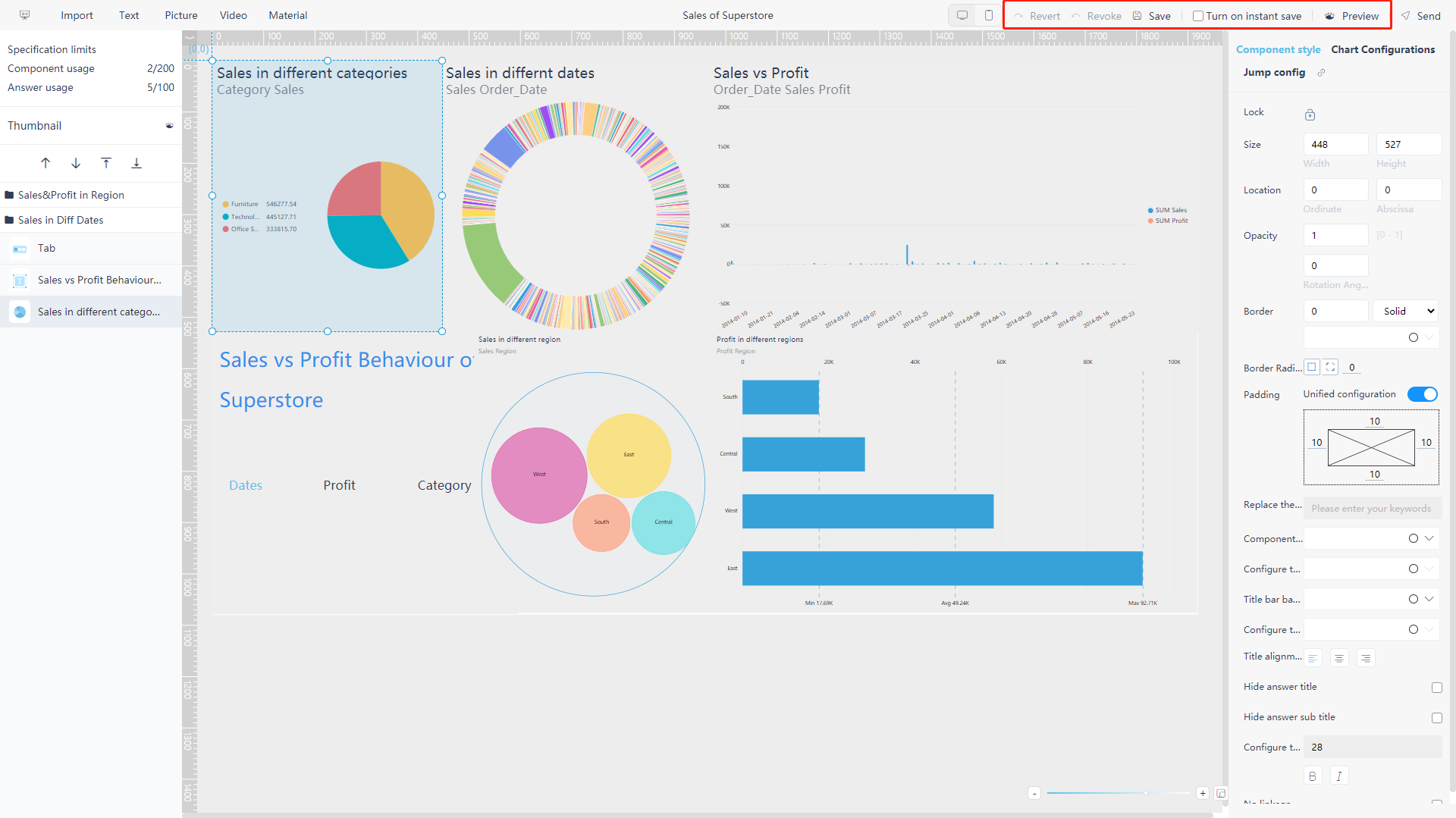
5.3.15 Save & Preview & Revert
During the process of making a dashboard, you can click “Save” in the upper right corner to keep the results. Or you can turn on instant save, and the system will automatically save the dashboard for you.
If there are mistakes in the production process, you can use the “Revert” and “Revoke” buttons to return to the correct step (the deleted one cannot be restored). If you want to preview the production effect, you can click “Preview” on the upper right to view the data dashboard interface.
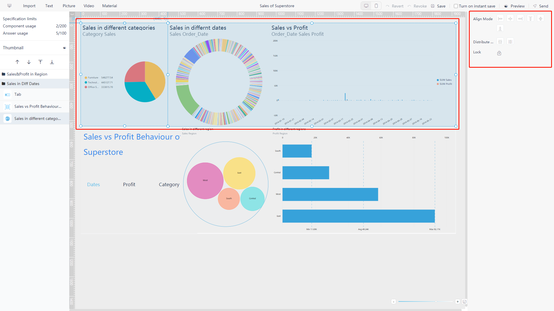
5.3.16 Alignment
When you need to adjust the arrangement of the charts, you can hold down the “CTRL” key to select multiple charts. There are 6 Alignment: “Align Left”, “Center Vertically”, “Align Right”, “Align Top”, “Center Horizontally”, and “Align Bottom”, and 2 distribution methods: “Horizontal Centered Distribution” and “Vertical Centered Distribution”. Which can make the charts neatly arranged and beautiful. In order to prevent the chart from destroying the original layout by moving again, you can click the lock button to fix the chart. As shown in figure 5-3-46 below.
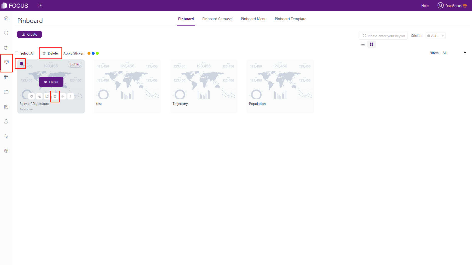
5.4 Delete Dashboard
On the dashboard module, move the mouse to the corresponding dashboard, and click the “ ” button that appears to delete the dashboard; or tick the white box in front of the name of the dashboard you want to delete, and then click the “Delete” button to delete in batches, and a pop-up window to confirm the operation before deleting to avoid misoperation. As shown in figure 5-4-1 below.
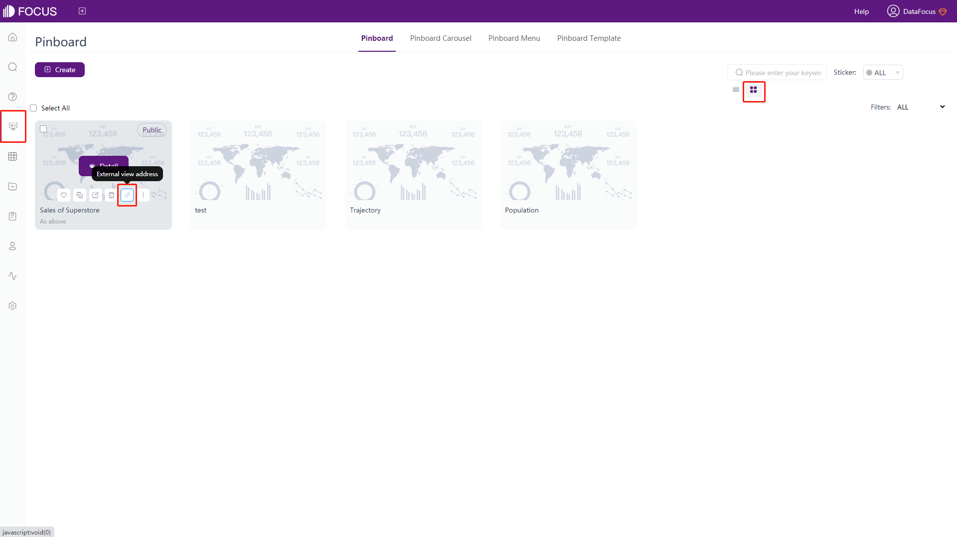
5.5 External viewing address
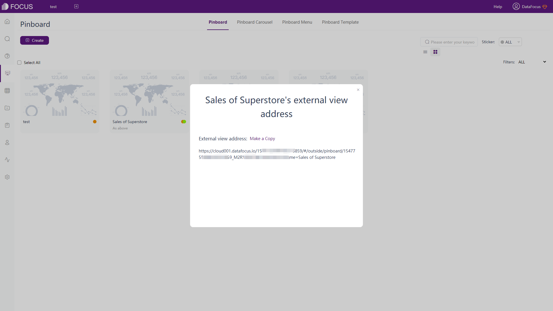
Under the thumbnail mode of the dashboard module, move the mouse to the corresponding dashboard, and click “” to generate an external viewing link address, as shown in figure 5-5-1 and 5-5-2.
5.5.1 PC
Click “Make a Copy” to copy the address to the PC web page to view the board.
5.5.2 Mobile - Auto Adaption
Directly copy the address to the mobile web page, and the board will be automatically adjusted to the appropriate size for viewing.
5.5.3 Mobile - Special Adaption
The mobile terminal adaptation version of the dashboard requires additional settings when making a large screen:
-
First create a dashboard in DataFocus Cloud, choose the size in the global style on the right side, and select the appropriate mobile phone model or size, as shown in figure 5-5-3;
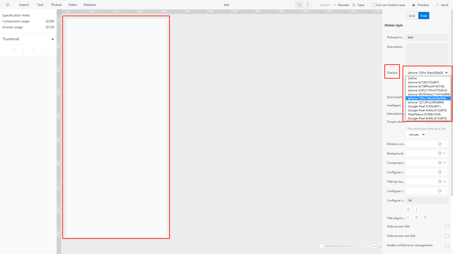
Figure 5-5-3 Create dashboard of mobile size -
Design the current dashboard under the chosen size, and click the “Save” when finished;
-
As shown in figure 5-5-1, click the external view address button;
-
Click to copy the external viewing address, and add the suffix “&forcePc=true” at the end;
-
Enter the full link in the browser to view the adapted version of the dashboard:
“https://cloud001.datafocus.io/154…859/#/outside/dashboard/154…859_M2RV4…bz?name=Sales of Superstore&forcePc=true”
5.6 Tags of Dashboard
5.6.1 Apply & Remove Tags
-
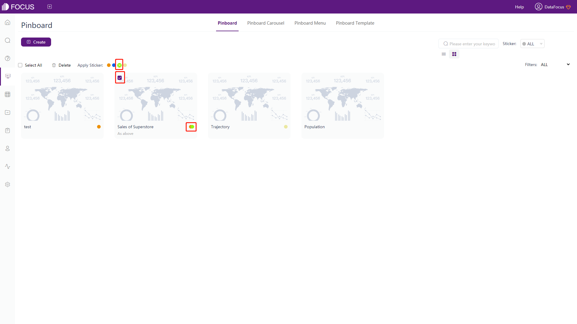
Select the board to be labeled, and tick the white box in front of its name to add the tags in batches;
-
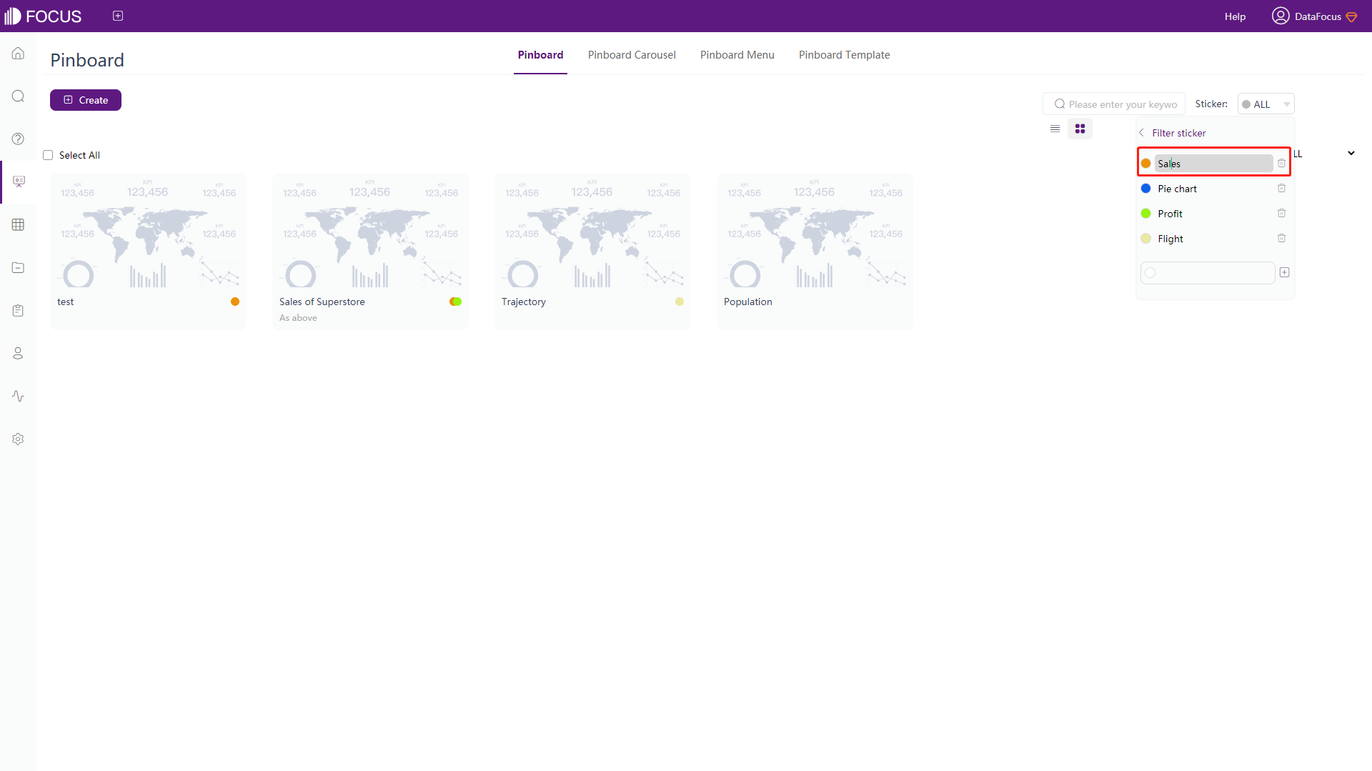
Select the appropriate tag according to the content as shown in figure 5-6-1;
-
Click the tag next to the “Apply Sticker” to add a tag;
-
Click the “x” on the tag can remove the label;
-
The added tag will appear on the bottom right corner of the board.
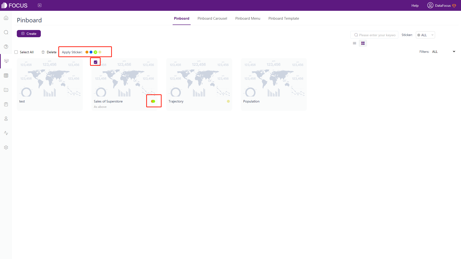
Figure 5-6-1 Apply & Remove tags
5.6.2 Select Tags
The interface when no tag is selected initially, as shown in figure 5-6-2.
-
Click the “Label” button at the top right of the dashboard list;
-
Select the tag, and view all the dashboards under the same tag, as shown in figure 5-6-3;
-
Choose “All” at the top of the tag list to cancel viewing the specific tag.
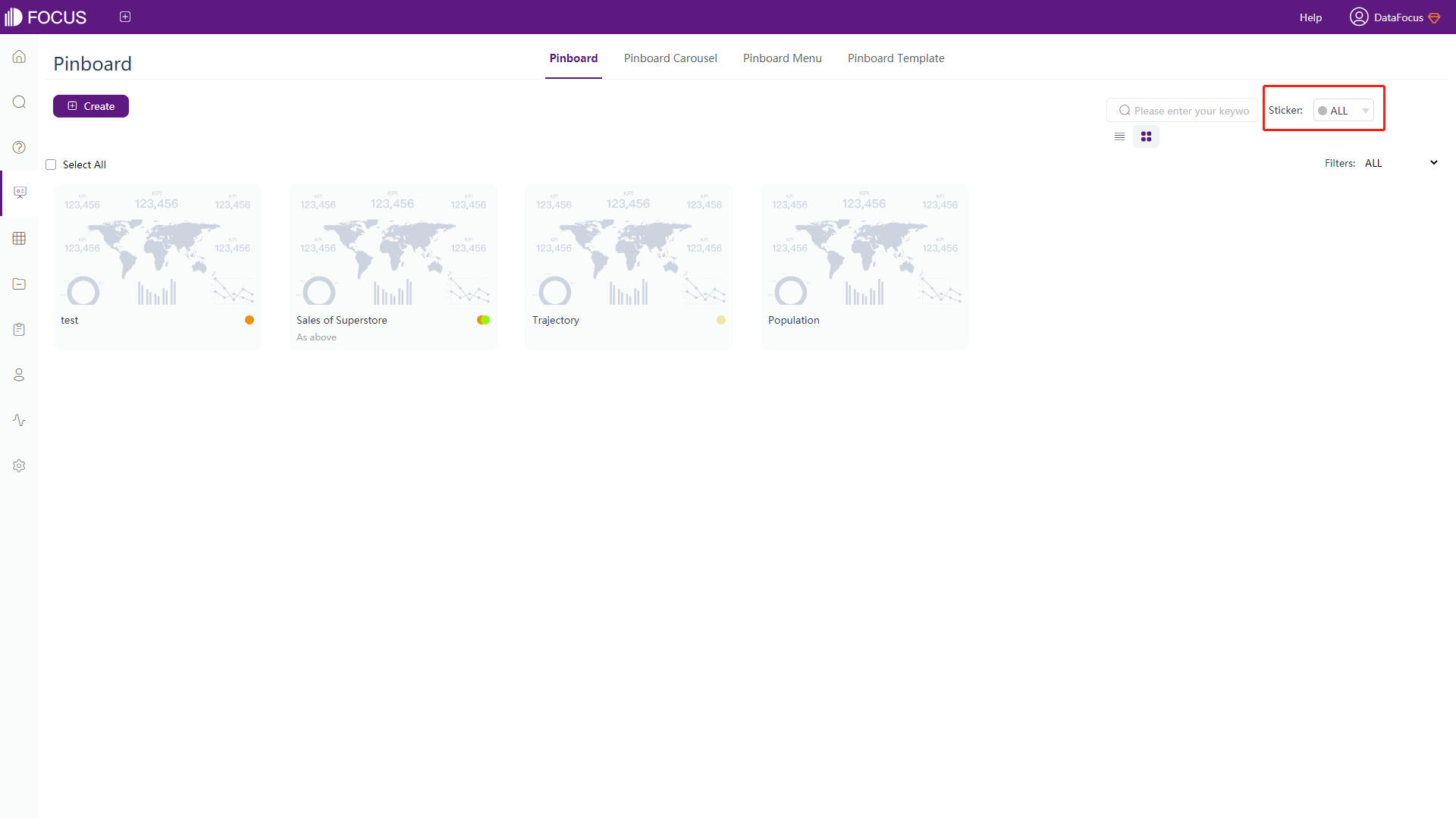
Figure 5-6-2 None tag selection 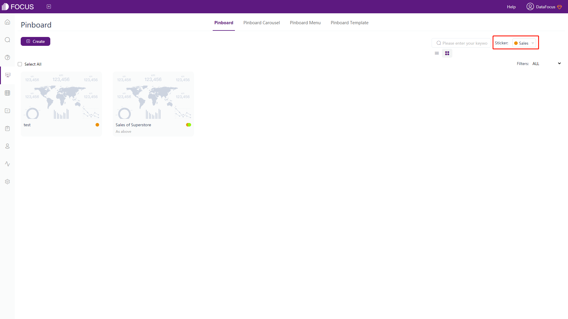
Figure 5-6-3 Tag selection
5.6.3 Add Tags
If the user with data management permission clicks the “Apply Label” button, you can see the “Add/Edit Sticker” option at the bottom of the displayed list, as shown in figure 5-6-4. The operation is the same as adding tags on answer. For details, see Section 4.8.1.
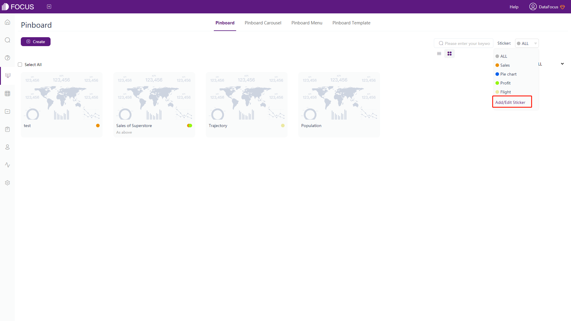
5.6.4 Edit Tags
Click “Add/Edit Sticker” as shown on figure 5-6-4. Then click the existing tag to modify or delete the color and name of it, as shown in figure 5-6-5.
5.6.5 Remove Tags
Click the “x” on the tag to remove the tag, as shown in figure 5-6-6 below.
5.7 Pin & Set Levels of Dashboard
At the top of the system page, you can see the edit “ ” button. Clicking this button can configure the outline display of the dashboard and whether to pin it.
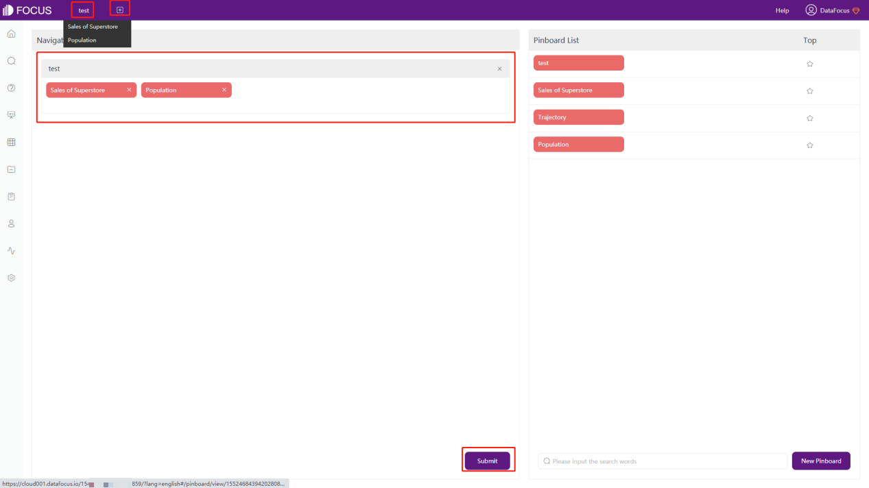
5.7.1 Set Levels of Dashboard
Configure the hierarchical quick display of the dashboard. If the dashboard is set to be displayed quickly, then no matter which page you are on, you can click the name of the dashboard that has been set at the top of the page. Then you can directly enter the detail page of the dashboard without going to the dashboard module first. The specific operations are as follows:
● When the display level of the dashboard is level-one:
Click the edit button “” at the top of the page, select and drag the dashboard to be set (the frequently viewed dashboard) to the left box, and click the “Submit” button at the bottom of the left box. You can see the name of the dashboard at the top. Click the name of the dashboard to directly enter the detail page.
● When the display level of dashboard is level-two:
Click the edit button “” at the top of the page, select the dashboard and drag it to the box on the left that has been set as level-one, and click the “Submit” button at the bottom to complete the setting. Hover the mouse over the name of the level-one dashboard at the top of the page, and you can see the name of the level-two dashboards set below the level-one dashboard pop out. Click on the name to directly enter the dashboard detail page. As shown in figure 5-7-1 below, multiple dashboards can be set under the same level of dashboard.
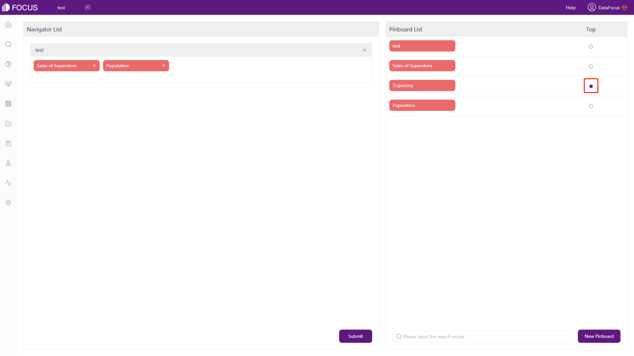
5.7.2 Pin Dashboard
Pinning dashboard is to make the dashboard as the system startup page, that is, the page will jump into the designated dashboard after logging in to the system.
Click the edit button “” at the top of the page, the interface shown in figure 5-7-2 will appear. Then light up the “ ” button on the right side of the dashboard.
5.8 Dashboard Carousel
Carousel dashboard is to play multiple dashboards in turn.
-
Click “dashboard Carousel” at the top of the dashboard module;
-
Click “New Carousel” at the top left;
-
Type in the “dashboard name” and “description”. Then select the dashboard you want to play in turn, and click “
” on the right. Set the carousel time, and finally click “Submit” to complete the carousel creation, as shown in figure 5-8-1.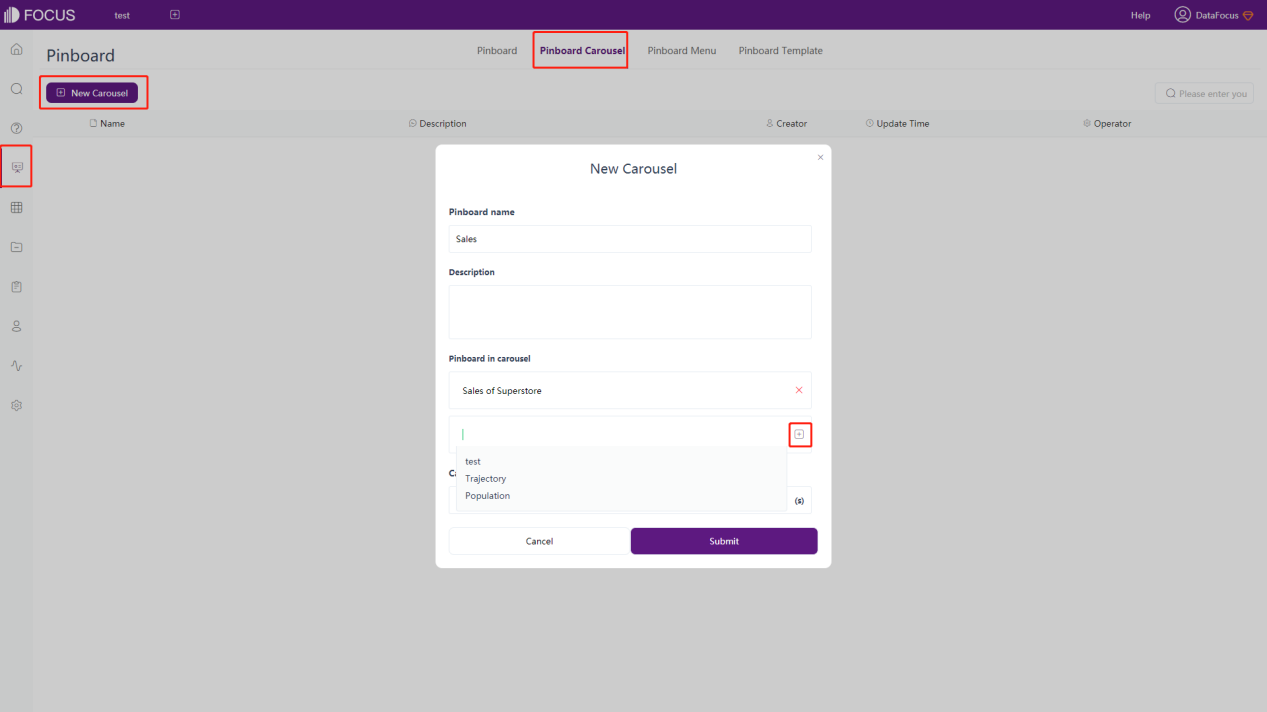
Figure 5-8-1 dashboard carousel After completing the establishment of the carousel, you can also view, edit, publish, share and delete the carousel, as shown in figure 5-8-2.
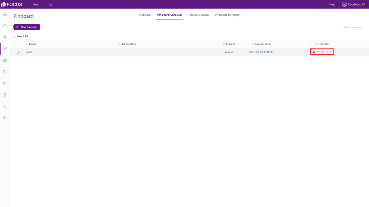
Figure 5-8-2 dashboard carousel operation
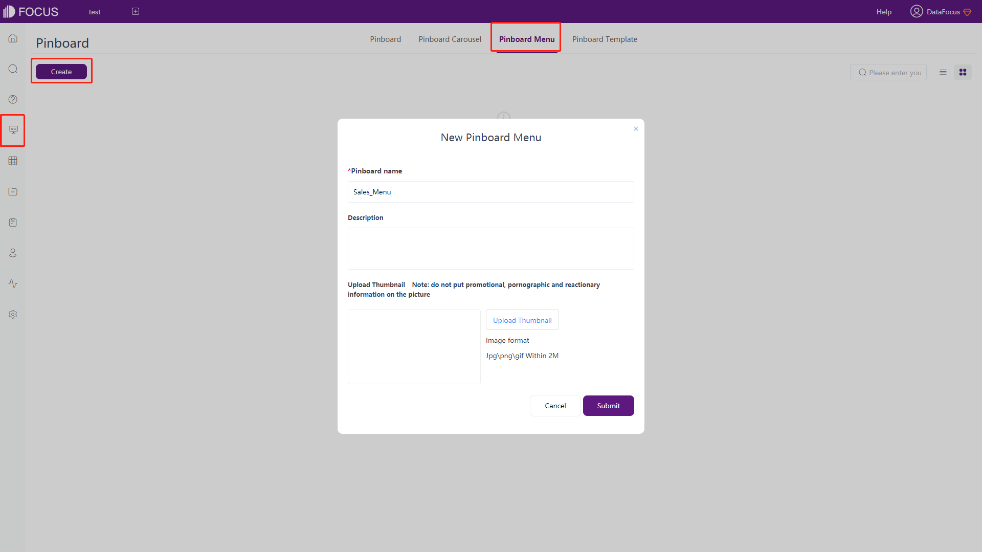
5.9 Dashboard Menu
dashboard menu organizes multiple dashboards into a list, where you can switch and view at will.
5.9.1 Create Dashboard Menu
Click the “Create” button to add a new menu. Edit the name of the menu, and etc.
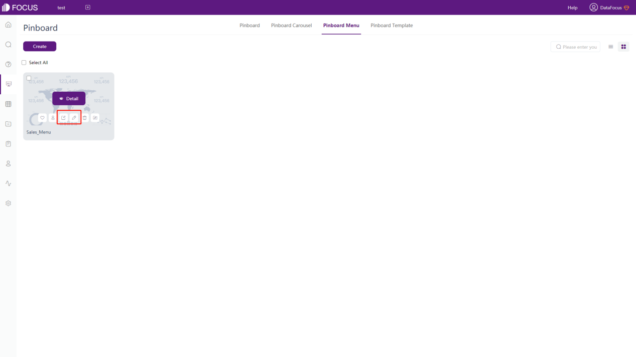
5.9.2 Edit Dashboard Menu
After the creation is successful, click the edit button to edit the menu.
5.9.3 Add Dashboard Menu
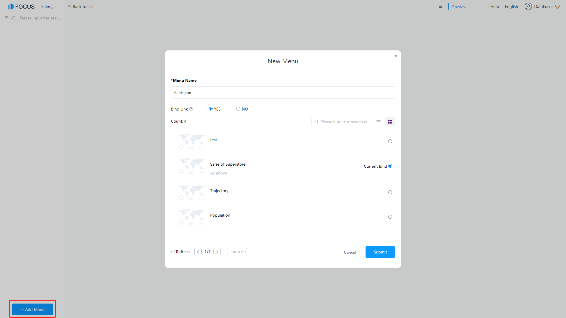
On the editing page of dashboard menu, click “Add Menu”. In the pop-up window, select the binding connection, a board to be added in the displayed list, and enter the menu name, as shown in figure 5-9-3.
5.9.4 View Dashboard Menu
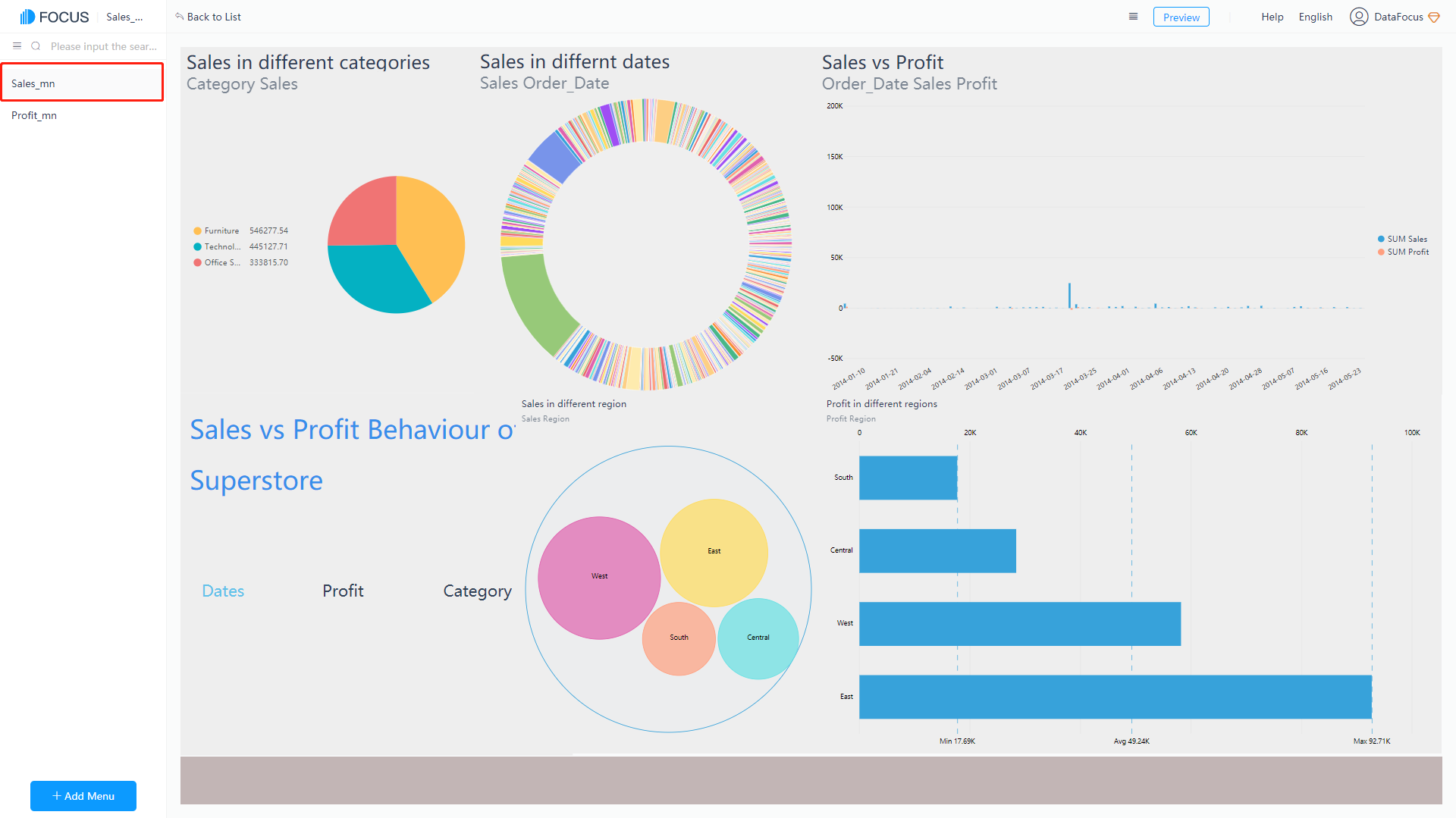
After the board is added successfully, on the left side of the page, a list of the set names of menu will be displayed. Click the name to view the corresponding board, as shown in figure 5-9-4.
5.9.5 Reorder Dashboard Menu
Select the menu name in the list on the left and drag it up and down to adjust the position. Drag the name onto other names to set the hierarchy display, as shown in figure 5-9-5.
5.10 Dashboard Template
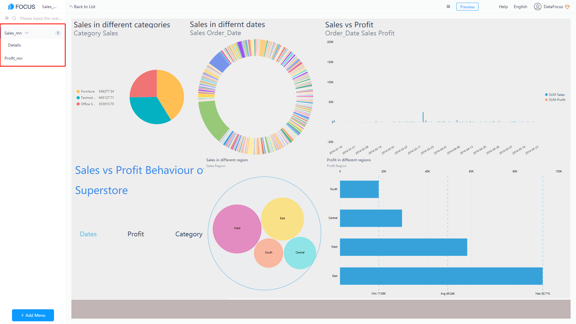
Dashboard template is the template of the dashboard, from which you only need to replace the answer component and change the text. In this way, you can make a beautiful dashboard simply and quickly, as shown in figure 5-10-1.
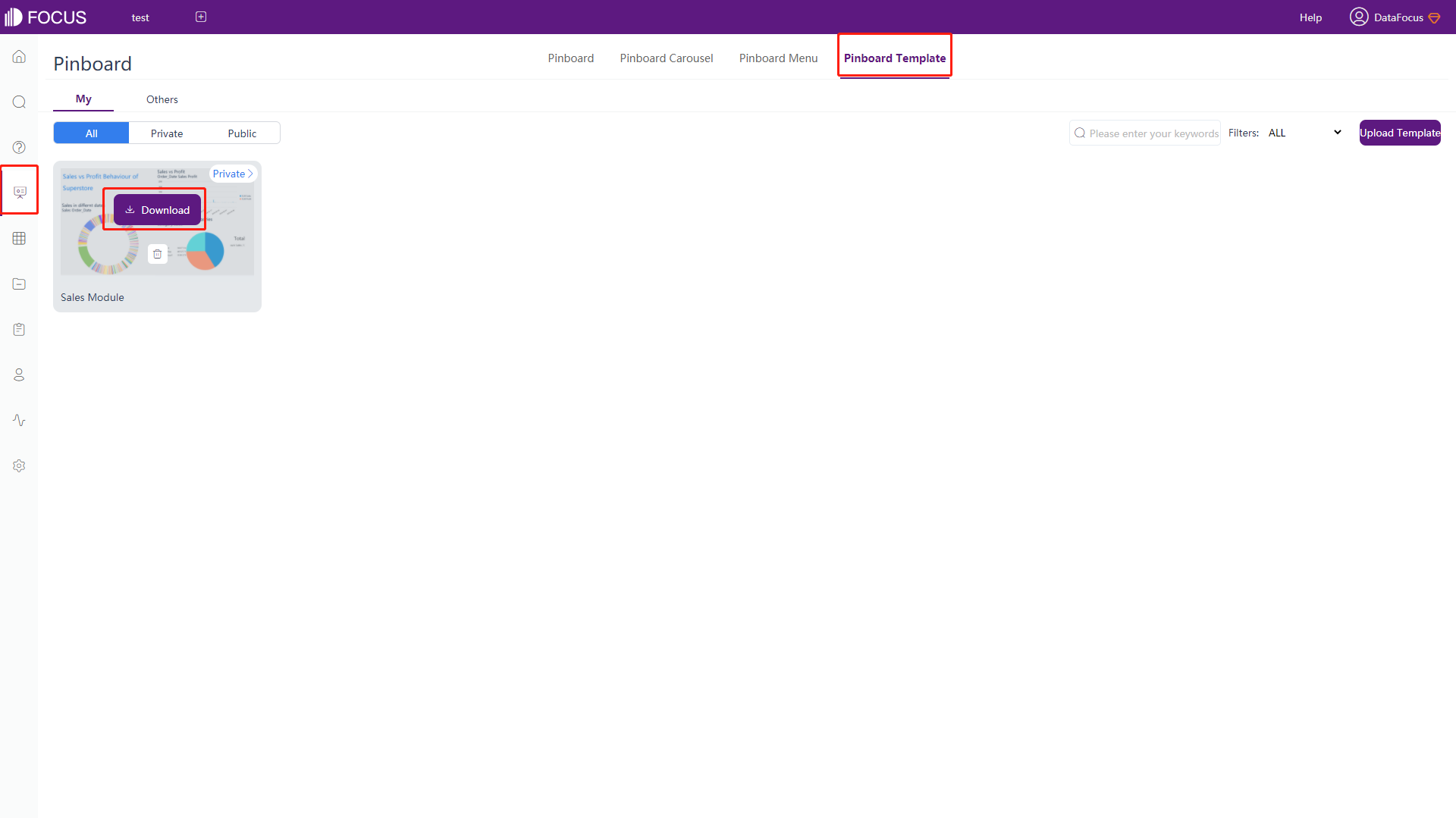
5.10.1 Download Dashboard Template
Click the “Download” button to download the template, as shown in figure 5-10-2. The saved file format is zip.
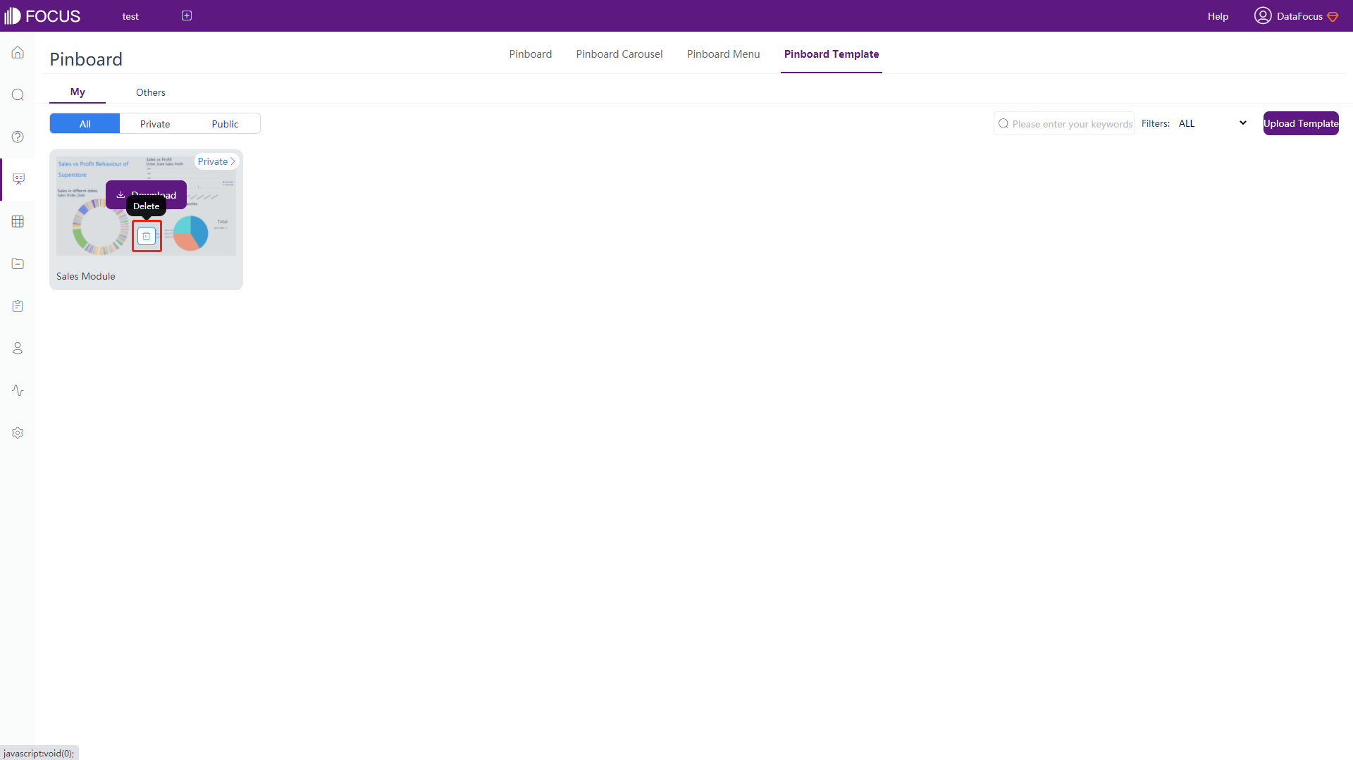
5.10.2 Remove Dashboard Template
Click the “Delete” button to remove the template, as shown in figure 5-10-3.
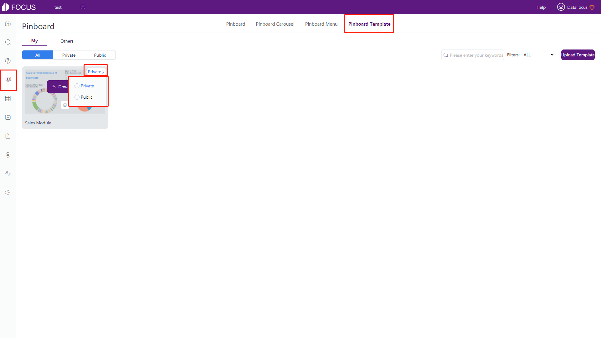
5.10.3 Set Dashboard Template
Click the “Private” or “Public” button to switch the template between private and public, as shown in figure 5-10-4.
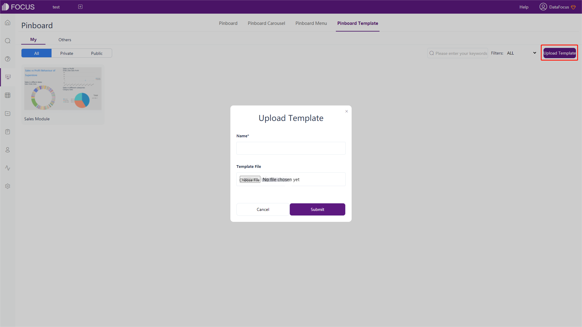
5.10.4 Upload Dashboard Template
Click “Upload Template” at the top right. On the pop-up window, enter template name, select template file, and click “Submit” to upload the template, as shown in figure 5-10-5.