Chapter 3 Search
3.1 Select Data Source
Before performing search data analysis, users need to select the data table they want to use. On the search interface, click “Choose Tables”, and a window for selecting data tables will pop up, as shown in figure 3-1-1.
Click the check box in front of the data table to select the data table. In the case of a large number of data tables, you can directly enter keywords in the search box on the upper right to search. Tables with stickers/tags can also be quickly selected by clicking the tag.
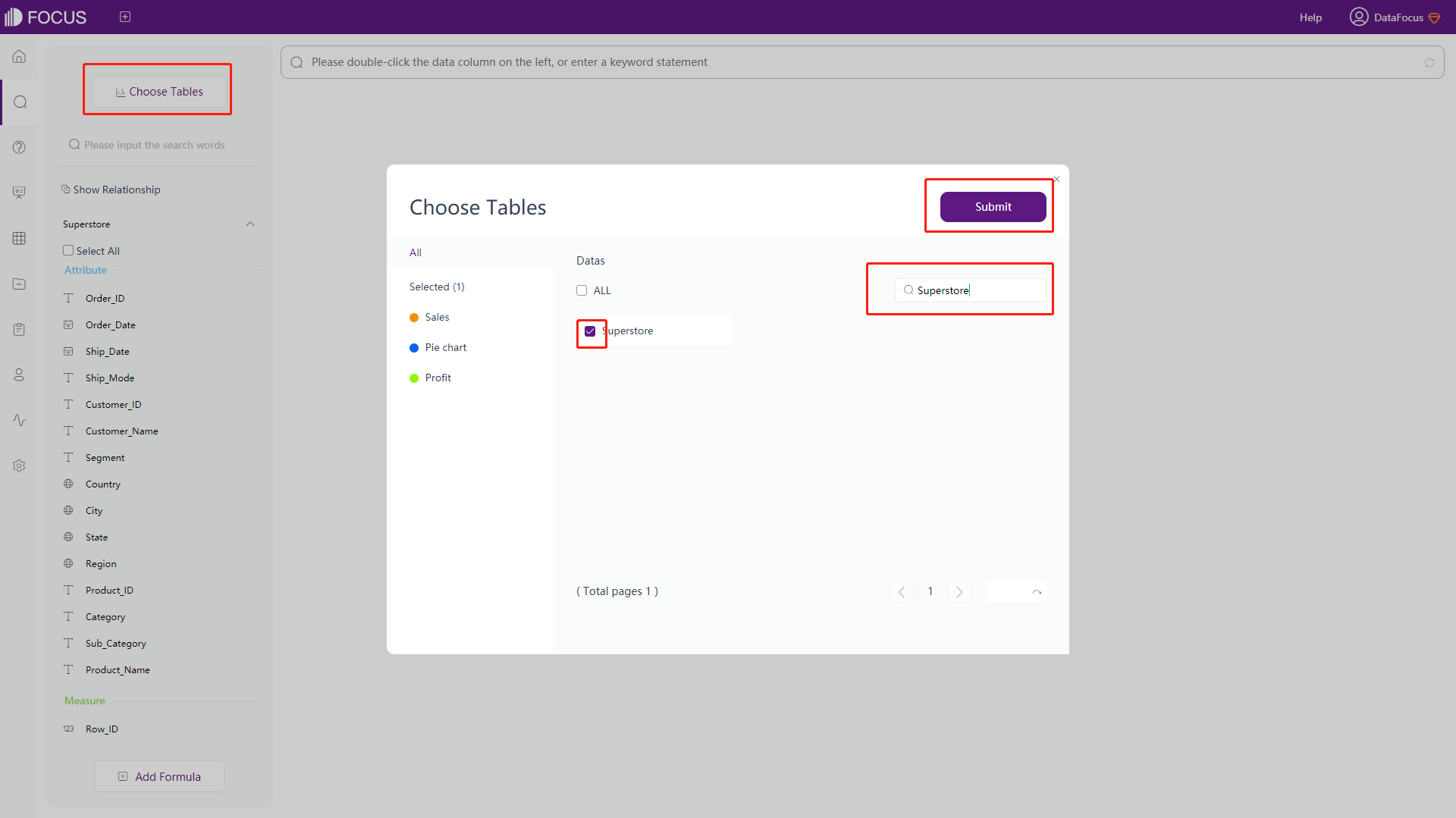
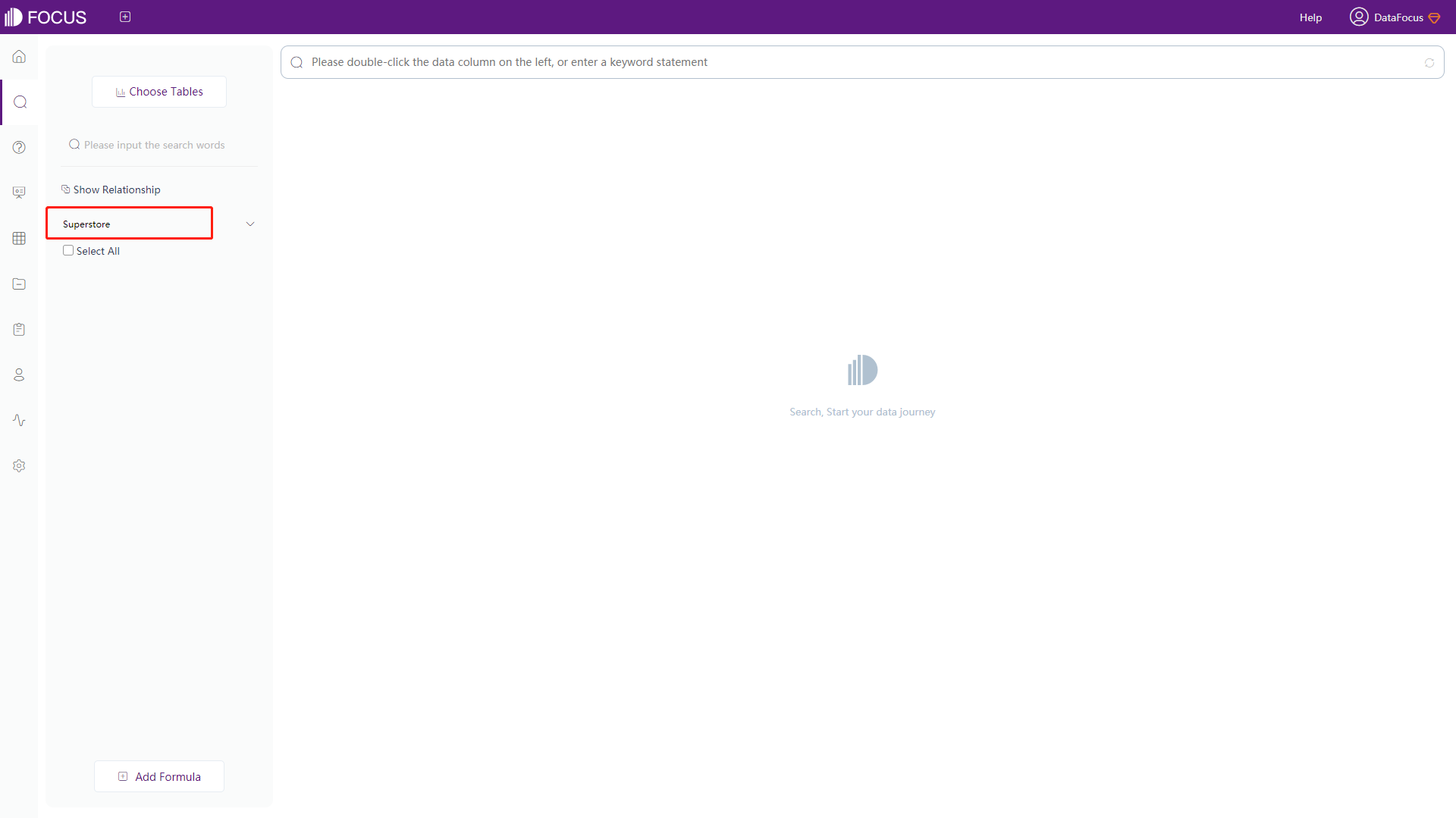
Click the “Submit”, and the selected table/intermediate table will be displayed on the left side of the page, as shown in figure 3-1-2.
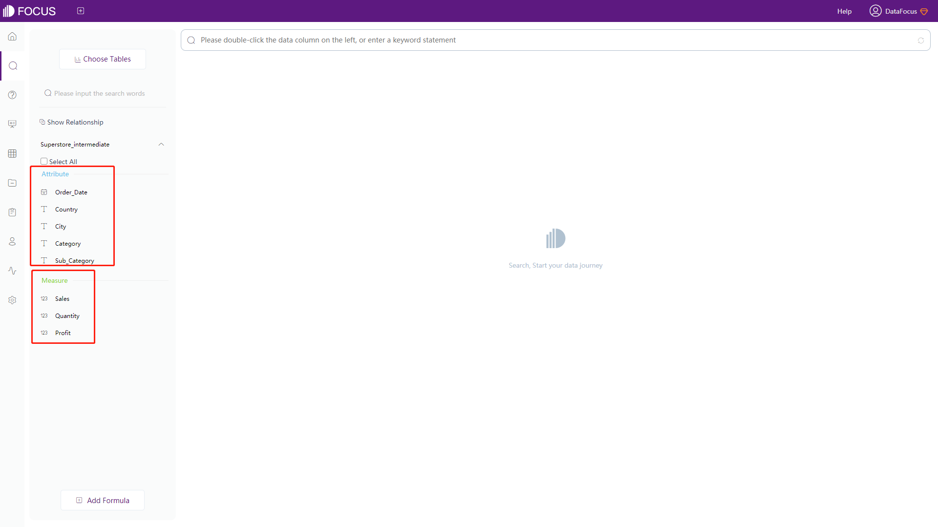
The columns of the selected worksheet/intermediate table will be displayed according to the Attribute column and the Measure column, as shown in figure 3-1-3.
3.2 How to search
There are two ways to search for data:
-
Double-click the column names under the data table on the left, and the search results will be displayed in the middle of the page, as shown in figure 3-2-1; Or you can click the column name first and then click the “->” button.
Select and drag a field in the search box to change its position, and so that the display order of the columns in the table/graph would change. Click the “x” to the right of a field in the search box to remove the field and refresh the search results.
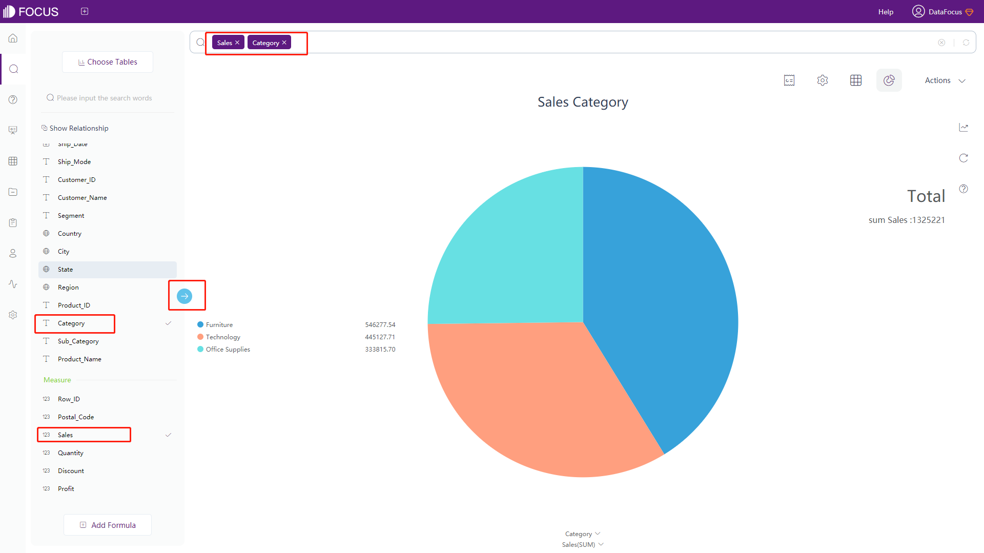
Figure 3-2-1 Click column name to search -
Type in relevant keywords directly into the search box when simply clicking on the column name cannot fulfill the analysis needs. For example, “growth of Sales by Order_Date monthly”. The system will analyze and return the corresponding results as shown in figure 3-2-2.
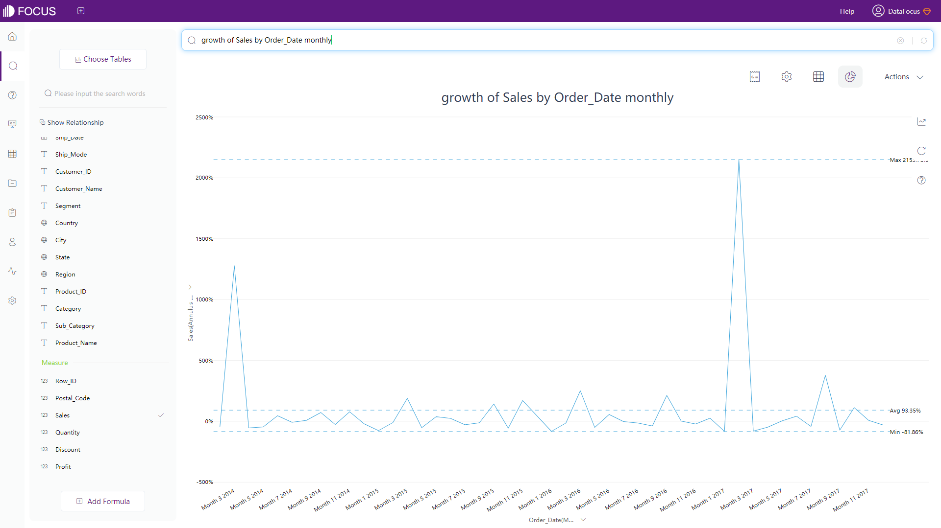
Figure 3-2-2 Enter keywords to search The search of DataFocus is based on data table, so you can enter any relevant keywords in the search box to search as shown in Table 3-1:
Table 3-1 Input statement
Type of Keywords Description Column names City, Category, Profit, Sales, etc. Keywords Greater than, less than, top, bottom, etc. Synonym Synonyms defined in column information of a table Specific value Some use of a value in a column when using keywords to search. For example, “Furniture” in Category, “East” in Region, etc. In the case of English, searching can be conducted by directly entering column names, keywords marked synonyms and some specific values. Currently, if you want to search data by entering specific values, you need to enter column name = “specific value” (specific value is enclosed in single or double quotation marks) to make the operation effective, as shown in figure 3-2-3 below.
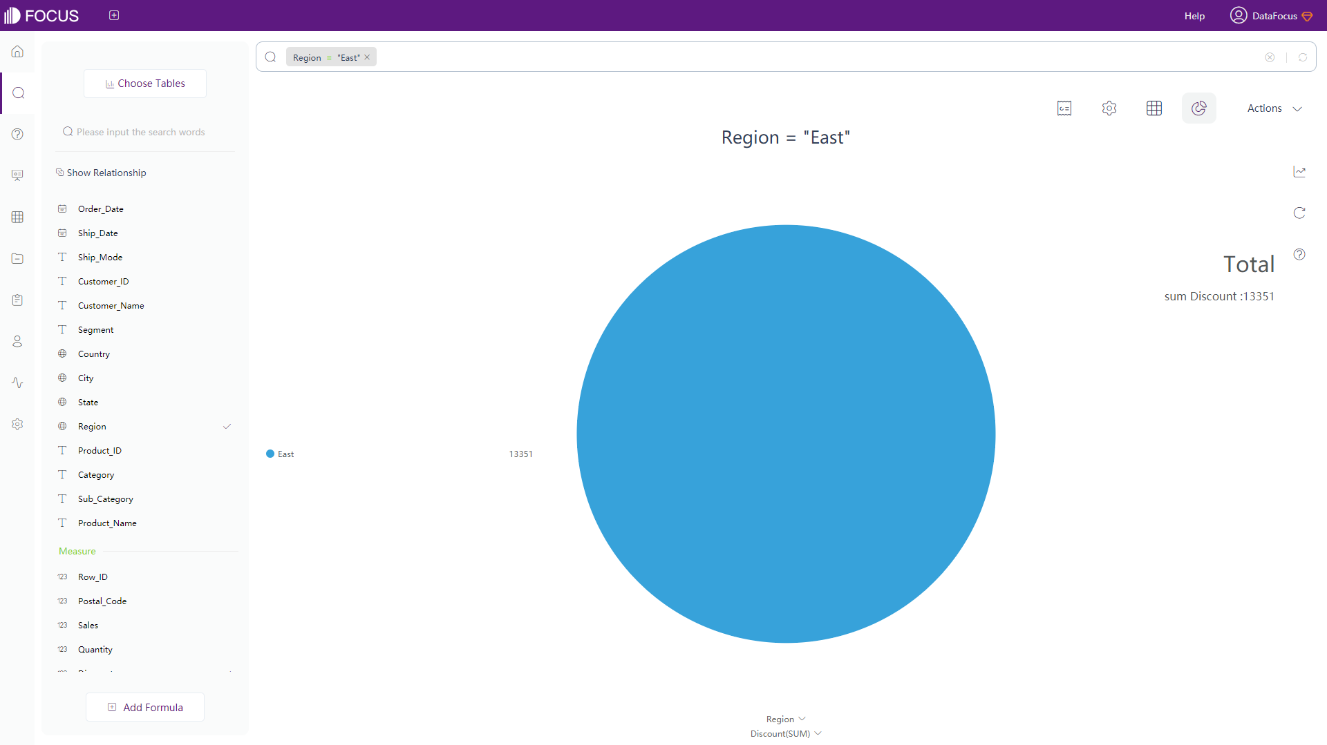
Figure 3-2-3 An example of searching specific values
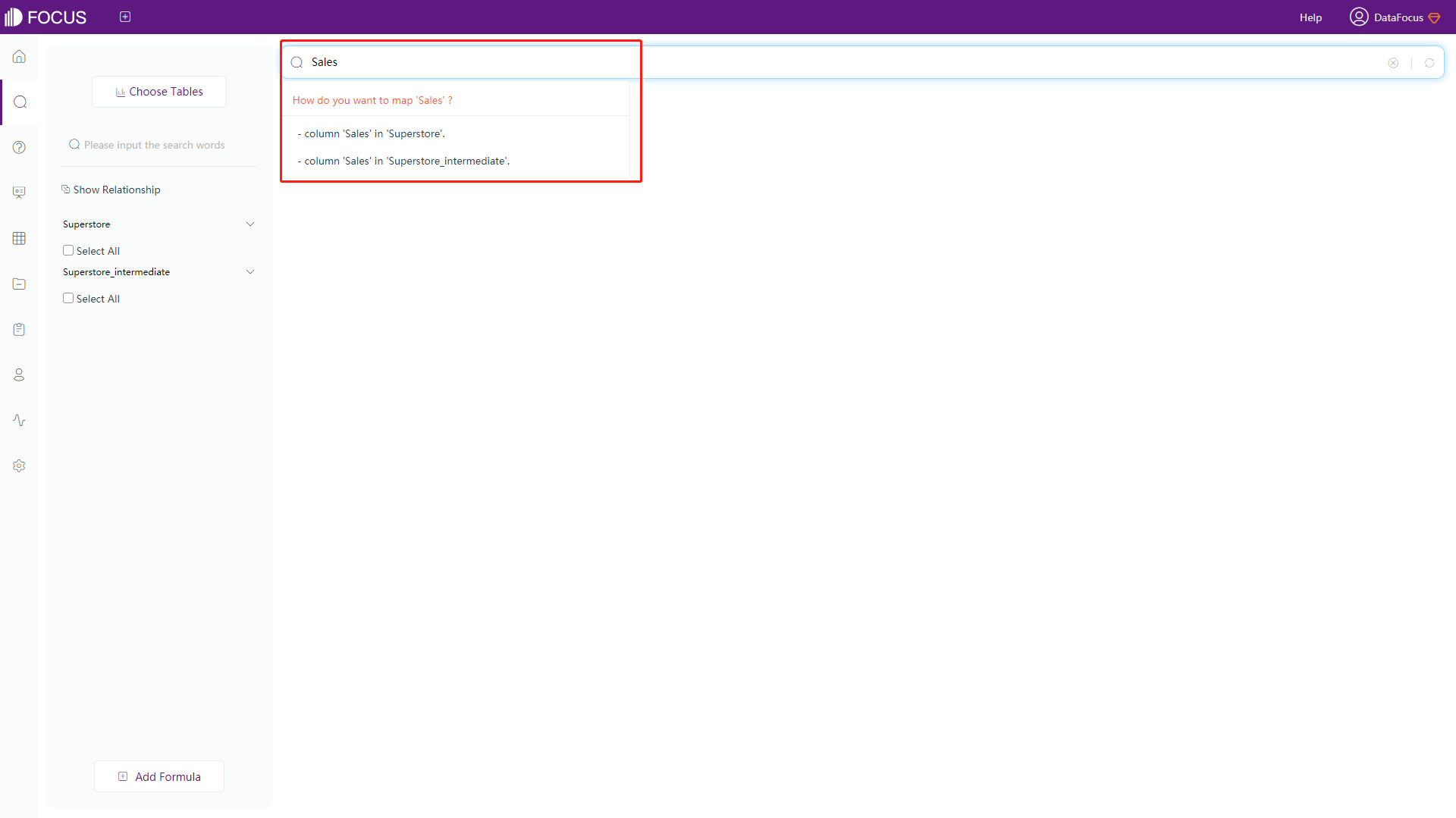
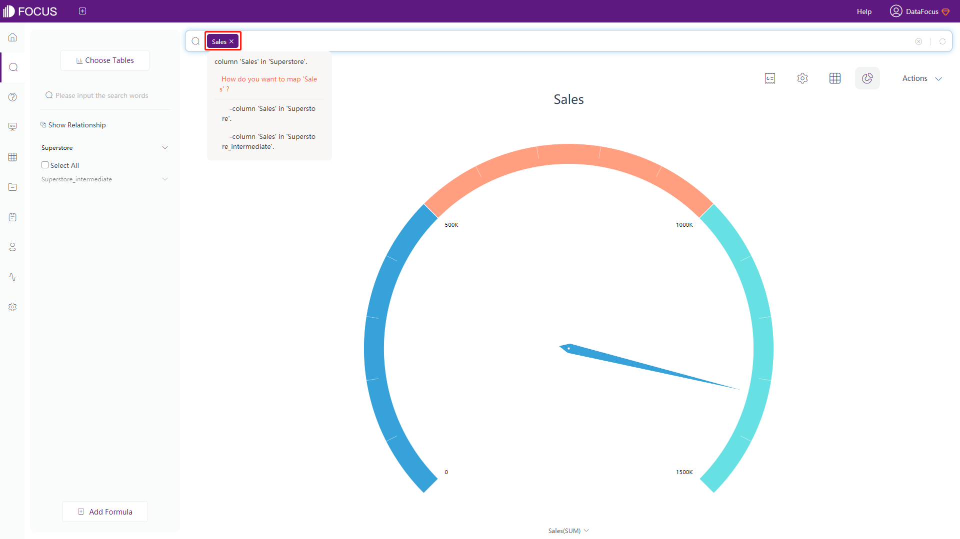
3.3 Ambiguity of Column Names
When selecting multiple data tables, different data tables may have the same column name. Therefore, it is necessary to avoid ambiguity and choose the right mapping.
When an ambiguous statement appears during the typing of keywords, the system will prompt to show that the statement is ambiguous and list several different options to ask how to map. Click the corresponding table name to avoid ambiguity, as shown in figure 3-3-1.
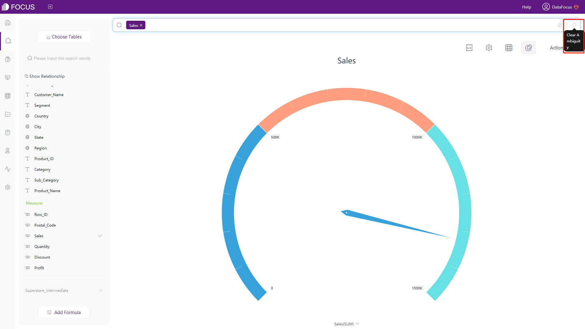
Similarly, the mapping selected can be modified. Move the mouse to the ambiguity column name, and multiple mapping options will pop up as well. Click the selection again to modify the ambiguity, as shown in figure 3-3-2.
The ambiguity selected by the system will be inherited by default. Therefore, if the ambiguity mapping before and after the column name field is inconsistent, you can click the button on the end of the search box to clear the selected mapping, and re-select one, as shown in figure 3-3-3.
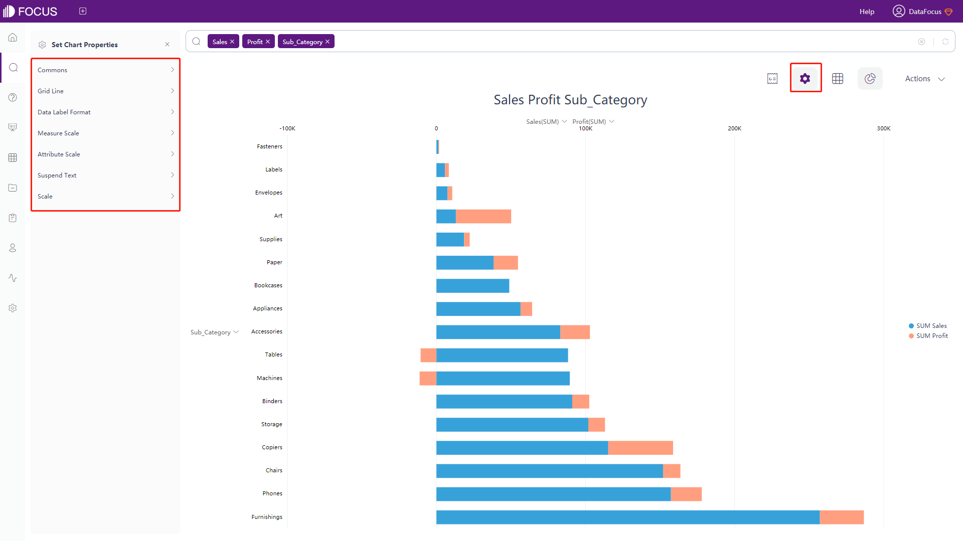
3.4 Graph Configuration
3.4.1 Graph Conversion
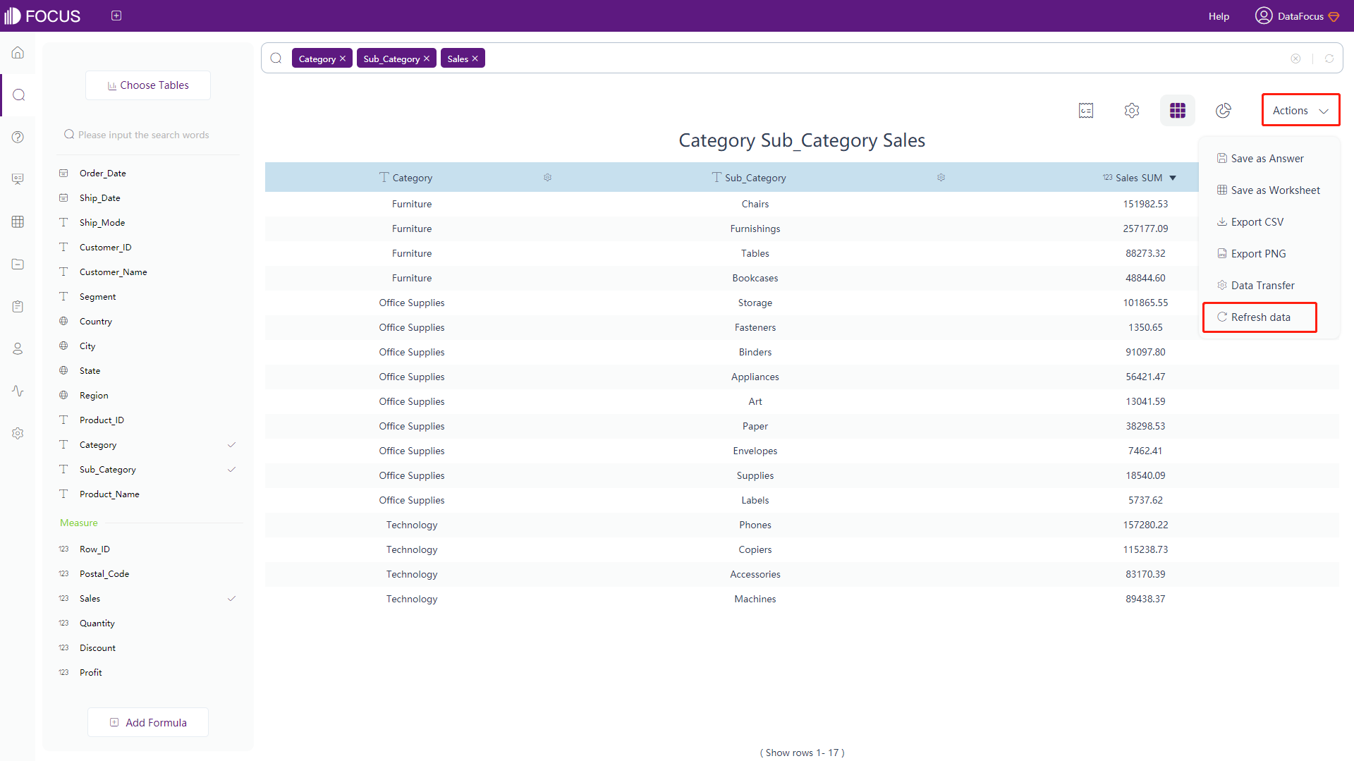
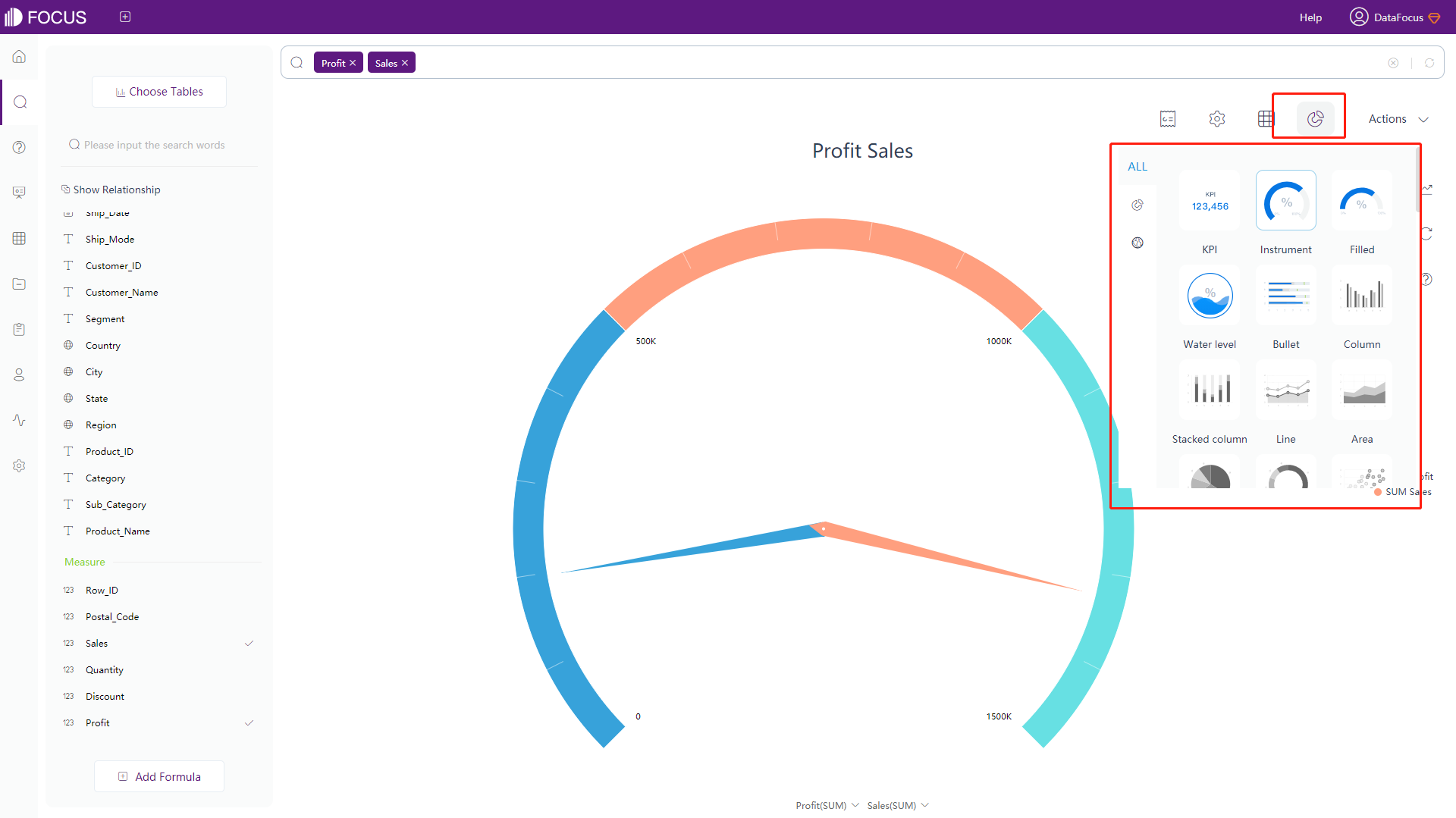
DataFocus Cloud supports 52 chart types such as histogram, line chart, pie chart, ring chart, scatter plot, funnel plot, bubble plot, stacked histogram, bar chart, area chart, Pareto chart, etc. After searching, the system will select the appropriate graph to display the result. Users can click the “Display in chart” button to switch the graph, as shown in figure 3-4-1.
Note: Grayed out icon indicates that the search result is not suitable for display with this type of graphics, colored icon indicates that the search result is suitable for display with such graphics. The currently displayed chart type is within the blue frame.
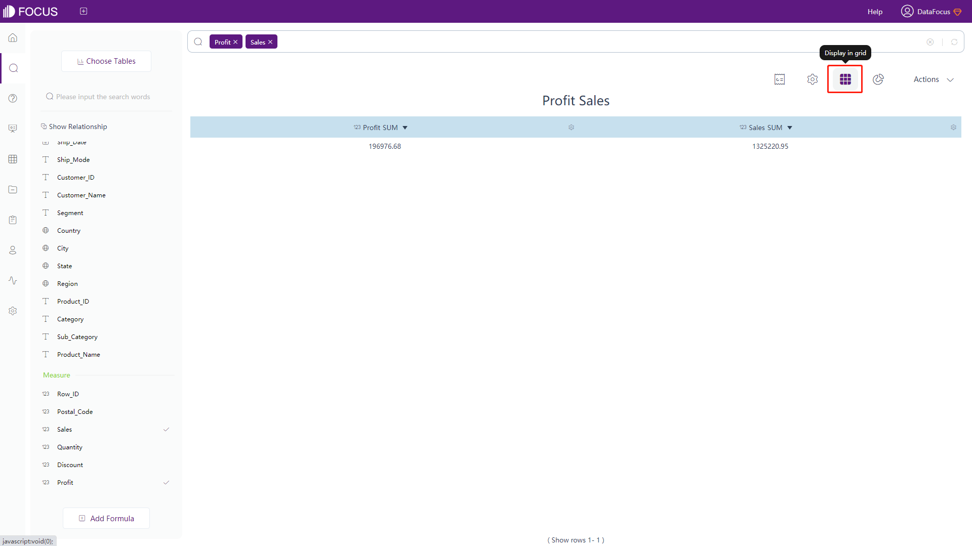
Data is also supported in the form of a numerical table, as shown in figure 3-4-2.
3.4.2 Graph Types & Implementation Prerequisites
DataFocus Cloud supports 52 different graph types.
Note: Legend column is an Attribute column whose distinct count is within 50, as shown in table 3-2 below:
Table 3-2 Premise of graphic realization
| # | Chart Type | Premise |
|---|---|---|
| 1. | Bar chart | At least 1 Attribute column, at least 1 valid Measure column, 1 legend column is allowed |
| 2. | Line chart | At least 1 Attribute column, at least 1 valid Measure column, 1 legend column is allowed |
| 3. | Pie chart | At least 1 Measure column and at least 1 Attribute column, the amount of search results < 100 When the condition is met: if there is only 1 Measure column, the pie chart will be displayed first. If there is more than 1 Measure column, the ring chart will be displayed first. |
| 4. | Ring chart | At least 1 Attribute column and at least 1 Measure column (more than 2 Y-axis are allowed when drawing the graph), the amount of search results < 100 |
| 5. | Scatter plot | At least 1 Attribute column, at least 1 valid Measure column, 1 legend column is allowed |
| 6. | Funnel plot | At least 1 Attribute column, only 1 valid Measure column, 1 <= amount of searching result <= 10 |
| 7. | Bubble plot | At least 1 Attribute column, at least 2 valid Measure columns, 1 legend column is allowed |
| 8. | New bubble plot | At least 2 Attribute columns, at least 1 valid Measure column, 1 legend column is allowed |
| 9. | Stacked bar chart | n (n >= 1) Attribute columns and n (n >= 2) Measure columns; Or n (n >= 1) Attribute column, 1 Measure column, 1 legend column |
| 10. | Horizontal bar chart | At least 1 Attribute column and at least 1 valid Measure column, 1 Legend column is allowed |
| 11. | Area chart | At least 1 Attribute column, at least 1 valid Measure column, 1 Legend column is allowed |
| 12. | Pareto chart | At least 1 Attribute column, at least 1 Measure column, 1 Legend column is allowed, the amount of search result < 100 |
| 13. | Matchstick chart | At least 1 Attribute column, at least 1 valid Measure column, 1 Legend column is allowed |
| 14. | Pivot table | At least 2 Attribute columns and at least 1 Measure column |
| 15. | Location map | 1 ~ n address columns (n < 4, when multiple address columns are included, multiple address columns from the same geographical level are not allowed. For example, 2 state columns are not allowed, but 1 state column and 1 city column are allowed), 1 ~ n Measure columns, No other Attribute columns exclude address columns. Enter 1 location Attribute column: it must be a state column; Enter 2 location Attribute columns: must be state&city columns; Enter 3 location Attribute columns: must be the city set column |
| 16. | GIS location map | At least 1 Address column (at most 3) and 1 Measure column |
| 17. | Combination chart | 2 ~ n Measure columns and 1 ~ n Attribute columns |
| 18. | Gauge diagram | n (n >= 1) Measure columns, 0 Attribute column; Or n (n >= 1) Attribute columns, n Measure column (limit 1 when drawing the graph) and the amount of searching result < 10; Or n (n >= 1) Attribute columns, n Measure column and the amount of searching result = 1 |
| 19. | Progress chart | At least 1 Measure column, 0 Attribute column |
| 20. | Water-level chart | At least 1 Measure column, 0 Attribute column |
| 21. | Digital flop chart | 1 and only 1 Measure value |
| 22. | Radar map | 1 Attribute column, n (n >= 1) Measure columns; Or 1 Attribute column, 1 Legend column, 1 Measure column. The number of Attribute column’s values all < 50 |
| 23. | Treemap | At least 1 Measure column (only 1 Y-axis is allowed when drawing the graph), 1 Attribute column; Or at least 1 Measure column (only 1 Y-axis is allowed when drawing the graph), 1 Attribute column, 1 Legend column |
| 24. | Tree diagram | 1 and only 1 pair of Attribute columns indexed by nested columns, at least 1 non-indexed Attribute column, and at least 1 Measure column. Note: Nested columns need to have a certain hierarchical relationship, such as departmental structure relationship, Work position hierarchy, etc. |
| 25. | Word cloud | n Measure columns (only 1 allowed when drawing the graph), 1 Attribute column, the amount of data < 100 |
| 26. | Waterfall chart | n Measure columns (only 1 allowed when drawing the graph) and 1 Attribute column. Prioritize the display of waterfall chart in statements such as growth rate. |
| 27. | Chord diagram | At least 2 Attributes columns and 1 Measure column. The 2 Attribute columns should have 2-way liquidity, and the total amount of unique data <= 10. |
| 28. | Sunburst diagram | 1 ~ 3 Attribute column(s) and 1 Measure column (the hierarchy of the graph is arranged in the order of Attribute column(s)). If too many Attribute columns are typed in, the large amount of hierarchy will lead to excessive nodes and data expansion. |
| 29. | Package diagram | 1 ~ 3 Attribute columns and 1 Measure column (the hierarchy of the graph is arranged in the order of Attribute column). If too many Attribute columns are typed in, the large amount of hierarchy will lead to excessive nodes and data expansion. |
| 30. | Sankey diagram | At least 2 Attribute columns and 1 Measure column. The 2 Attribute columns have 1-way liquidity and the total amount of unique data < 100; |
| 31. | Parallel coordinate chart | At least 1 Attribute column and 1 valid Measure column, The amount of unique data from Attribute column <= 50, The total number of Attribute and Measure column <= 20 |
| 32. | KPI | 1 Measure column and 0 ~ 1 Attribute column, The amount of search results < 5 |
| 33. | Stacked horizontal bar chart | n (n >= 1) Attribute column(s) and n (n> = 2) Measure columns; Or n (n >=1) Attribute column(s), 1 Measure column, 1 legend column |
| 34. | Time series bar chart | Only 1 annual/monthly keyword, 1 ~ n Measure column(s), and 1 ~ n Attribute column(s),The amount of search results < 1000 |
| 35. | Time series bubble chart | Only 1 annual/monthly keyword, 2 ~ n Measure columns, and 1 ~ n Attribute column(s), The amount of search results < 1000 |
| 36. | Time series scatter plot | Only 1 annual/monthly keyword, 1 ~ n Measure column(s), and 1 ~ n Attribute column(s), The amount of search results < 1000 |
| 37. | Boxplot | At least 1 Attribute column and 1 Measure column; The amount of search results> 10 |
| 38. | Time series horizontal bar chart | Only 1 annual/monthly keyword, 1 ~ n Measure column(s), and 1 ~ n Attribute column(s), The amount of search results < 1000 |
| 39. | Polar bar chart | 1 Attribute column (number of unique data <= 50), 1 Time column (number of unique data <100), and 1 Measure column, The amount of search results >=100 |
| 40. | Bullet chart | 1 Attribute column and 2 Measure columns,The amount of search results <= 20 |
| 41. | Calendar heat map | 1 Measure column(s), 1 Time column, The Time column must be aggregated daily (time span within 3 years) or by hour (time span within 30 days) |
| 42. | Trajectory map | 2 and only contains 2 pairs of latitude and longitude, At least 1 Measure column |
| 43. | Histogram | 1 Attribute column and 1 Measure column; Or 0 Attribute column and n Measure column |
| 44. | Longitude & Latitude location map | At least 1 geographical Attribute column, at least 1 Measure column. When there are multiple geographical Attribute columns, the geographic column must be a continuous geographic column, for example: country state. |
| 45. | Longitude & Latitude map | Valid longitude and latitude columns, at least 0 Attribute column and 1 Measure column |
| 46. | Longitude & Latitude bubble chart | Valid longitude and latitude columns, at least 0 Attribute column and 1 Measure column |
| 47. | 3D globe bar chart | 1 and only 1 pair of longitude and latitude columns, at least 1 Measure column |
| 48. | 3D globe scatter plot | 1 and only 1 pair of longitude and latitude columns, at least 1 Measure column |
| 49. | 3D globe fly line | 2 and only 2 pairs of longitude and latitude columns |
| 50. | Correlation heat map | 2 Attribute columns and the number of search results >= 2 |
| 51. | Matrix heat map | 2 Attribute columns and the number of unique data < 50,1 Measure column where the value is in the interval [-1,1] |
| 52. | Longitude & Latitude heat map | Valid longitude and latitude columns, At least 0 Attribute column and 1 Measure column |
3.4.3 Change Theme Color
There is a default theme color when generating a chart. Users can change or customize the theme color. The specific operations are as follows:
-
Click the “Chart Configurations” button in the upper right corner to open the configuration page of the chart configurations, as shown in figure 3-4-3;
-
Click the “Commons”, and select the desired theme color, currently, there are 7 preset theme colors; you can also choose a custom color, as shown in figure 3-4-3.
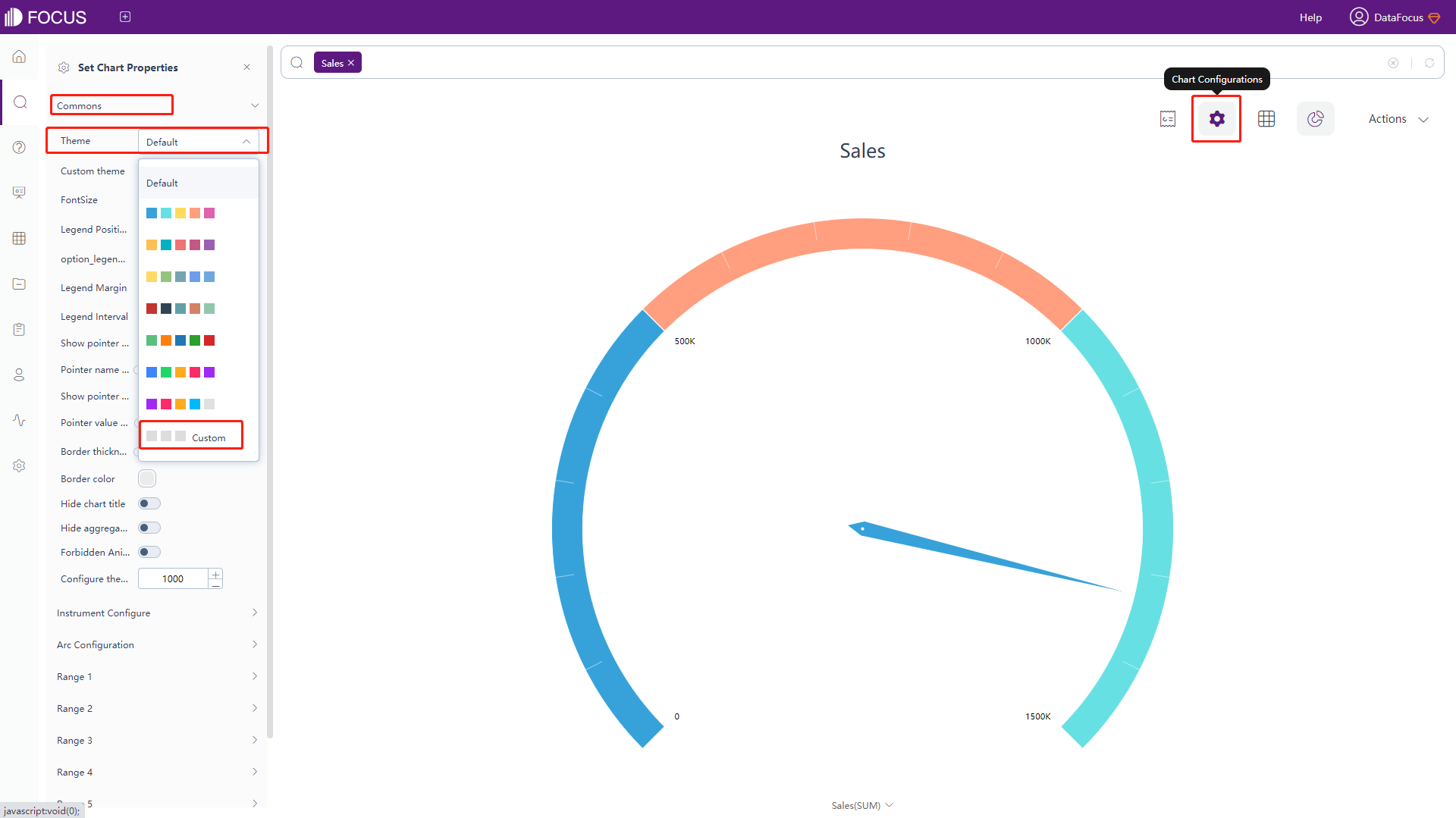
Figure 3-4-3 Change theme color -
If you choose to customize the color, in the “Custom Theme” column, set the theme color, as shown in figure 3-4-4.
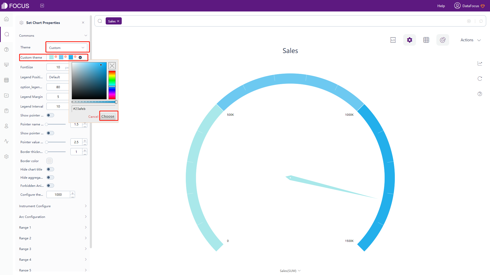
Figure 3-4-4 Customize theme color
The system also supports customizing the color of the graphics. The specific operations are as follows:
-
Click on the colored dot before a legend, as shown in figure 3-4-5;
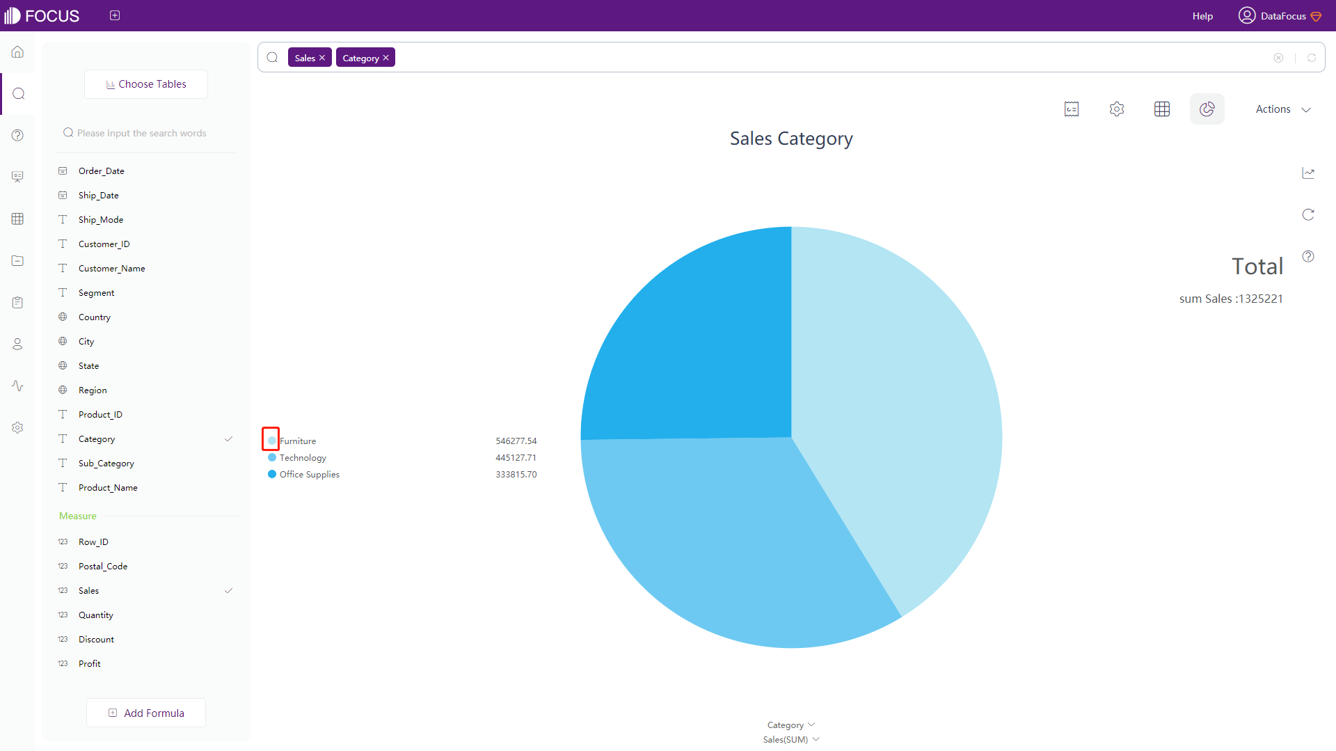
Figure 3-4-5 Colored dot -
Select the color you want to change in the pop-up color selection box. Select the desired color directly on the left, or drag the slider on the right to select a different color, as shown in figure 3-4-6;
-
Click the “Choose” button, the color corresponding to the legend and the variable in the graph will also change.
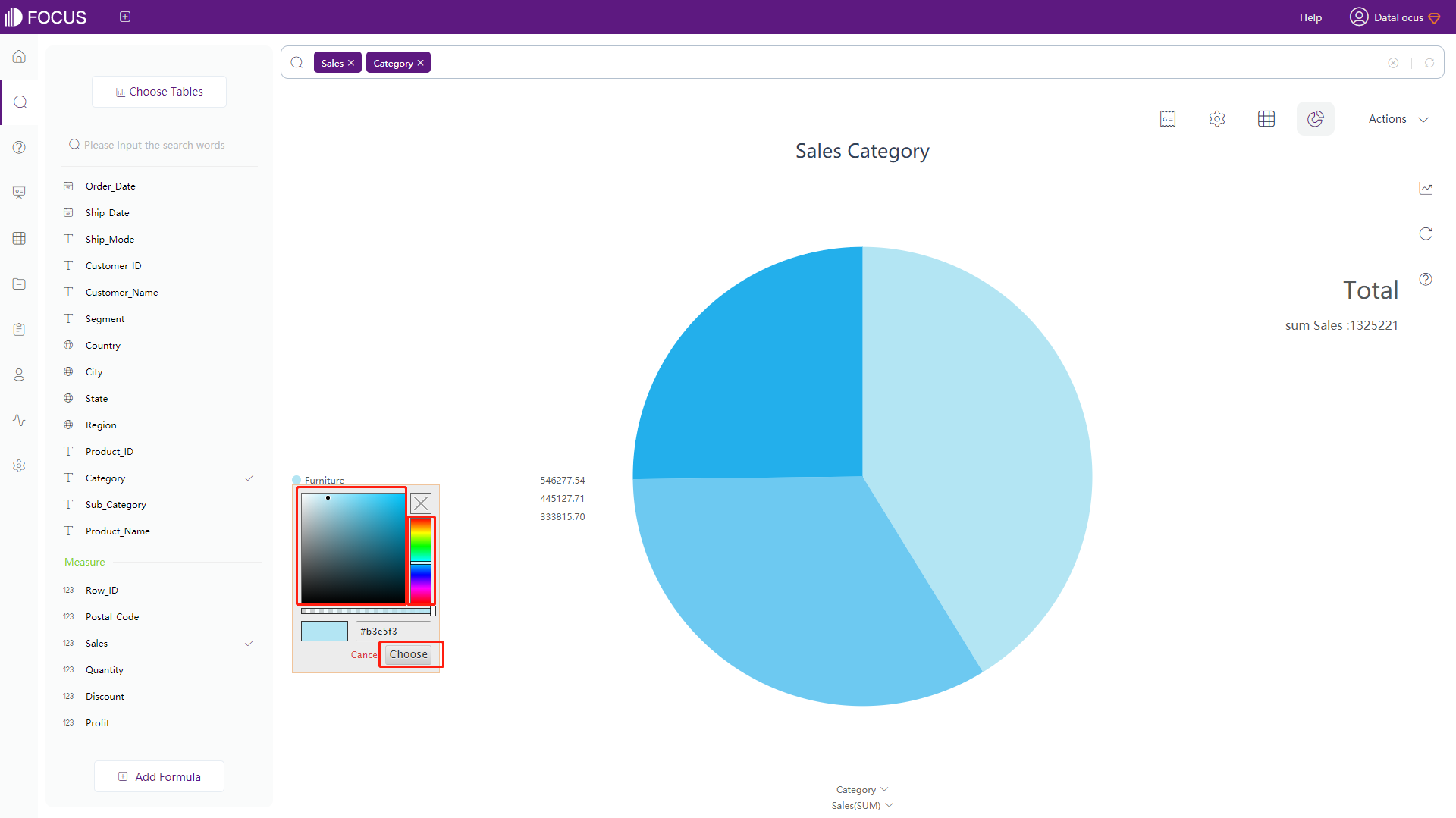
Figure 3-4-6 Change graph color
3.4.4 Table Attributes
If the search results are displayed in the form of a numerical table, the column width of the cell can be dragged with the mouse, and the table can be configured through the chart configurations. The specific operations are as follows:
Click the “Chart Configuration” button in the upper right corner, and the chart configuration interface will pop up on the left side of the page. Users can set 6 parts: commons, header row, total row, row-column index, option_pivot_hot_mode, and time configuration.
-
General Settings
Click the “Commons” button to pop up the interface, as shown in figure 3-4-7. Table 3-3 shows the setting contents and descriptions of the general options of the value table:
Table 3-3 Table configuration - commons
General Settings Description Font Size Set font size Cell Height Set the height of the cell Column Width Configure the width of each column.
If the width is set between 0 and 1, it is considered as a percentage;
If the width is set above 1, it is considered as the specific width value (the minimum width is 50px)
Note: if each column is configured with column width, and the sum of the widths is less than the total width of the displayed area, then each column will proportionally adapt to the width.Word Wrap After the word wrap is turned on, the content in the cell will be automatically wrapped. By default, it is displayed in a single line. Table Alignment Set the table alignment, you can choose Align Center, Align Left, Align Right Font Color RGB(0,0,0) Set the color of the text Border Color RGB(0,0,0) Set the color of the border Odd Row Shading Color RGB(0,0,0) Set the shading color of odd rows, excluding headers Even Row Shading Color RGB(0,0,0) Set the shading color of even rows, excluding headers Odd Row Border Color RGB(0,0,0) Set the border color of odd rows, excluding headers Even Row Border Color RGB(0,0,0) Set the border color of even rows, excluding headers Display Color Formatting After setting, the color shape configured in the color formatting rule is displayed together with the data content.
By default, only the shape is displayed for cells that satisfy the color formatting rules and shape configuration of each column; for cells that do not satisfy, the original content of the data is displayed.Hide Alternating Row Shading Turn on/off alternating row background shading Hide Column Type Hide the column type of the columns Financial Negative Number Adjust the display of negative numbers from -100 to (100) Negative Numbers Color Display negative numbers in red Hide Aggregation Mode Turn on the button to hide the aggregation method of the columns in the header Hide Columns Hide the columns in the output. Type in the column index value (column serial number) to be hidden, separated by commas. It may be used in conditional formatting. Align Individual Columns The alignment of a column can be set individually, and the alignment of multiple columns can be set at the same time, for example: 1:left; 5:right Number of Search Records Set the maximum number of records returned by the search results (1-100000), the default is 1000 records 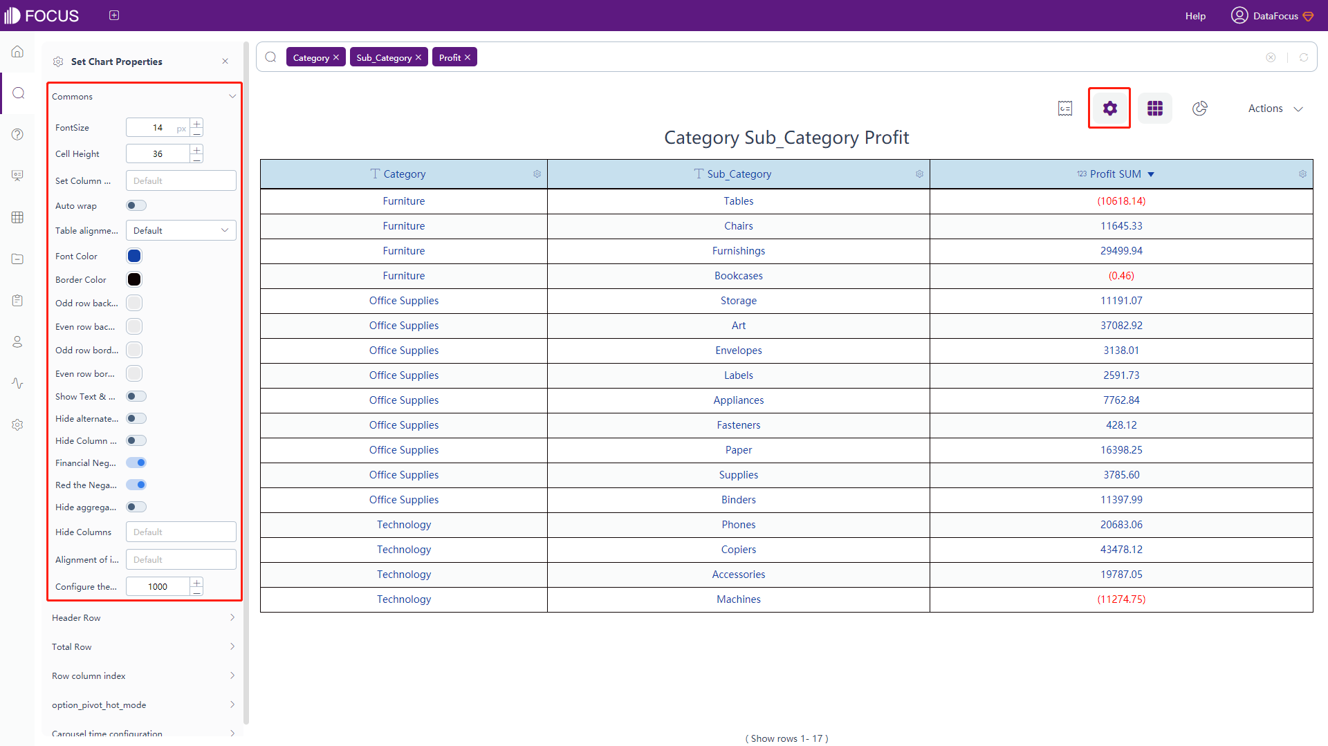
Figure 3-4-7 Table configuration - commons -
Header Row
Click the “Header Row” button to pop up the interface, as shown in figure 3-4-8. In this interface, you can set whether to hide the header, the shading color, the border color, the font color, and the font style of the header row.
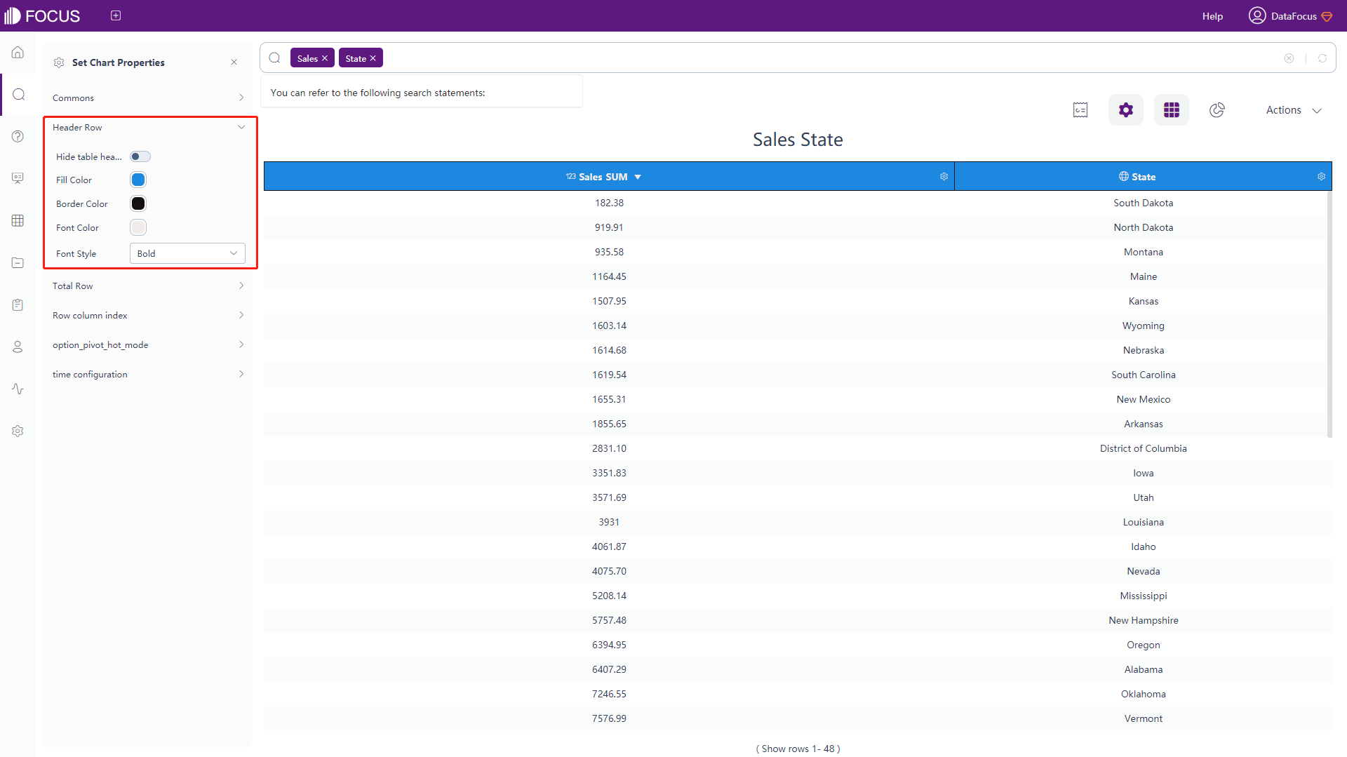
Figure 3-4-8 Table configuration - header row -
Total Row
Click the “Total Row” button to pop up the interface, as shown in figure 3-4-9. In this interface, you can set whether to display the total row, whether to hide the count and the label, shading color, border color, font color, font style as well as the position of the total row.
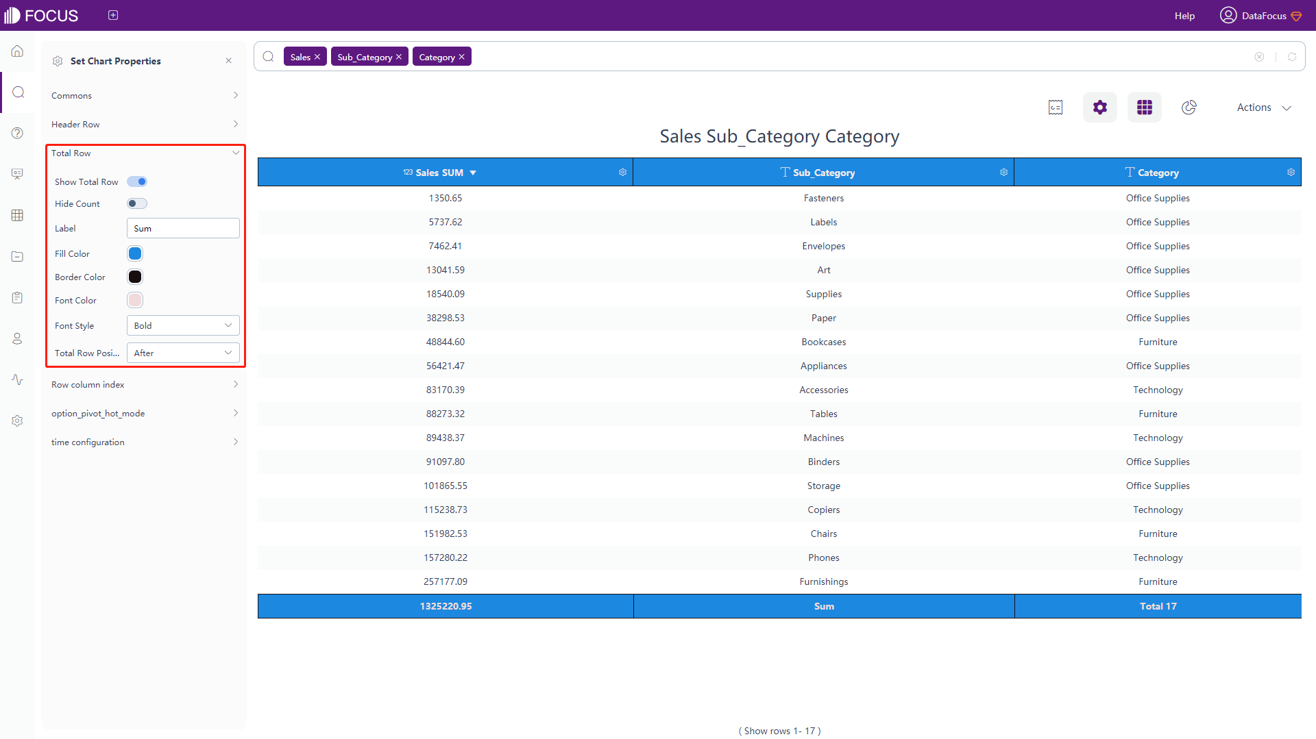
Figure 3-4-9 Table configuration - total row -
Row Column Index
Click the “Row Column Index” button to pop up the interface, as shown in figure 3-4-10. In this interface, you can set whether to display the index values of the rows&columns, the displayed names, and widths of the index column. Also, each single style of index can be set individually, including the value, color, font, font size, shading color, shading size, shading height percent and etc.
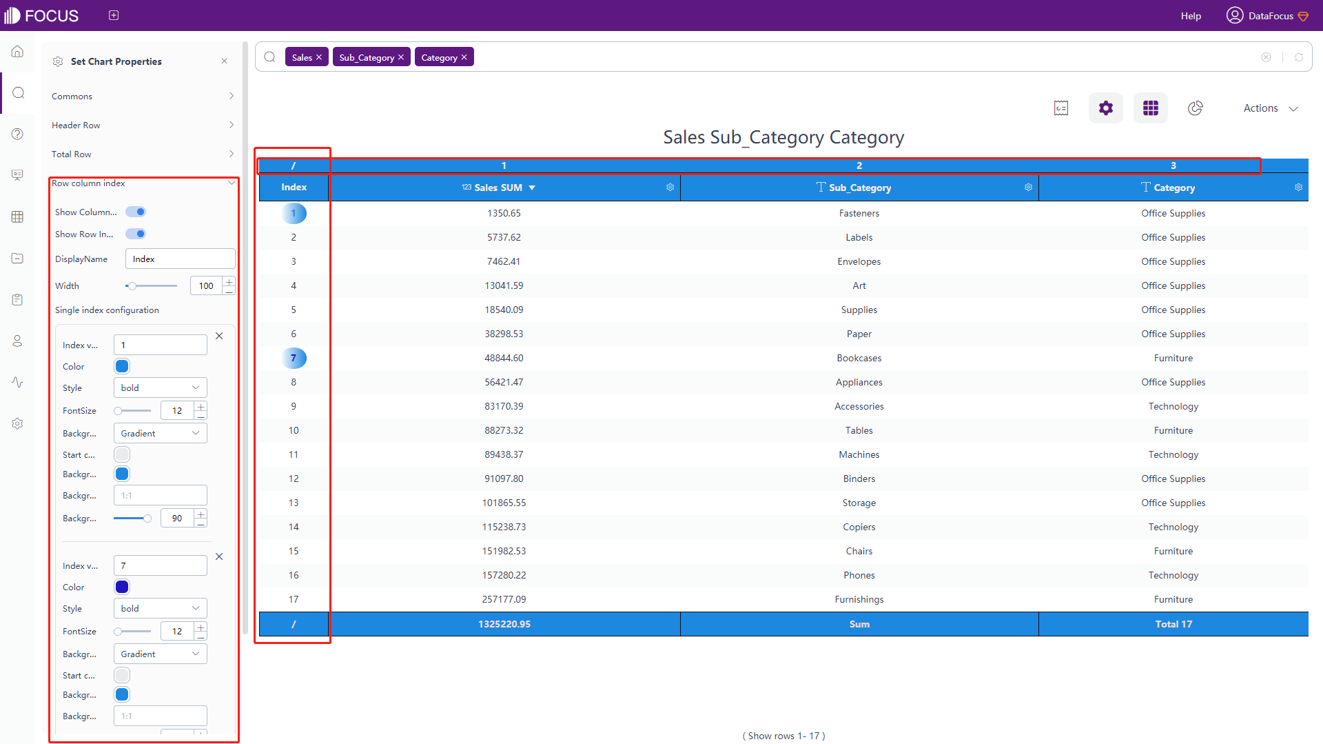
Figure 3-4-10 Table configuration - row column index -
Heat Map Mode
Click the “option_pivot_hot_mode” button to pop up the interface, as shown in figure 3-4-11. In this interface, you can set whether to turn on the heat map mode, set the gradient color, and the type of the heat map. Also, the heat map mode for negative numbers can be calculated independently and you can change the shading color.
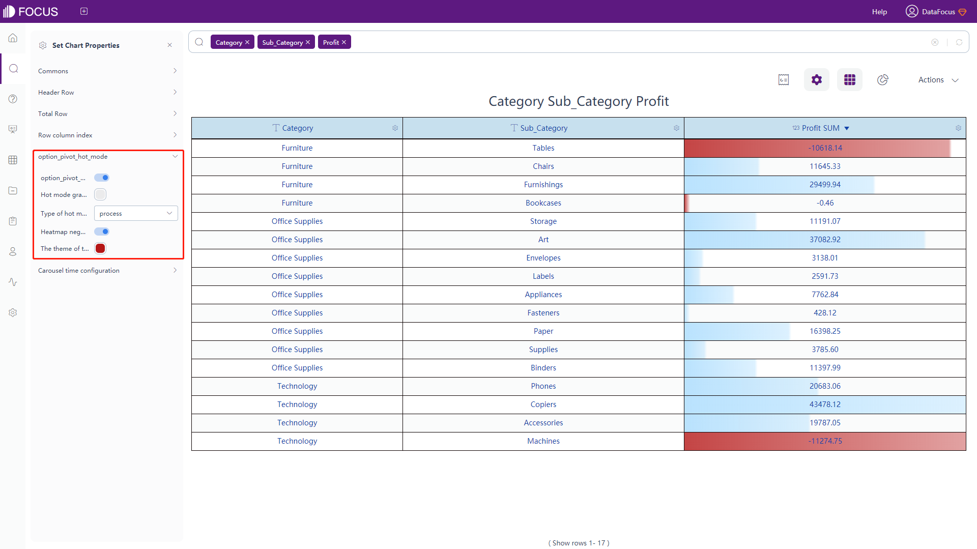
Figure 3-4-11 Table configuration - option_pivot_hot_mode -
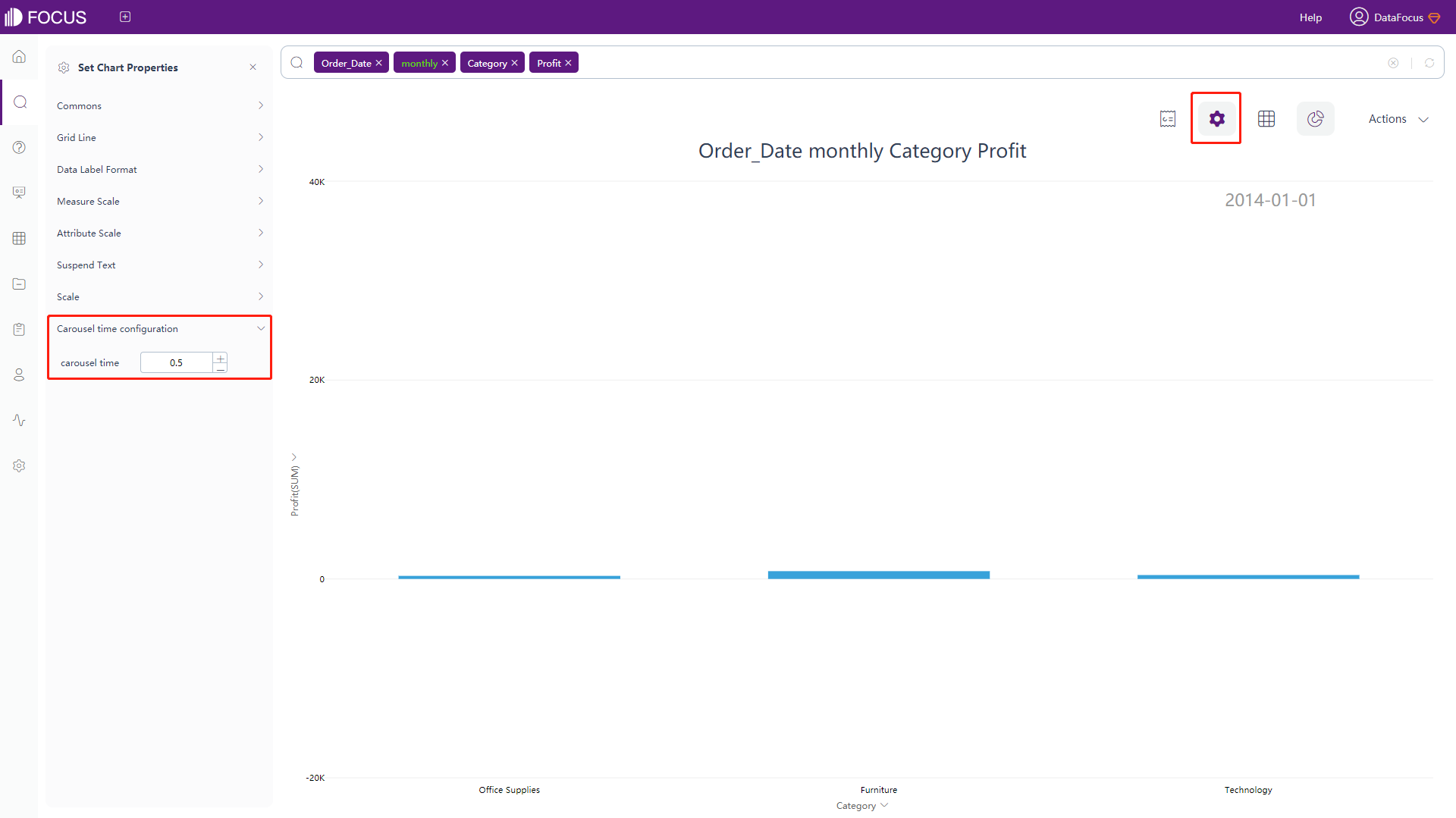
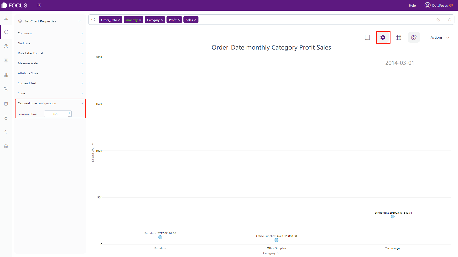
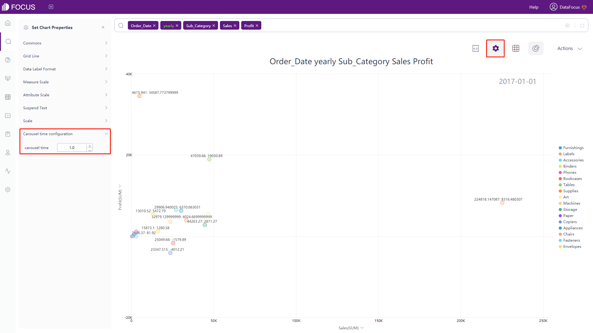
Time Configuration
Click the “Time Configuration” button to pop up the interface, as shown in figure 3-4-12. In this interface, you can set whether to open the carousal and the carousal time whose default is 3 seconds.
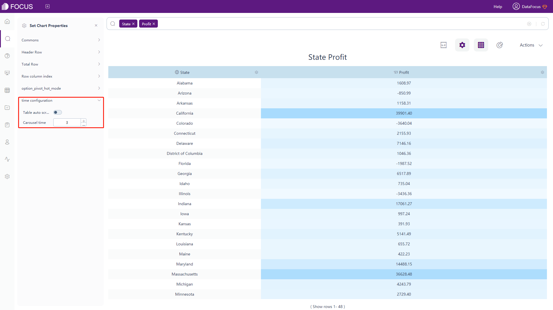
Figure 3-4-12 Table configuration - time configuration
3.4.5 Graphic Attributes
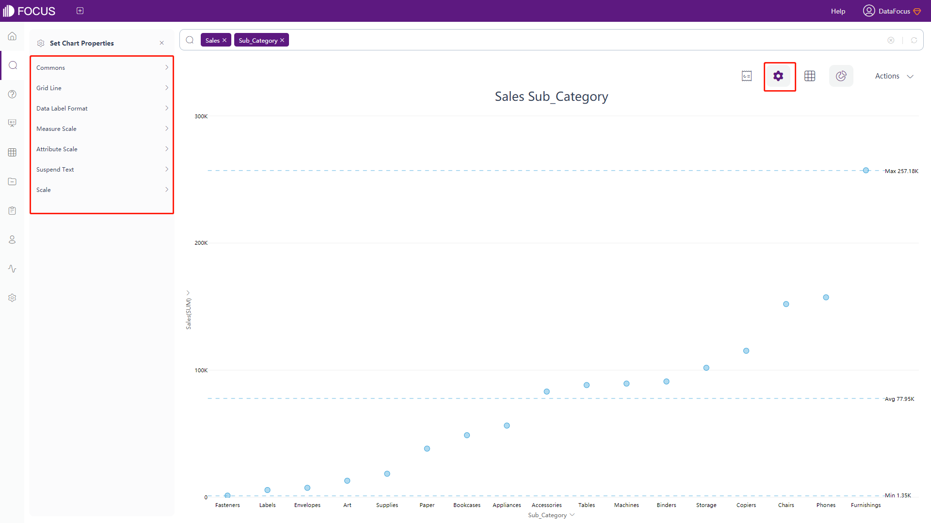
If the search results are displayed in the form of graphs, graph properties can be configured. On the graph display page, click the “Chart Configurations” button in the upper right corner, and the chart configuration interface pops up on the left side of the page. Different graphs have different corresponding configurations.
The configuration of each graph is described as follows:
Bar Chart
-
General Settings
Click on the “Commons” button under the chart configurations, an interface will pop up, as shown in figure 3-4-13. In this interface, you can set the theme color, font size (generally display the default size), legend position (default display on the right), legend margin (set the distance between the legend and the drawing area), legend interval (set the interval between the legends) , scale width, column width ratio (set the ratio of the column width relevant to the scale, the default is 0.6), whether to hide the chart title, whether to hide the aggregation method of the header and legend, whether to disable animation, whether to hide the axis, whether to hide the legend, custom colors of legends, whether to assign colors to each data column, limit number of legend (default 50), the number of search records (default 1000), and set the number of records displayed(default 100).
In the general settings, you can customize the legend color, and set a custom color for a single legend. If you modify the theme color after setting customized legend colors, the color of the legend remains unchanged. The priority of customized colors is higher than the theme color.
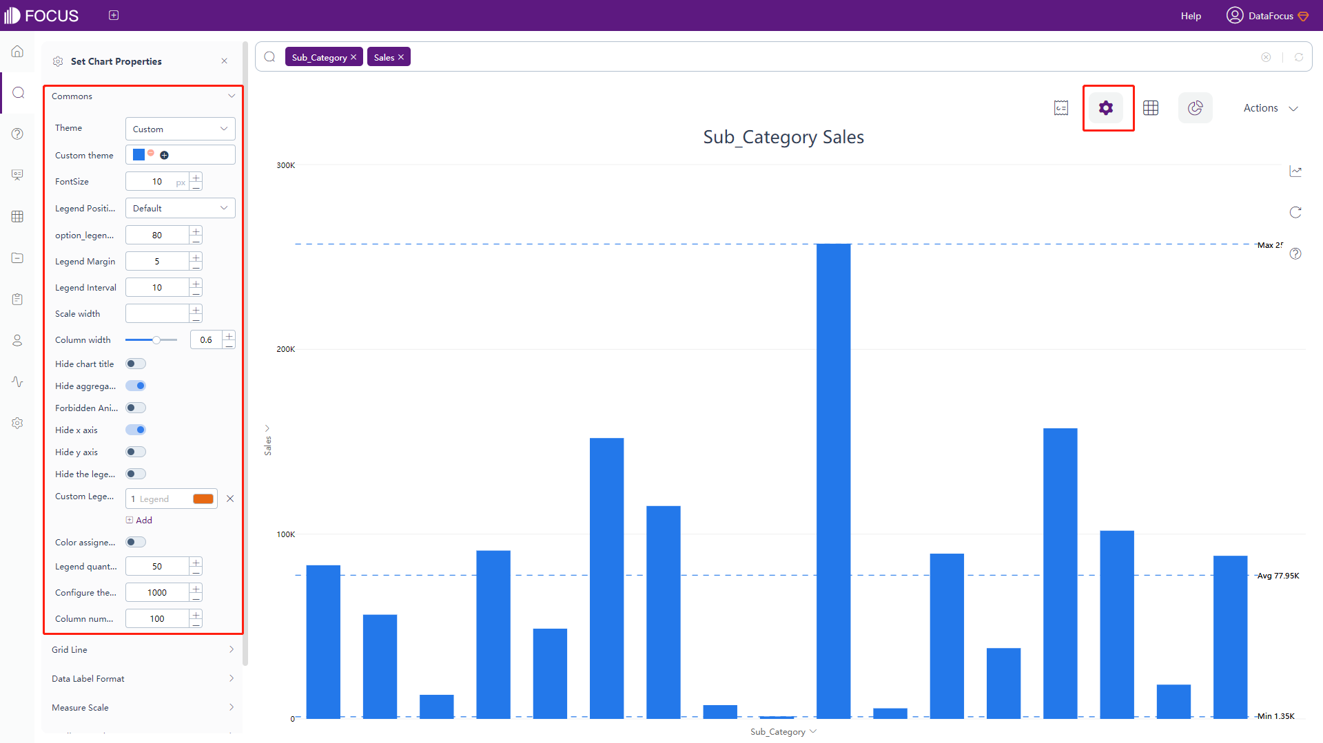
Figure 3-4-13 Bar chart - commons -
Grid Line Configuration
Click the “Grid Line Configuration” button under the chart configurations, as shown in figure 3-4-14, the interface will pop up. In this interface, you can set the color and width of zero line, whether to remove the average, maximum and minimum scale lines, and whether to hide grid lines in the graph.
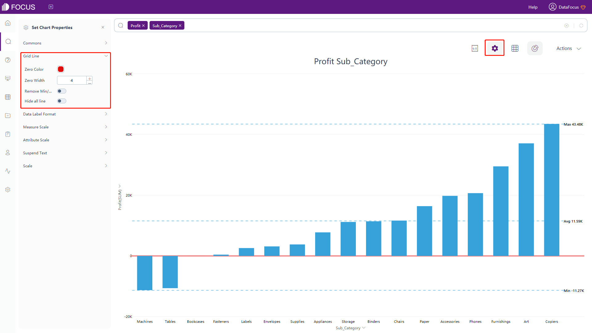
Figure 3-4-14 Bar chart - grid line configuration -
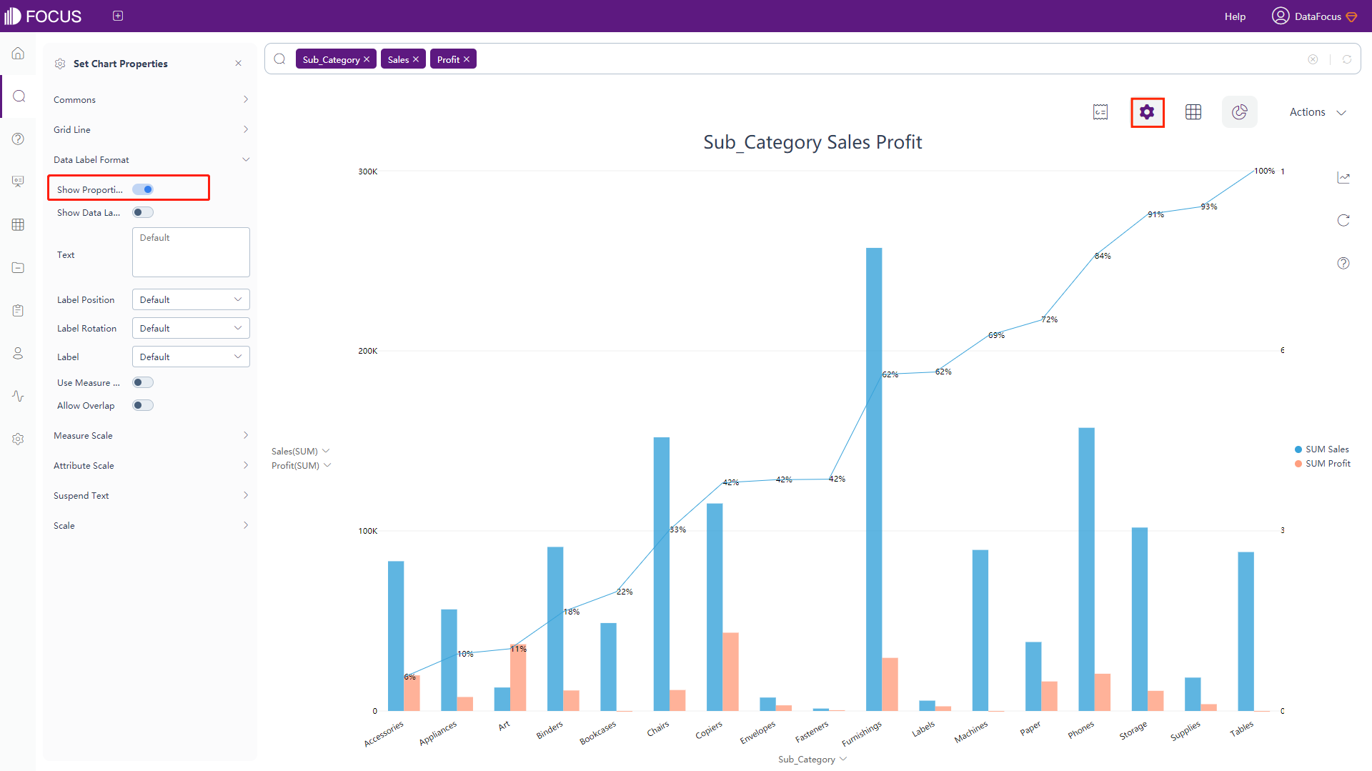
Data Label Format
Click the “Data Label Format” button under the chart configurations, as shown in figure 3-4-15. In this interface, you can set whether to display the data label, the text type, label position, label rotation, the label display (all/maximum and minimum), whether to allow overlapping, and whether to use the measure abbreviation, that is, whether 1000 is abbreviated to 1K.
The meaning of the macro in the text is shown in table 3-4. Adding text after the macro can add additional information based on the original label.
Table 3-4 Bar chart - text type of data label
Text Type of Data Label Descriptions %_VALUE Display the original value % _CATEGORY_TOTAL Display the sum of values from y-axis when choosing a specific x %_CATEGORY_AVERAGE Display the average value of y-axis when choosing a specific x %_PERCENT_OF_TOTAL Display the percentage of a specific y to the sum of y-axis %_PERCENT_OF_CATEGORY Display the percentage of y to the sum of y-axis when choosing a specific data point %_SERIES_NAME Display corresponding legend name %_SERIES_NUMBER Display corresponding legend order %_CATEGORY_NAME Display corresponding x %_CATEGORY_NUMBER Display corresponding order of x among the x-axis %_COLUMN_N Display the value of column N %_BR Newline character 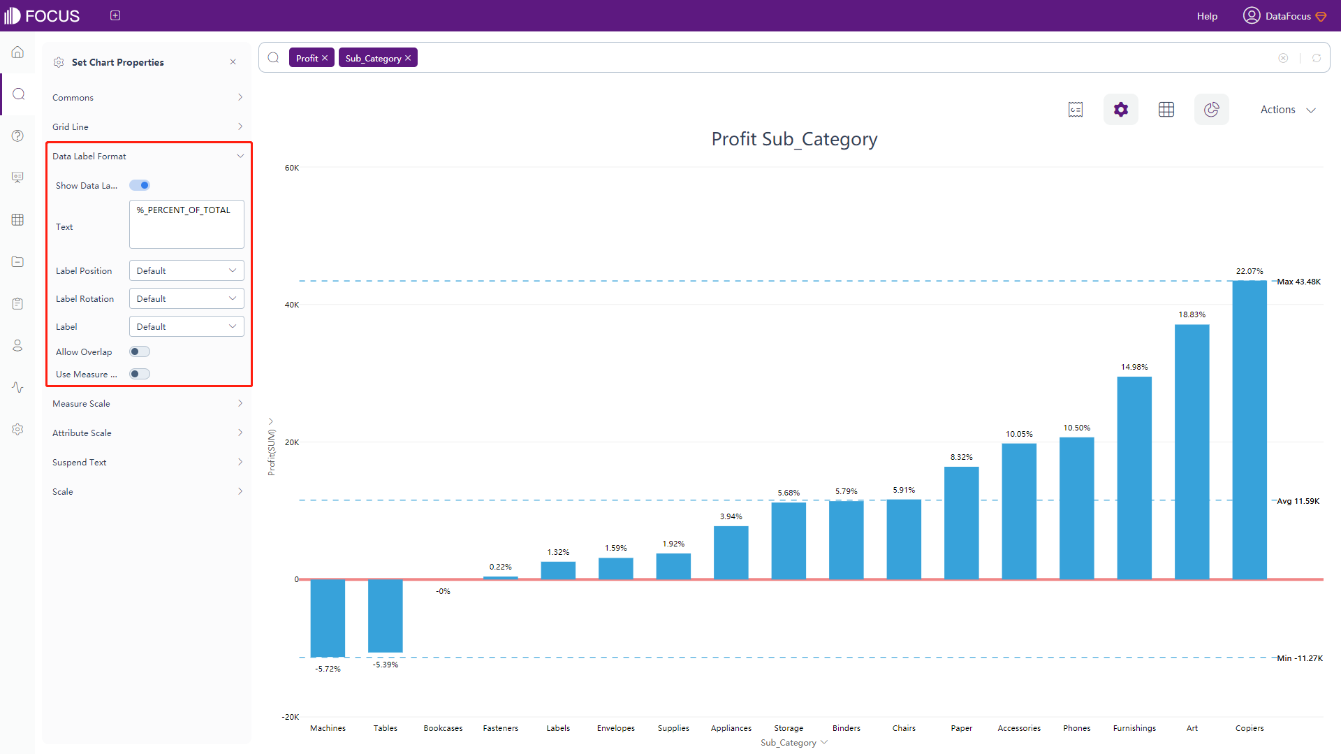
Figure 3-4-15 Bar chart - data label format -
Measure Scale
Click the “Measure Scale” button under the chart configurations and the following interface 3-4-16 will pop up. In this interface, you can configure the format of the left and right Y-axis, set the maximum and minimum values of the scale, and zero-scale alignment. Note: to have 2 y-axes, you need to set the y-axis by clicking on “configure chart” on the right side of the page as the small highlighted area in figure 3-4-16.
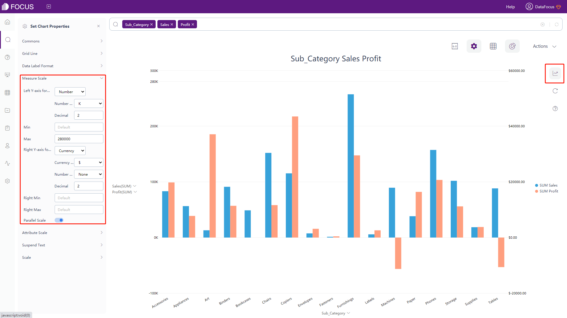
Figure 3-4-16 Bar chart - measure scale -
Attribute Scale
Click the “Attribute Scale” button under the chart configurations to pop up the interface, as shown in figure 3-4-17. In this interface, you can set the maximum height, interval, and the rotation angle of the Attribute scale occupying the drawing area.
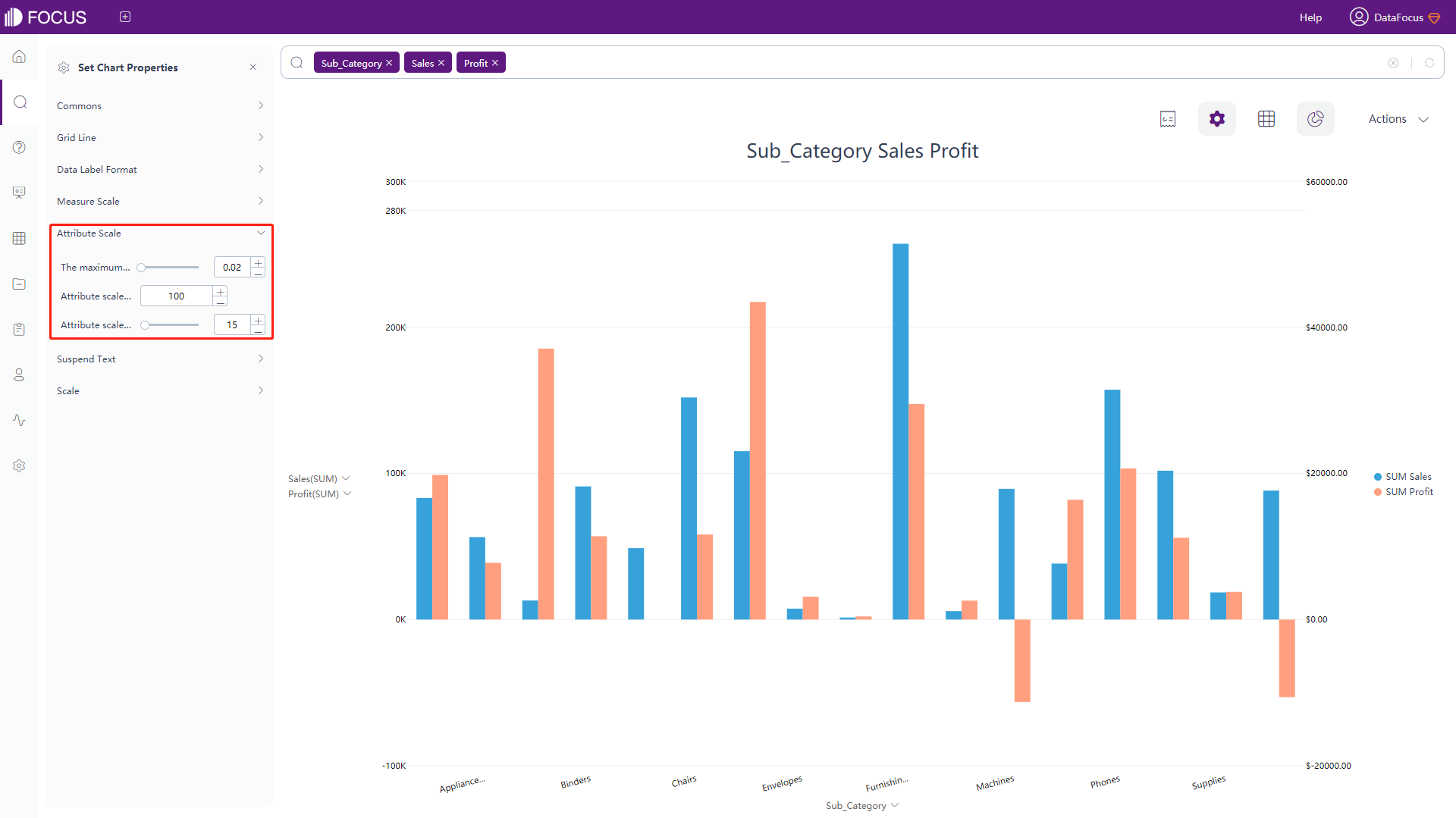
Figure 3-4-17 Bar chart - Attribute scale -
Floating Text Setting
Click the “Suspend Text” button under the chart configurations, and the interface will pop up, as shown in figure 3-4-18. In this interface, you can set the content of the floating text, or enter a defined macro. The defined macro is consistent with the macro usage in the configuration in table 3-4.
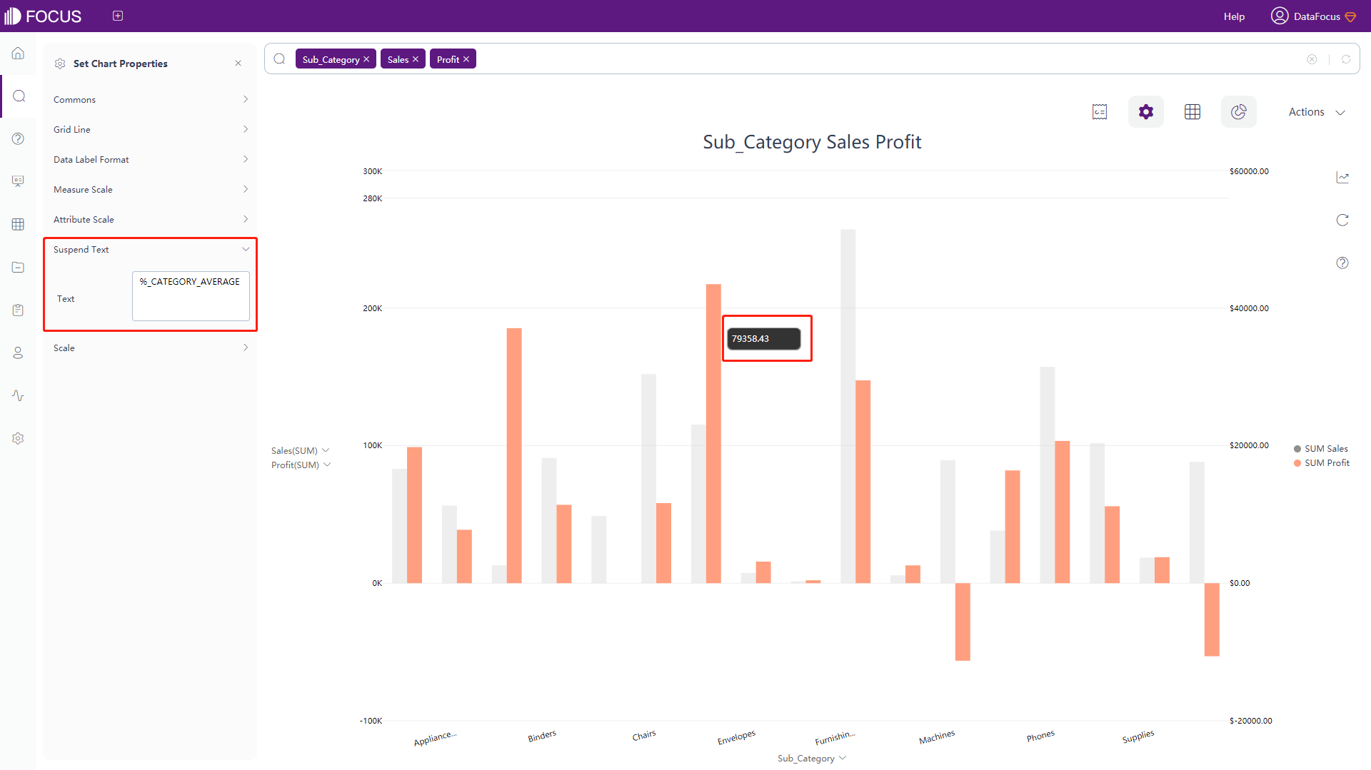
Figure 3-4-18 Bar chart - suspend text -
Scale
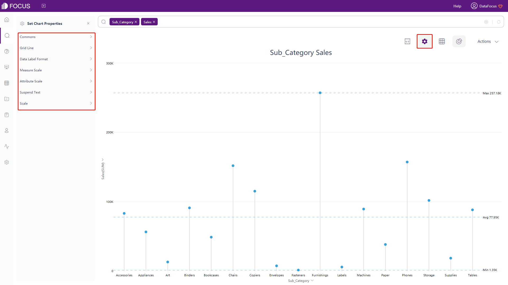
Click the “Scale” button under the chart configurations, and the interface will pop up, as shown in figure 3-4-19. In this interface, you can set the scale text (only valid for one Y axis), the scale can be set as a line or a range, and the value type of the scale can be set (maximum value, minimum value, average value, standard deviation value, manual input), color, width, style (solid or dashed), etc.
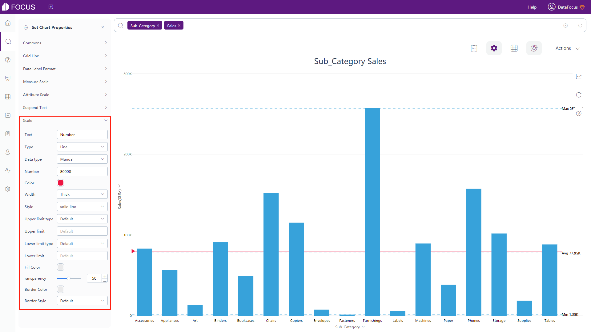
Figure 3-4-19 Bar chart - scale
Line Chart
-
General Settings
Under the chart configurations, click on the “Commons” button, and an interface will pop up, as shown in figure 3-4-20. Most of the functions are the same as in the bar chart. For the line chart, what’s special is that you can set the style (how smooth it is), width, and whether to show the area under the line as shadow.
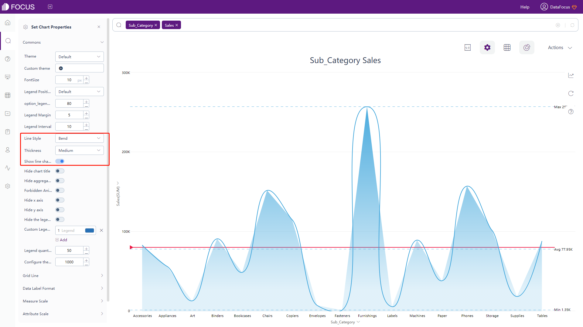
Figure 3-4-20 Line chart - commons -
The rest of the configuration is exactly the same as the bar chart. For details, please refer to bar chart configuration.
Pie Chart
-
General Settings
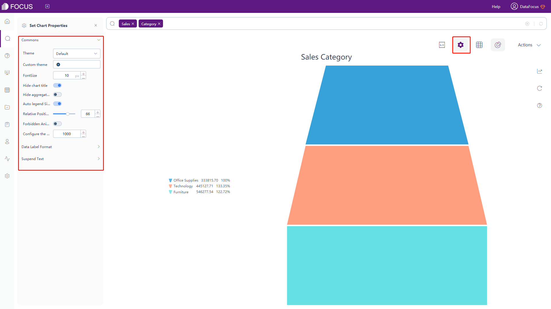
Click on the “Commons” button under the chart configurations, the following interface will pop up, as shown in figure 3-4-21. In this interface, you can set theme color, font size, whether to hide chart title, aggregation method, and information beside the pie (left and right), pie chart mode (traditional pie chart or rose mode), drawing mode in rose mode (radius mode: petal center The angle is different, the area mode: the angle is the same, only related to the area). You can also set the legend adaptive size, relative position, radius and its starting point, the maximum number of slices of the pie chart (the number of slices before other slices), whether to sort the data, whether to disable animation, customize legend color, limit number of legend (default 50) and configure the number of search records (default 1000).
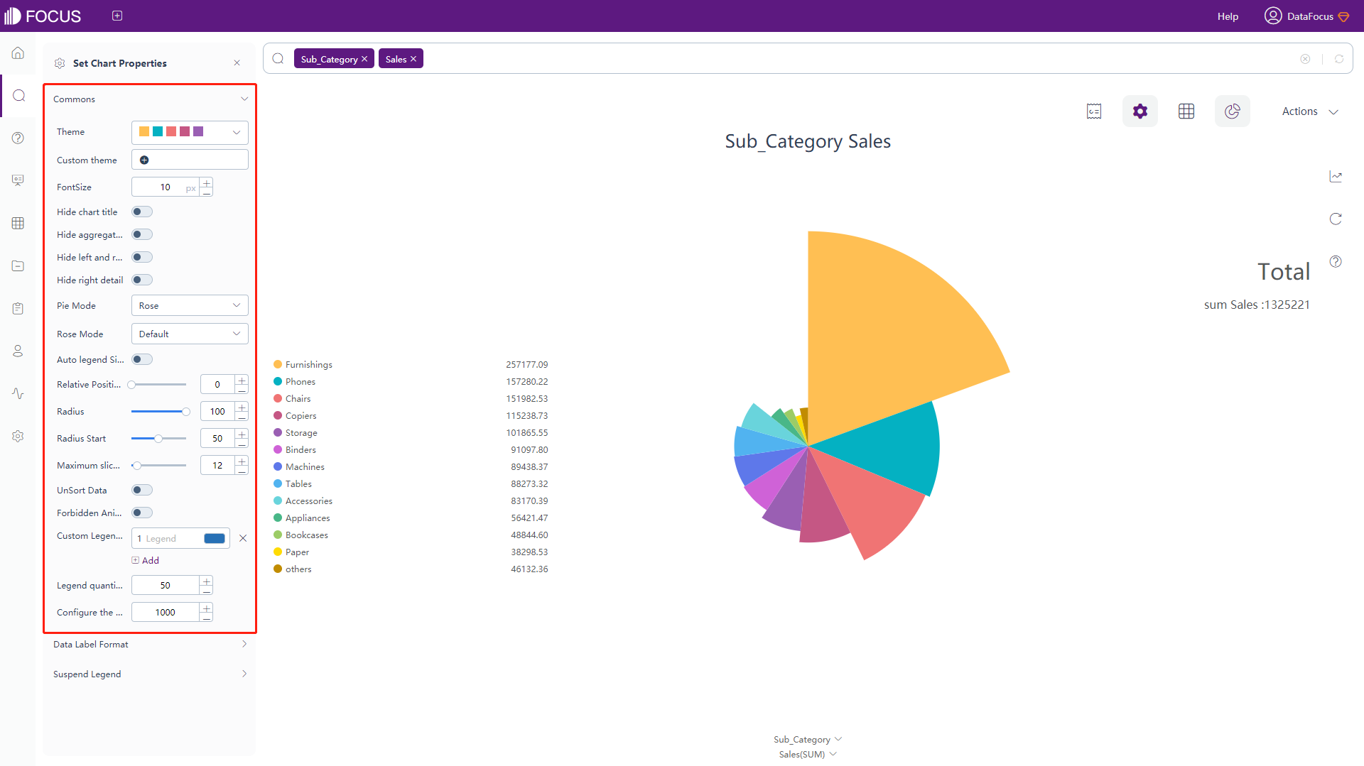
Figure 3-4-21 Pie chart - commons -
Data Label Format
Click on the “Data Label Format” button under the chart configurations, the following interface will pop up, as shown in figure 3-4-22. In this interface, you can set the text of the data label (the data label is displayed on the premise). The meaning of the macro in the text is described in Table 3-5. Add text after the macro to add additional text information on the basis of the original data label; at the same time, you can choose whether to allow overlapping.
Table 3-5 Pie chart - text type of data label
Text Type of Data Label Description %_NAME Display original name %_VALUE Display original value %_PERCENT_OF_TOTAL Display the percentage of current sector %_COLUMN_N Display the value of column N %_BR Newline character 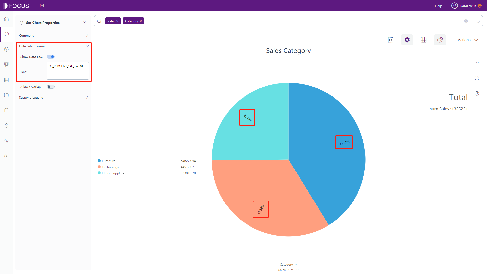
Figure 3-4-22 Pie chart - data label format -
Suspend Legend
Click the floating legend configuration button under the chart configurations, and the interface will pop up, as shown in figure 3-4-23. In this interface, you can set the text and value of the floating title.
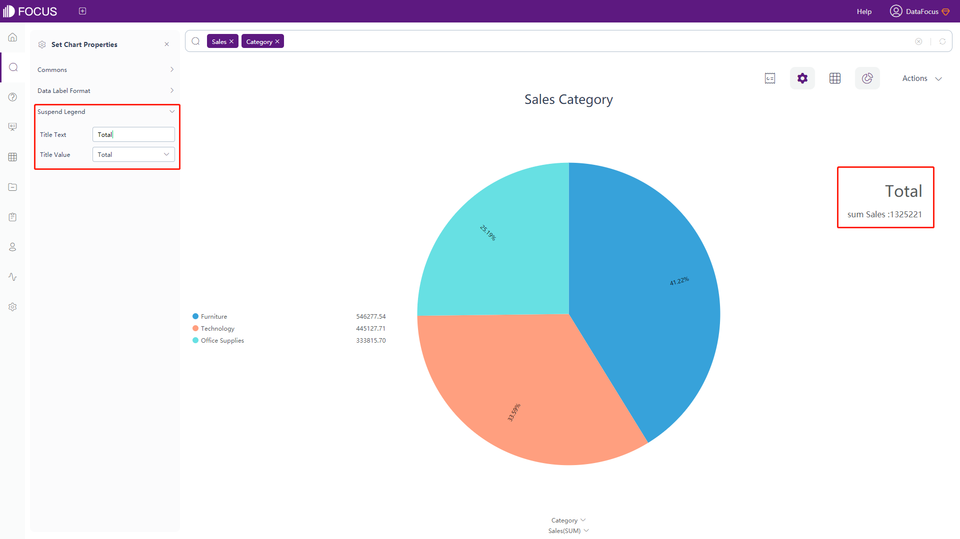
Figure 3-4-23 Pie chart - suspend legend
Ring Chart
-
General Settings
The configuration of “Commons” is the same as part of “Commons” in the pie chart configuration, as shown in figure 3-4-24. For details, please refer to the pie chart configuration.
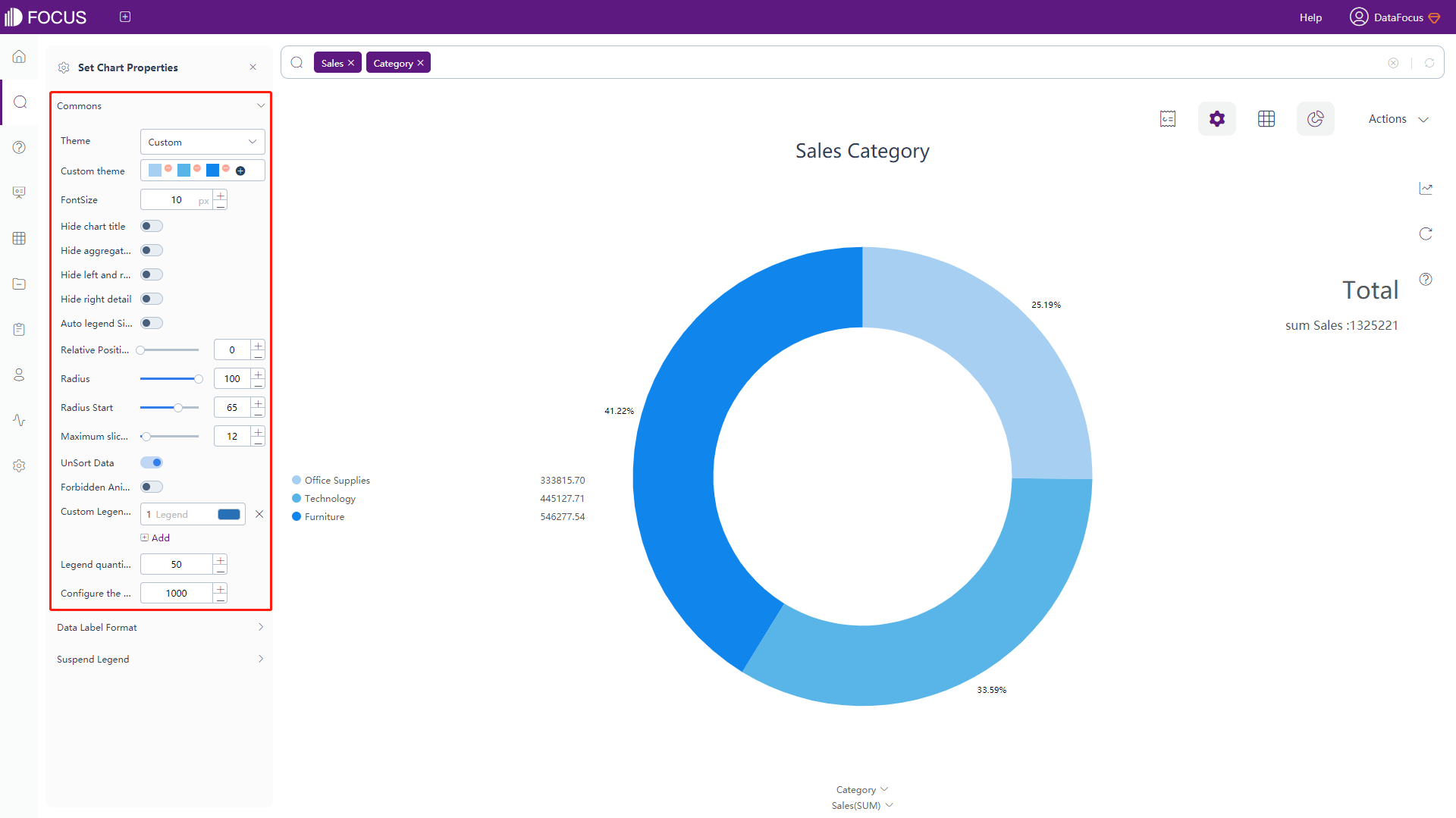
Figure 3-4-24 Ring chart - commons -
The configuration of the data label format and floating legend is exactly the same as the pie chart. For details, please refer to the pie chart configuration.
Scatter Plot
The configuration of the scatter plot is similar to the configuration of the bar chart. For details, please refer to the configuration of the bar chart, as shown in figure 3-4-25.
Funnel Plot
The configuration of the funnel plot is similar to the configuration of the pie chart. For details, please refer to the configuration of the pie chart, as shown in figure 3-4-26.
Bubble Plot
-
The general settings, grid line, data label format, measure scale, attribute scale, floating text, and scale configuration of the bubble plot are basically the same as the configuration of the bar chart. For details, please refer to the configuration of the bar chart.
Among them, the data labels of the bubble plot and the meanings of the macros in the floating text are shown in table 3-6. Adding text after the macros can add additional text information on the basis of the original data labels.
Table 3-6 Bubble plot - text type of data label
Text Type of Data Label Description %_YVALUE Display the value of y %_XVALUE Display the value of x %_SERIES_NAME Display corresponding legend name %_SERIES_NUMBER Display corresponding legend order %_SIZE_NAME Display the name of the Attribute %_SIZE_VALUE Display original values of each corresponding bubble %_COLUMN_N Display the value of column N %_BR Newline character -
Bubble Range
As shown in figure 3-4-27, click the “Bubble Range” button under the chart configurations, and the interface will pop up. In this interface, you can set the size of the bubbles.
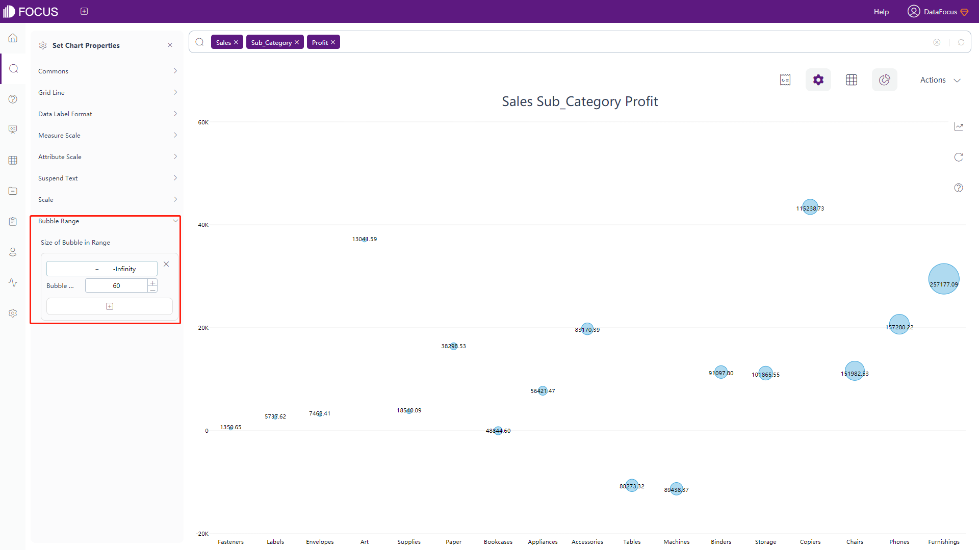
Figure 3-4-27 Bubble plot - bubble range
New Bubble Plot
-
The general settings, data label format, floating text configuration of the bubble plot is basically the same as the configuration of the bar chart. For details, please refer to the configuration of the bar chart.
Among them, the data labels of the new bubble plot and the meanings of the macros in the floating text are shown in table 3-7. Adding text after the macros can add additional text information on the basis of the original data labels.
Table 3-7 New bubble plot - text type of data label
Text Type of Data Label Description %_VALUE Display the original value %_XNAME Display the name of x-axis %_YNAME Display the name of y-axis %_COLUMN_N Display the value of column N %_BR Newline character -
Grid Line
Click the “Grid Line” button under the chart configurations, and the interface will pop up, as shown in figure 3-4-28. In this interface, you can set the color and width of the grid line.
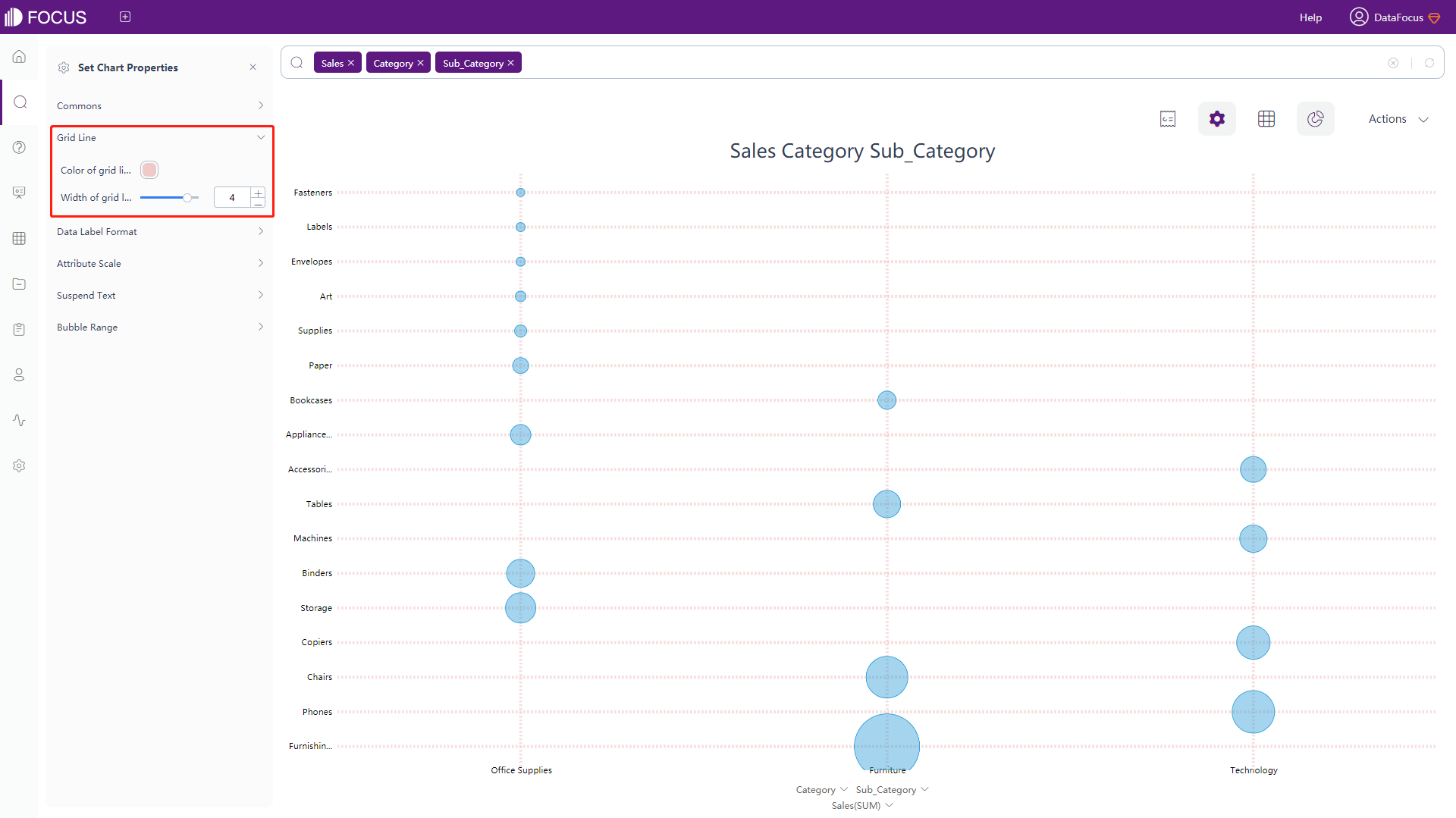
Figure 3-4-28 New bubble plot - grid line -
Attribute Scale
Click the “Attribute Scale” button under the chart configurations, and the interface will pop up, as shown in figure 3-4-29. In this interface, you can set the maximum height and width of the scale occupying the drawing area, scale spacing, and scale rotation angle of x-axis and whether to display x-axis on the top of the page.
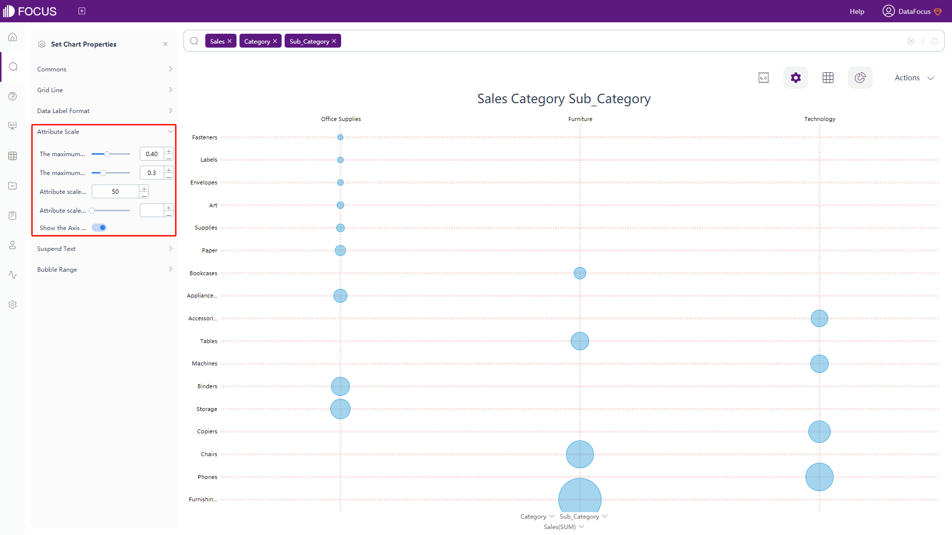
Figure 3-4-29 New bubble plot - scale -
Bubble Range
As shown in figure 3-4-30, click the “Bubble Range” button under the chart configurations, and the interface will pop up. In this interface, you can set the minimum, maximum radius and the transparency of the bubbles.
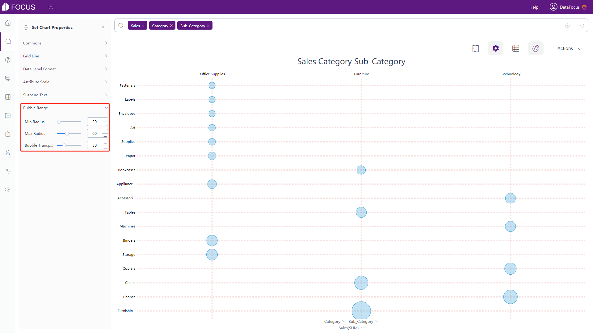
Figure 3-4-30 New bubble plot - bubble range
Stacked Bar Chart
The configuration is similar to most of the bar chart configuration, please refer to the bar chart configuration for details. The differences:
-
General Settings
There is a “Remove Stack Interactivity” button, which can control whether to display the interaction between columns, as shown in figure 3-4-31. Note that only columns with same values can show the difference.
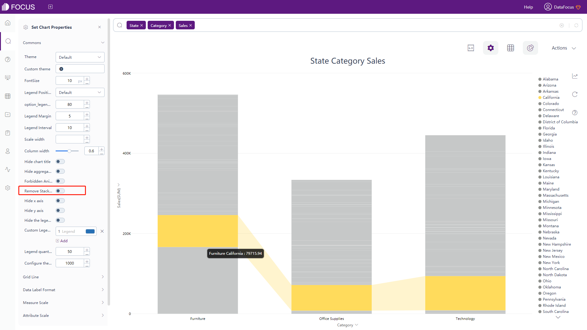
Figure 3-4-31 New bubble plot - commons -
Measure Scale
Click the “Measure Scale” button under the chart configurations, and the interface will pop up, as shown in figure 3-4-32. In this interface, you can set whether to display the y-axis as percentage, the format of the left y-axis (there might exist 2 y-axis), and the minimum&maximum value of the measure scale.
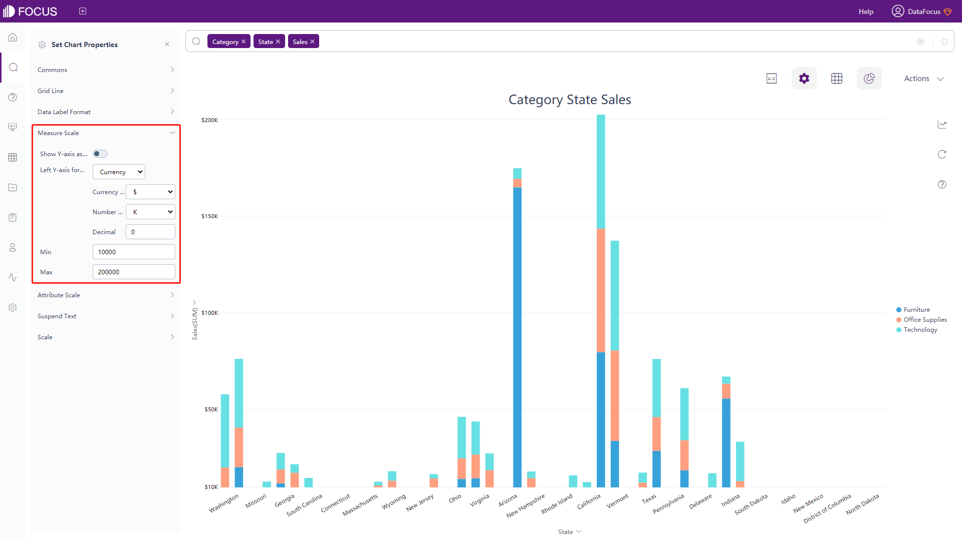
Figure 3-4-32 New bubble plot - measure scale
Horizontal Bar Chart
The horizontal bar chart configuration is the same as the bar chart configuration. Please refer to the bar chart configuration for details, as shown in figure 3-4-33.
Area chart
The configuration of the area chart is the same as that of the stacked bar chart. Please refer to the stacked bar chart for details, as shown in figure 3-4-34.
Pareto Chart
The Pareto chart configuration is basically the same as the bar chart configuration. For details, please refer to the bar chart configuration, as shown in figure 3-4-35. For the data labels of the Pareto chart, you can set whether the proportion label is displayed.
Matchstick Chart
The Matchstick chart configuration is similar to the bar chart configuration. For details, please refer to the bar chart configuration, as shown in figure 3-4-36.
Pivot tables
-
General Settings
Click on the “Commons” button under the chart configurations, the following interface will pop up, as shown in figure 3-4-37. In this interface, you can set font size, height and color of cells, table alignment, font color, name of second left header, heatmap mode (the same as table properties) and the number of search records (default 1000). Also, you can set whether to display the color formatting, to expand index, to display negative number as the form of (number), to color negative numbers red, to hide the headers, and to hide aggregation method. Note that you need to hide the name of the second left header to rename it.
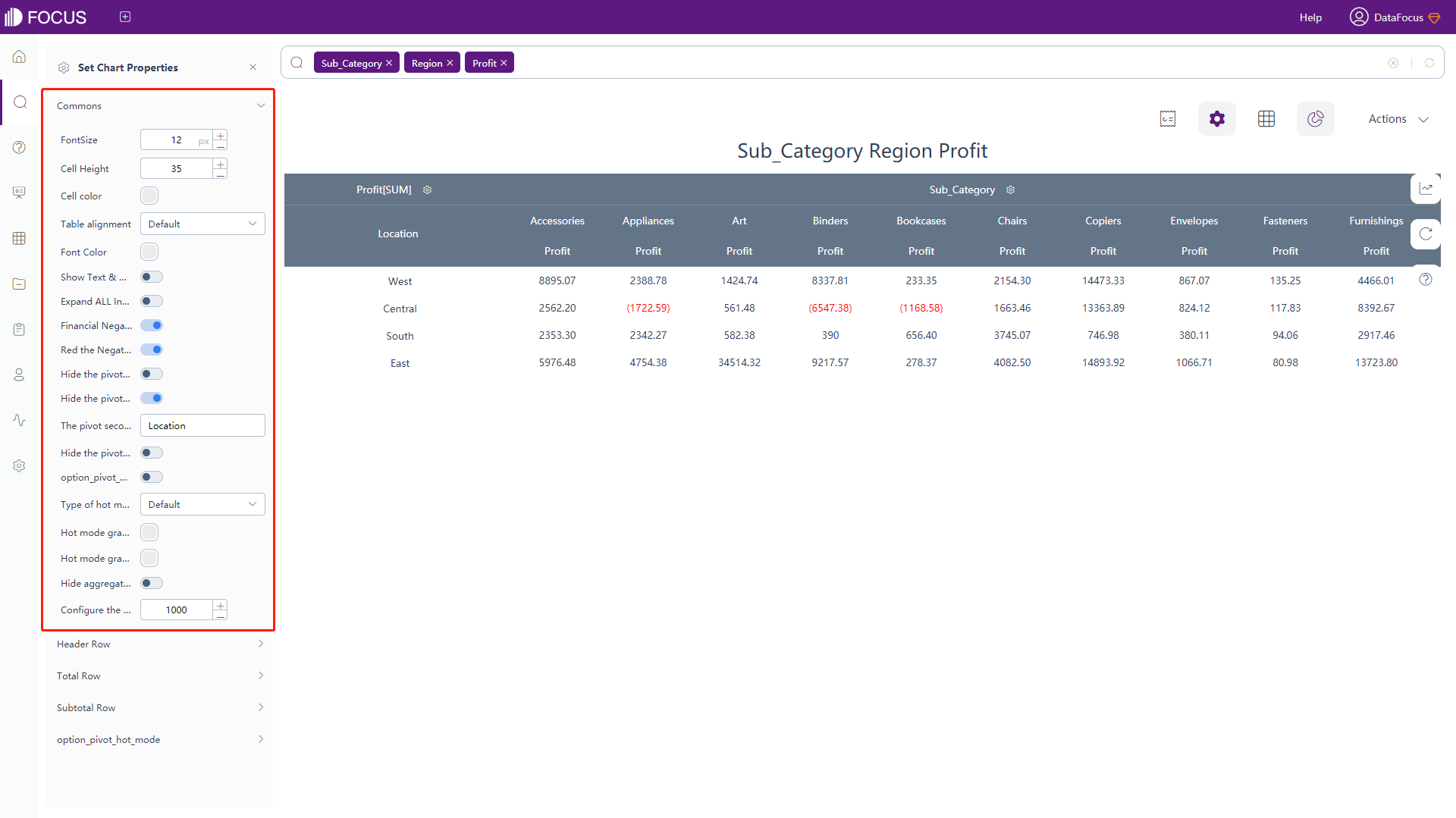
Figure 3-4-37 Pivot table configuration -
The configuration of header row, total row and heatmap mode is similar to the table properties configuration. For details, please refer to the configuration of table properties.
-
Subtotal Row
Click the “Subtotal Row” button under the chart configurations, and the interface will pop up, as shown in figure 3-4-38. In this interface, you can set whether to show subtotal, to display the subtotal as the percentage of the total column. Also, you can set the name, shading color, font color and font style of the subtotal row.
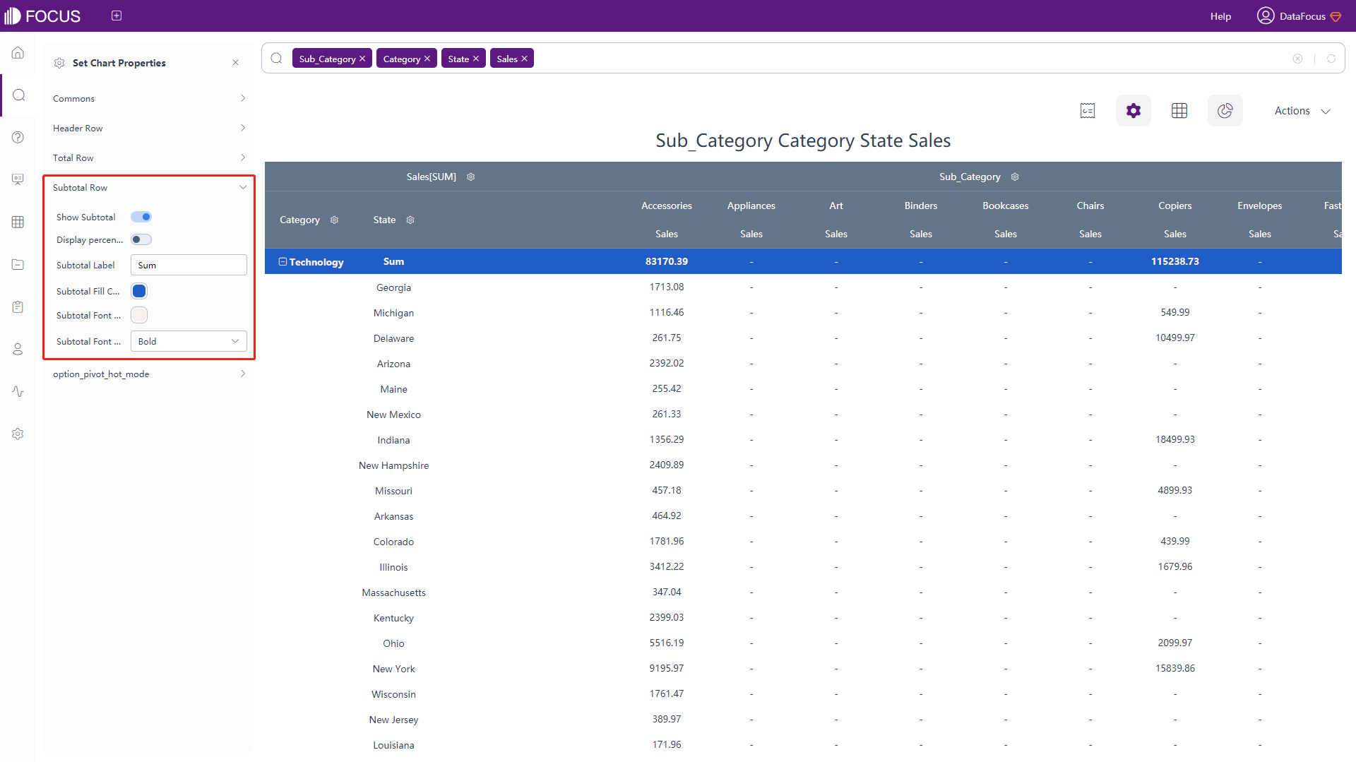
Figure 3-4-38 Pivot table - subtotal row
Location map
-
Color Configuration
Click the “Map Config” under chart configurations, and the interface will pop up, as shown in figure 3-4-39. In this interface, you can set the color mode. When configuring by pole mode, you can select the color of the minimum and maximum value. When configuring by area mode, you can set the interval and select different colors for each interval.
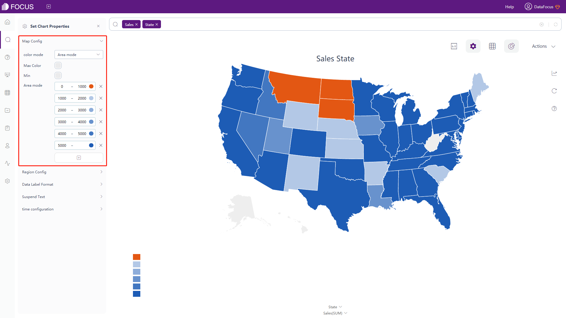
Figure 3-4-39 Location map - map config -
Map Configuration
Click the “Region Config” under chart configurations, and the interface will pop up, as shown in figure 3-4-40. In this interface, you can set color of area without data, color of the border lines, distance of legend from bottom, whether to hide the legend, whether to display the range of legend, and the position as well as the direction of the legend.
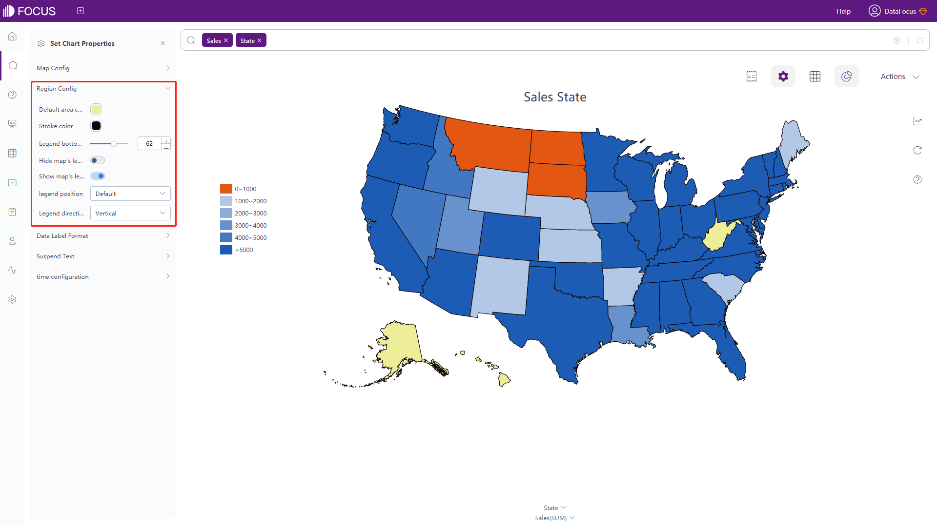
Figure 3-4-40 Location map - region config -
Data Label Format & Suspend Text
The data labels and the meanings of the macros in the floating text are shown in table 3-8. Adding text after the macros can add additional text information based on the original data labels, as shown in figure 3-4-41.
Table 3-8 Location map - text type of data label
Text Type of Data Label Descriptions %_NAME Display the original text %_VALUE Display the original value %_RANK Display the rank of the value %_PERCENT_OF_TOTAL Display the percentage of a specific value to the sum of all values %_COLUMN_N Display the value of column N %_BR Newline character 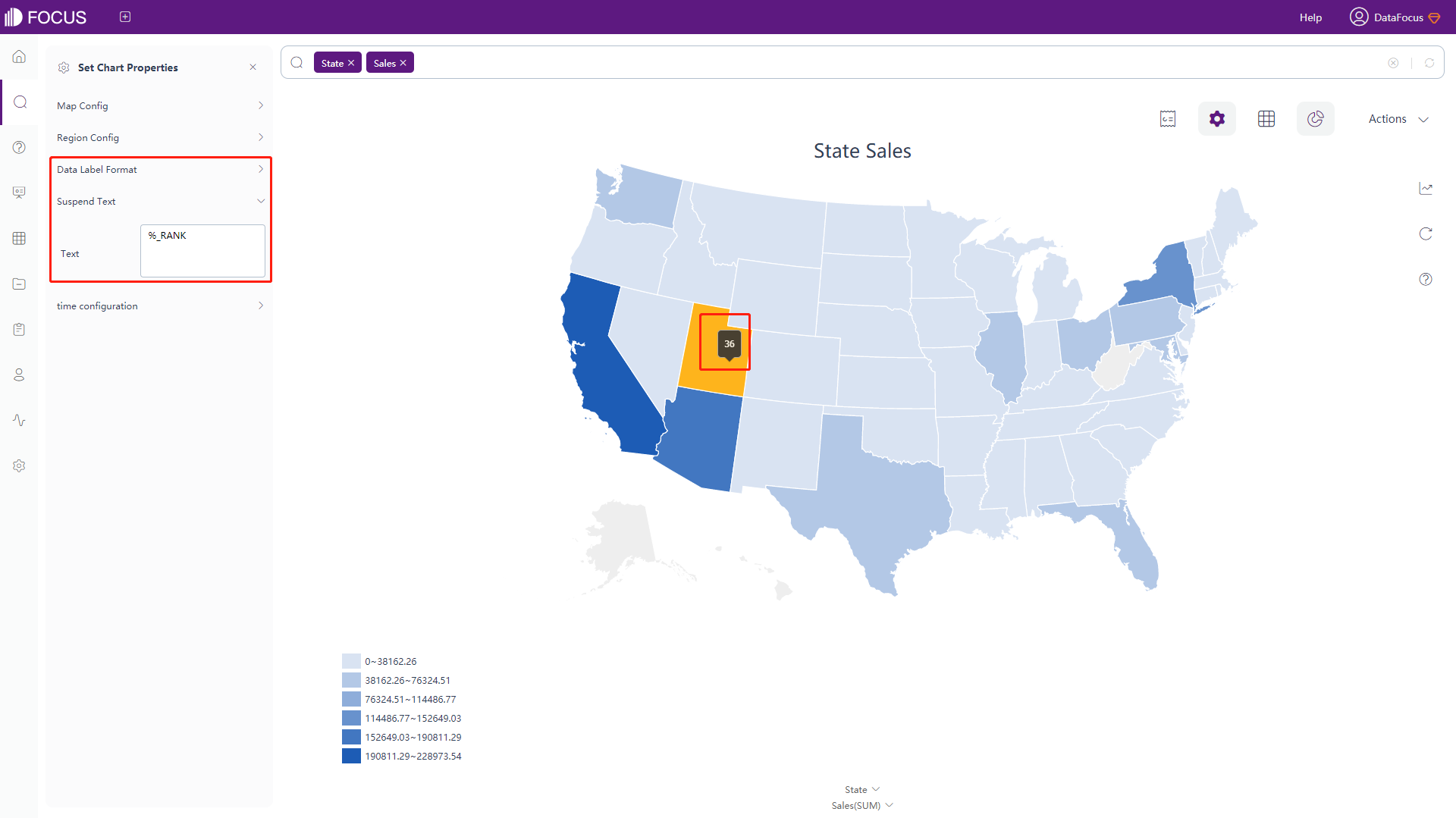
Figure 3-4-41 Location map - data label format & suspend text -
Time Configuration
Click the “Time Configuration” button to pop up the interface, as shown in figure 3-4-42. In this interface, you can set to highlight top n areas in carousel, and the carousal time whose default is 3 seconds.
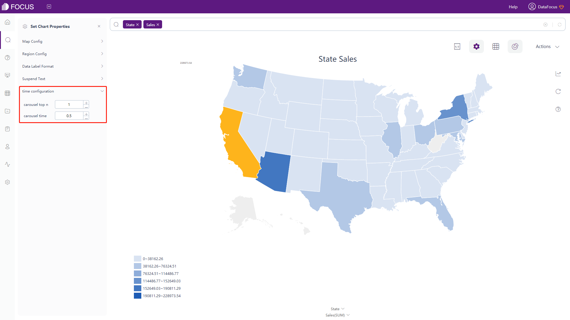
Figure 3-4-42 Location map - time configuration
GIS Location Map
For maps, On the top right corner, there is a message saying “Please contact admin to configure the map access token in the system.”, as shown in figure 3-4-43. Without this configuration, the map displayed is the default one. If configured, users can realize visualization using their own maps.
-
General Settings
Click the “Commons” button under the chart configurations, and the interface will pop up, as shown in figure 3-4-43. In this interface, you can set the theme color, whether to make a continuous map, the minimum zoom scale. Also, you can configure the color of land, water, road, and label of area, and can set the font size, whether to hide the aggregation mode, and the number of search records (default 1000).
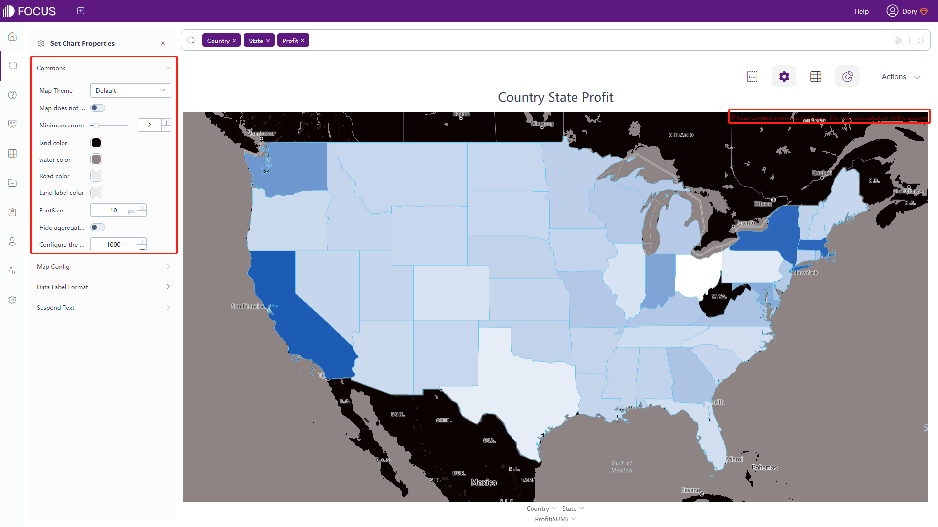
Figure 3-4-43 GIS location map - commons -
Map Configuration
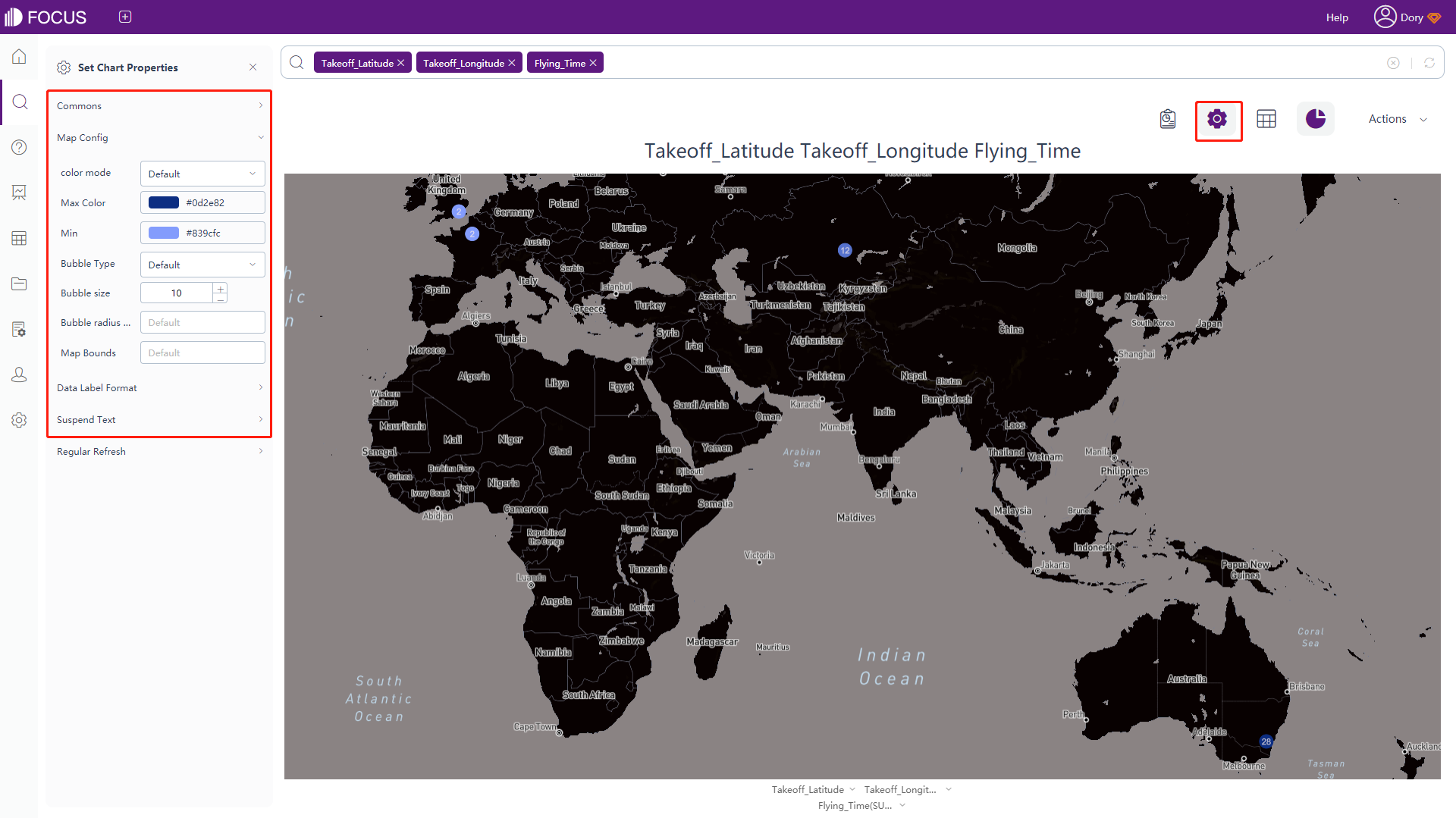
Click the “Map Config” under chart configurations, and the interface will pop up, as shown in figure 3-4-44. In this interface, you can set the color mode. When configuring by pole mode, you can select the color of the minimum and maximum value. When configuring by area mode, you can set the interval and select different colors for each interval.
At the same time, you can set the opacity, the color and width of the outline, the boundary value of the initialized map, and the default country (when there is no country column in the search result, the country to which the current province/state belongs.
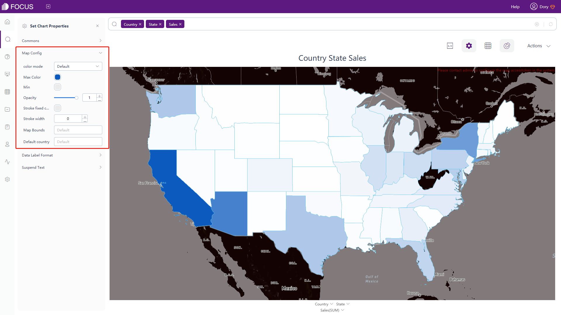
Figure 3-4-44 GIS location map - map config -
The rest of the configuration is basically the same as the configuration of the location map. For details, please refer to the configuration of the location map.
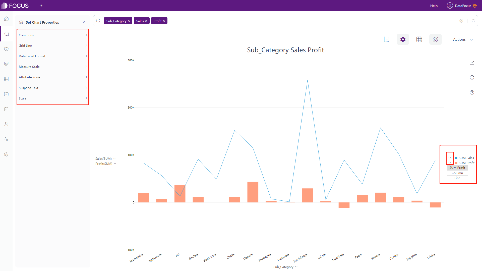
Combination Chart
The configuration in the combination chart is combined with the configuration of the line chart and the bar chart. For details, please refer to the configuration of the bar chart and the line chart. To convert the chart type of a numerical column in the combination chart, you can click the unfold symbol in the legend to modify the graph type(bar/line) of the corresponding column field, as shown in figure 3-4-45.
Gauge Diagram
-
General Settings
Click the “Commons” button under the chart configurations, and the interface will pop up, as shown in figure 3-4-46. In this interface, you can set the theme color, font size, position, width, margin, and interval of legend, whether to display the name and value of the Measure column, size of the name and value of the Measure column, the width and color of the border, whether to hide the title or aggregation method, whether to prohibit animation and the number of search records (default 1000).
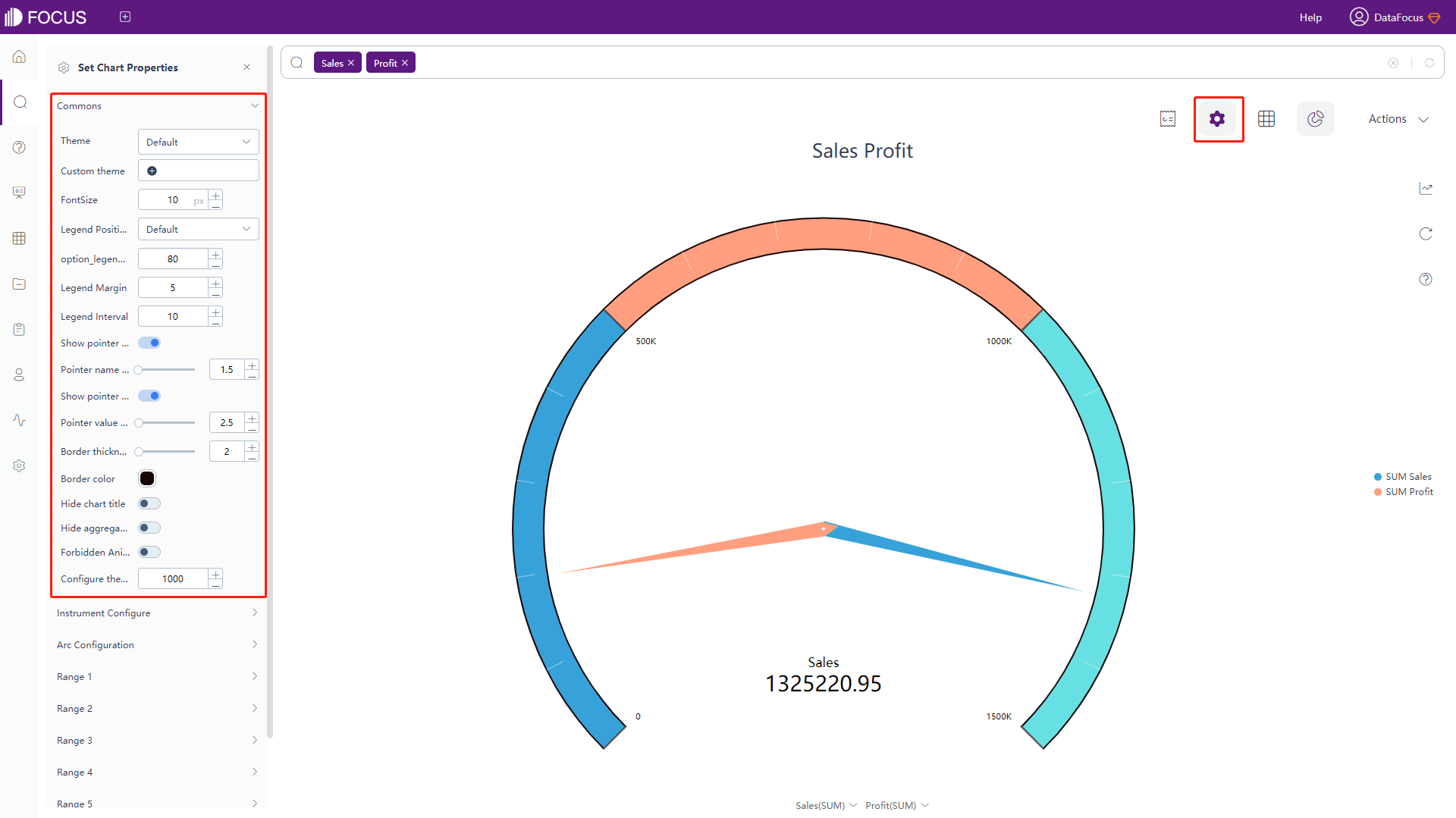
Figure 3-4-46 Gauge diagram - commons -
Gauge Configuration
Click “Instrument Configure” under the chart configurations, as shown in figure 3-4-47, this interface can set the type of the gauge diagram. By default, the color of the graph is divided into 3 types according to the value interval. After selecting “Multiple Title Instrument”, the color is divided according to the number of numerical columns, there are two numerical columns, and the gauge color is divided into two types.
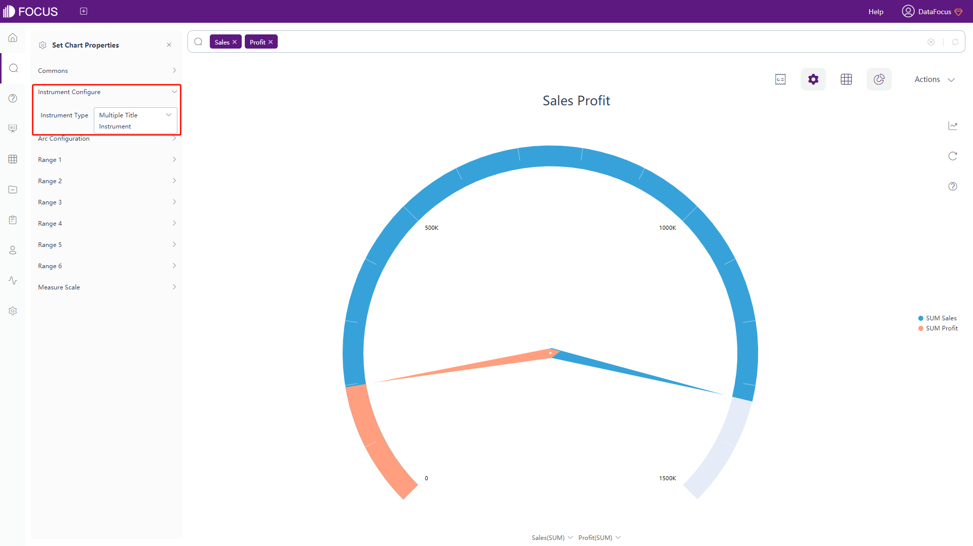
Figure 3-4-47 Gauge diagram - gauge config -
Arc Configuration
Click “Instrument Configure” under the chart configurations, as shown in figure 3-4-48, this interface can set the arc degree (90~360) and the arc width (0.01~0.15).
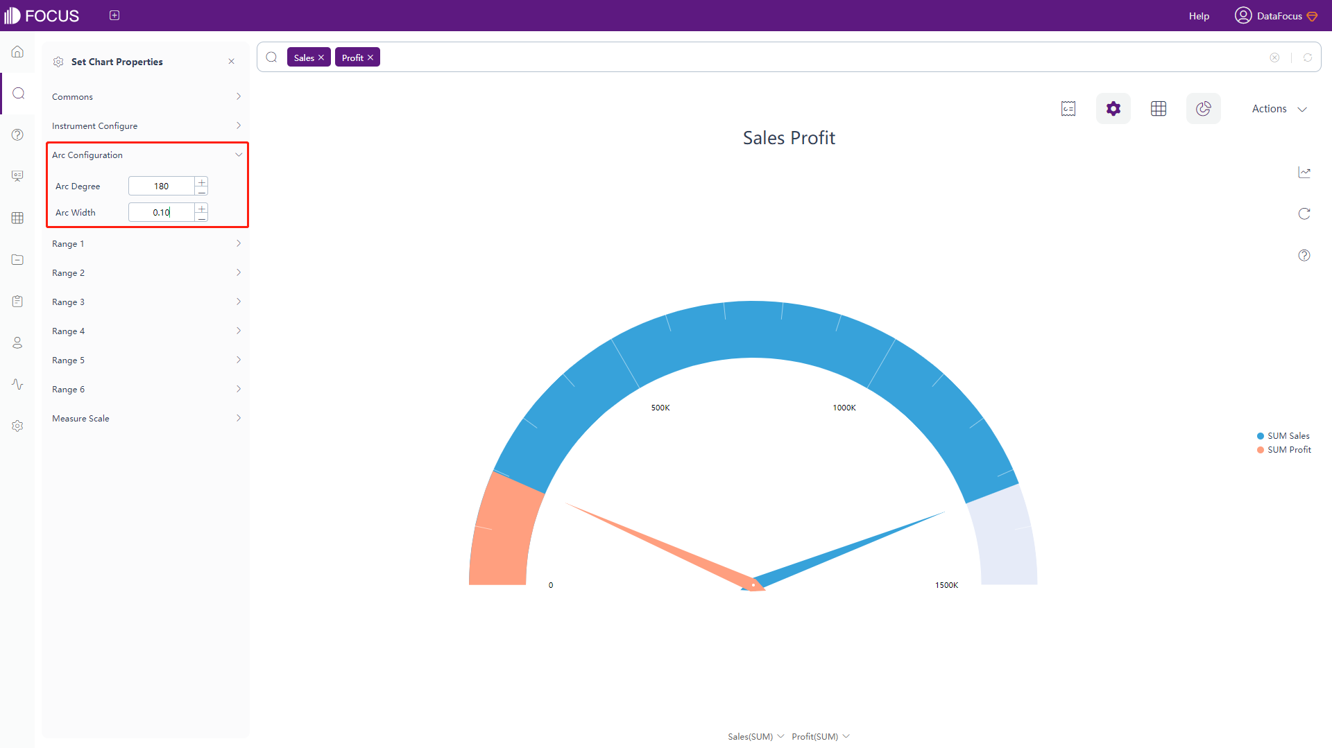
Figure 3-4-48 Gauge diagram - arc config -
Range Configuration
Click “Range 1” under the chart configurations, and an interface will pop up, as shown in figure 3-4-49. In this interface, you can set the numerical range of the gauge and its corresponding displayed color. The dial can be set to 6 numerical ranges at most. Range 2 ~ Range 6 are the same as those of Range 1.
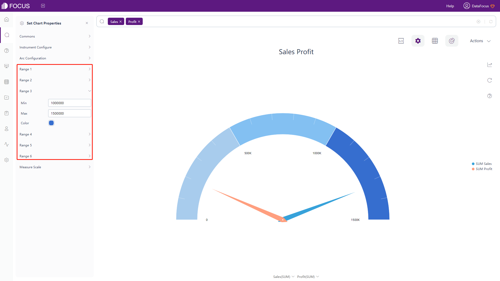
Figure 3-4-49 Gauge diagram - range -
Measure Scale
Click the “Measure Scale” under the chart configurations, and an interface will pop up, as shown in figure 3-4-50. In this interface, you can set the format, the maximum and minimum values of y-axis.

Figure 3-4-50 Gauge diagram - measure scale
Progress Chart
-
General Settings
Click the “Commons” button under the chart configurations, and the interface will pop up, as shown in figure 3-4-51. In this interface, you can set the theme color, font size, width, font size, and shading color of the dial, whether to hide the title or aggregation method, and whether to prohibit animation.
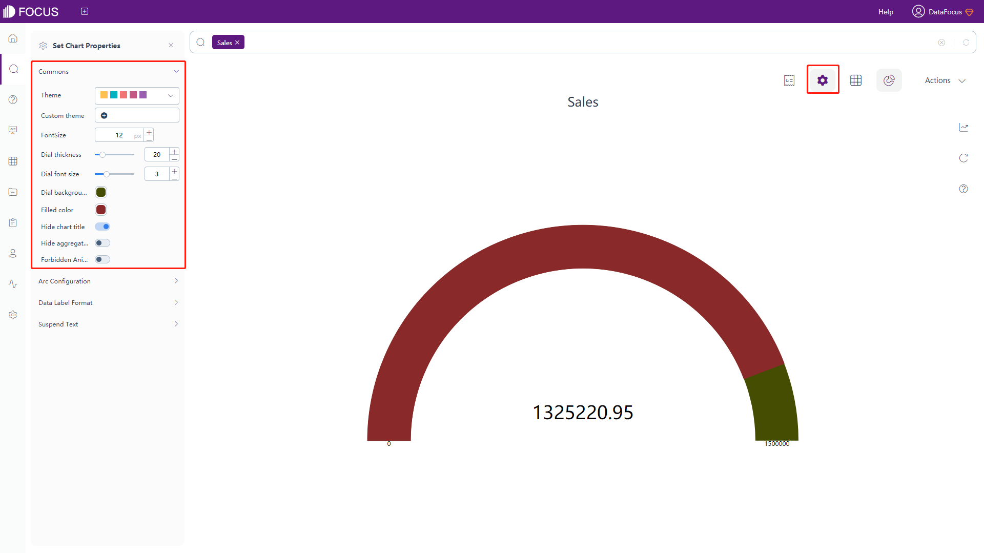
Figure 3-4-51 Progress chart - commons -
Arc Configuration
Click “Arc Configuration” under the chart configurations, as shown in figure 3-4-52, this interface can set the degree (90~360) of arc.
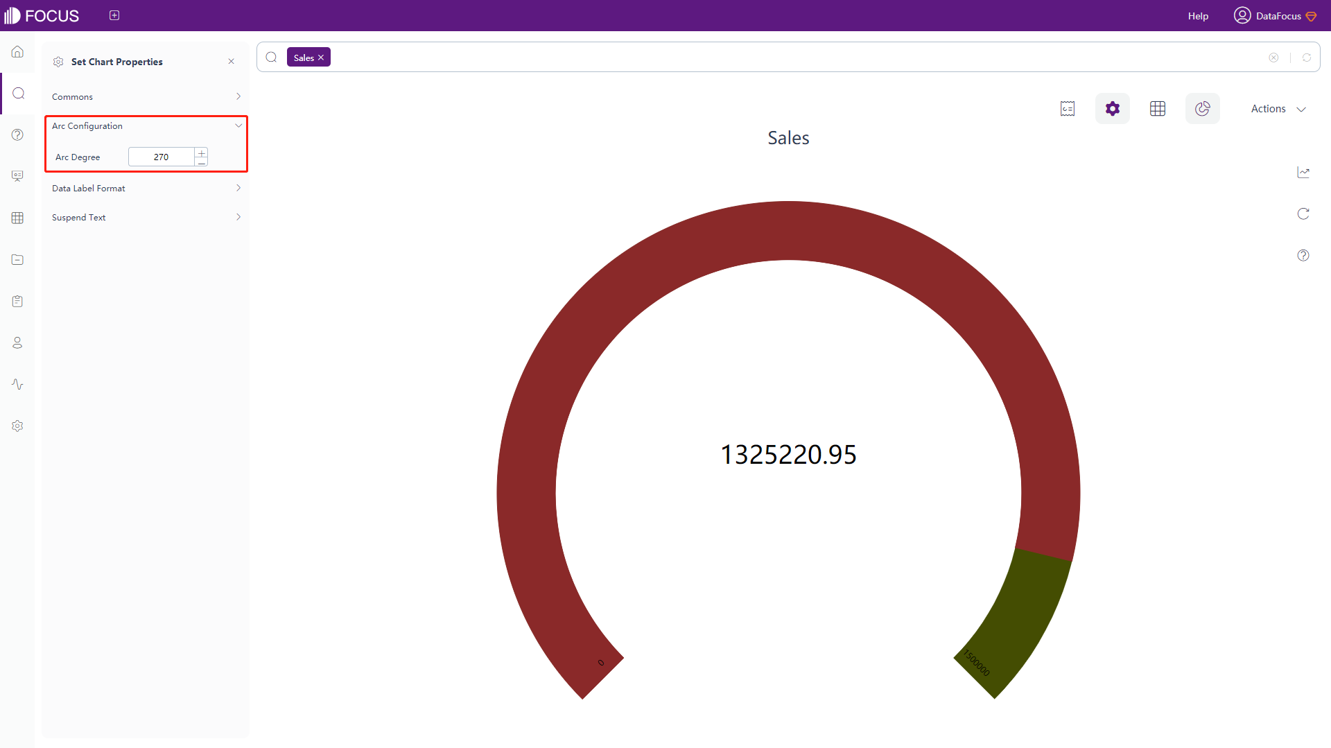
Figure 3-4-52 Progress chart - arc configuration -
Data Label Format & Suspend Text
The data labels and the meanings of the macros in the floating text are shown in table 3-9. Adding text after the macros can add additional text information based on the original data labels, as shown in figure 3-4-53.
Table 3-9 Progress chart - text type of data label
Text Type of Data Label Description %_VALUE Display the original value %_PERCENT Display the percentage of current value to target %_TARGET Display the target value %_COLUMN_N Display the value of column N %_BR Newline character 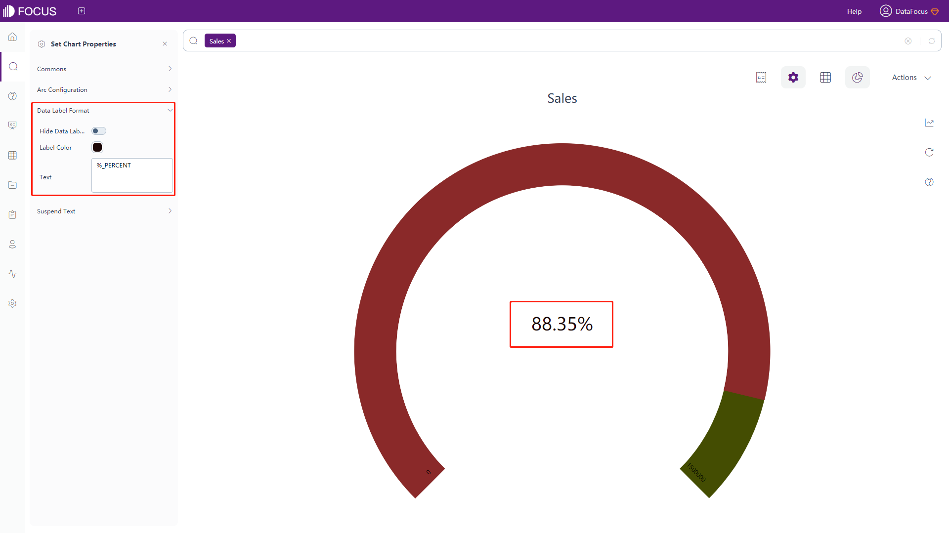
Figure 3-4-53 Progress chart - data label format & suspend text
Water-Level Chart
-
General Settings
Click the “Commons” button under the chart configurations, and the interface will pop up, as shown in figure 3-4-54. In this interface, you can set the theme color, font size, the shape, number, height, and transparency of the wave, the size of the chart, font size of the displayed text, whether to hide the title or aggregation method, and whether to prohibit animation.
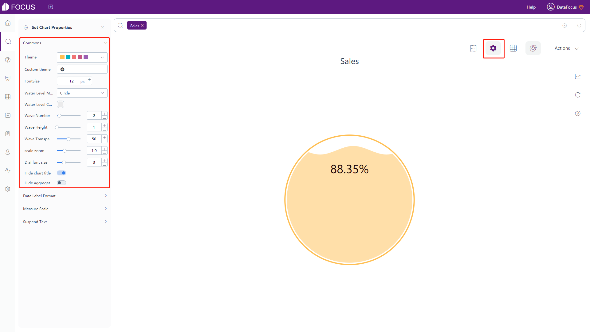
Figure 3-4-54 Water-Level chart - commons -
Measure Scale
Click the “Measure Scale” under the chart configurations, and an interface will pop up, as shown in figure 3-4-55, where the target water level can be set.
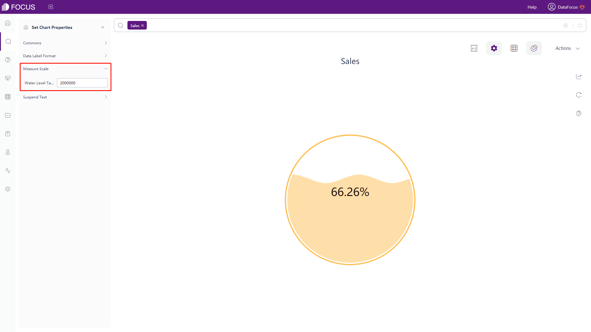
Figure 3-4-55 Water-Level chart - commons -
The data labels and the meanings of the macros in the floating text are the same as the progress chart. For details, please refer to table 3-9.
Digital Flop Chart
-
General Settings
Click the “Commons” button under the chart configurations, and the interface will pop up, as shown in figure 3-4-56. In this interface, you can set whether to hide the title, and animation transition time.
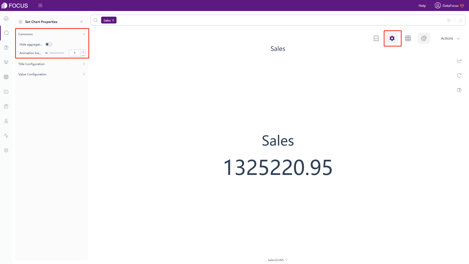
Figure 3-4-56 Digital flop chart - commons -
Title Configuration
Click the “Title Configuration” button under the chart configurations, and the interface will pop up, as shown in figure 3-4-57. The so-called title here is the text right above the values. In this interface, you can set whether to hide the title, and the position, text, size, color, and format of the title, and the distance between title and value.
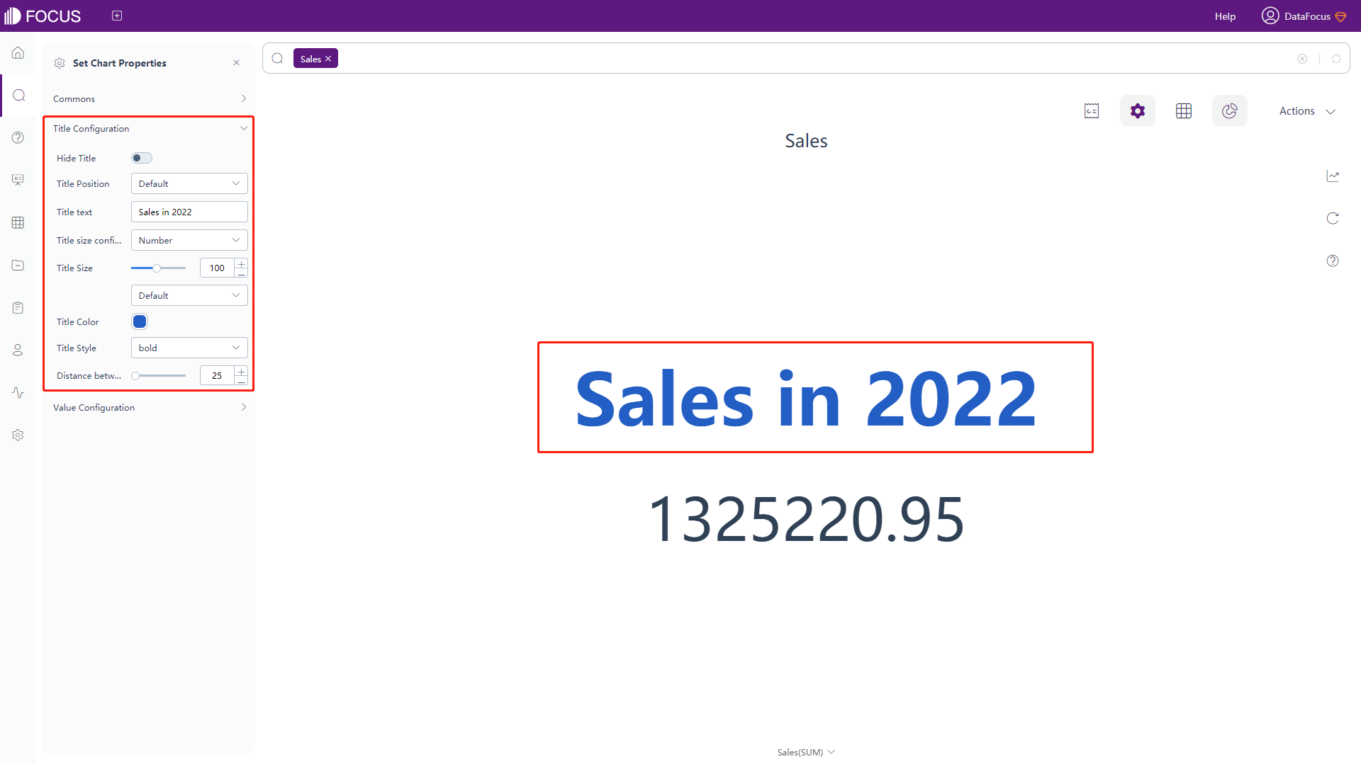
Figure 3-4-57 Digital flop chart - title configuration -
Value Configuration
Click the “Value Configuration” button under the chart configurations, and the interface will pop up, as shown in figure 3-4-58. In this interface, you can set whether to hide the value, and the size, format of the title, the distance between the displayed numbers, the way the displayed numbers split, the color and range of the shading, size and format of prefix as well as suffix.
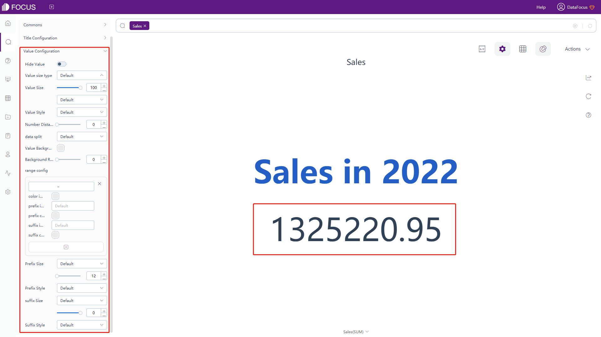
Figure 3-4-58 Digital flop chart - value configuration
Radar map
-
General Settings
Under the chart configurations, click on the “Commons” button, an interface will pop up, as shown in figure 3-4-59. Most of the functions are the same as in the bar chart. For the line chart, what’s special is that you can set the width of the lines.
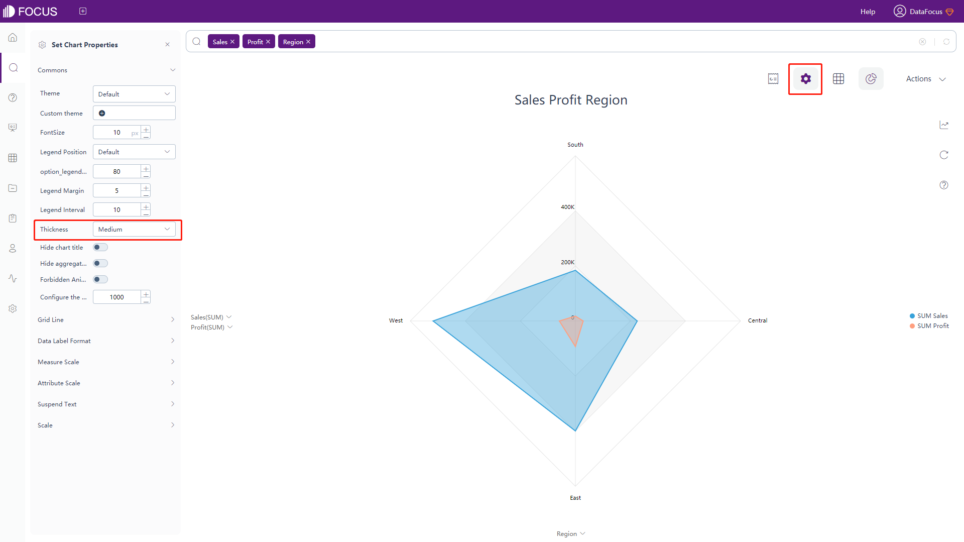
Figure 3-4-59 Radar map - commons -
Attribute Scale
Under the chart configurations, click on the “Attribute Scale” button, an interface will pop up, as shown in figure 3-4-60. In this interface, you can set the distance between the Attribute scale and the nearest grid line.
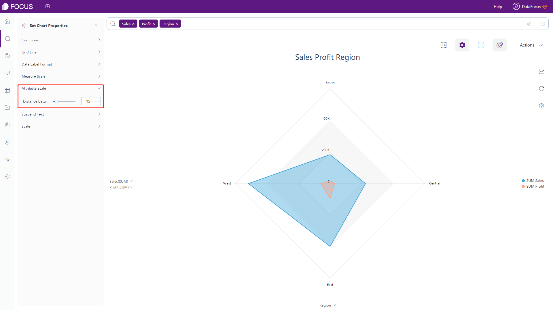
Figure 3-4-60 Radar map - Attribute scale -
Grid line, data label, measure scale, floating text, and scale configuration are consistent with some configurations in the bar chart. Please refer to the bar chart configuration for details.
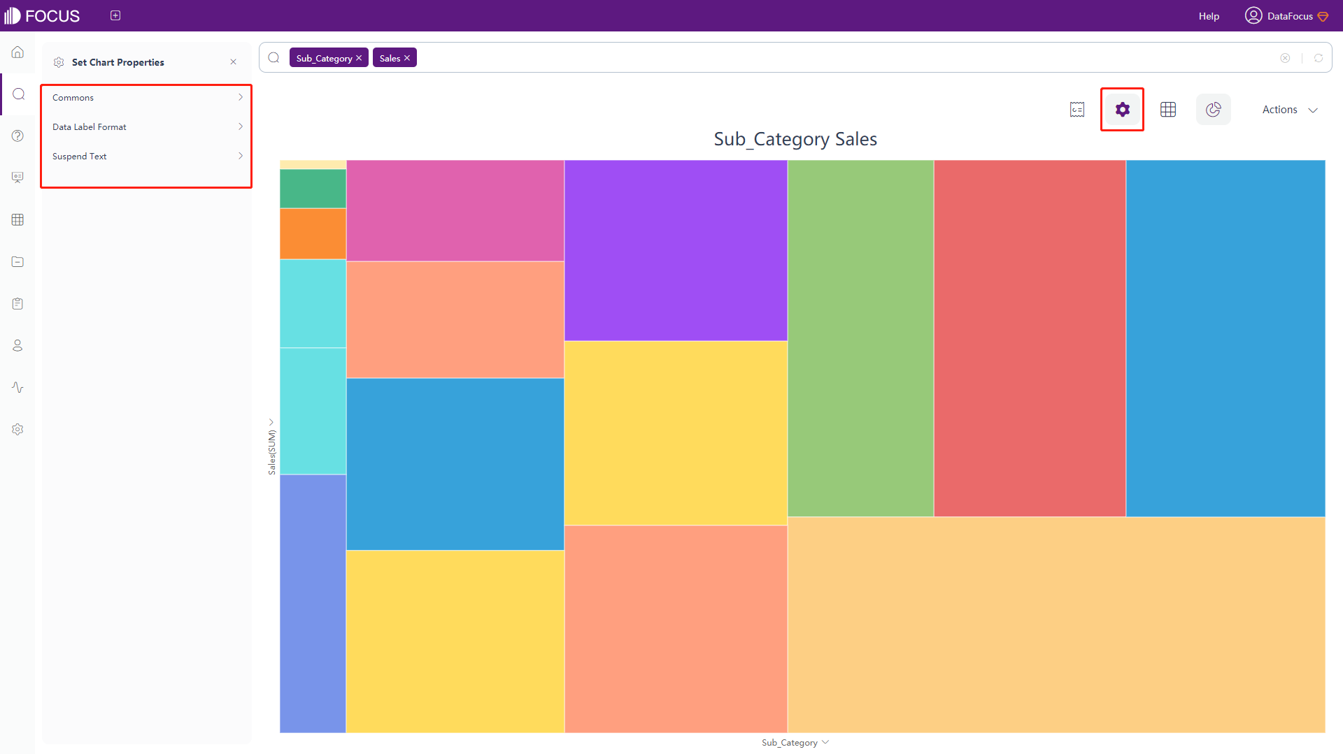
Treemap
As shown in figure 3-4-61 below, the chart configuration of the treemap is the same as part of the bar chart configuration. For details, please refer to the configuration of the bar chart.
Tree Diagram
-
General Settings
Under the chart configurations, click on the “category_chart_general” button, an interface will pop up, as shown in figure 3-4-62. In this interface, you can set theme color, displayed direction (the default is horizontal), whether to cluster context, set size and color of font, set the length, format and color of lines, set color, size, and angle of nodes, set format, width and color of border for each node, set the format, and color of lines, and set format and color of arrows. Note that to use “cluster context”, there needs to be at least 2 Attribute columns excluding the nested columns.
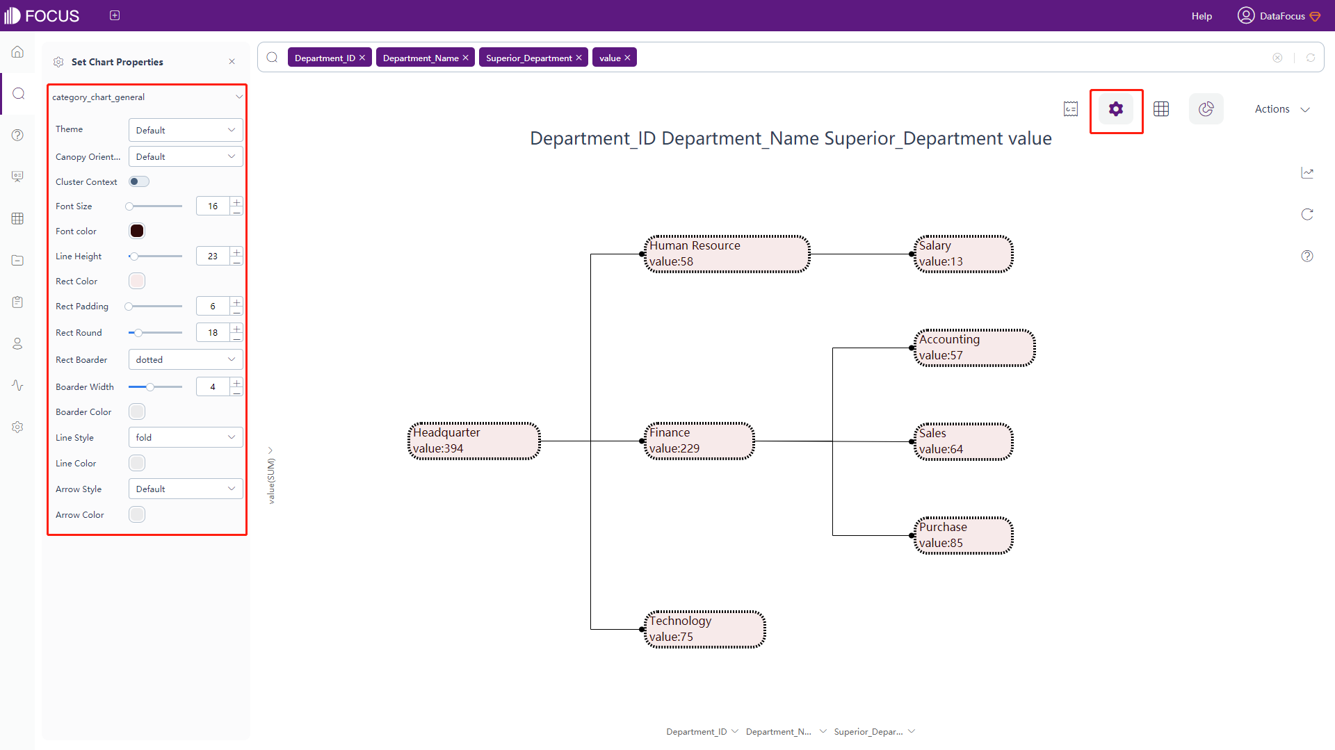
Figure 3-4-62 Tree diagram configuration
Word Cloud
-
The chart configuration of the word cloud is the same as part of the bar chart configuration. For details, please refer to the configuration of the bar chart.
-
Word Cloud Configuration
Under the chart configurations, click on the “Word Cloud Config” button, an interface will pop up, as shown in figure 3-4-63. In this interface, you can set whether to show the result in a specific shape, and choose the shapes, or make it in a text shape.
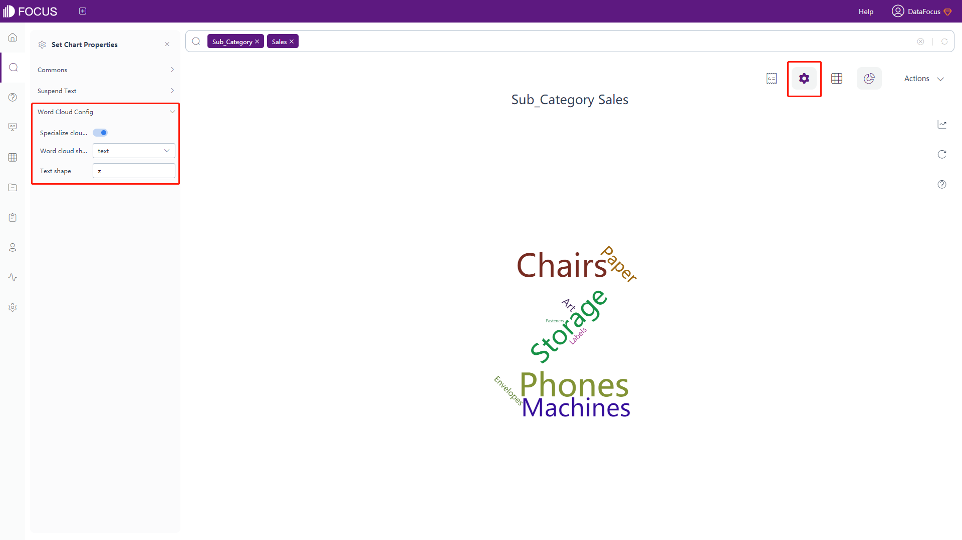
Figure 3-4-63 Word cloud configuration
Waterfall Chart
-
General Settings
Click on “Commons” button under the chart configurations, the interface as shown in figure 3-4-64 will pop up. In this interface, you can set theme color, font size, the width of scale and columns, whether to hide the chart title or the aggregation method, color of rising and descent direction, whether to display a total, the label text and color of the total, the overall direction of the chart (ascending and descending), whether to hide x-axis or y-axis, whether to hide the legend, the color and quantity limit of the legend, and the number of search records.
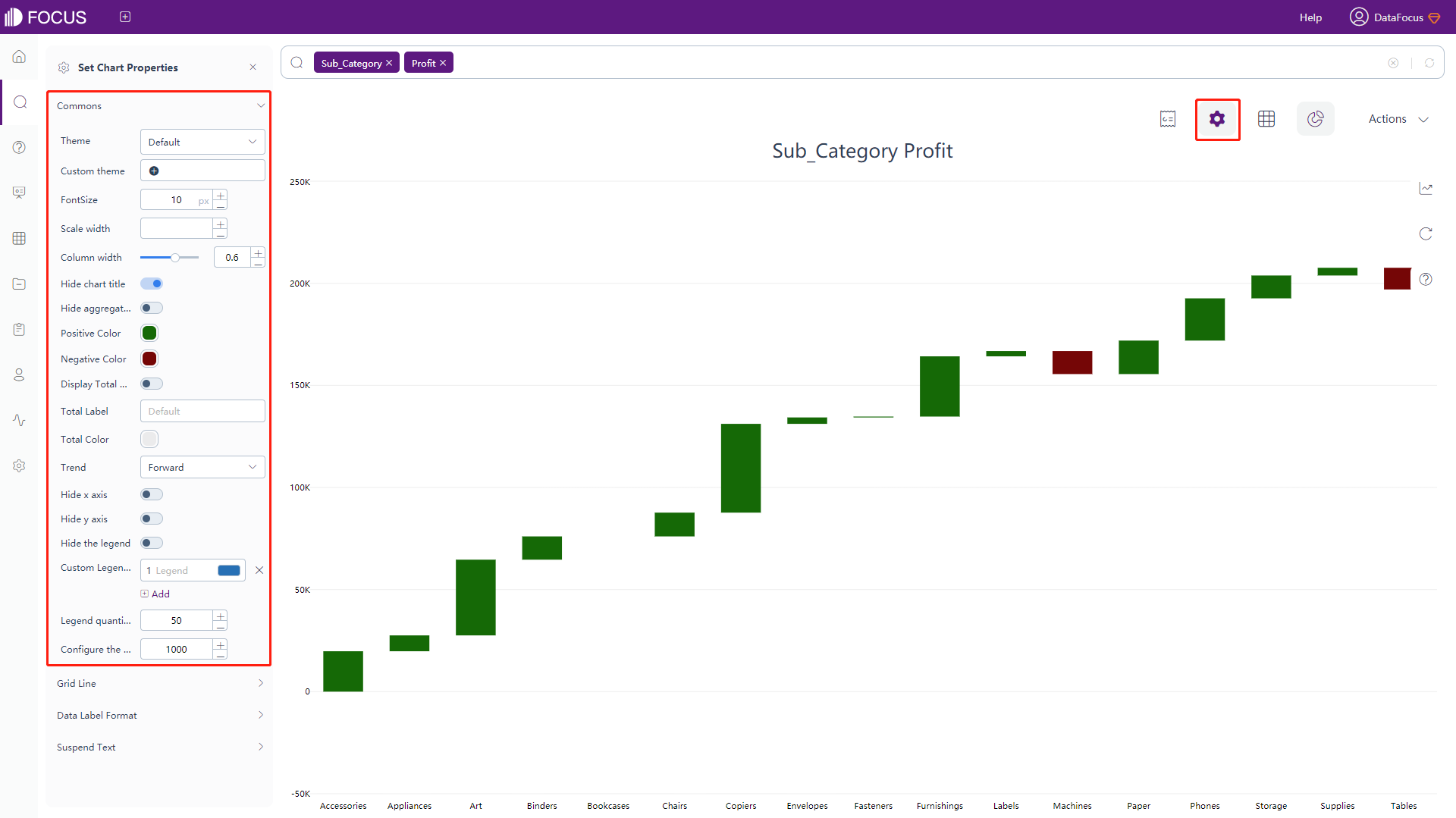
Figure 3-4-64 Waterfall chart - commons -
The configuration of grid line, data label format, and floating text are consistent with some configurations in the bar chart. Please refer to the bar chart configuration for details.
Chord Diagram
-
General Settings
Click the General button under the chart configurations, as shown in the following interface 3-4-65, where you can set the theme color, font size, width of lines and whether to hide chart title or aggregation method, whether to forbid animation, and set the number of search records.
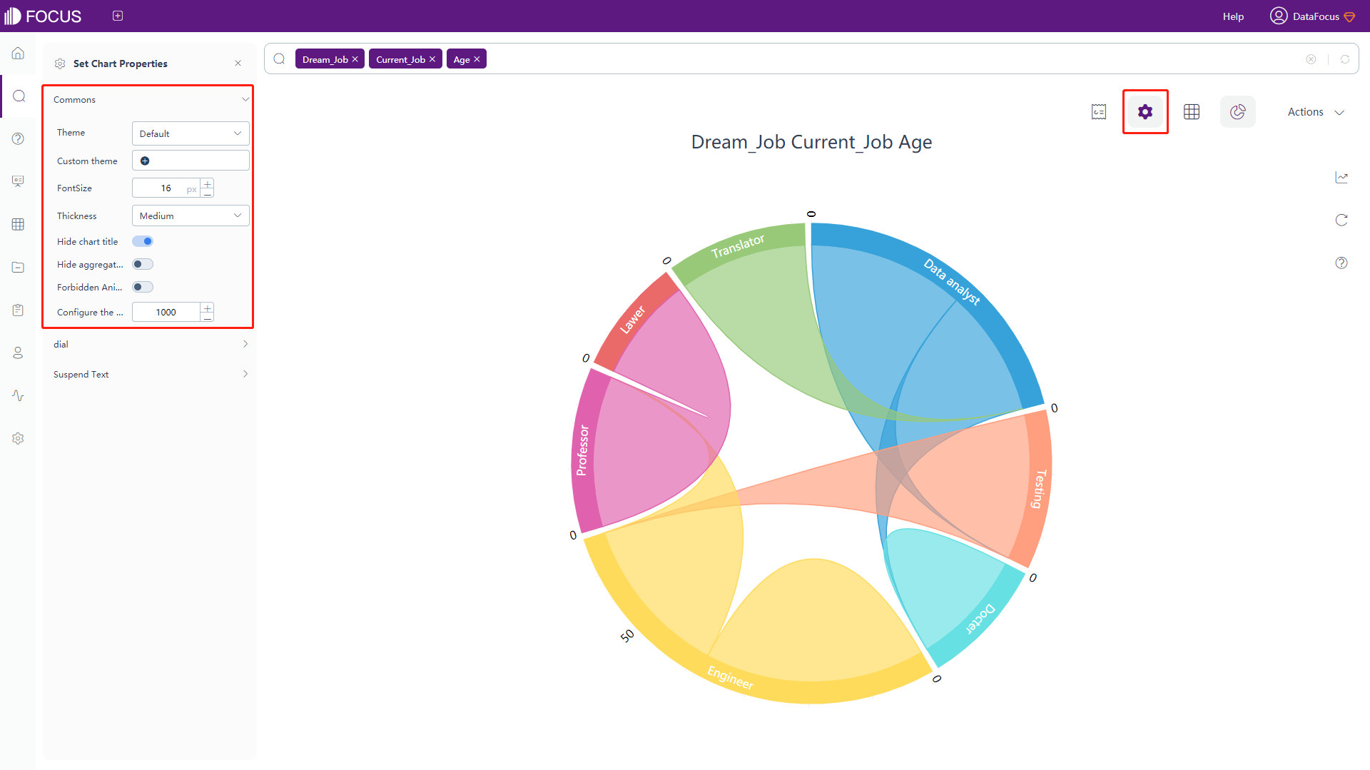
Figure 3-4-65 Chord diagram - commons -
Dial Configuration
Click the “dial” button under the chart configurations, as shown in the following interface 3-4-66, where the dial style can be set.
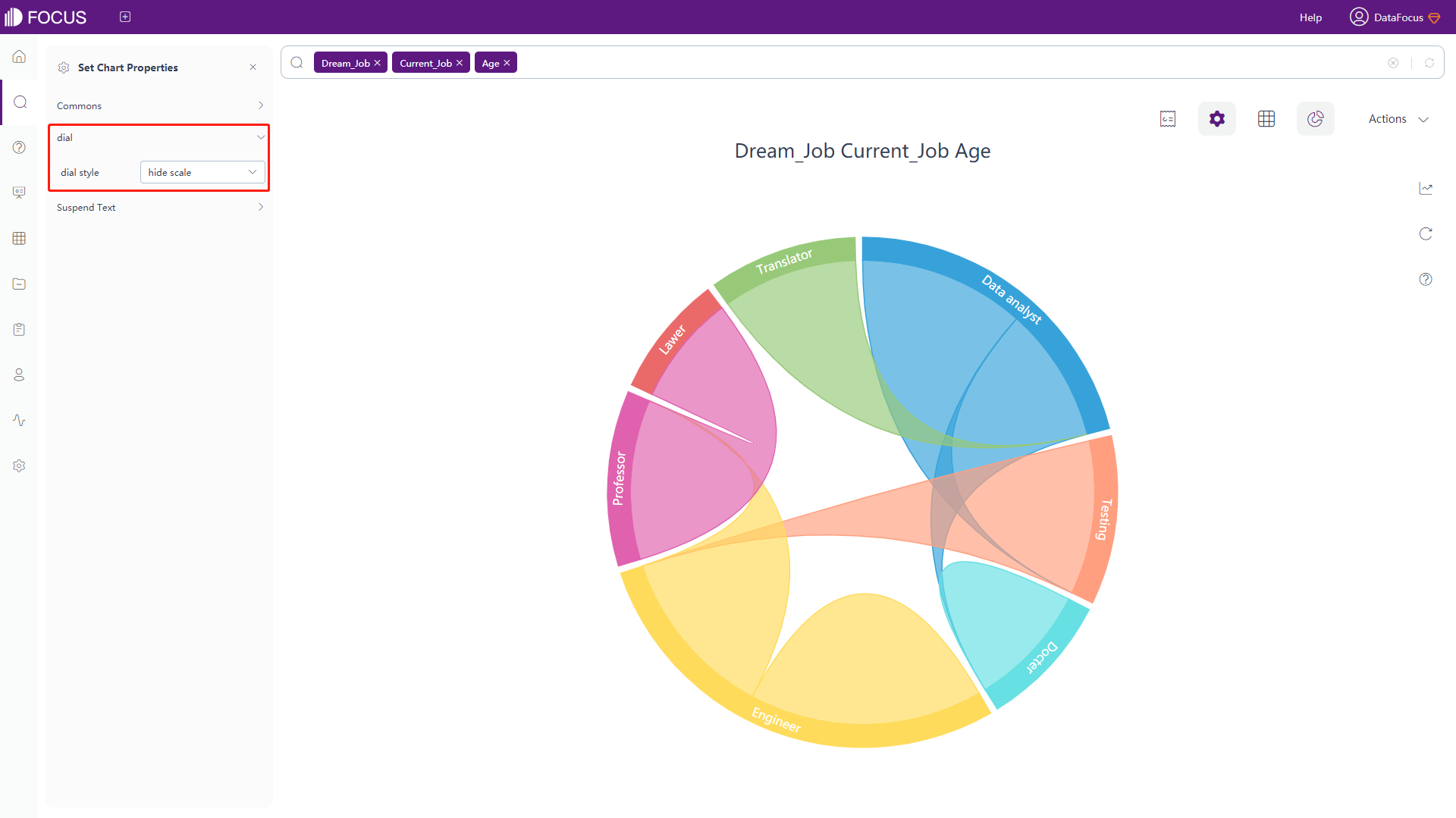
Figure 3-4-66 Chord diagram - dial -
The floating text configuration is consistent with the bar chart configuration, please refer to the bar chart configuration for details.
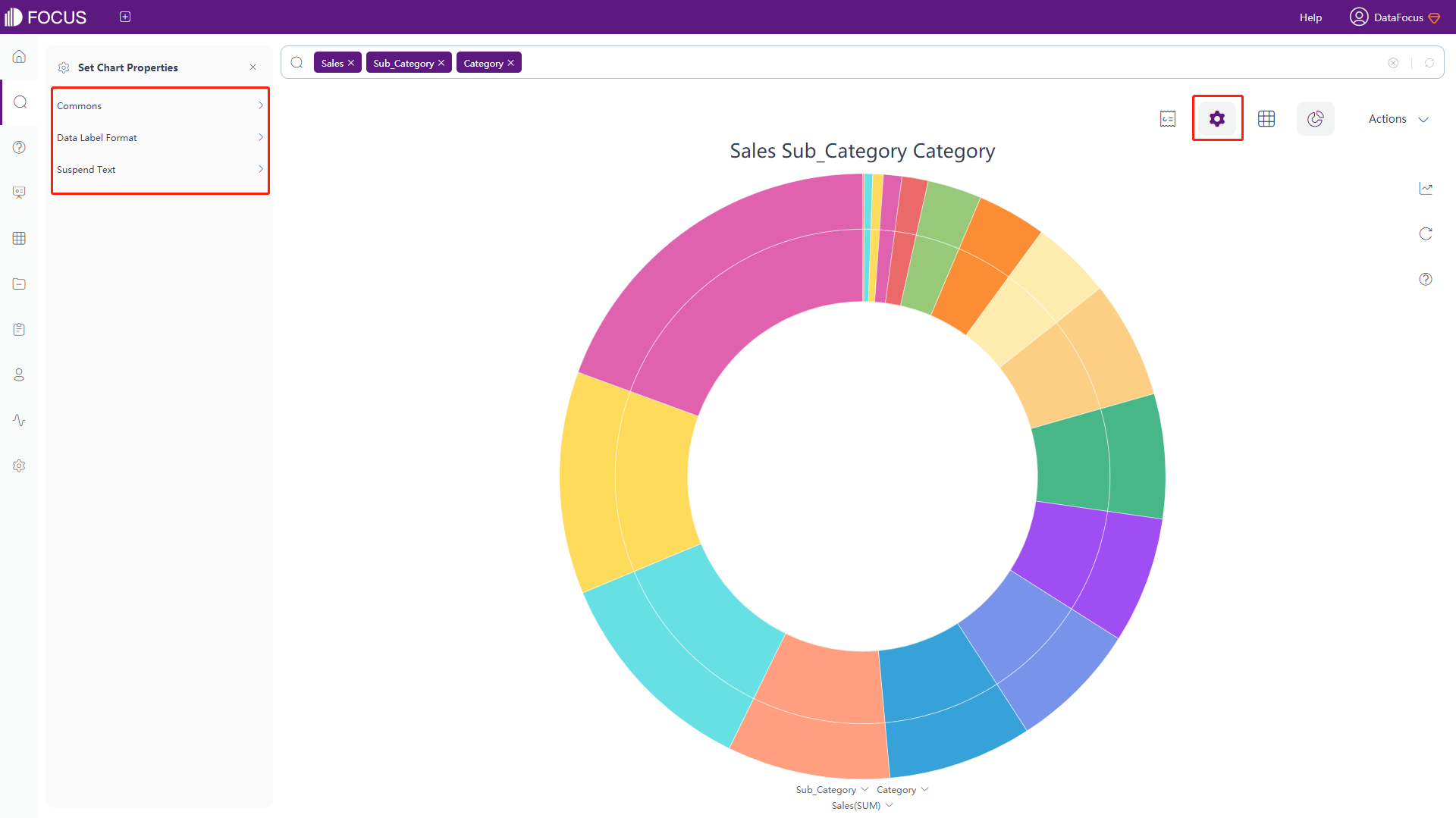
Sunburst Diagram
The chart configuration of the sunburst diagram is consistent with the part of the configuration in the bar chart, as shown in figure 3-4-67 below. Please refer to the bar chart configuration for details.
Package Diagram
The chart configuration of the package diagram is consistent with the part of the configuration in the bar chart, as shown in figure 3-4-68 below. Please refer to the bar chart configuration for details.
Sankey Diagram
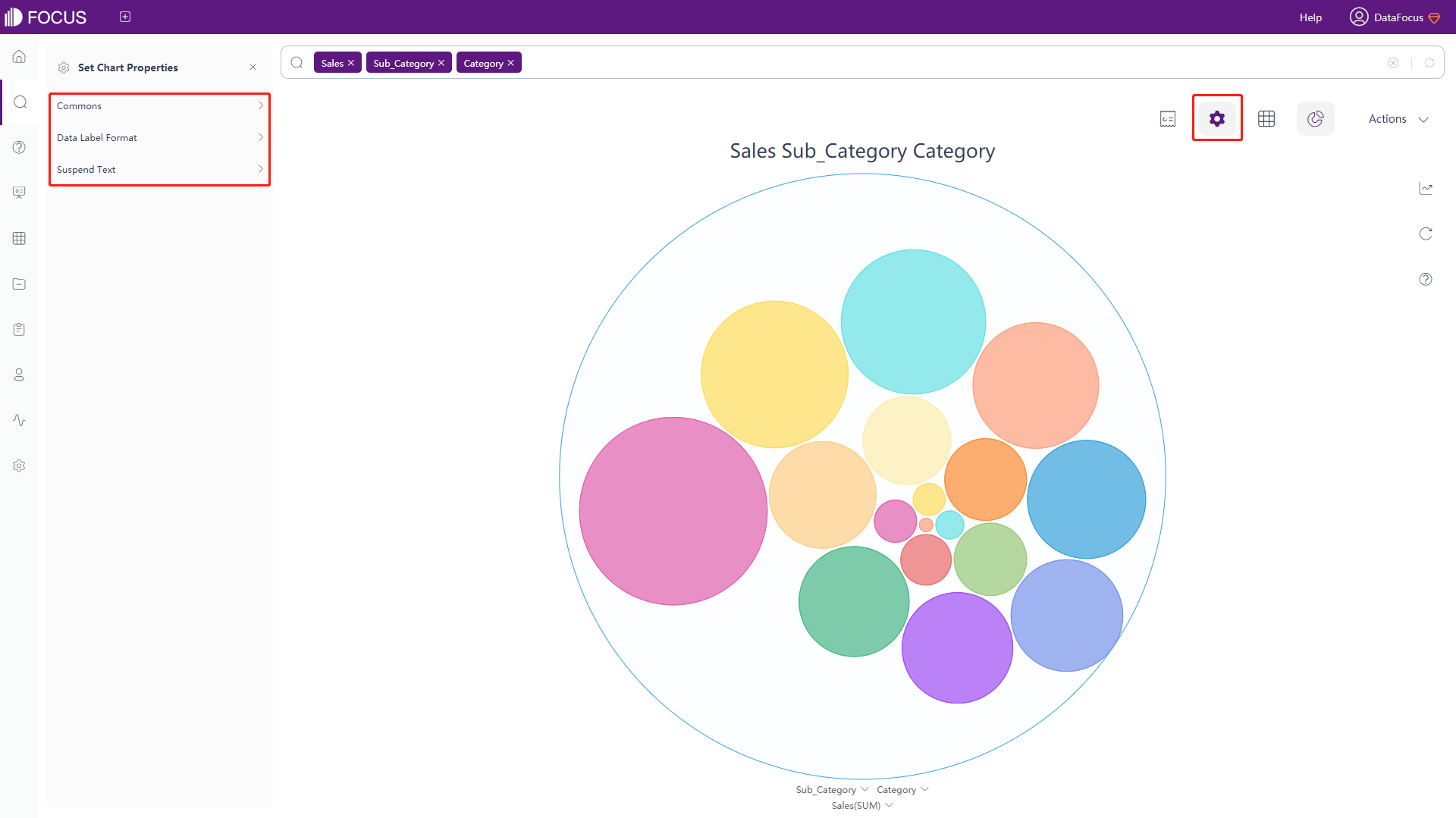
-
General Settings
Click the “Commons” button of the chart configurations to pop up the interface, as shown in figure 3-4-69. In this interface, you can set the theme color, font size, whether to hide the chart title and aggregation method, width of nodes (default 30px) and the number of search records.
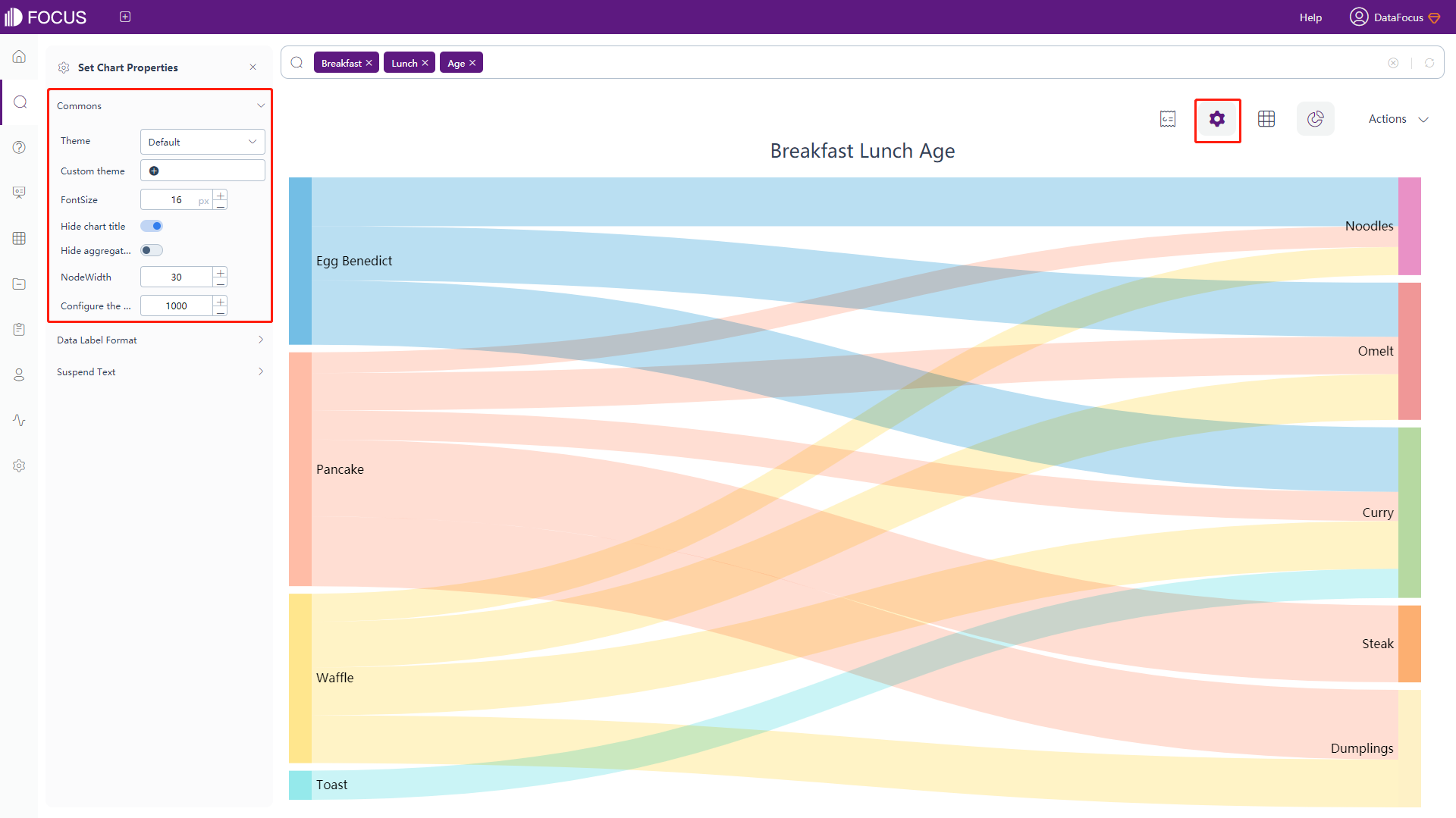
Figure 3-4-69 Sankey diagram - commons -
Data Label Format
Click the “Data Label Format” button of the chart configurations to pop up the interface, as shown in figure 3-4-70. In this interface, you can modify the format of data labels, as in table 3-10.
Table 3-10 Sankey diagram - text type of data label
Text Type of Data Label Descriptions %_NAME Display the Attribute name %_VALUE Display the original value %_BR Newline character 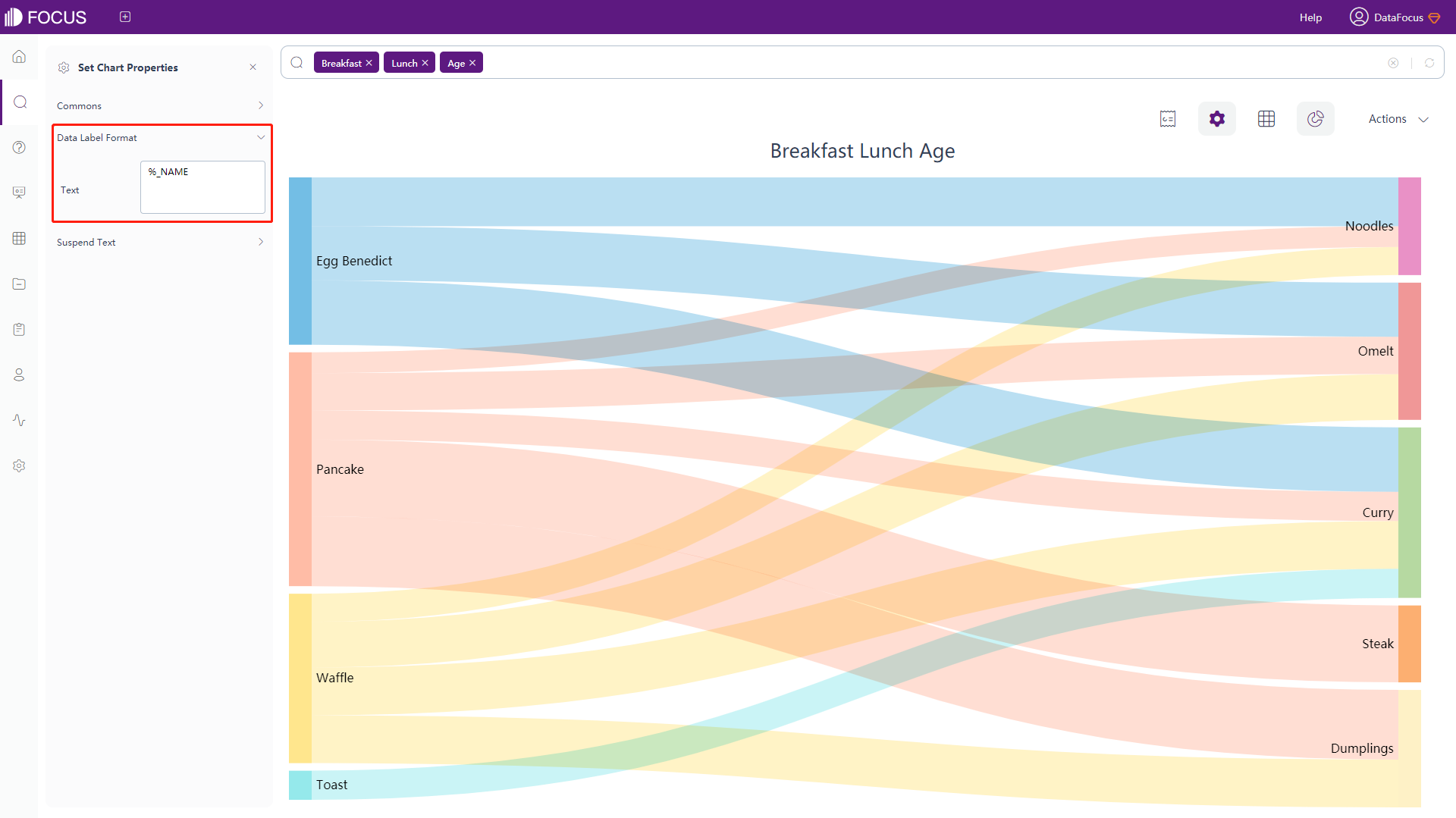
Figure 3-4-70 Sankey diagram - data label format -
Floating Text
Click the “Suspend Text” button of the chart configurations to pop up the interface, as shown in figure 3-4-71. In this interface, you can set the content of the floating text, or enter a defined macro. The defined macro is shown in table 3-11.
Table 3-11 Sankey diagram - descriptions of floating text
Text Type Description %_ SOURCE_NAME Display the name of the source %_ TARGET_NAME Display the name of the target %_ VALUE Display the value of Measure column %_ SOURCE_VALUE Display the sum of the measure value of the source column %_PERCENT_OF_SOURCE Display the percentage of each measure value to the sum of the source value %_ TARGET_VALUE Display the sum of the measure value of the target column %_PERCENT_OF_TARGET Display the percentage of each measure value to the sum of the target value %_BR Newline character 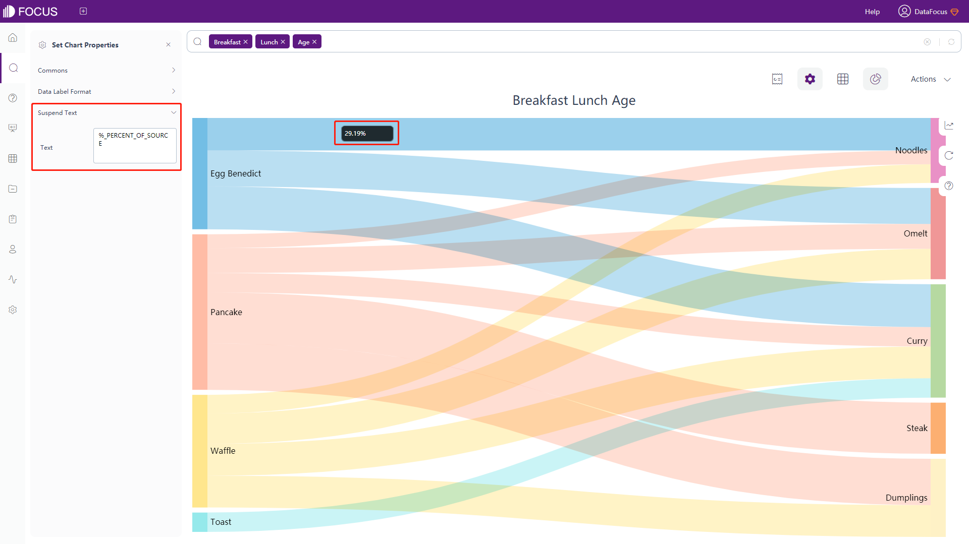
Figure 3-4-71 Sankey diagram - suspend text
Parallel Coordinate Chart
-
General Settings
Click the “Commons” button of the chart configurations to pop up the interface, as shown in figure 3-4-72. In this interface, you can set the font size.
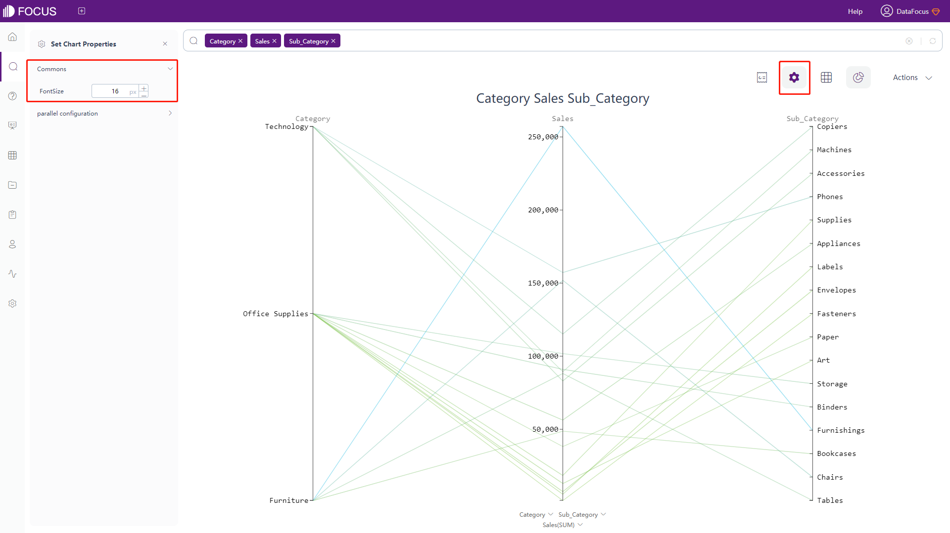
Figure 3-4-72 Parallel coordinate chart - commons -
Parallel Configuration
Click the “parallel configuration” button of the chart configurations to pop up the interface, as shown in figure 3-4-73. In this interface, you can set the color of the minimum as well as the maximum value.
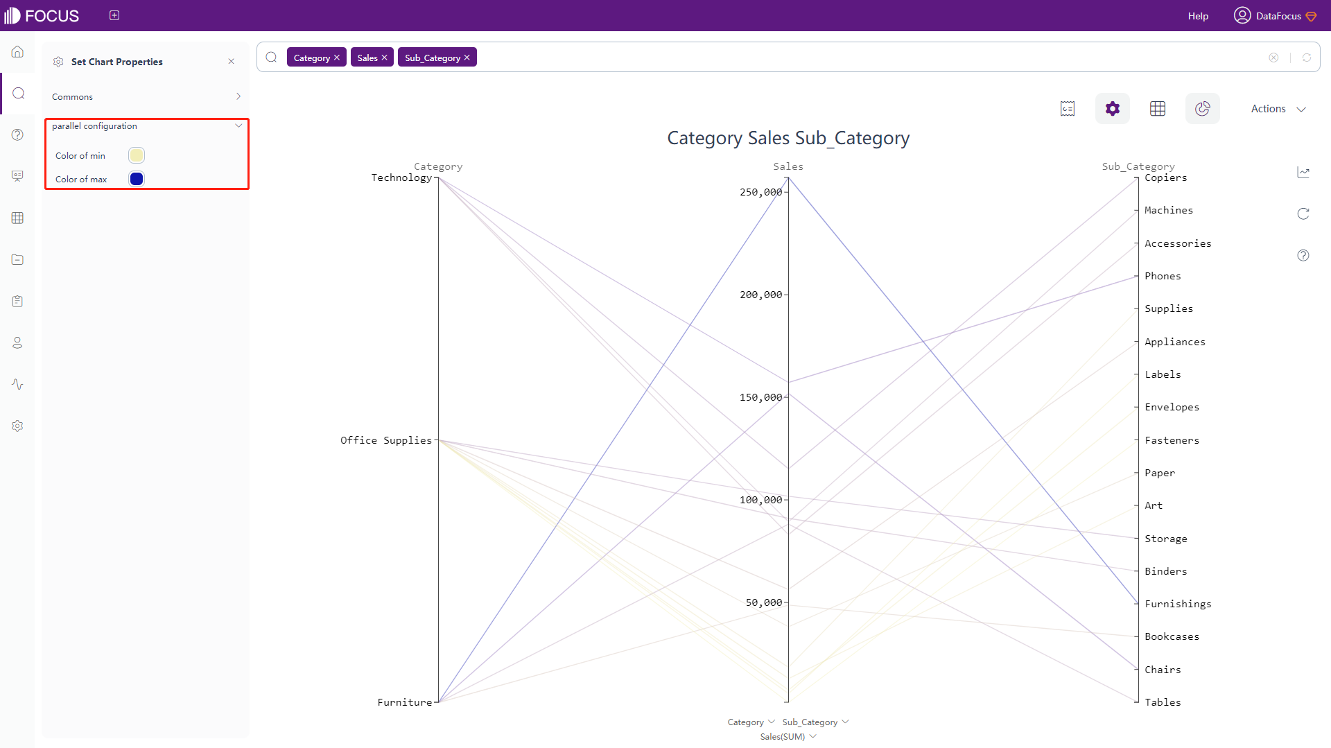
Figure 3-4-73 Parallel coordinate chart - parallel configuration
KPI
-
General Settings
Click the “Commons” button of the chart configurations to pop up the interface, as shown in figure 3-4-74. In this interface, you can choose whether to hide the aggregation mode.
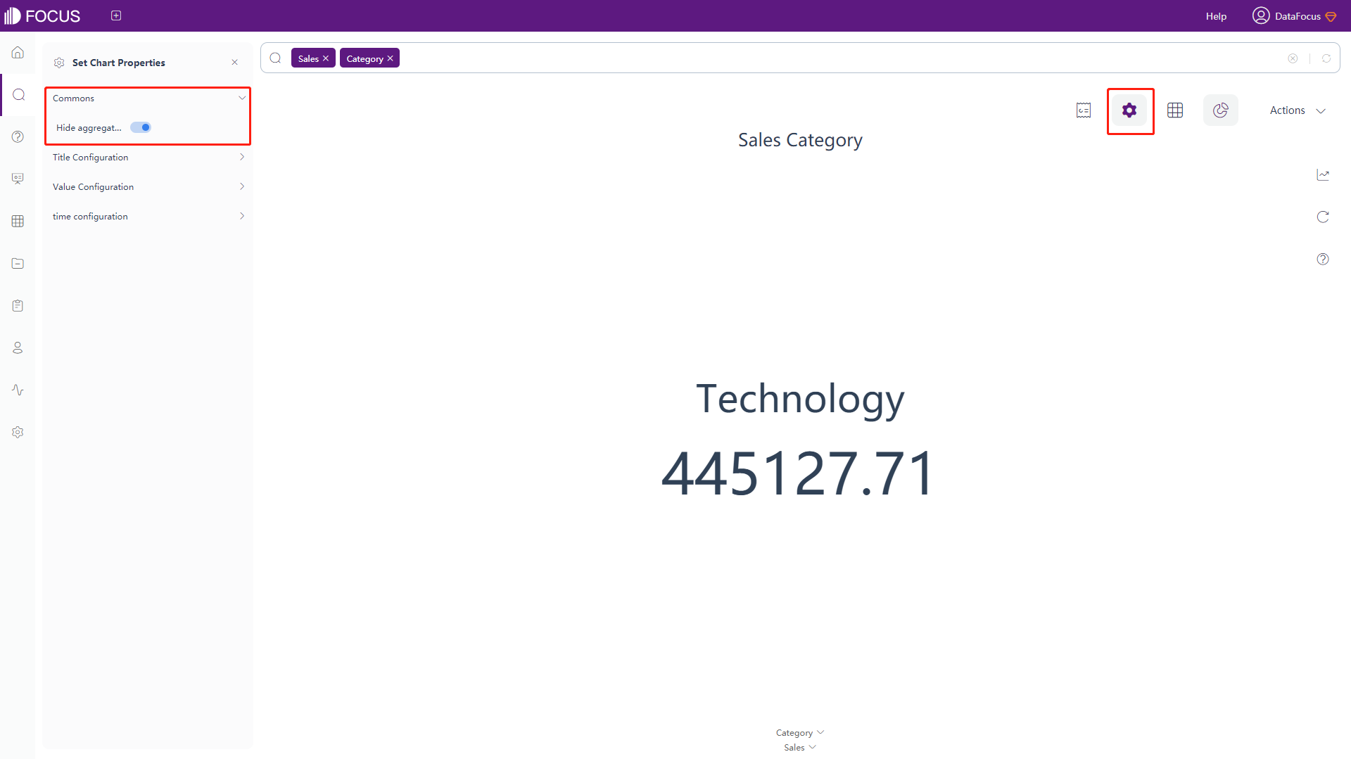
Figure 3-4-74 KPI - commons -
The title and value configurations are the same as that of digital flop chart. For details, please refer to the configuration of the digital flop chart.
-
Time Configuration
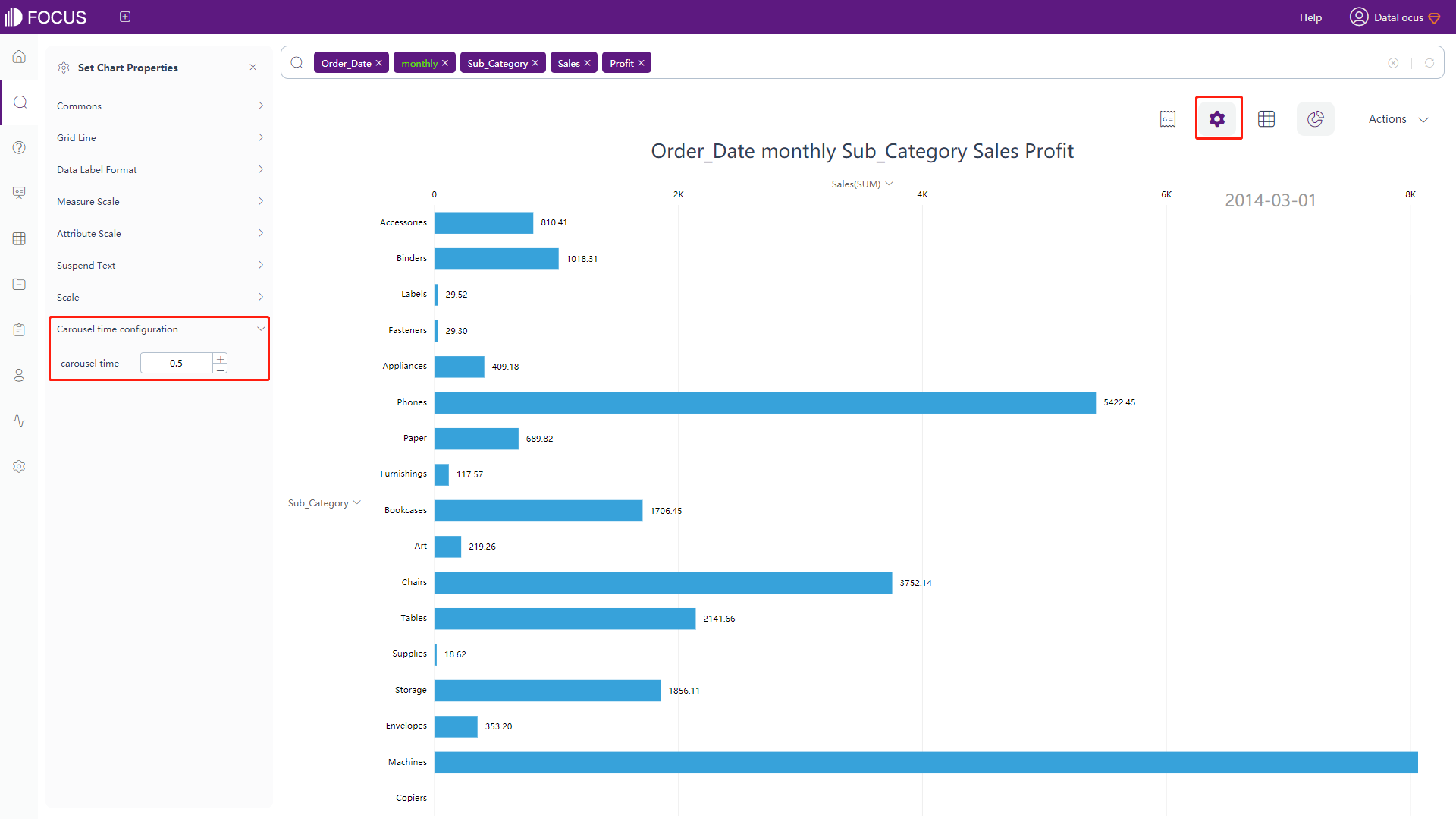
Click the “carousel time configuration” setting of the chart configurations to pop up the interface, as shown in figure 3-4-75. In this interface, you can set the carousel time.
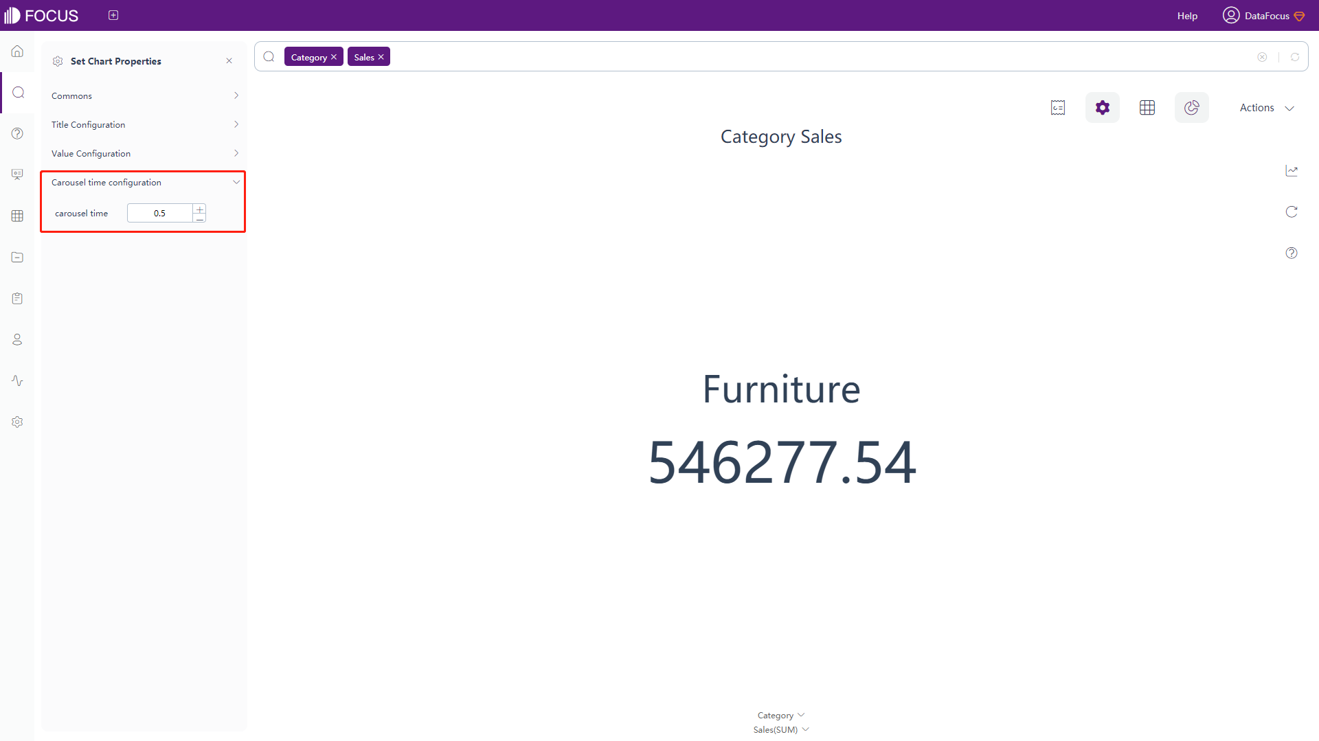
Figure 3-4-75 KPI - time configuration
Stacked Horizontal Bar Chart
The configuration is basically the same as that of the stacked bar chart. For details, please refer to the configuration of the stacked bar chart, as shown in figure 3-4-76 below.
Time Series Bar Chart
The time series bar chart supports time configuration, and the carousel time can be set, as shown in figure 3-4-77. The other settings are the same as the bar chart. For details, please refer to the bar chart configuration.
Time Series Bubble Chart
The time series bubble chart supports time configuration, and the carousel time can be set, as shown in figure 3-4-78. The other settings are the same as the bar chart. For details, please refer to the bar chart configuration.
Time Series Scatter Plot
The time series scatter plot supports time configuration, and the carousel time can be set, as shown in figure 3-4-79. The other settings are the same as the bar chart. For details, please refer to the bar chart configuration.
Boxplot
The configuration is similar to most of the bar chart configurations, please refer to the bar chart configuration for details. The differences:
-
General Settings
You can choose whether to hide abnormal data, median value, and different quantile values, a shown in figure 3-4-80.
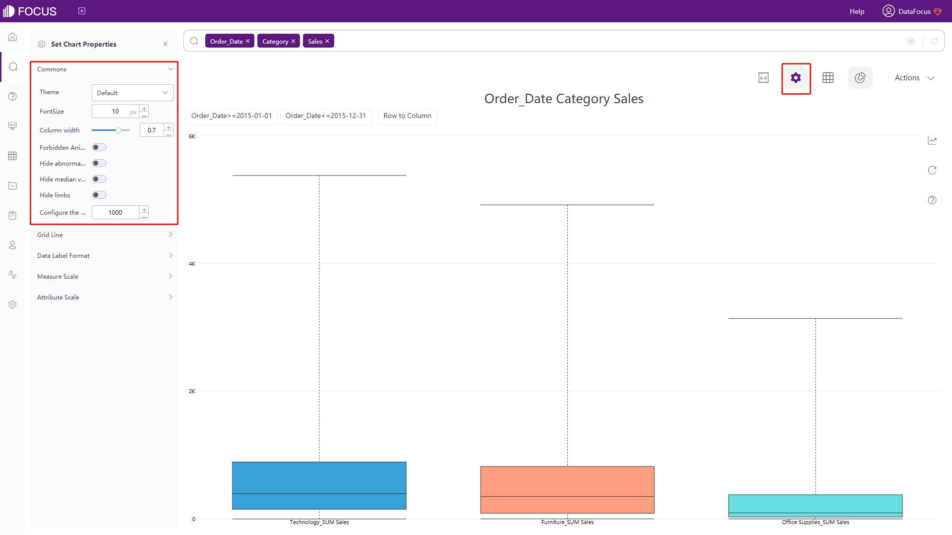
Figure 3-4-80 Boxplot - commons -
Data Label Format
You can choose to whether display the detailed data of each percentile/quartile, as shown in figure 3-4-81.
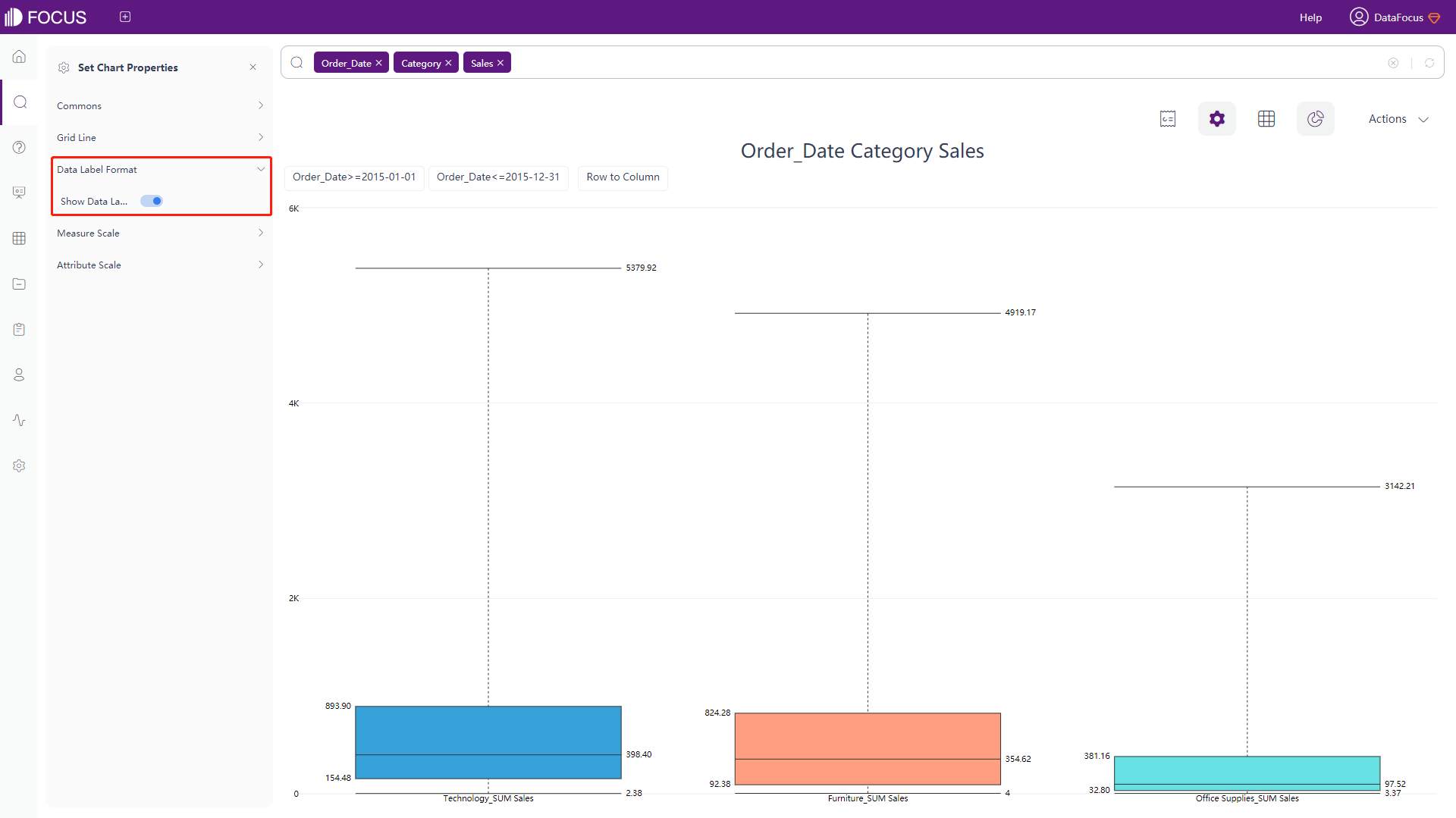
Figure 3-4-80 Boxplot - data label format
Time Series Horizontal Bar Chart
The time series horizontal bar chart supports time configuration, and the carousel time can be set, as shown in figure 3-4-82. The other settings are the same as the bar chart. For details, please refer to the bar chart configuration.
Polar bar chart
The configuration is basically the same as part of the bar chart configuration. For details, please refer to the configuration of the bar chart, as shown in figure 3-4-83 below.
Bullet Chart
-
General Settings
Click the “Commons” button of the chart configurations to pop up the interface, as shown in figure 3-4-84. In this interface, you can set the theme color, font size, whether to hide the chart title and aggregation method, whether to forbid the animation, whether to display the chart vertically, set the extra text, and set the number of search records.
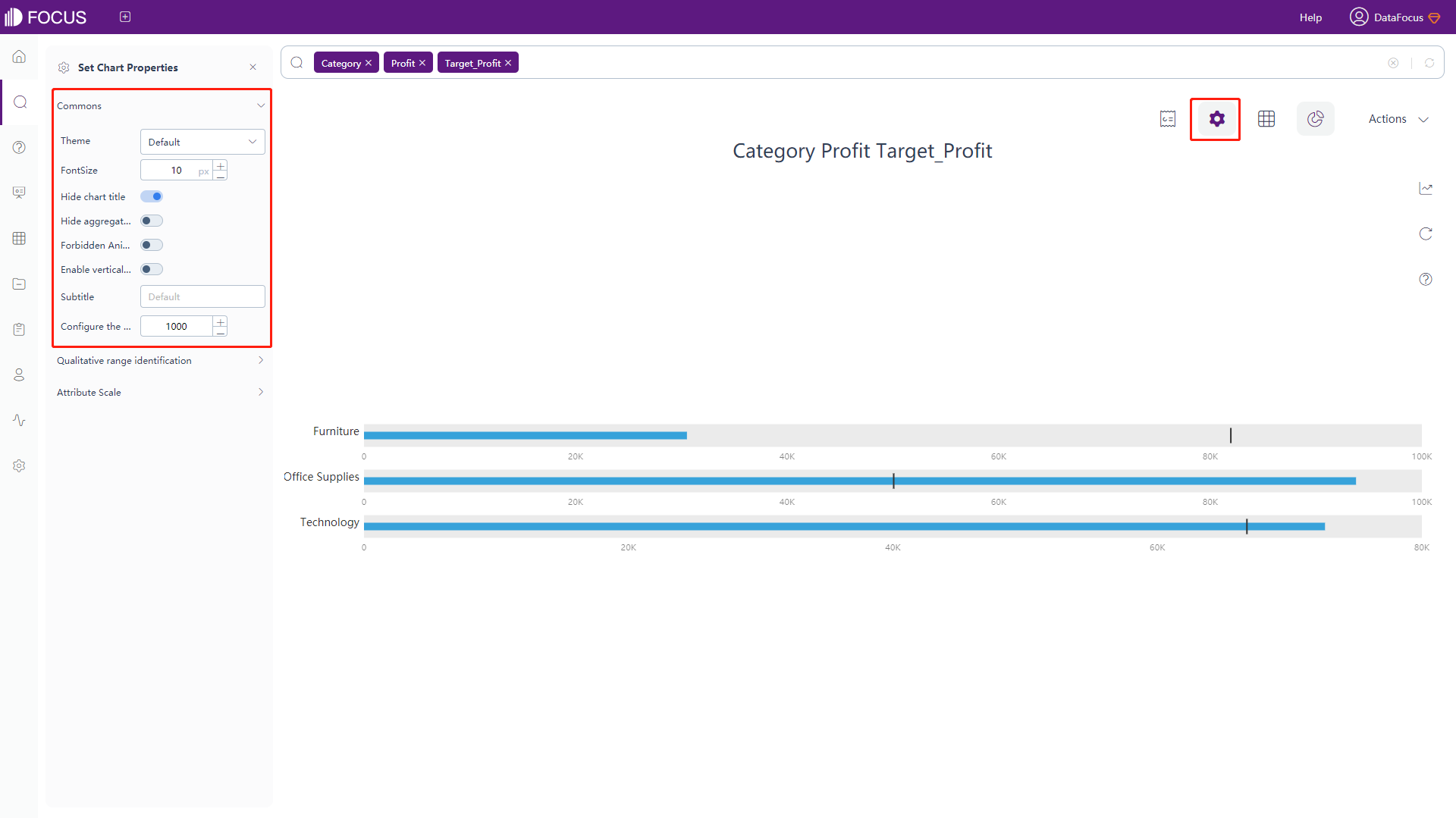
Figure 3-4-84 Bullet chart - commons -
Qualitative Range Identification
Click the “Qualitative Range Identification” button of the chart configurations to pop up the interface, as shown in figure 3-4-85. In this interface, you can set 4 different qualitative range identifications. For example, 25%, 50%, 75%, 100% of the target value.
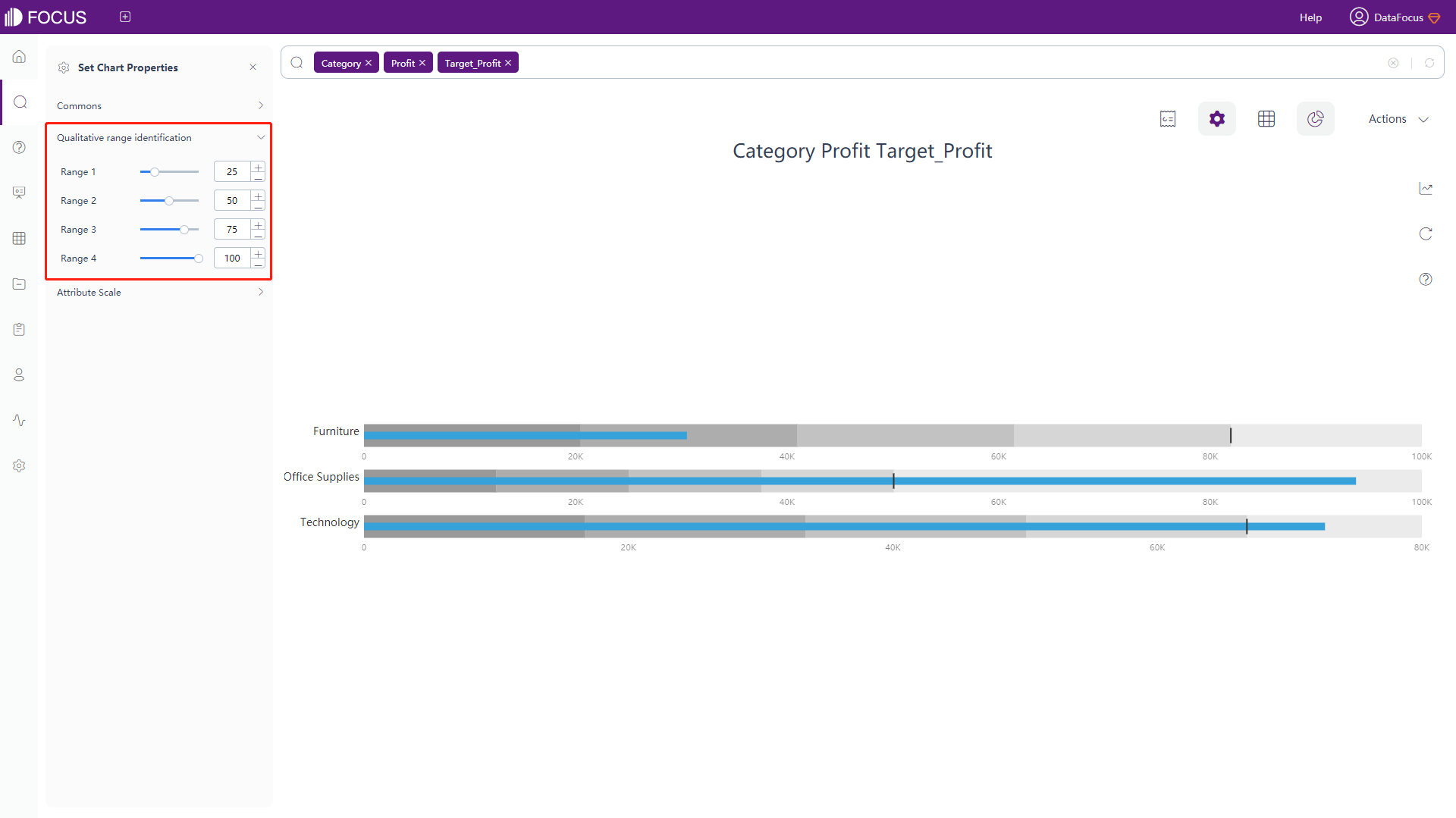
Figure 3-4-85 Bullet chart - qualitative range identification -
Attribute Scale
Click the “Attribute Scale” button of the chart configurations to pop up the interface, as shown in figure 3-4-86. In this interface, you can set the maximum width of the Attribute name.
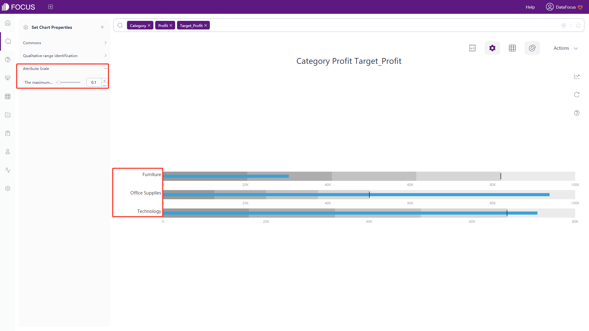
Figure 3-4-86 Bullet chart - Attribute scale
Calendar Heat Map
-
General Settings
Click the “Commons” button of the chart configurations to pop up the interface, as shown in figure 3-4-87. In this interface, you can set the theme color, font size, whether to hide the chart title and aggregation method, whether to forbid the animation, whether to display the chart vertically, set the color schemes (colors of the lowest and highest value), and set the number of search records.
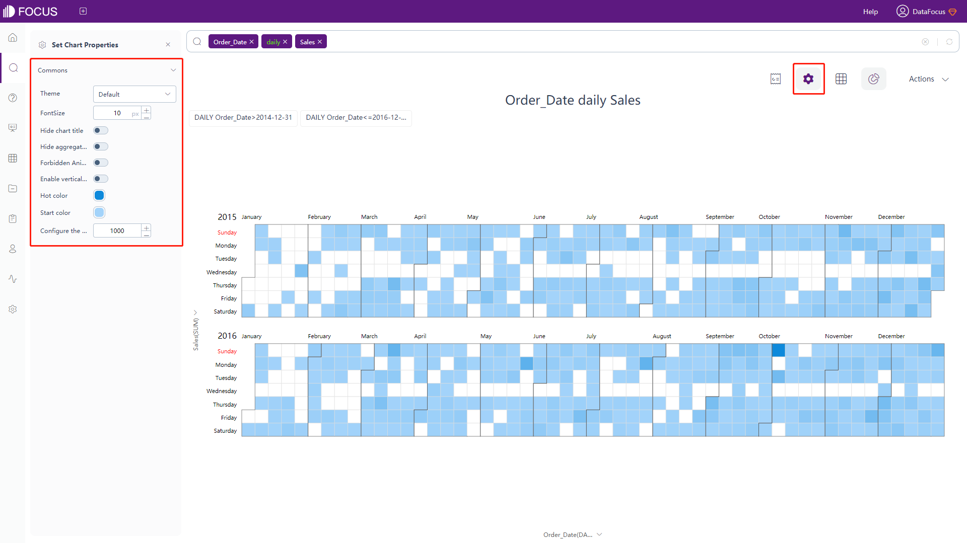
Figure 3-4-87 Calendar heat map - commons
Trajectory Map
-
Map Configuration
Click the “Map Config” button of the chart configurations to pop up the interface, as shown in figure 3-4-88. In this interface, you can set the opacity, the format of the dotted line, the boundary of the map, and the color as well as width of the track line.
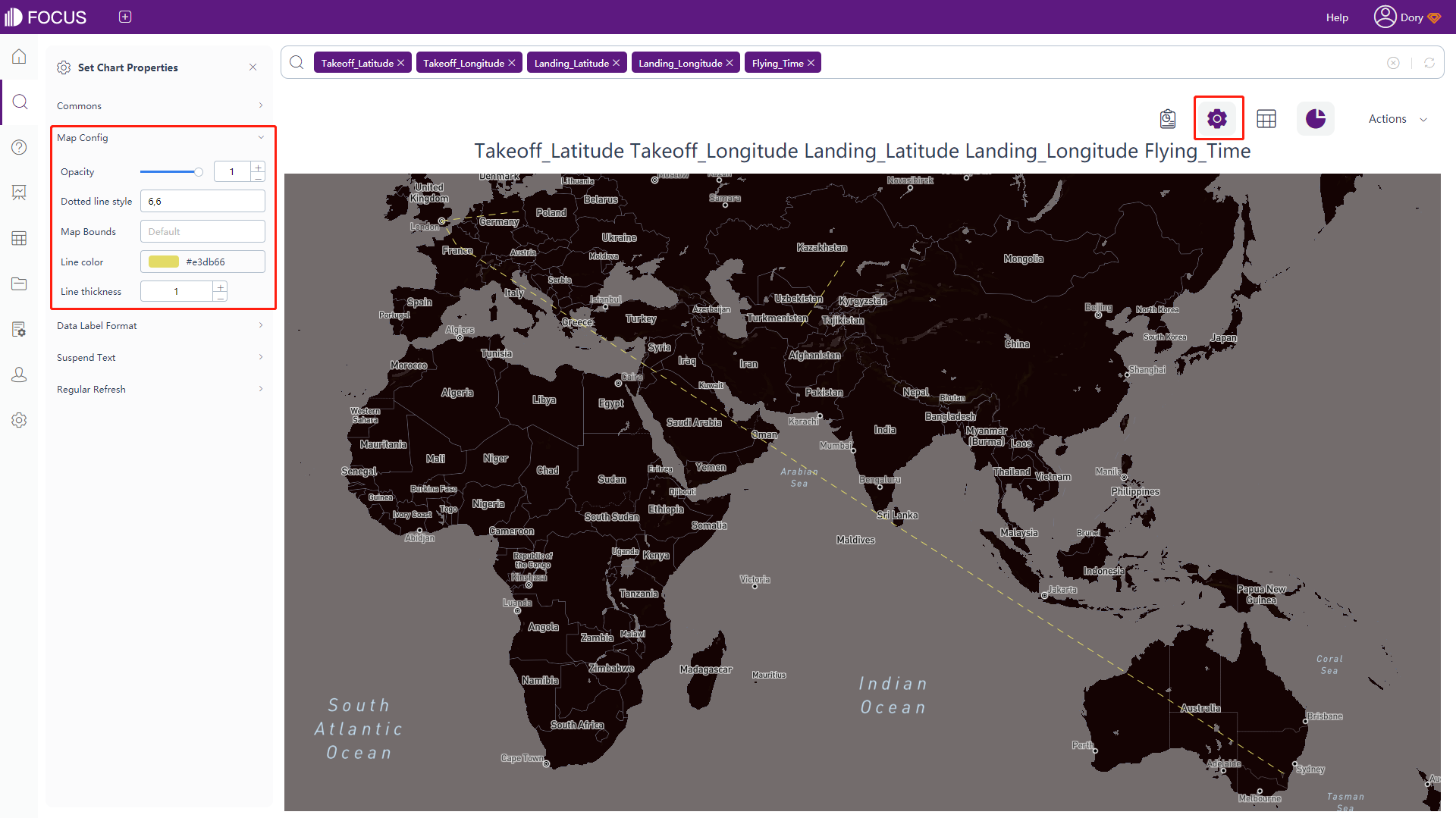
Figure 3-4-88 Trajectory map - map config -
The rest of the configuration is the same as part of the GIS location map configuration. For details, please refer to the configuration of the GIS location map.
Histogram
The configuration is similar to most of the bar chart configurations, please refer to the bar chart configuration for details. The differences:
-
Histogram Configuration
Click the “Histogram Config” button of the chart configurations to pop up the interface, as shown in figure 3-4-89. In this interface, you can set the number of intervals, the width of effect area for each sample, Kernel function, whether to display density or frequency on the y-axis, and whether to hide the kernel density.
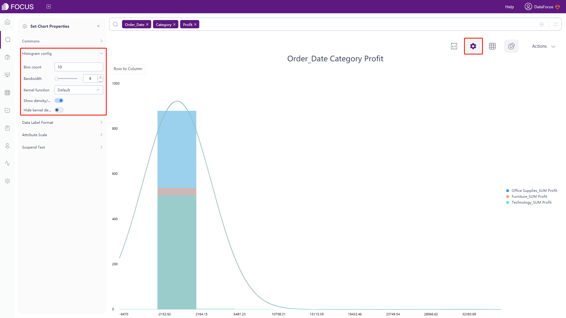
Figure 3-4-89 Histogram - histogram config -
Data Label Format & Suspend Text
The data labels and the meanings of the macros in the floating text are shown in table 3-12. Adding text after the macros can add additional text information based on the original data labels, as shown in figure 3-4-90.
Table 3-12 Progress chart - text type of data label
Text Type of Data Label Description %_VALUE Display the original value %_SERIES_NAME Display the name of legend %_FREQUENCY Display the frequency %_BR Newline character 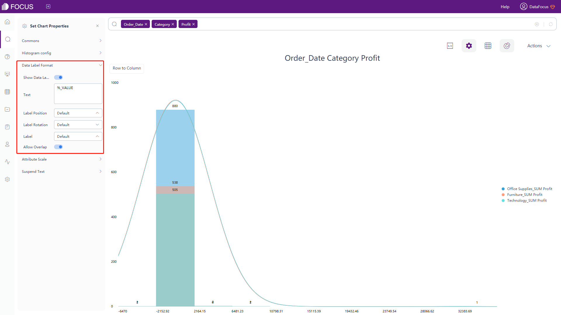
Figure 3-4-90 Histogram - data label format & suspend text
Longitude & Latitude Location Map
The configuration is similar to most of the GIS location map configurations, please refer to that of GIS location map for details. The difference:
-
Map Configuration
Click the “Map Config” button of the chart configurations to pop up the interface, as shown in figure 3-4-91. In this interface, you can set the size and radius scale of the bubbles.
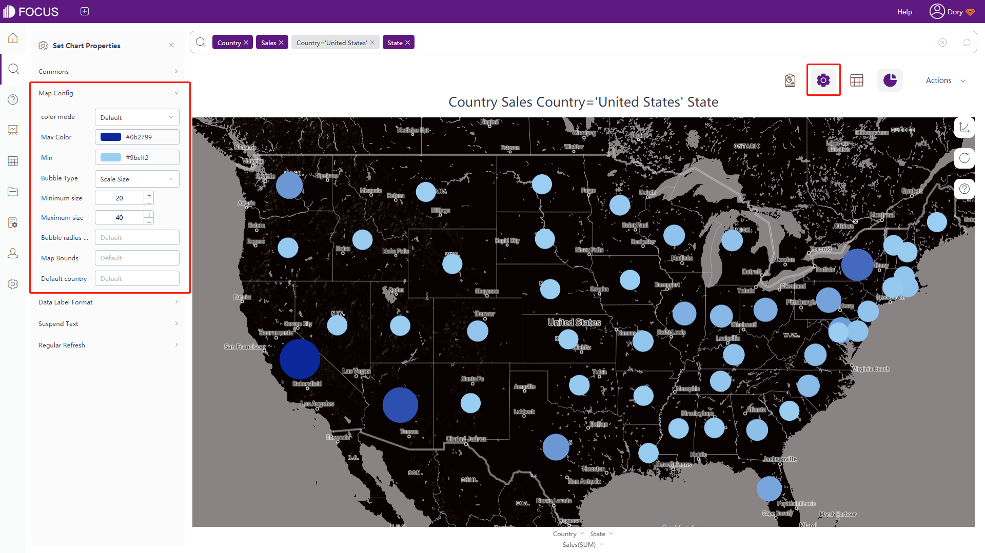
Figure 3-4-91 Longitude & Latitude location map - map config
Longitude & Latitude Map
The configuration is similar to most of the longitude & latitude location map configurations, please refer to that for details. The difference:
-
Map Configuration
Click the “Map Config” button of the chart configurations to pop up the interface, as shown in figure 3-4-92. In this interface, you can set different icons to show the measure value and can set the size as well as the color of the icon.
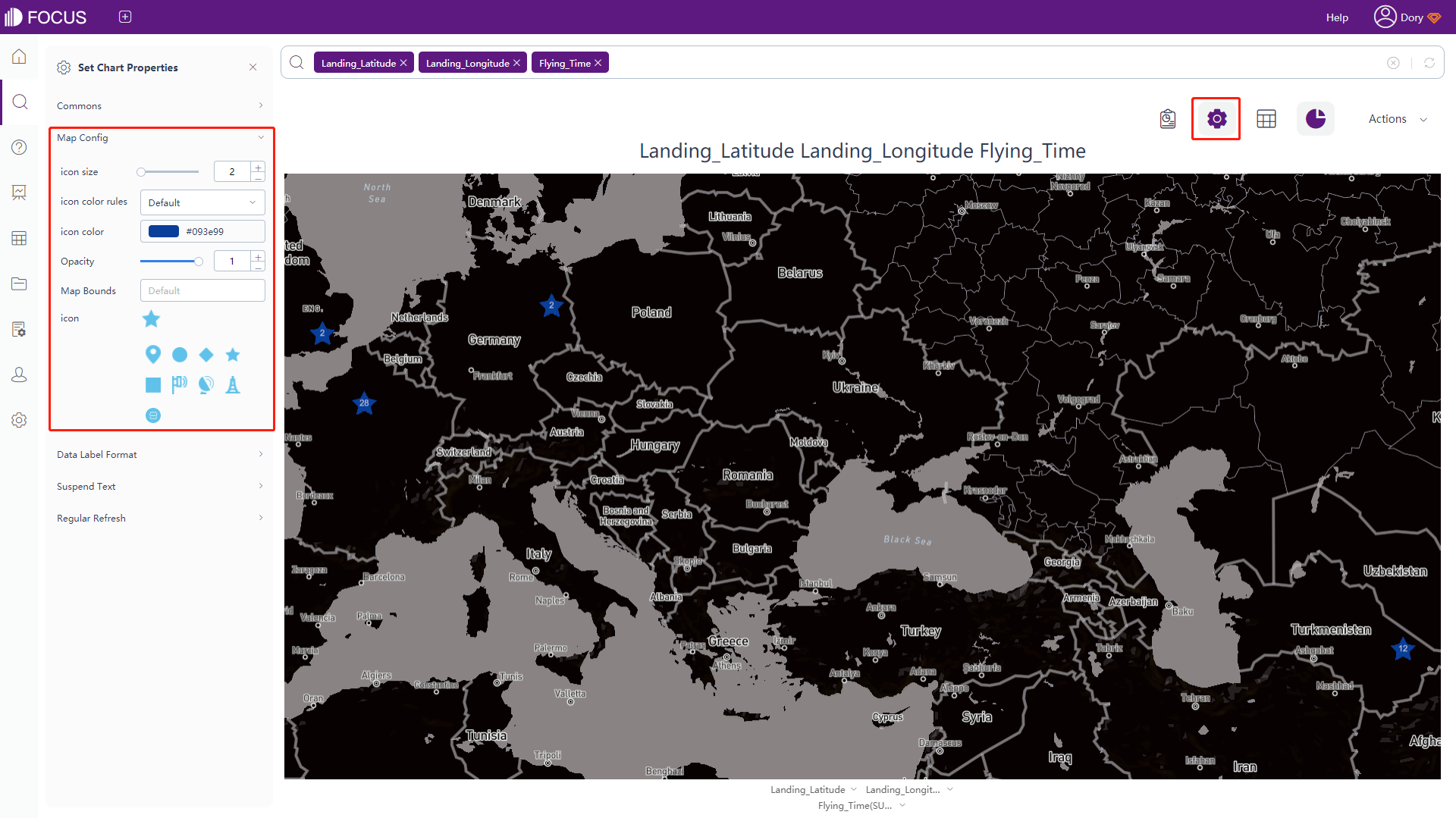
Figure 3-4-92 Longitude & Latitude map - map config
Longitude & Latitude Bubble Chart
The configuration is basically the same as the longitude & latitude location map configuration. For details, please refer to the longitude & latitude location map, as shown in figure 3-4-93.
3D Globe Bar Chart
-
Globe Configuration
Click the “Globe Container” under chart configurations, and the interface will pop up, as shown in figure 3-4-94. In this interface, you can set the type of the displayed globe, whether to turn on the environment light, the color of the space, whether to add starts, whether to make the globe rotate, and can the speed of the rotation.
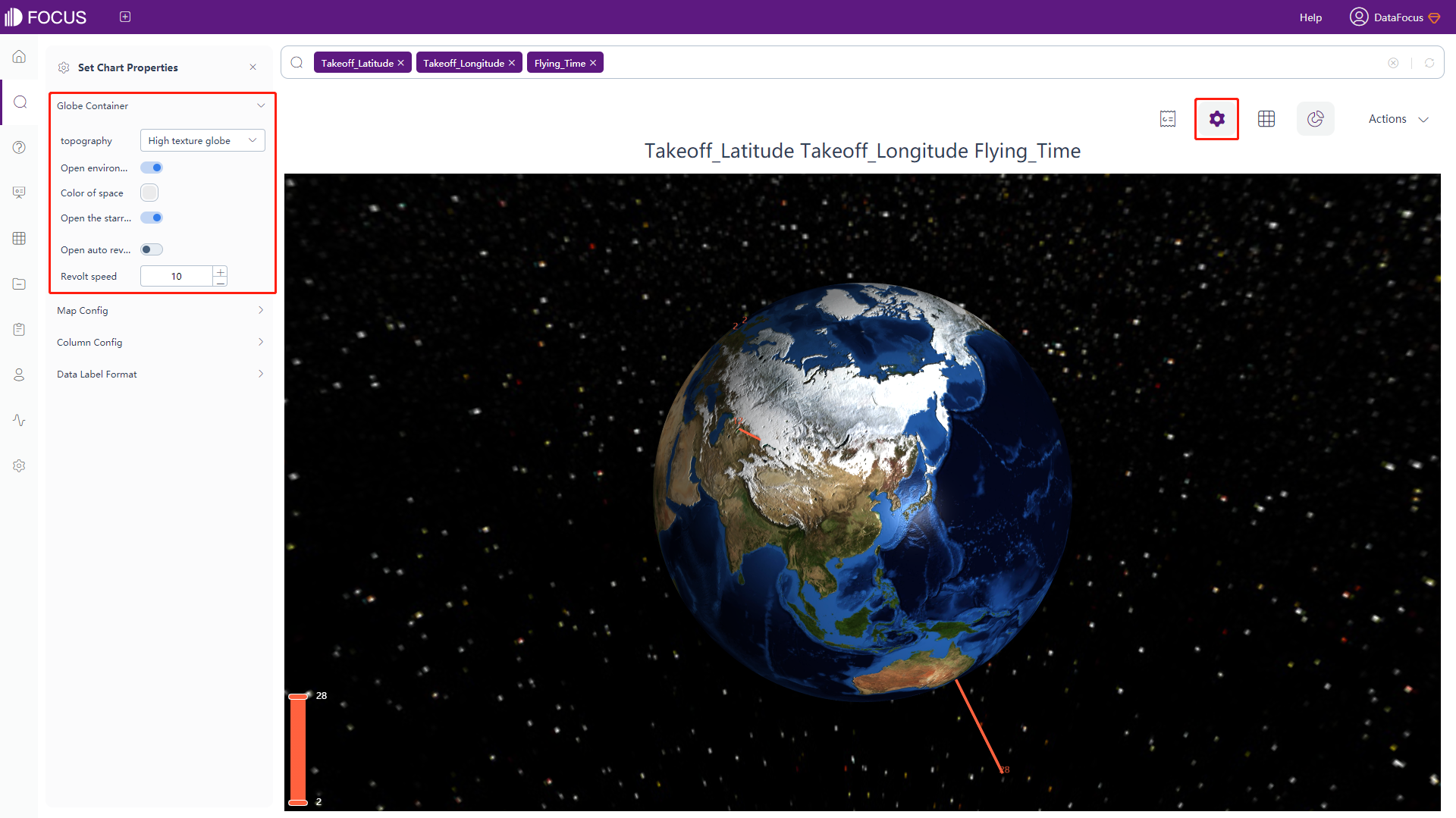
Figure 3-4-94 3D globe bar chart - globe container -
Map Configuration
Click the “Map Config” under chart configurations, and the interface will pop up, as shown in figure 3-4-95. In this interface, you can set the color of the land, the ocean/sea, highlight area (area when mouse hovered upon), set the color and width of the borders, set the size and color of texts in the highlighted area, and set whether to display the longitude&latitude grid line and its color.
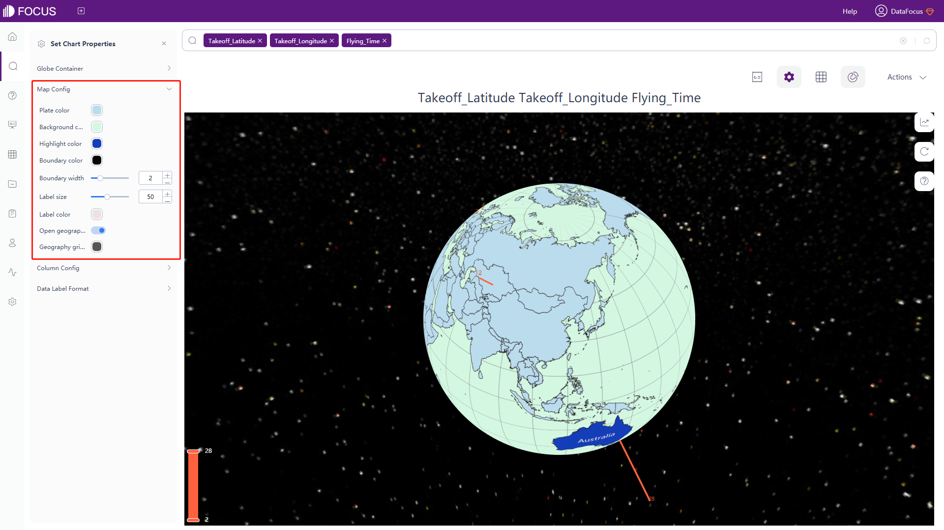
Figure 3-4-95 3D globe bar chart - map config -
Bar Configuration
Click the “Column Config” under chart configurations, and the interface will pop up, as shown in figure 3-4-96. In this interface, you can set the color, shape, width, height and opacity.
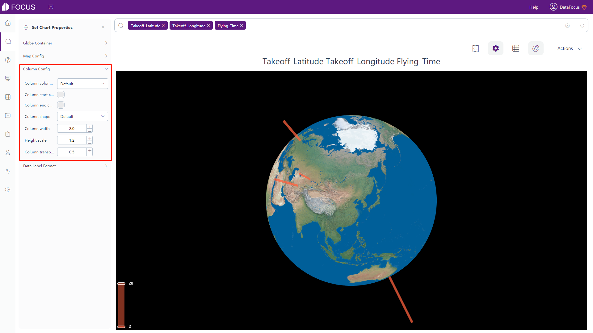
Figure 3-4-95 3D globe bar chart - column config -
Data Label Format
Click the “Data Label Format” button of the chart configurations to pop up the interface, as shown in figure 3-4-96. In this interface, you can choose whether to display the data label, as well as set its color, and modify the format of data labels, as in table 3-13.
Table 3-13 3D globe bar chart - text type of data label
Text Type of Data Label Description %_LATITUDE Display the latitude %_LONGITUDE Display the longitude %_COLUMN_N Display the value of column N %_BR Newline character
3D Globe Scatter Plot
The configuration is similar to most of the 3D globe bar chart configurations, please refer to that for details. The difference:
-
Scatter Configuration
Click the “Scatter Config” button of the chart configurations to pop up the interface, as shown in figure 3-4-97. In this interface, you can set the format, color, size and opacity of the scatter points.
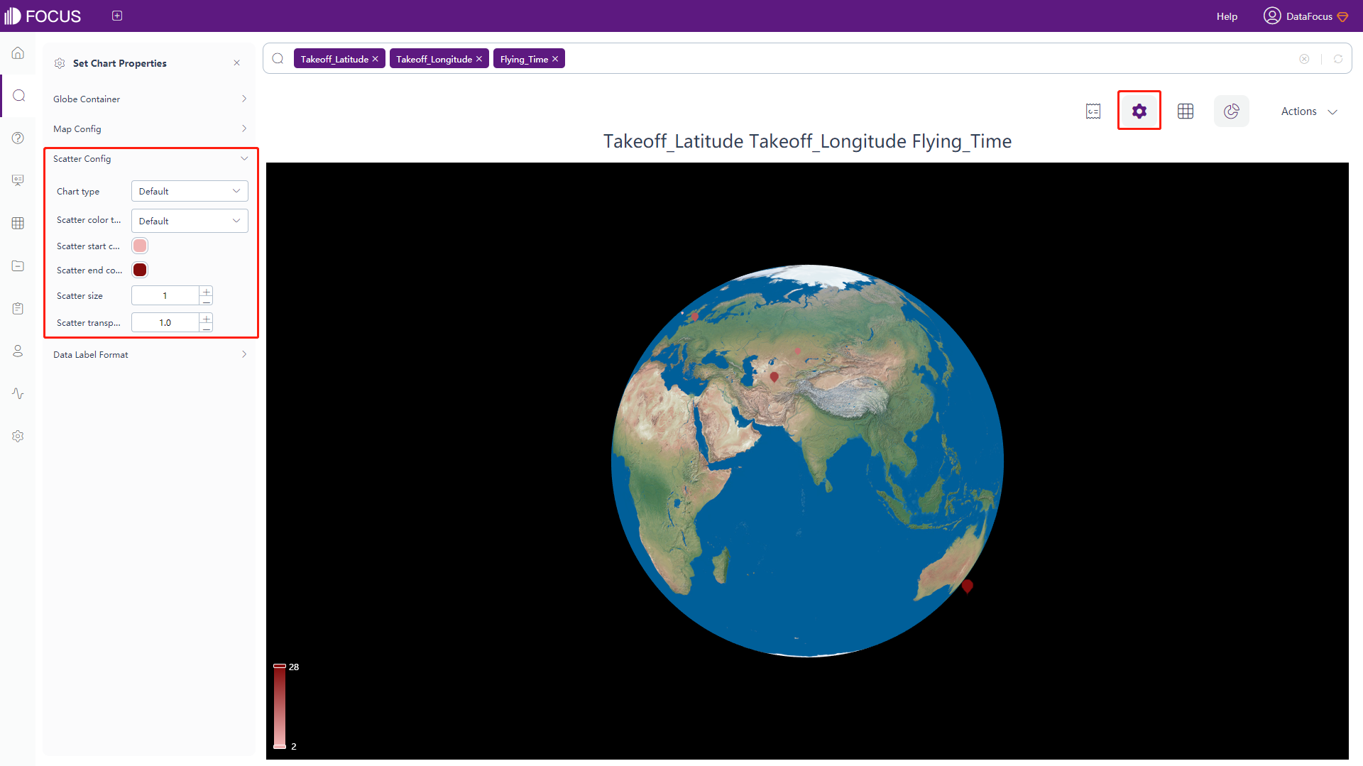
Figure 3-4-97 3D globe scatter plot - scatter config
3D Globe Fly line
The configuration is similar to most of the 3D globe bar chart configurations, please refer to that for details. The difference:
-
Fly Line Configuration
Click the “Lines Config” button of the chart configurations to pop up the interface, as shown in figure 3-4-98. In this interface, you can set the color and width of the fly line, set the color and size of the data point, whether to display the line animation and set the color, opacity, width, length and speed of the line animation.
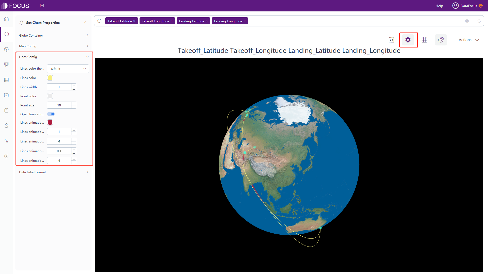
Figure 3-4-98 3D globe fly line - lines config
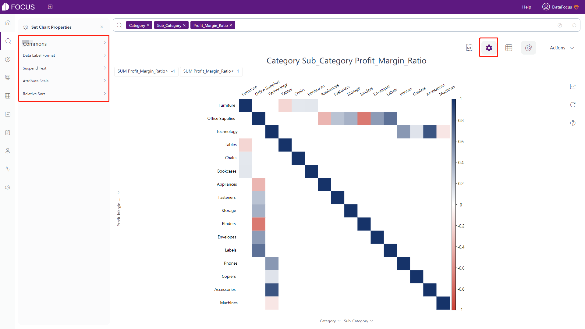
Correlation Heat Map
-
General Settings
Click the “Commons” button of the chart configurations to pop up the interface, as shown in figure 3-4-99. In this interface, you can set the font size, font color, shading color, display method (default or only upper/lower part of the graph), type of the cell size (default is to adjust the size, number is to display the chart according to the original number), element type (whether to display cells in circles or color blocks), color of positive as well as negative values, width and color of the boarder and the margin of cells.
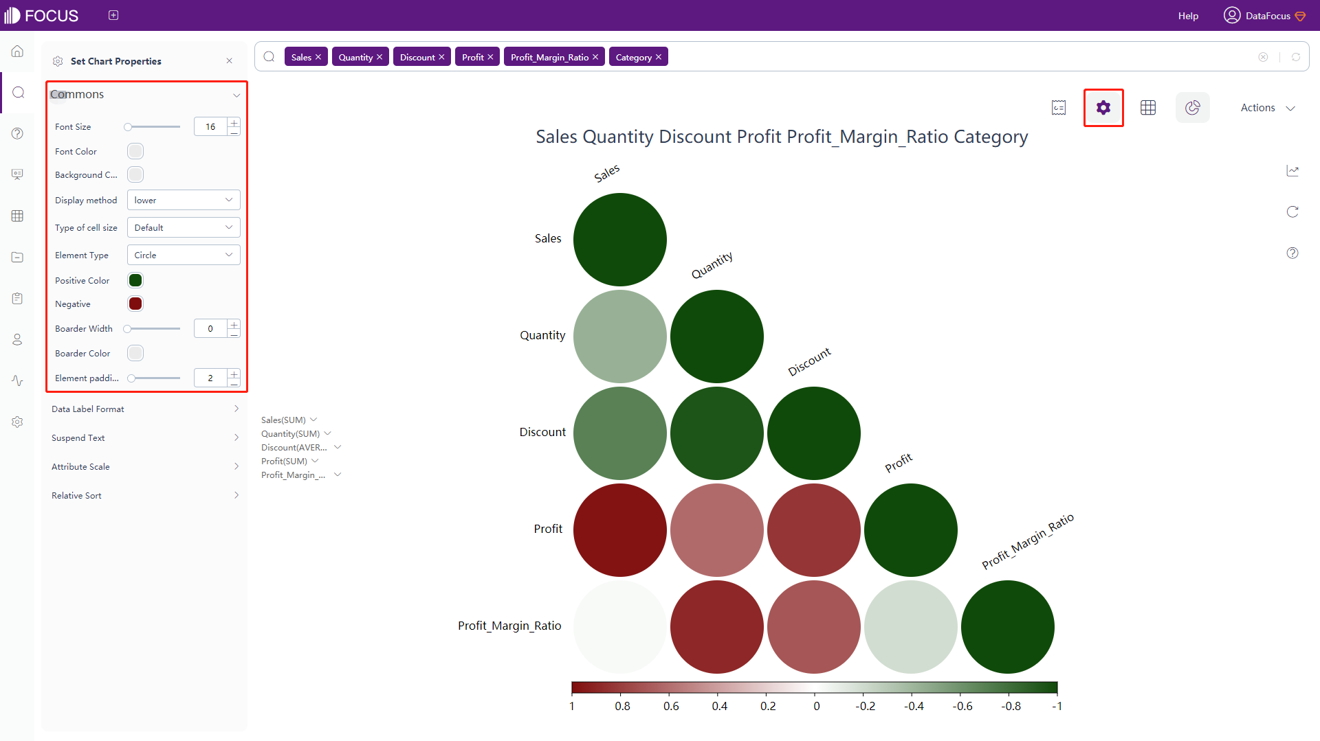
Figure 3-4-99 Correlation heatmap - commons -
Data Label Format & Suspend Text
The data labels and the meanings of the macros in the floating text are shown in table 3-14. Adding text after the macros can add additional text information based on the original data labels, as shown in figure 3-4-100.
Table 3-14 Progress chart - text type of data label
Text Type of Data Label Description %_VALUE Display the original value %_LABEL_X Display the label of x-axis %_LABEL_Y Display the label of y-axis %_BR Newline character 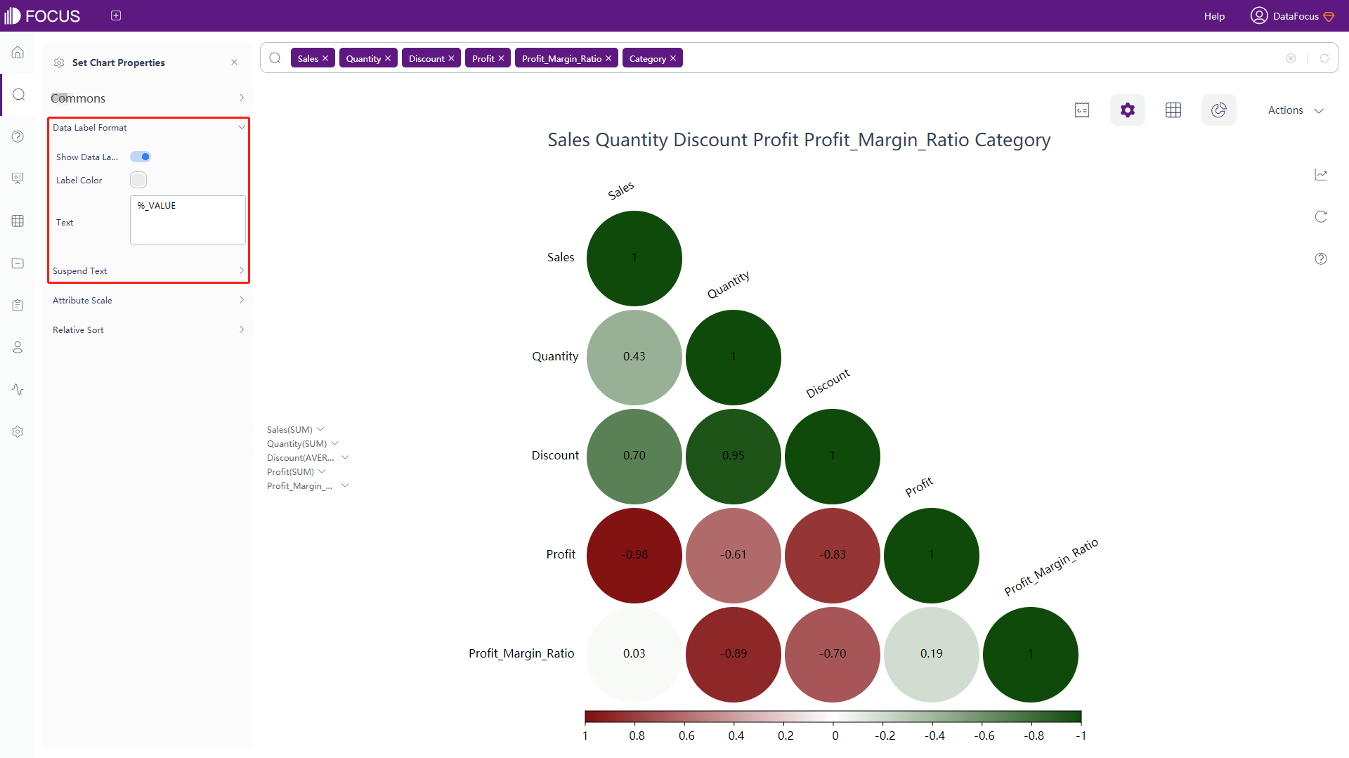
Figure 3-4-100 Correlation heatmap - data label format & suspend text -
Attribute Scale
Click the “Attribute Scale” button of the chart configurations to pop up the interface, as shown in figure 3-4-101. In this interface, you can set the maximum height and width of the x-axis scale, the scale display margin on the top and left, and the rotation angle of the scale.
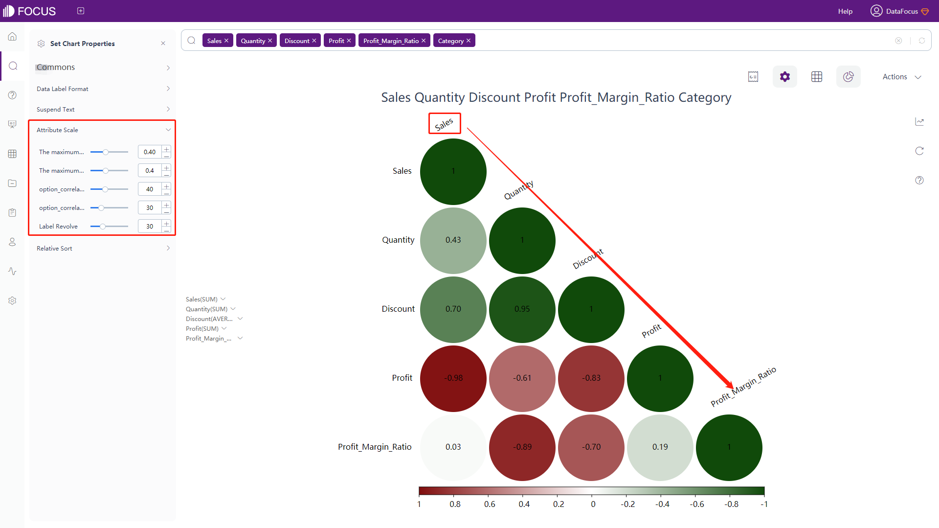
Figure 3-4-101 Correlation heatmap - Attribute scale -
Relative Sort
Click the “Relative Sort” button of the chart configurations to pop up the interface, as shown in figure 3-4-102. In this interface, you can set whether to sort based on clusters (After hierarchical clustering, sort according to the distance between categories) and set the number of sorting categories, and the color as well as the width of the borders for each category.
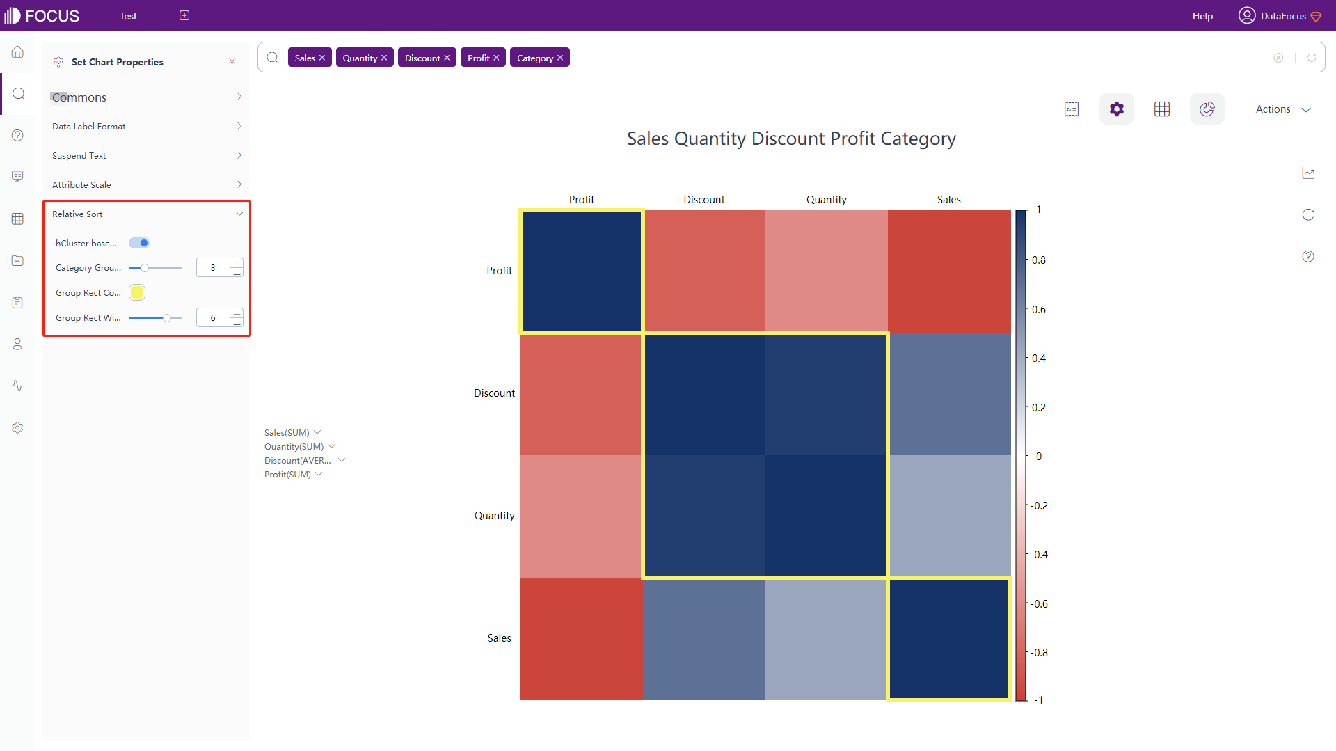
Figure 3-4-102 Correlation heatmap - relative sort
Matrix Heat Map
As shown in figure 3-4-103, the configuration is exactly the same as the correlation heat map configuration, please refer to that of correlation heat map for details.
Longitude & Latitude Heat Map
The configuration is similar to most of the GIS location map configurations, please refer to that of GIS location map for details. The difference:
-
Map Configuration
Click the “Map Config” button of the chart configurations to pop up the interface, as shown in figure 3-4-104. In this interface, you can set the size of the heated area and the boundary of the map.
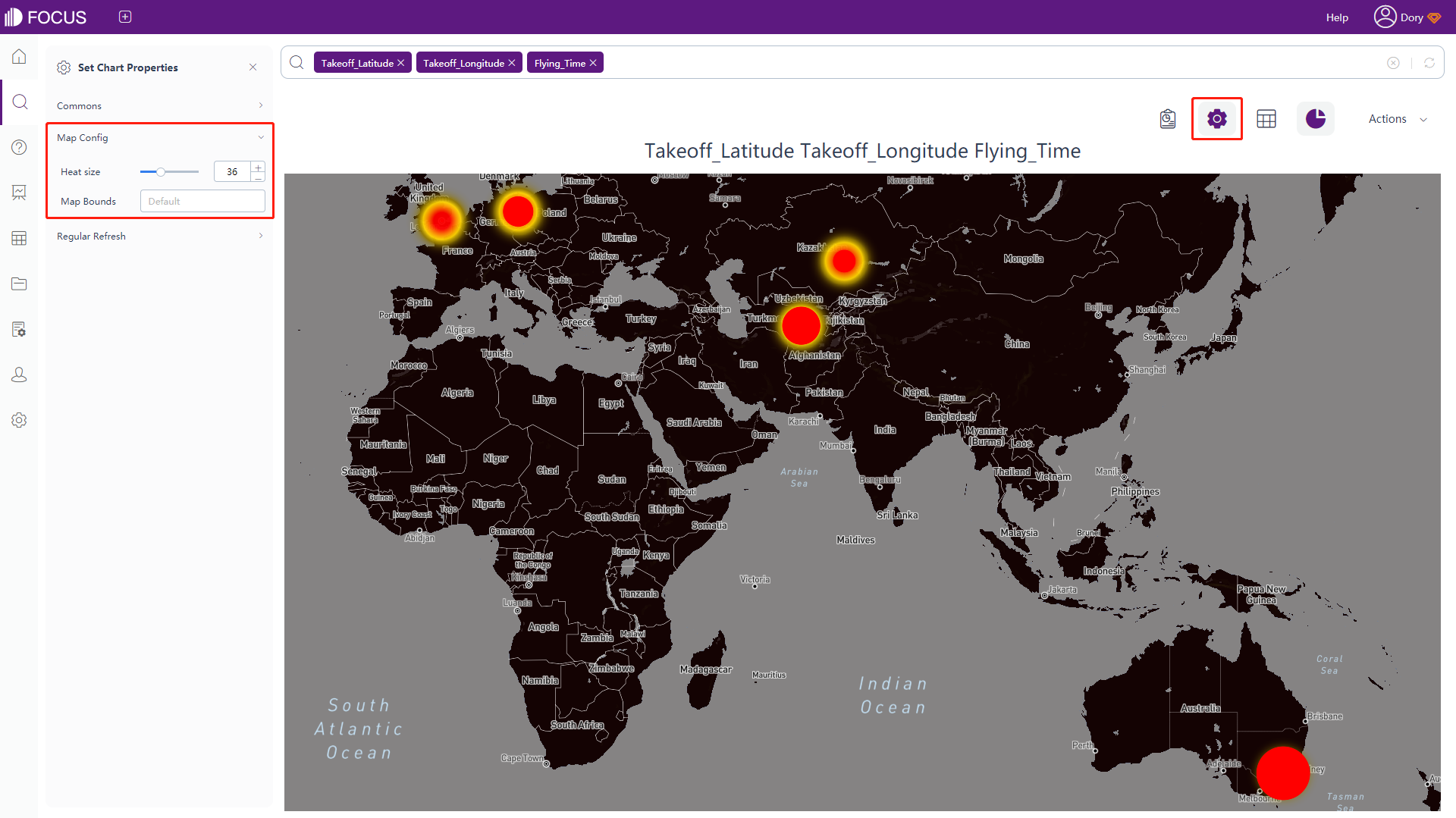
Figure 3-4-104 3D longitude & latitude heat map - map config
3.4.6 Chart Configuration
DataFocus supports multiple X-axis. When the graph contains multiple X-axis variables, all the x-axis variables are displayed in the configuration box and can be changed by the user.
- The specific operation of changing the X-axis is as follows:
-
Click the configuration button on the right of the figure to pop up the interface, as shown in figure 3-4-105. In this operation box, you can see the variable set of X-axis and Y-axis;
-
DataFocus Cloud supports multiple x-axes. Click the blank space in the “x-axis box”, and all x-axis column names in the search criteria will be displayed, you can click the column name to add;
-
Click the “×” button on the column name to delete the column from the x-axis;
-
Click the “Done”, the deleted column names will no longer be displayed in the X-axis box, and the system will adjust the graph accordingly.
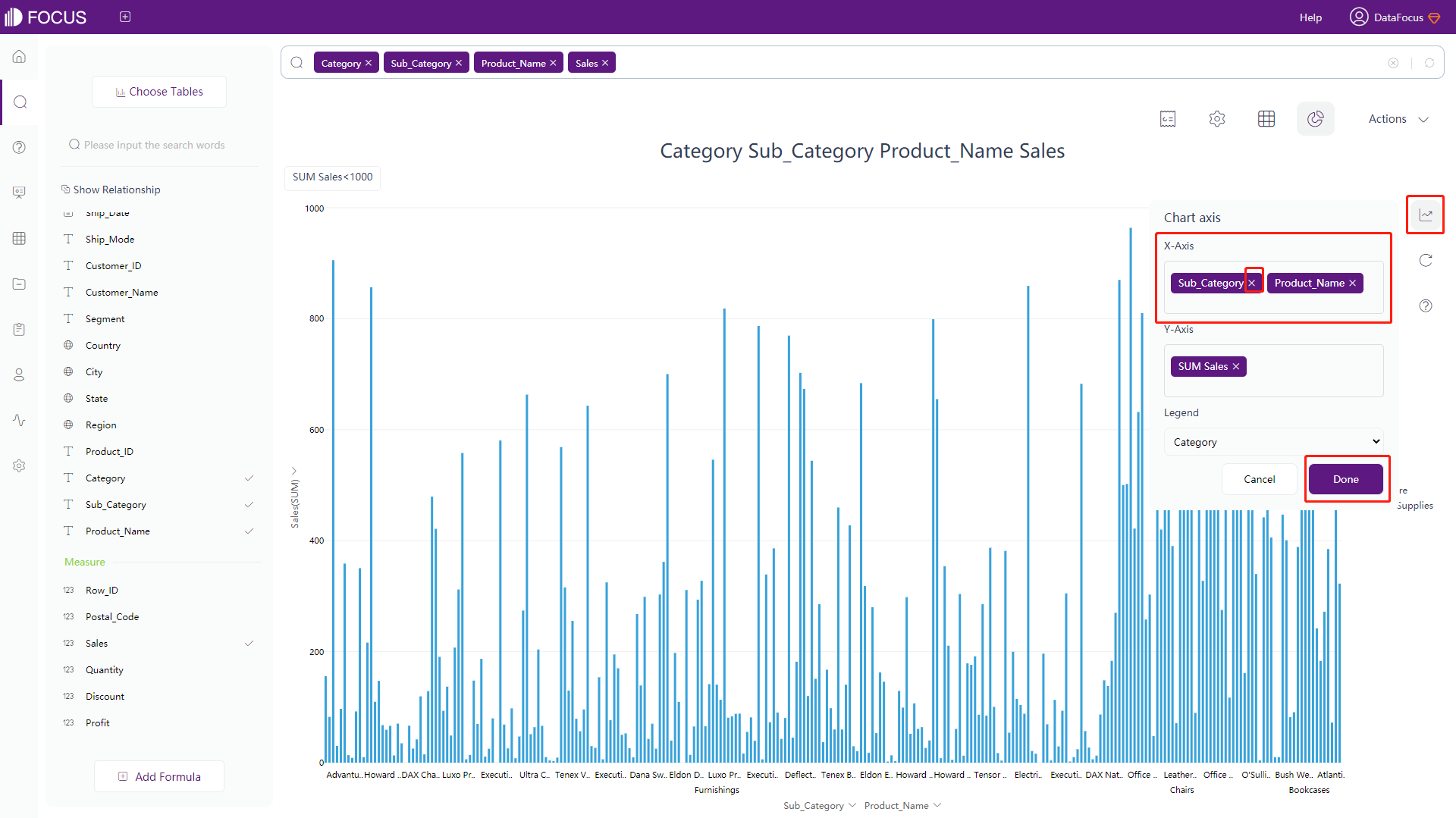
Figure 3-4-105 Chart configuration - x-axis
-
- The specific operation of the change to the Y-axis is as follows:
-
Click the configuration button on the right of the figure to pop up the interface, as shown in figure 3-4-106. In this operation box, you can see the variable set of X-axis and Y-axis, where the Y-axis allows multiple variables, and most graphics support dual Y-axis configurations;
-
Click the “×” button on the column name to delete the column from the y-axis;
-
Click the “Done” and the graph will be adjusted accordingly.
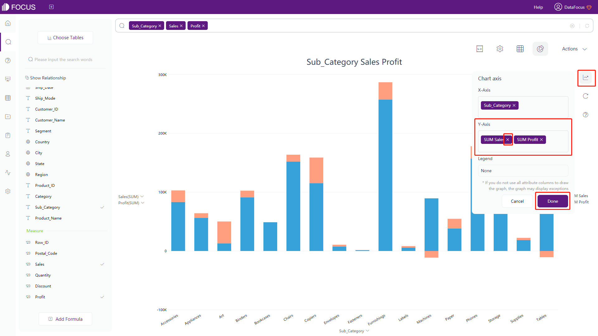
Figure 3-4-106 Chart configuration - y-axis -
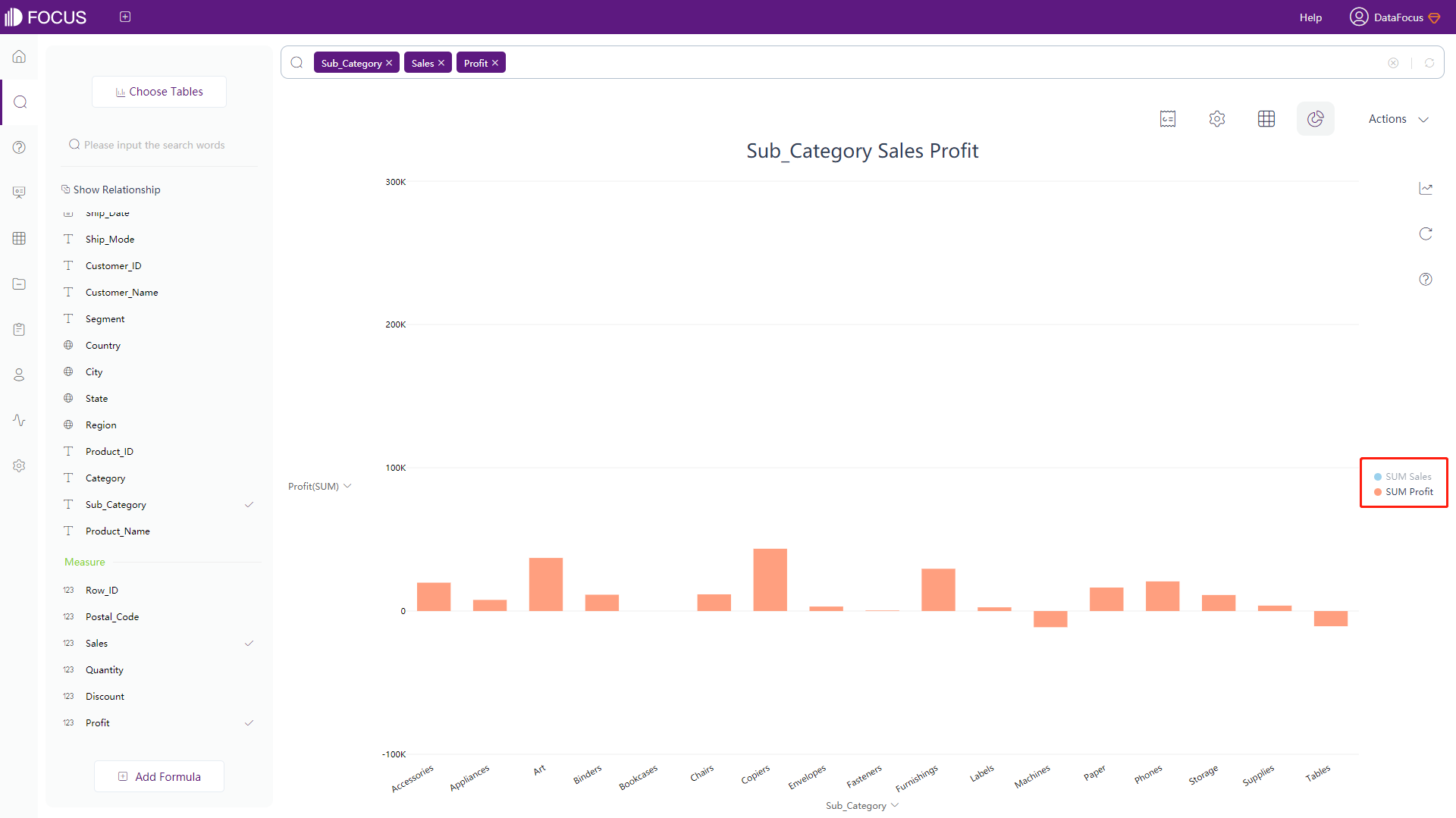
All legends will be displayed on the right side of the graph. Click the name of the legend to hide it (the icon will be dimmed), and the graph will automatically hide the value of the corresponding legend. As shown in figure 3-4-107, it is the graph after the legend “Sum of Sales” is hidden. If you want to restore the original graph, just click the name corresponding to the hidden legend again.
3.4.7 Check Values
In DataFocus, there are three ways to view values:
-
Click the “Chart Configurations” button and select “Data Label Format”. Click the ‘Show Data Labels’ to display all data values, as shown in figure 3-4-108. You can also set the text type, position, and rotation of the data label, and set whether to display all of the values or the minimum&maximum, whether to allow overlap, and whether to use abbreviations.
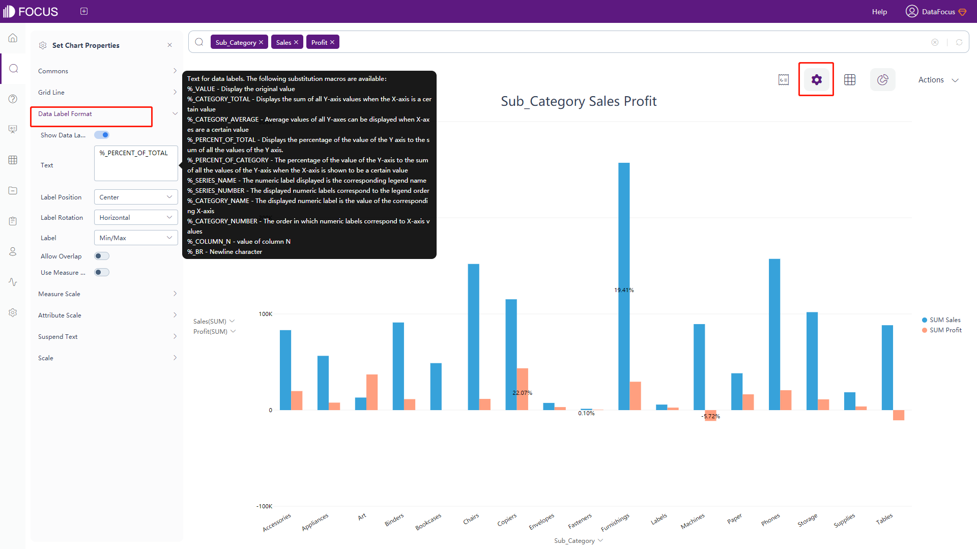
Figure 3-4-108 Display data label -
Move the mouse to the position of the value you want to view in the graph, the system will display the corresponding prompt box to show the specific value of the position (that is, the floating text), and also highlight all the parts under the same legend at the same time, as shown in figure 3-4-109. You can reset the content on the “Suspend Text” under chart configurations.
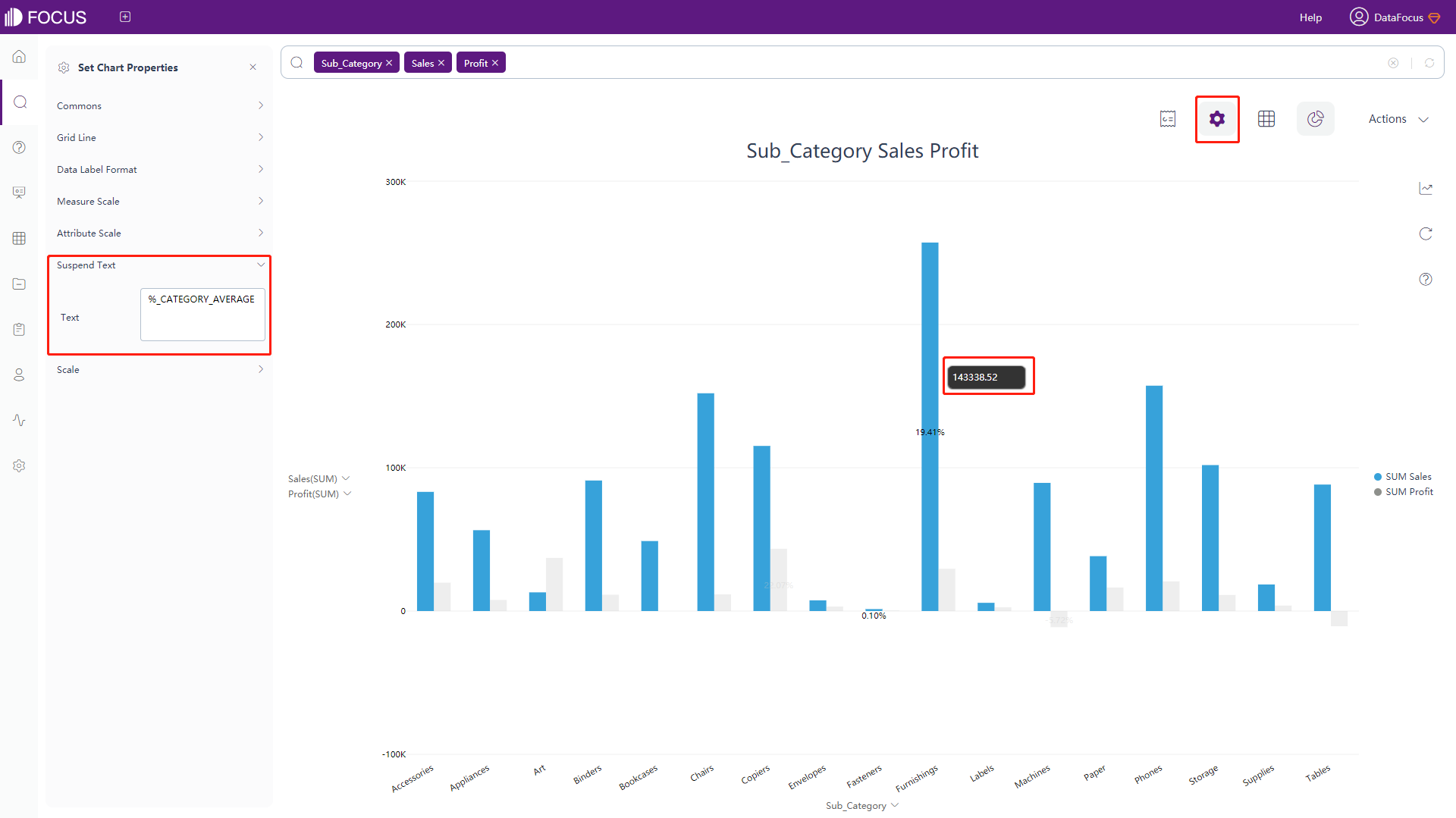
Figure 3-4-109 Display suspend text -
As shown in figure 3-4-110, click the “Display in grid” button in the upper right corner, the graph will switch to the data value table so that you can view all values.
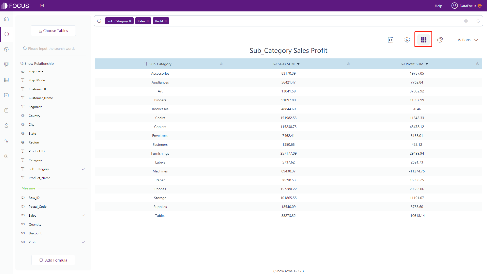
Figure 3-4-110 Display in grid
3.4.8 Data Filtering
There are 4 ways to filter data:
-
Directly enter the criteria in the search box, such as “sales greater than 5000”;
-
Filter on the interface of the numerical table:
(1) Click the settings button on the back of the column you want to filter, the input box of filter criteria will pop up, as shown in figure 3-4-111.
(2) For Measure value columns, you need to select one of the 6 operation symbols (>, <, >=, <=, !=, =) on the left side, and type in the specific value on the right side. For Time Attribute columns, click the corresponding time and date.
For non-time Attribute column, the filter box displays all the column values, click to choose the values wanted.
(3) Click the “Submit” and the system will display values according to the filters.
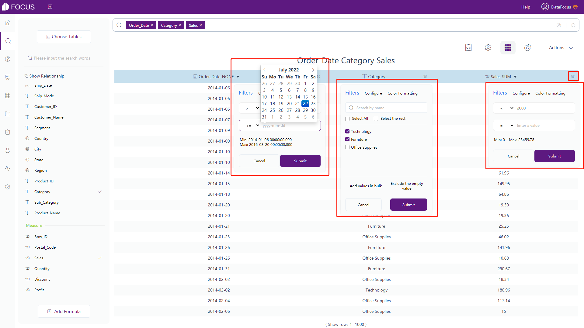
Figure 3-4-111 Filter numerical table -
Filter on the axes of the graphical interface:
(1) Click the axis you want to filter, as shown in figure 3-4-112, the input box of filter criteria will pop up. The filter operations are the same as that of numerical data table above. For details, please refer above.
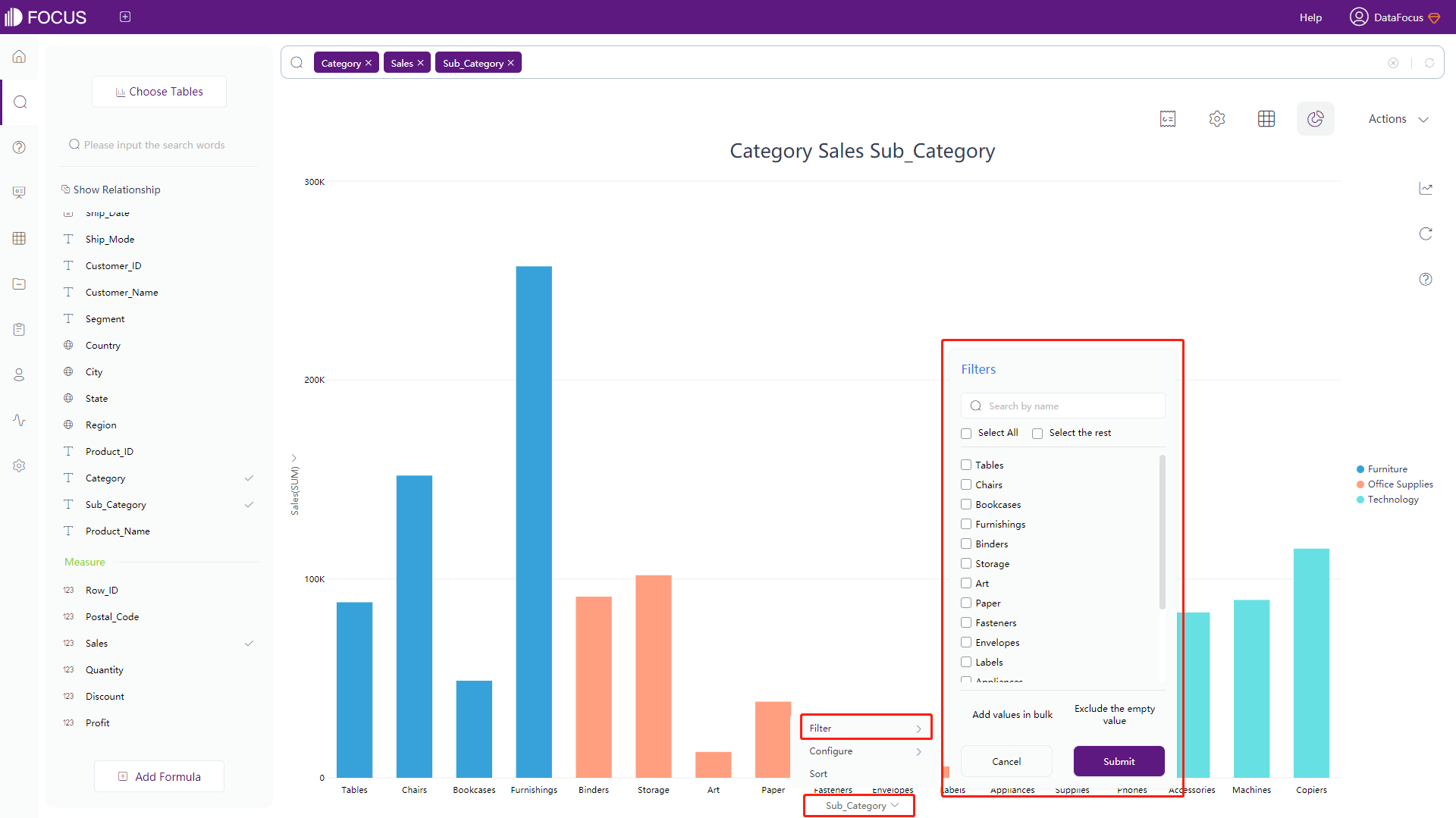
Figure 3-4-112 Filter axes -
Filter in batch:
(1) When filter on the axes of graphical interface, you can choose filter in batch. Click the axis you want to filter and select “Filter – Add values in bulk”, as shown in figure 3-4-113. Note that only non-time Attribute columns can be filtered in batch;
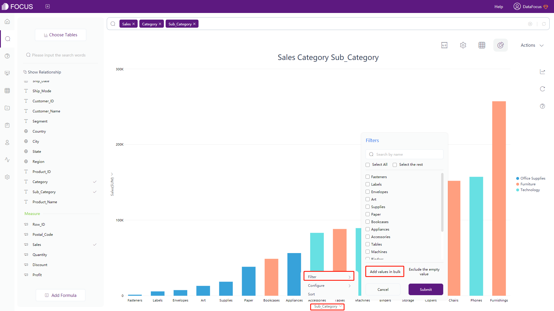
Figure 3-4-113 Filter in batch 1 (2) Enter the values you needed in the column to be filtered in the input box (separated by commas or spaces), as shown in figure 3-4-114;
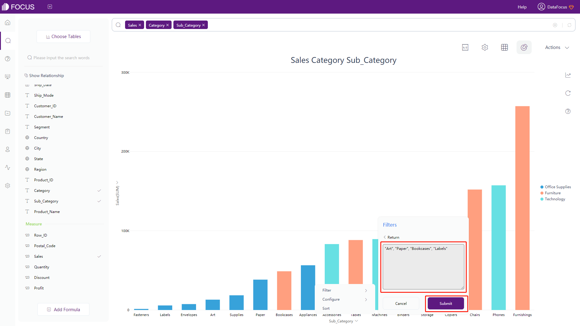
Figure 3-4-114 Filter in batch 2 (3) Click the “Submit” and the system will display values according to the filters, as shown in figure 3-4-115.
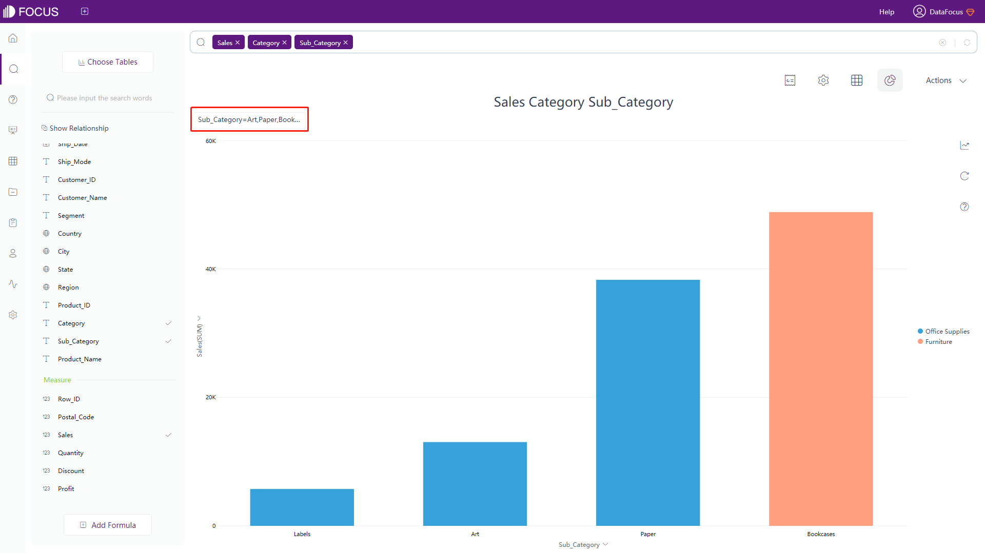
Figure 3-4-115 Filter in batch 3
3.4.9 Color Configuration
Data within a defined range can be set in a same color. For numerical table and pivot table, data within a defined interval or text can be set to display as different shapes. The operation is as follows:
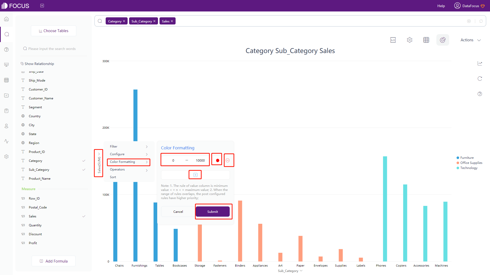
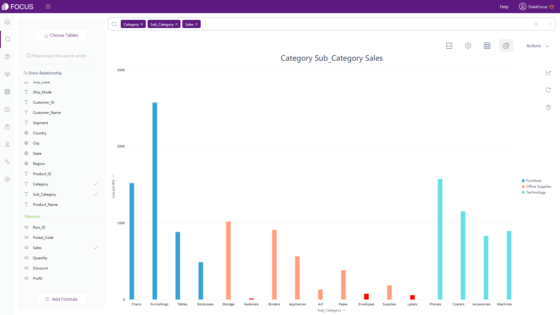
Click the name of Y columns, and 5 options will pop-up. Click “Color Formatting”, and click “+” to add more custom ranges of color. On the boxes, users can enter the custom interval of values. As shown in figure 3-4-116, click the red solid circle to customize the color, Then click “submit”. It can be seen in real time that the values within this range are displayed as the colors just set, as shown in figure 3-4-1117.
Click the “-“ behind the color format to delete the set color format and restore the original color.
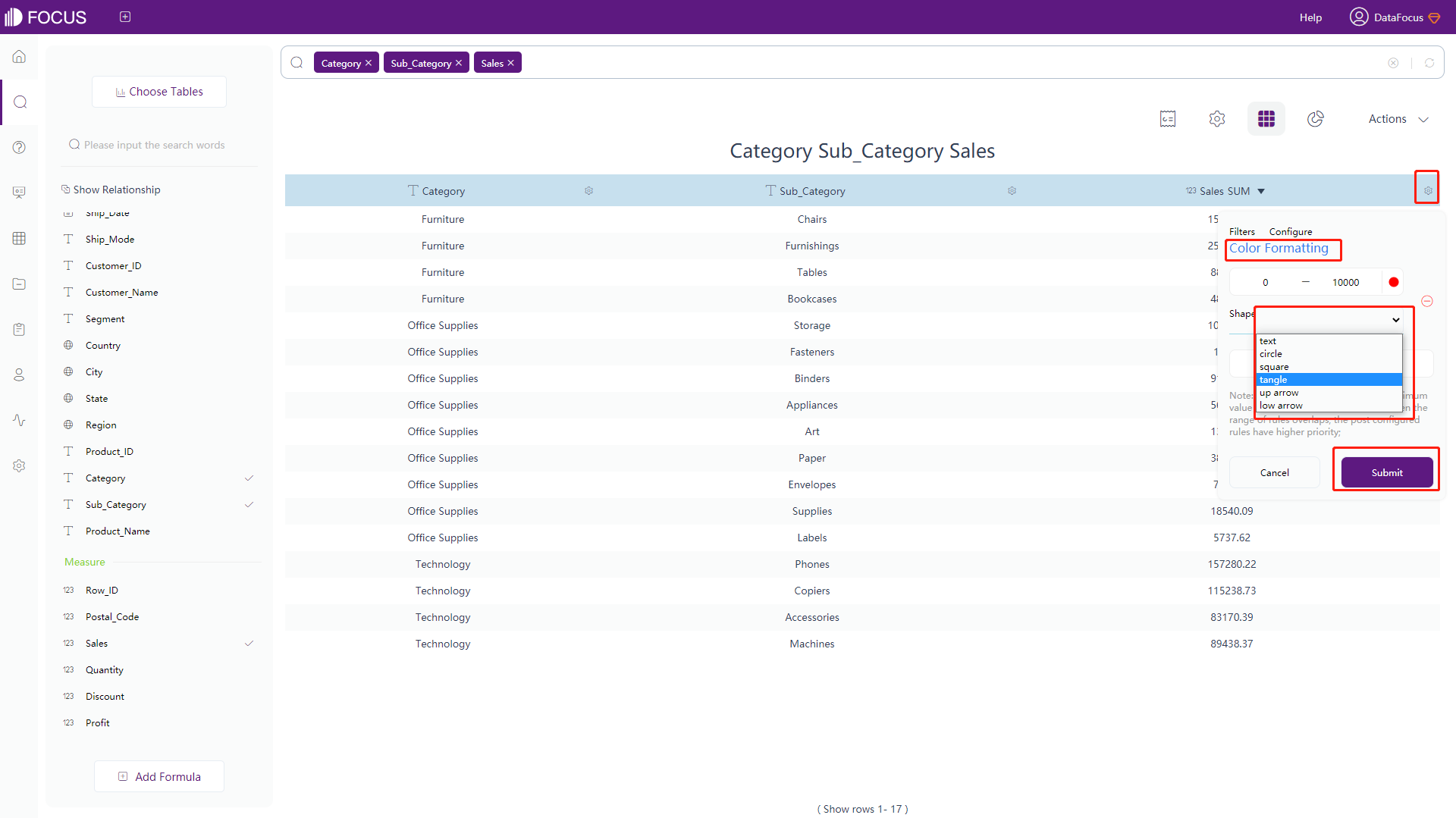
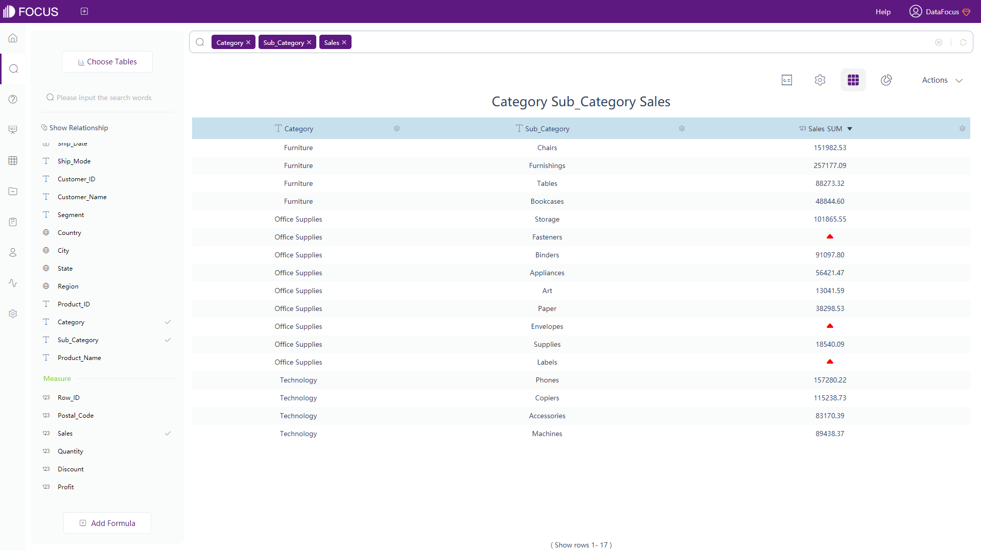
For numerical table or pivot table, click the settings button on the back of the Measure column, as shown in figure 3-4-118. Click the “Color Formatting”, the setting of color formats is the same as above. However, you can also set the shape of the format. Click the rectangular box on the right side of the “shape” to display the shape list, click to select one. The result is shown in figure 3-4-119.
3.4.10 Format Configuration
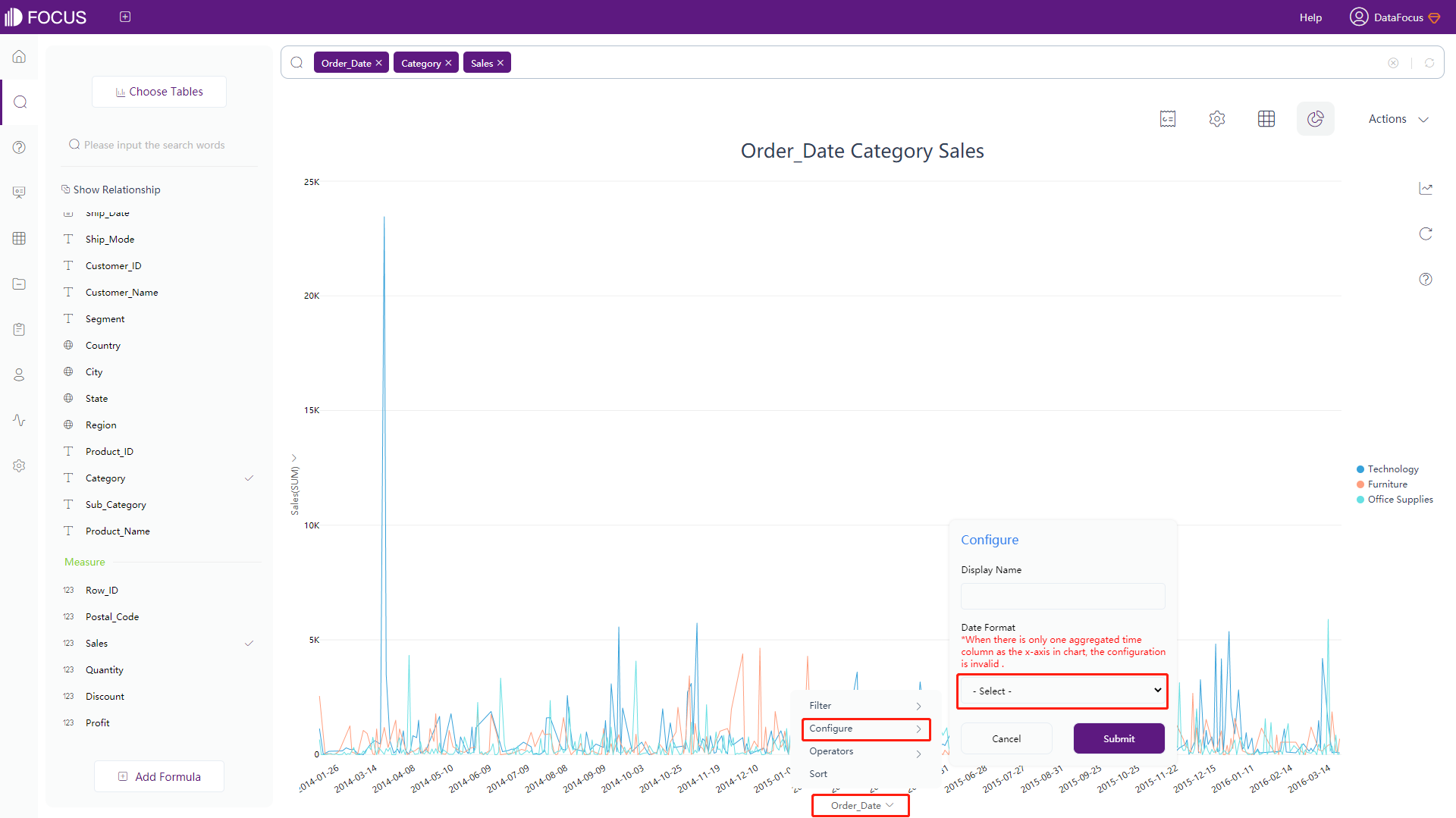
Click on the coordinate axis, select “Configure”, and on the configuration page that pops up, you can make special settings for the displayed name of the current axis, as shown in figure 3-4-120.
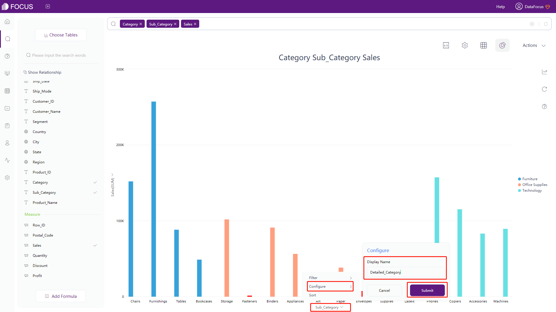
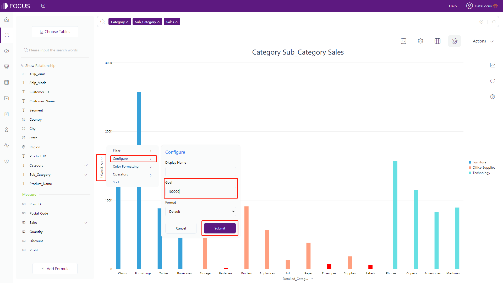
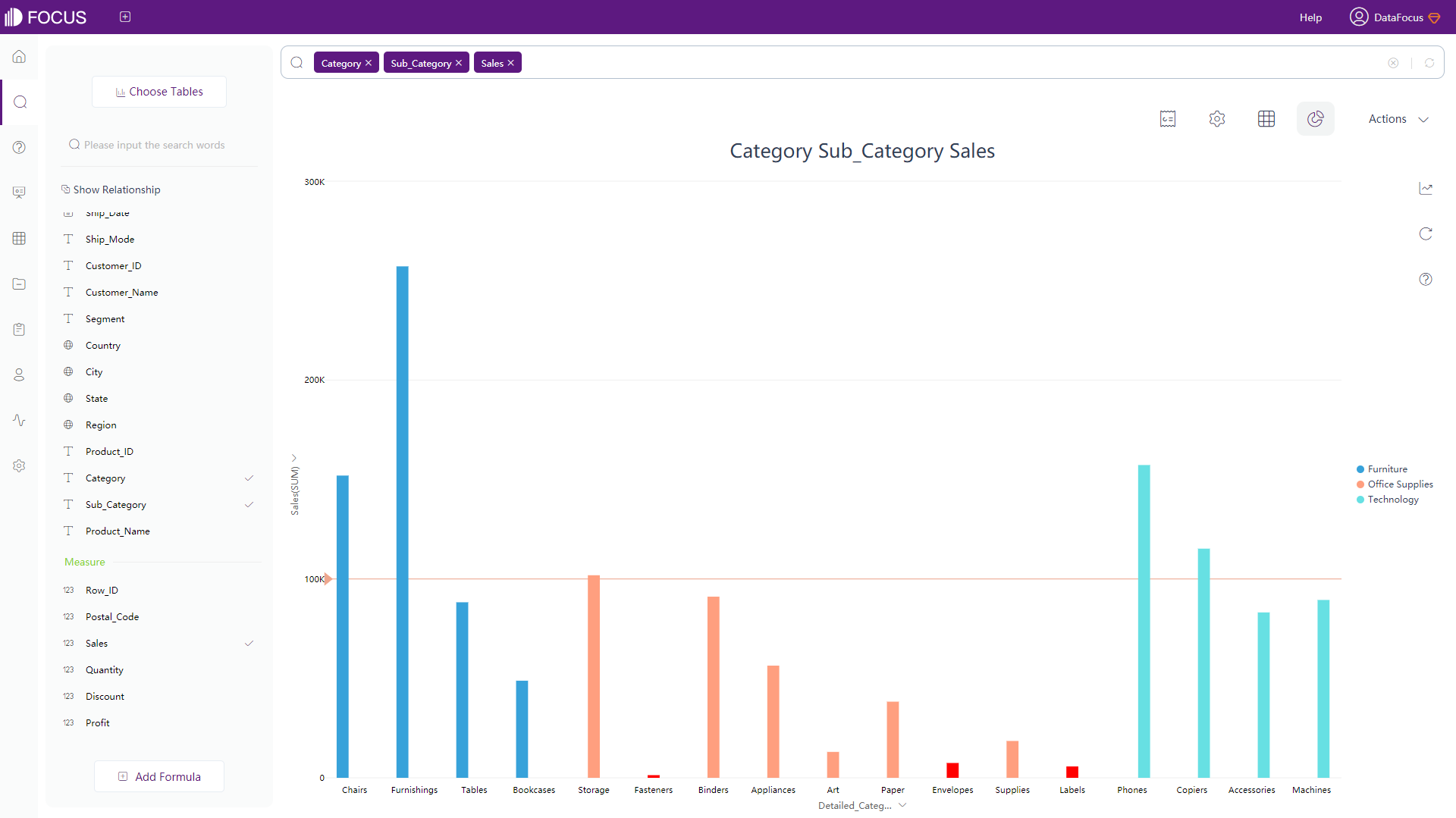
When the current axis is a Measure column, you can configure the target value of the current axis, as shown in figure 3-4-121. Then the line equal to a certain value is displayed in orange as shown in figure 3-4-122.
In the charts of DataFocus Cloud, you can set the format of the Measure column: According to different formats, you can set the corresponding unit of quantity and the number of decimal places reserved. The specific operations are as follows:
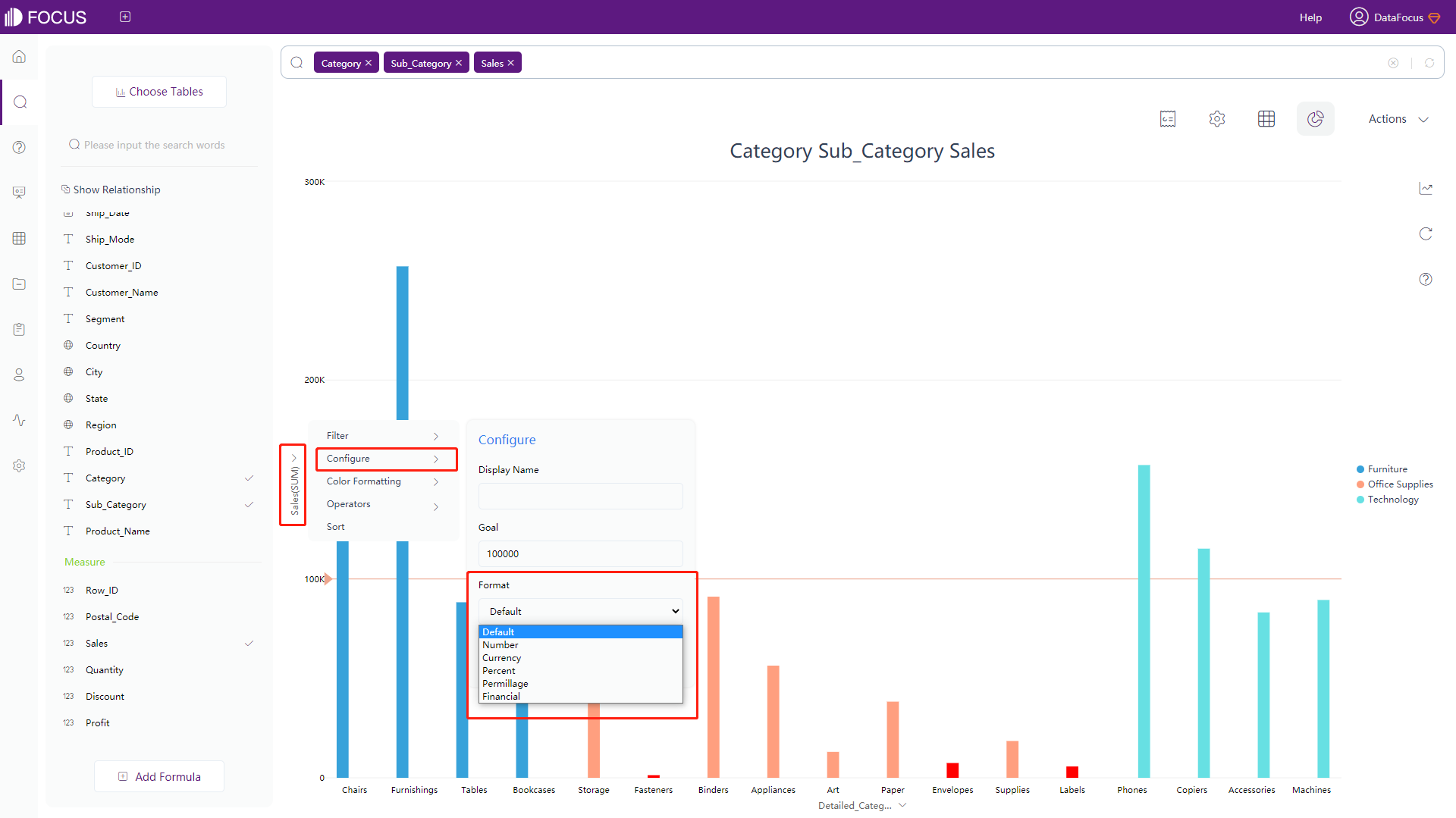
Select the Measure column of the axis, 5 options will pop up, click “Configure” - “Format”. There are 5 formats in total: number (you can continue to set the unit of quantity and decimal places); currency (you can continue to set the currency type, quantity unit, and decimal places); percent (can continue to set the reserved decimal places); permillage (can continue to set the reserved decimal places); financial (can continue to set the quantity unit and decimal places), as shown in figure 3-4-123.
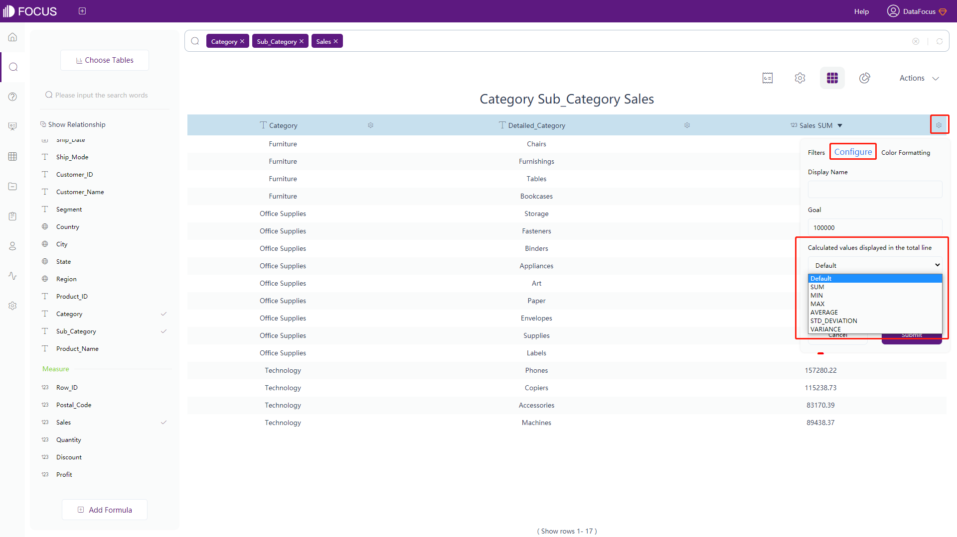
In addition, in the numerical table, the format configuration of the Measure column can set the calculated value displayed in the total row, as shown in figure 3-4-124.
At the same time, you can also set the format of the date column: modify the displayed format of the date column according to different date formats. Click the date format you want to modify, as shown in figure 3-4-125.
3.4.11 Aggregation
In DataFocus Cloud, the aggregation methods of numeric columns are as follows, as described in Table 3-15:
Table 3-15 Aggregation Method of Measure column
| Aggregation Method | Description |
|---|---|
| NONE | No aggregation |
| SUM | Sum value |
| MAX | Maximum value |
| MIN | Minimum value |
| AVERAGE | Average value |
| STD_DEVIATION | Standard deviation |
| VARIANCE | Variance |
| COUNT | Number of data |
| COUNT_DISTINCT | Number of unique data |
There are 4 ways of modifying the aggregation method:
-
Generally, the imported data table has the default aggregation method. The default of the Attribute column is None, and the default of the Measure column is the Sum. In the data table management module, click the data table details to modify, as shown in figure 3-4-126.
Figure 3-4-126 Aggregation - table management -
In the search box, enter the aggregation method you want to use after the corresponding Measure column, such as “max Sales”, as shown in figure 3-4-127.
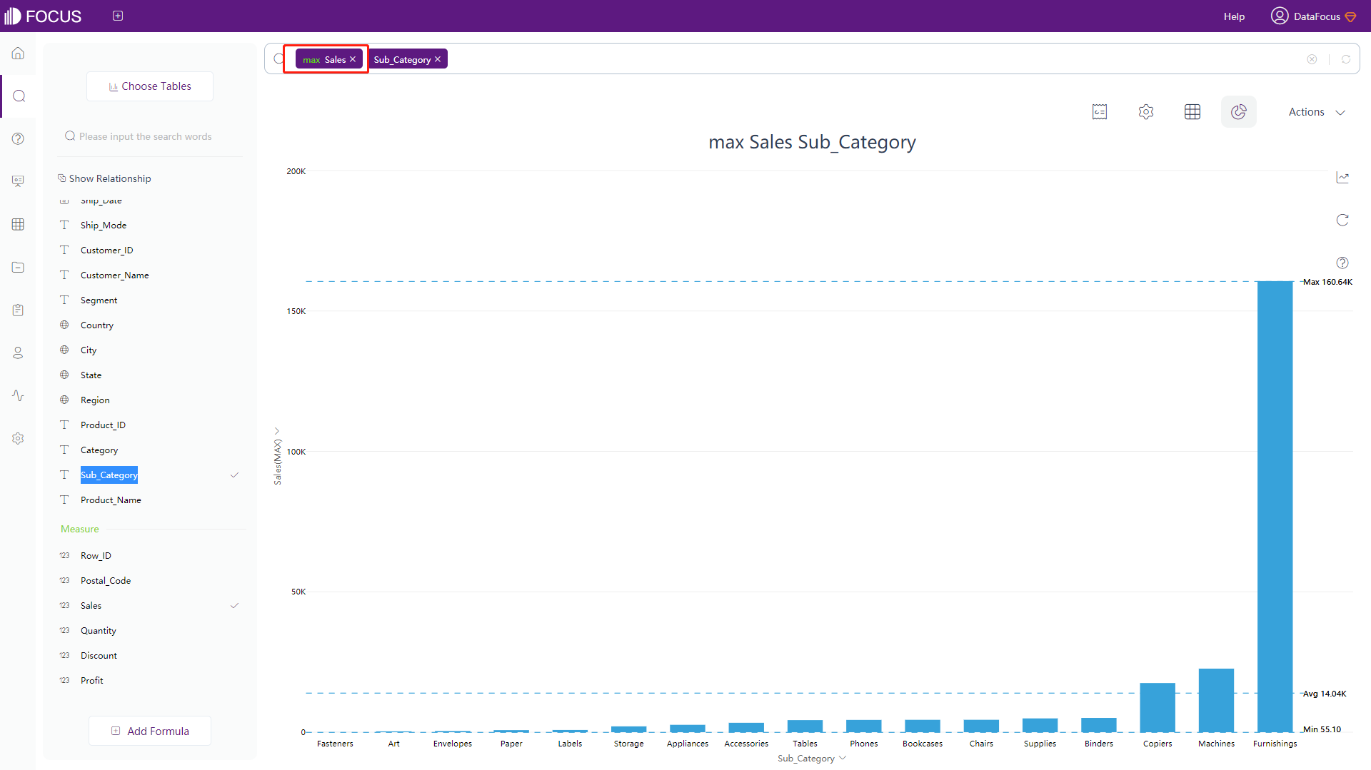
Figure 3-4-127 Aggregation - search box -
Modify the aggregation method in the numerical table:
Click the “Display in grid” button to switch the graphical interface to the numeric table interface;
Click the arrow displayed beside the name of the numeric column, and all aggregation methods will be displayed, as shown in figure 3-4-128;
Click to select an aggregation method, and the system will re-search and return results as required.
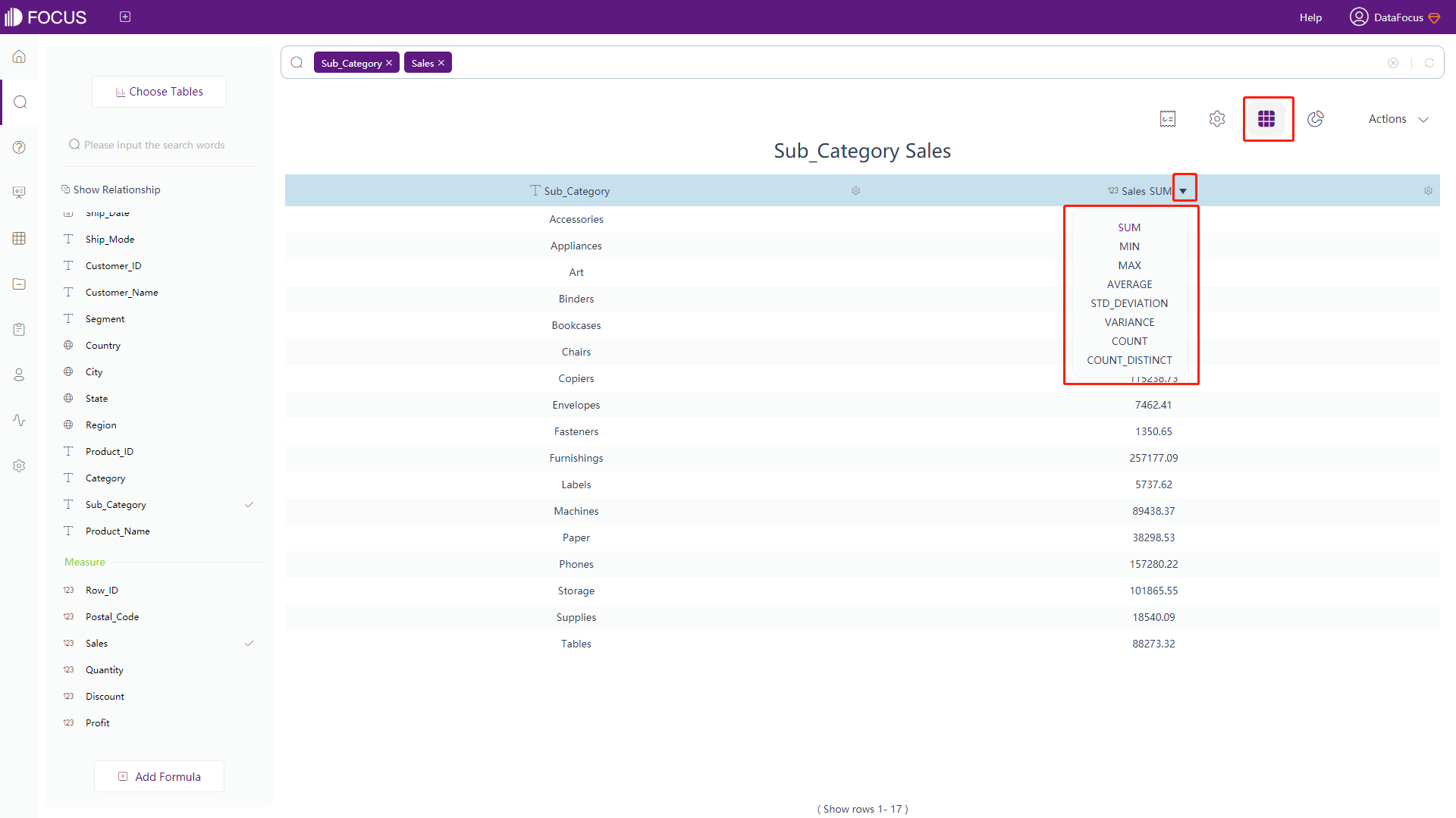
Figure 3-4-128 Aggregation - numerical table -
Modify in the graphical interface:
Click the “Display in chart” button and choose one chart to switch the numerical table interface to the graphical interface;
Click on the Measure column axis, select “Operators”, it will expand and display all types of aggregation methods, as shown in figure 3-4-129 below;
Select the desired aggregation method, and the system will re-search and return results as required.
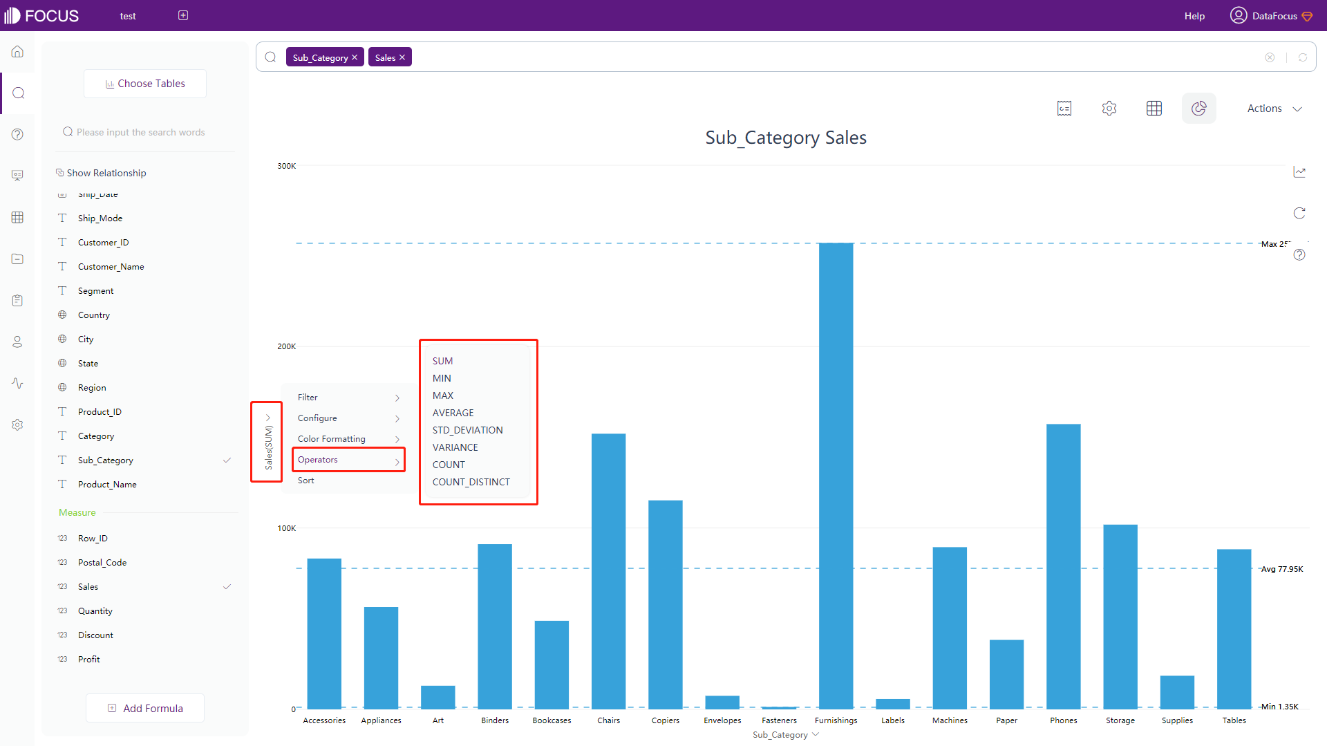
Figure 3-4-129 Aggregation - graphs
3.4.12 Data Drill
Drilling data is an operation for a specific value on the x-axis (Attribute column). It does not support charts such as pivot tables, histograms, and box plots. There are two types of drilling: drill-up and drill-down. Way. Currently, the drill-up and drill-down of geographic information is supported.
There are two ways to drill data: one is to drill in the numerical table, and the other is to drill directly in the chart. Before drilling, the geography type of the field needs to be configured.
-
On the table detail page, set the geographic type of the field
On the data table management page, find the data table in use and enter the table detail page. In “Columns”, set the corresponding “Geo type” for the column that needs to be drilled, as shown in figure 3-4-130.
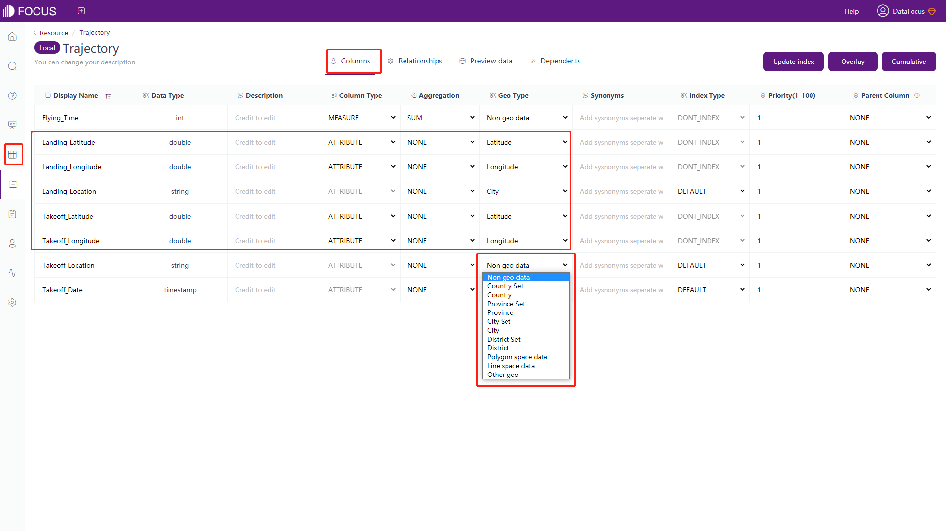
Figure 3-4-130 Data drill - geo type -
Drill directly in the graph as follows:
Select the data you want to perform the operation on. If the data meets the requirements, right-click to display the “Drill Up/Drill Down” button. After clicking this button, the drillable column information will be displayed as shown in figure 3 -4-131. If the data does not satisfy the requirements, the function button will not be displayed.
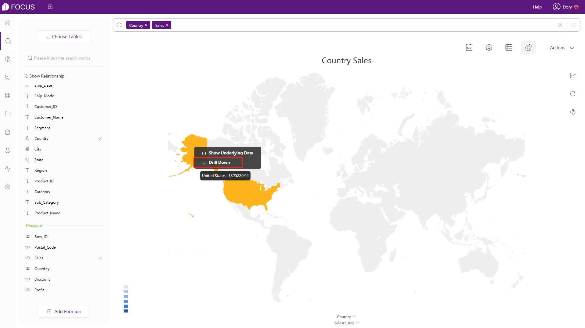
Figure 3-4-131 Data drill - graph Select the column you want to drill on if the “Drill Up/Drill Down” button is displayed. After drilling, the texts in the search box will also simultaneously display the column that is drilled and its drilled column on the x-axis, as shown in figure 3-4-132.
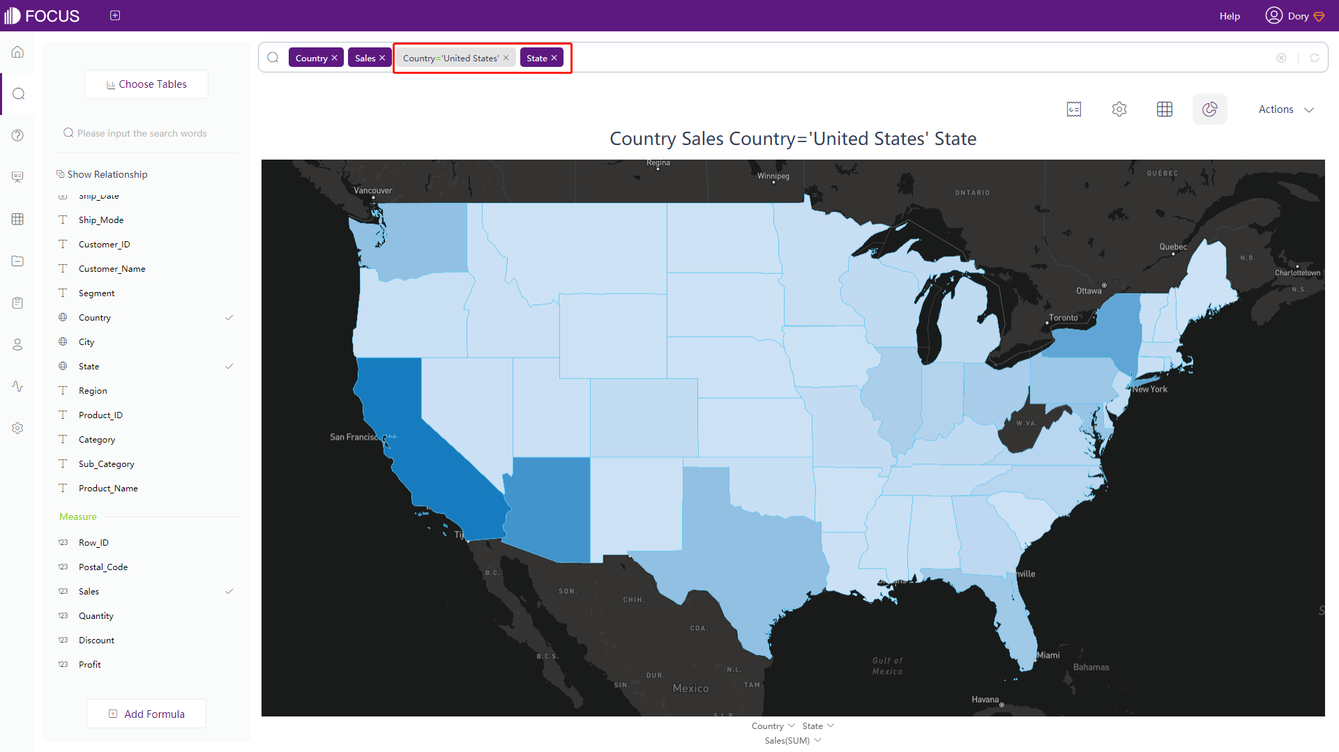
Figure 3-4-132 Data drill - graph drilled -
Drilling in the numerical table as follows:
Select the data you want to perform this operation in the numerical table. If the data meets the requirements, right-click to display the “Drill Up/Drill Down” button, as shown in figure 3-4-133. After clicking this button, the drillable column information will be displayed, as shown in figure 3-4-134. If the data does not satisfy the requirement, the function button will not be displayed.
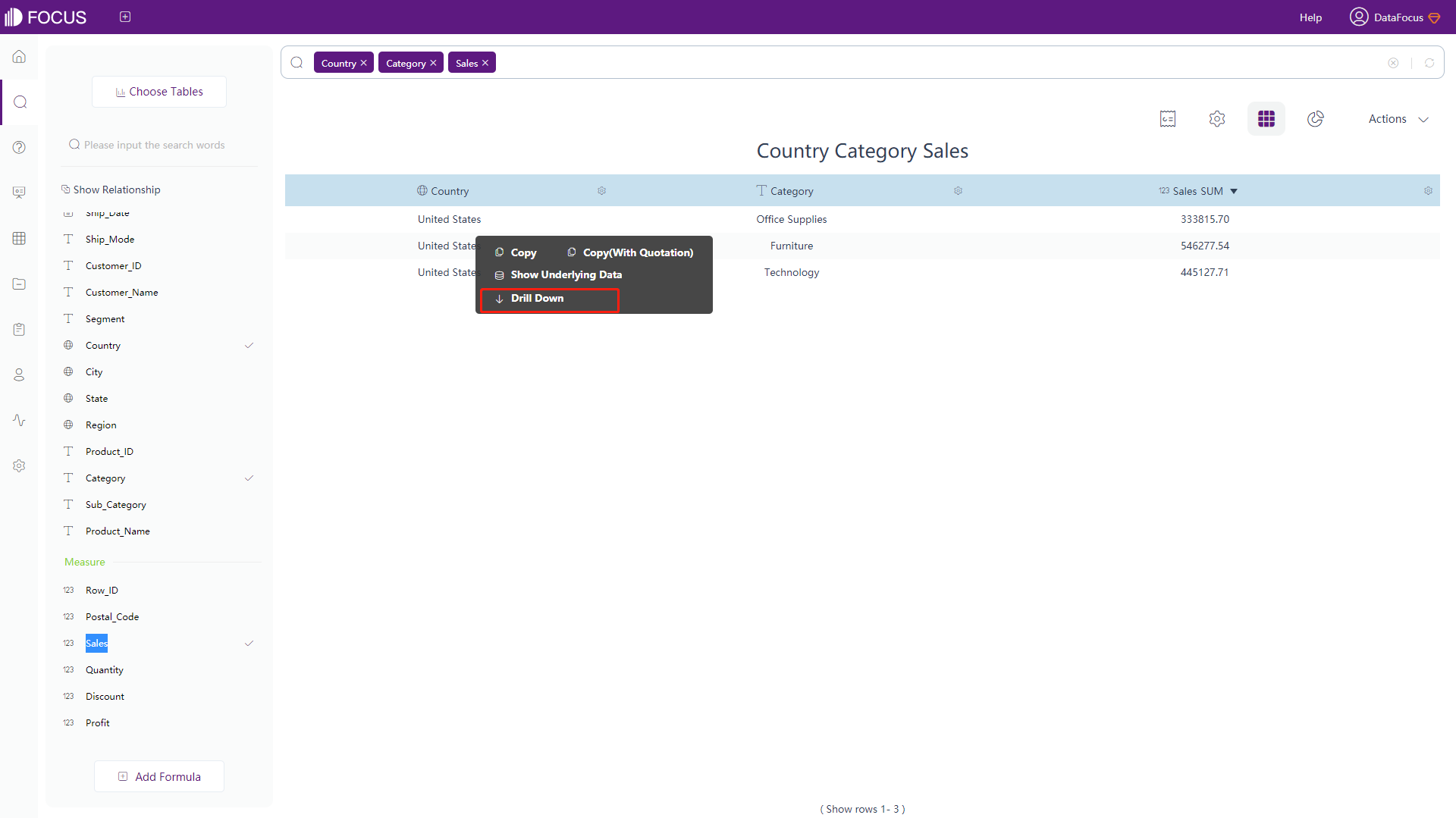
Figure 3-4-133 Data drill - numerical table 1 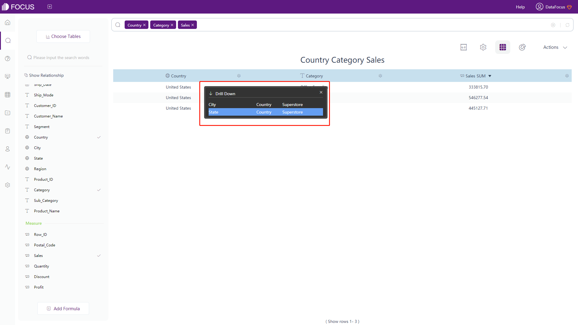
Figure 3-4-134 Data drill - numerical table 2 Select the column to drill on if the “Drill Up/Drill Down” button is displayed. After drilling, the texts in the search box will also simultaneously display the column that is drilled and its drilled column on the x-axis, as shown in figure 3-4-135.
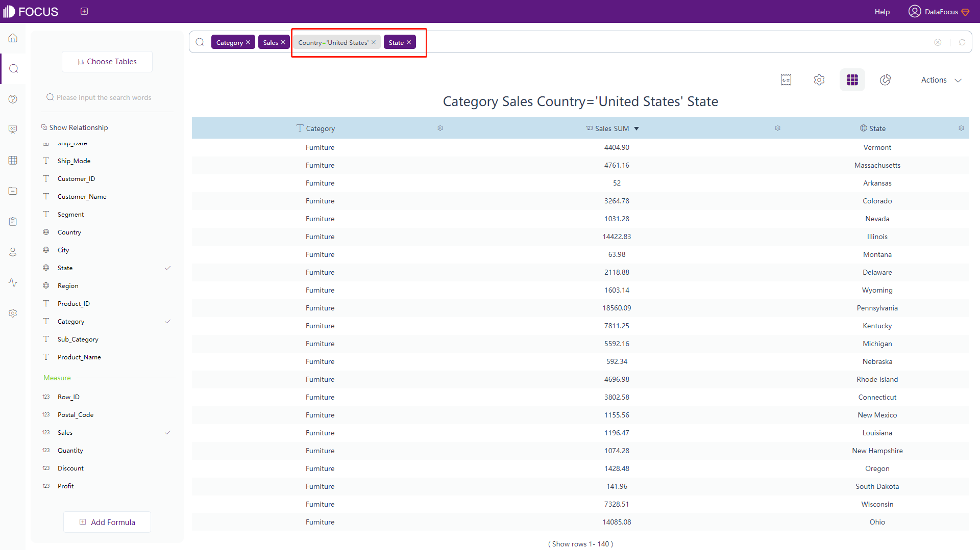
Figure 3-4-135 Data drill - numerical table result
3.4.13 Display Data Details
On the search analysis page, dashboard, or answer, right-click the graphic block and select “Show Data Details”, as shown in figure 3-4-136. It will display details of the original data, as shown in figure 3-4-137. You can export the details as csv file and save it locally.
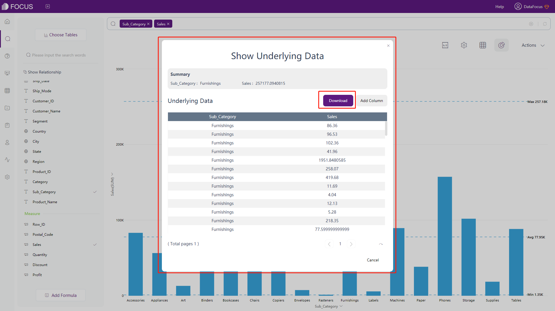
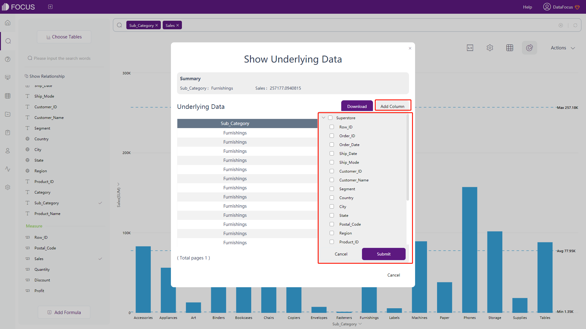
Also, you can add other columns from the table to enter the displayed data details by clicking “Add Column”, as shown in figure 3-4-138.
3.4.14 Hide & Restore Data
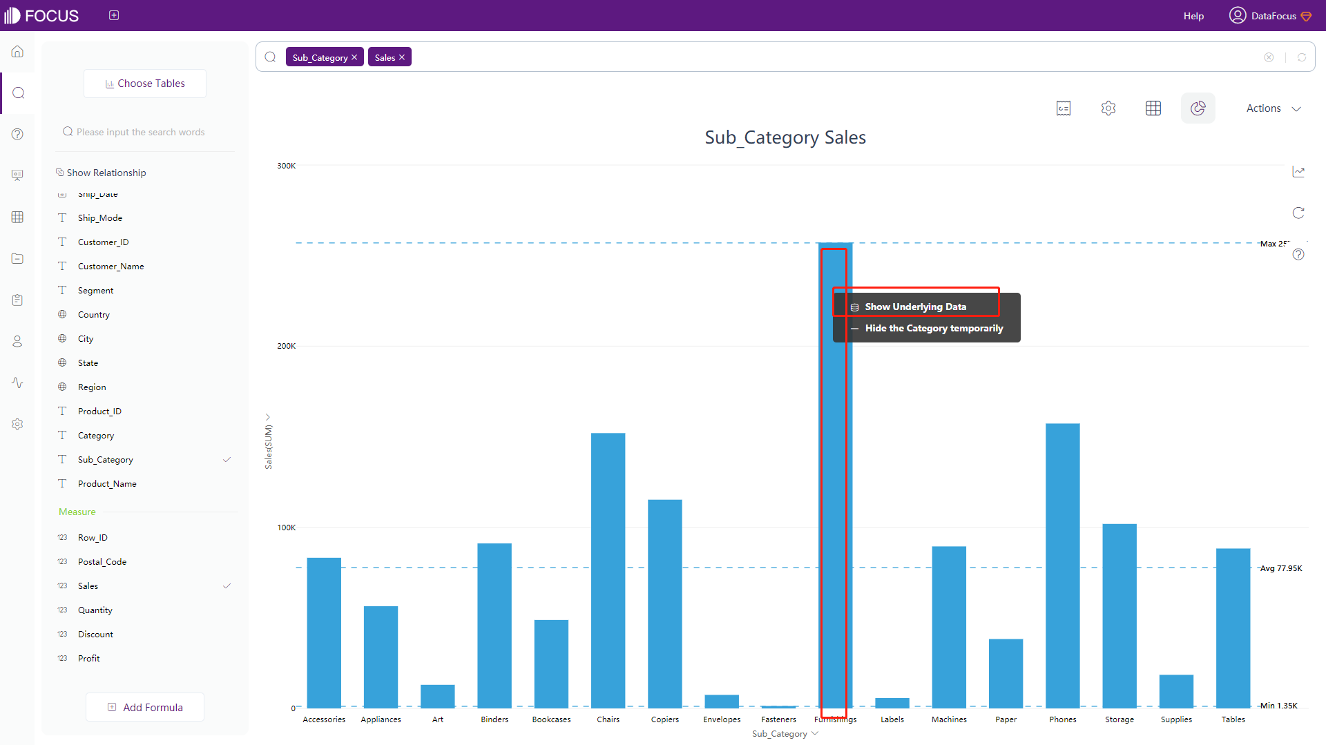
In search analysis pages, some types of charts can hide search results for specific values in columns. For example, in the bar chart, select a column, right-click “Hide the Category temporarily”, you can hide this data in the chart, as shown in figure 3-4-139.

Click “Reset the Hidden Items” button on the right side of the page to restore the hidden categories, as shown in figure 3-4-140.
3.5 Sort Configuration
There are 3 ways to sort data:
-
In the search box
Enter the sorting method after the column name you want to sort, for example, enter “sort by Sales descending” in the search box, as shown in figure 3-5-1.
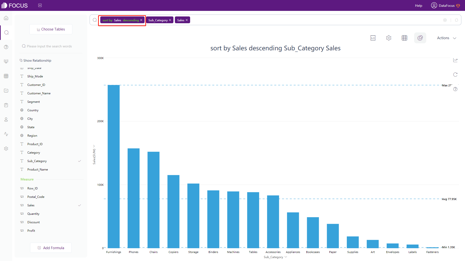
Figure 3-5-1 Sort - search box -
In the numerical table
Click the column name you want to sort by. The first clicked column names are sorted in descending order, and the second clicked column names are sorted in ascending order. The sorting method will also appear below the title, as shown in figure 3-5-2. Note that temporary columns cannot be sorted by this way.
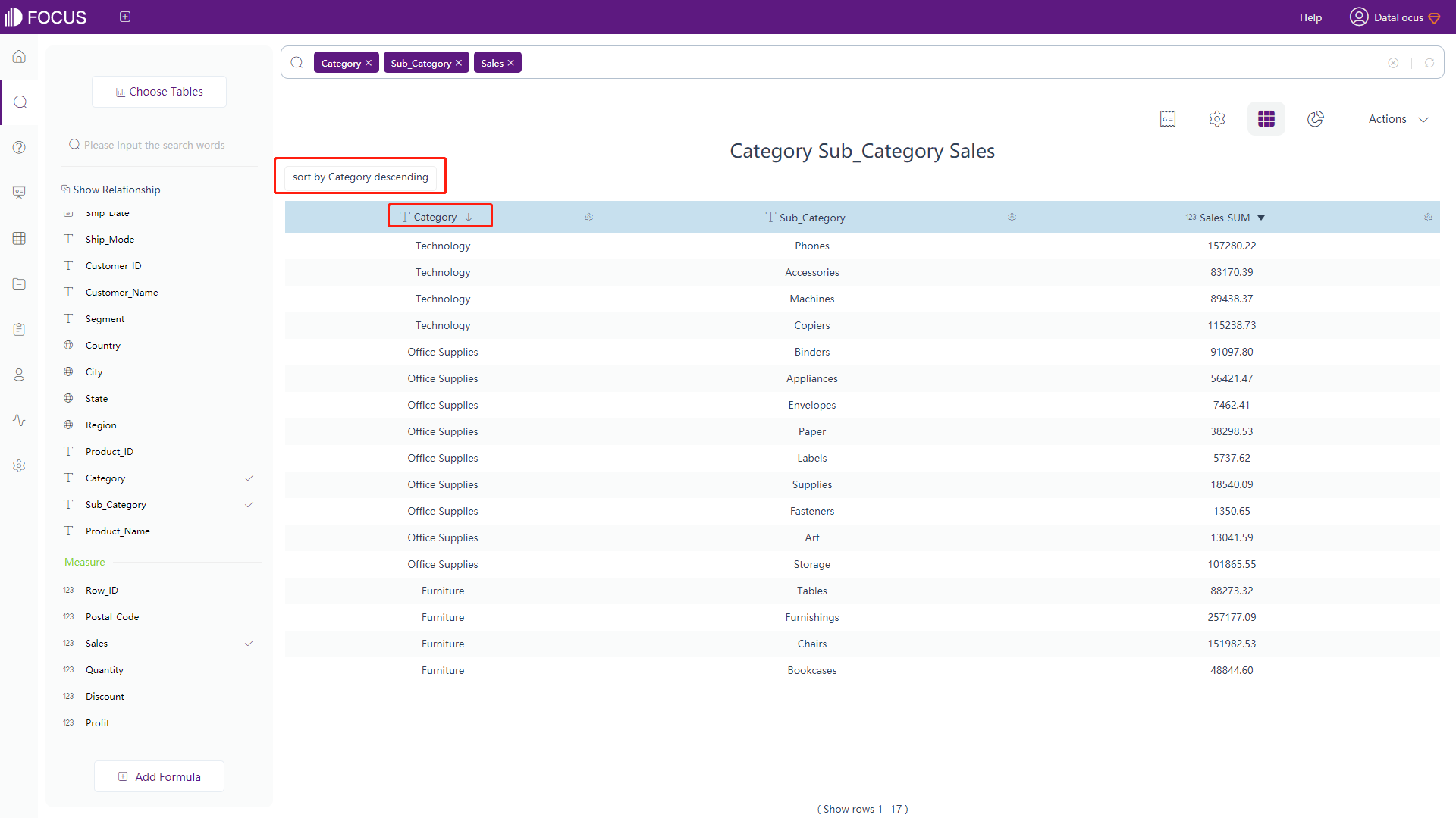
Figure 3-5-2 Sort - numerical table -
In the graphics:
Click on the axis you want to sort on. Select “Sort”, the column names clicked for the first time will be sorted in descending order, and ascending order for the second time. The sorting method will also appear below the title, as shown in figure 3-5-3.
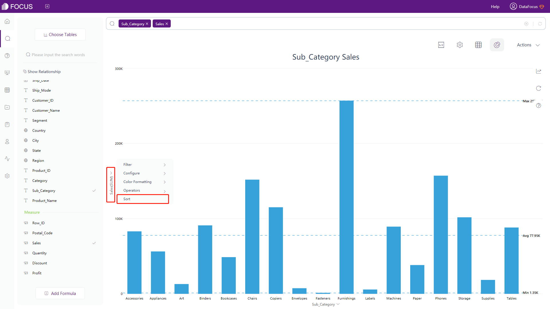
Figure 3-5-3 Sort - graphics
3.6 Keyword Search
Keywords are built-in in DataFocus Cloud to help users search and use. Using them to define the search, and can narrow the search scope as well as improve efficiency. See the Keywords Section for specific keywords that can be used and the use cases.
Keywords are mainly divided into the following categories, as shown in table 3-16:
Table 3-16 Keyword types
| Keywords Type | Description |
|---|---|
| Date | Freely narrow search by day, week, month, quarter or year. See Section 11.1 for details |
| Time | Find out the number of visitors in the last “N minutes or hours”, etc. See Section 11.2 for details |
| String | Find similar words or phrases that contain a word. For example, the username contains “Tom”. Section 11.3 for details |
| Filter | Corresponding numerical calculations, such as: “greater than”, “less than”, “greater than or equal to”, “not equal to”. See Section 11.4 for details |
| Sort | Display the search results according to certain sorting requirements. See Section 11.5 for details |
| Aggregate | Specify how the columns are aggregated. See Section 11.6 for details |
| Rank | Use keywords like “top” and “bottom” to see only the top or bottom sales. See Section 11.7 for details |
| Growth | Calculate the growth of data. See Section 11.8 for details |
| vs | Complex comparison situations, such as the comparison of median values in the same column, or the comparison between local and overall. See Section 11.9 for details |
3.7 Add Formulas
You can enrich the search results by adding formulas in the search box. Specific operations are as follows:
-
Click the “add formula” button in the lower-left corner of the search page and a formula filling interface will pop up, as shown in figure 3-7-1 below;
-
Enter the formula you want to use in the blank space or choose the formula you want by using the “Formula Assistant” button on the right. Hover the mouse over the formula, then the explanations and samples of the formula will appear below;
-
Formulas can be named by yourself. Click the formula name to edit the formula name (it cannot be the same as keywords);
-
If the final result calculated by the formula is a numerical value, the aggregation mode and column type of the formula can be modified in the “Advanced Settings” below the formula input box;
-
Click the “Submit” after entering the formula correctly, the formula will be added at the bottom of the data table;
-
Double-click the formula to add it to the search box, and the results are displayed.
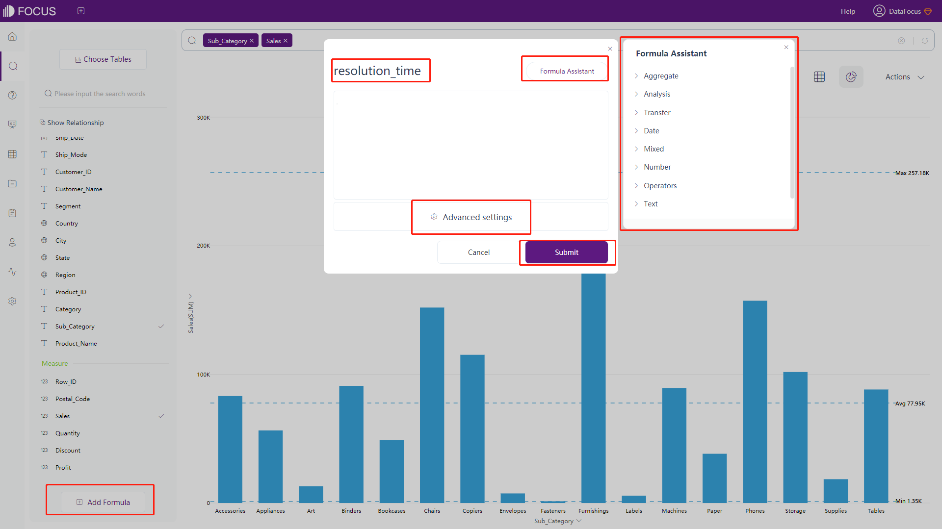
3.8 Save as Answer
On the search page, click “Actions” at the top right of the page, and click the “Save as Answer” button, as shown in figure 3-8-1.

Then the Edit History answer window pops up. Enter a name (required), a description (optional), and you can also choose to add a management item (not required). Click “Submit” to save the search results in the answer module, and you can review or edit the results through the answer, as shown in figure 3-8-2. Users with or without data permissions view different contents, but the page for editing answer information is the same.
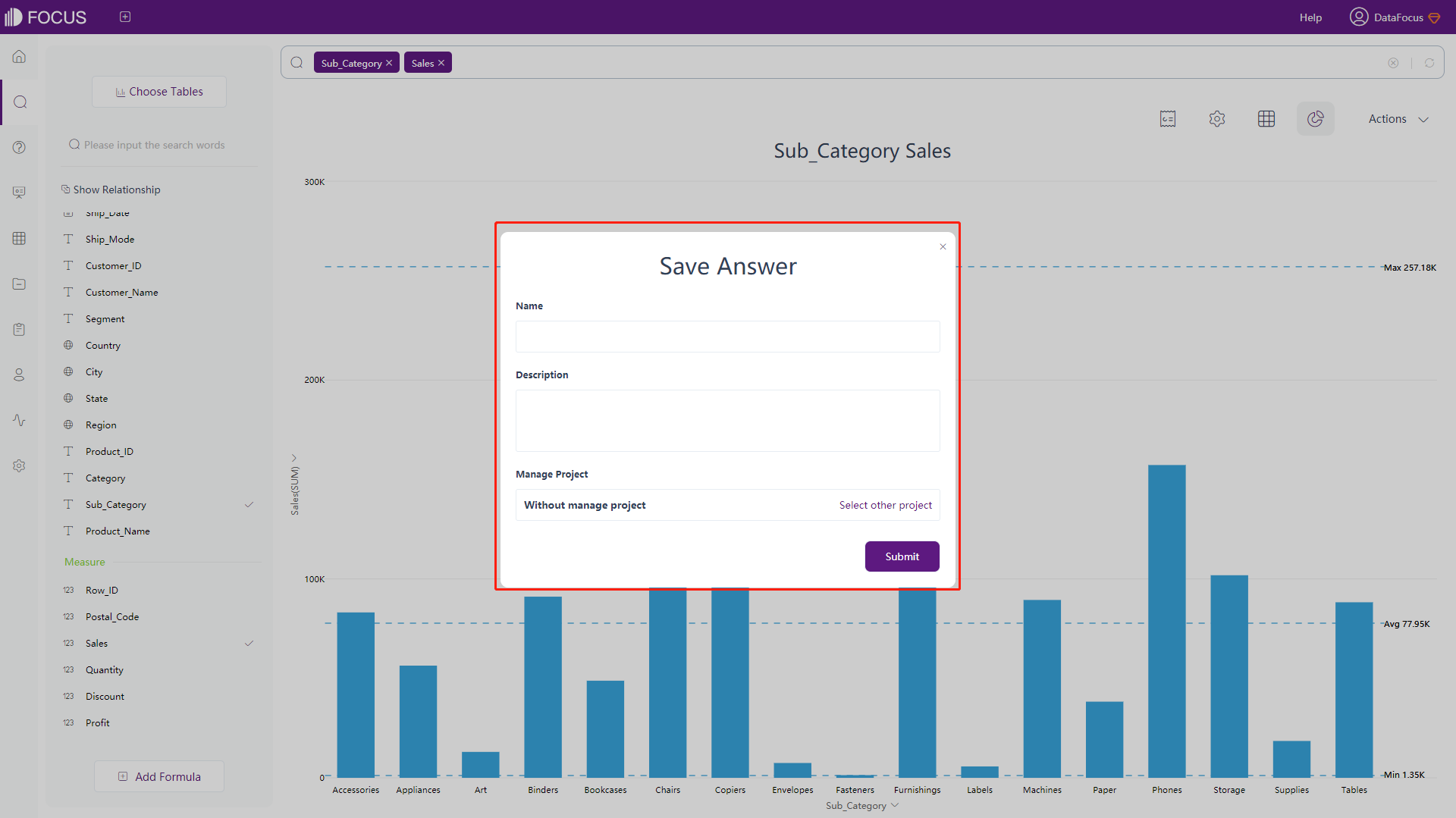
3.9 Save as Intermediate Table
On the search page, click “Actions” at the top right of the page. Then click the “Save as Worksheet” button to generate an intermediate table for the current search results and save it to the data management module. This option requires permissions, only users with administrator permission or data management permission can see the “Save as Worksheet” button, as shown in figure 3-9-1.
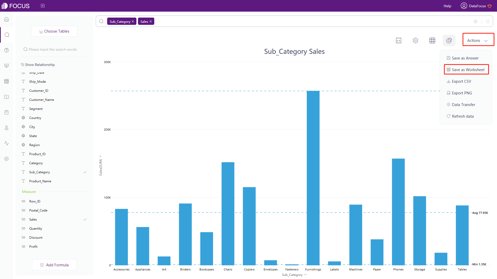
When saving as an intermediate table, you need to enter a name (required), a description (optional), and a management item (optional). You can also modify the column names of the intermediate table, as shown in figure 3-9-2.
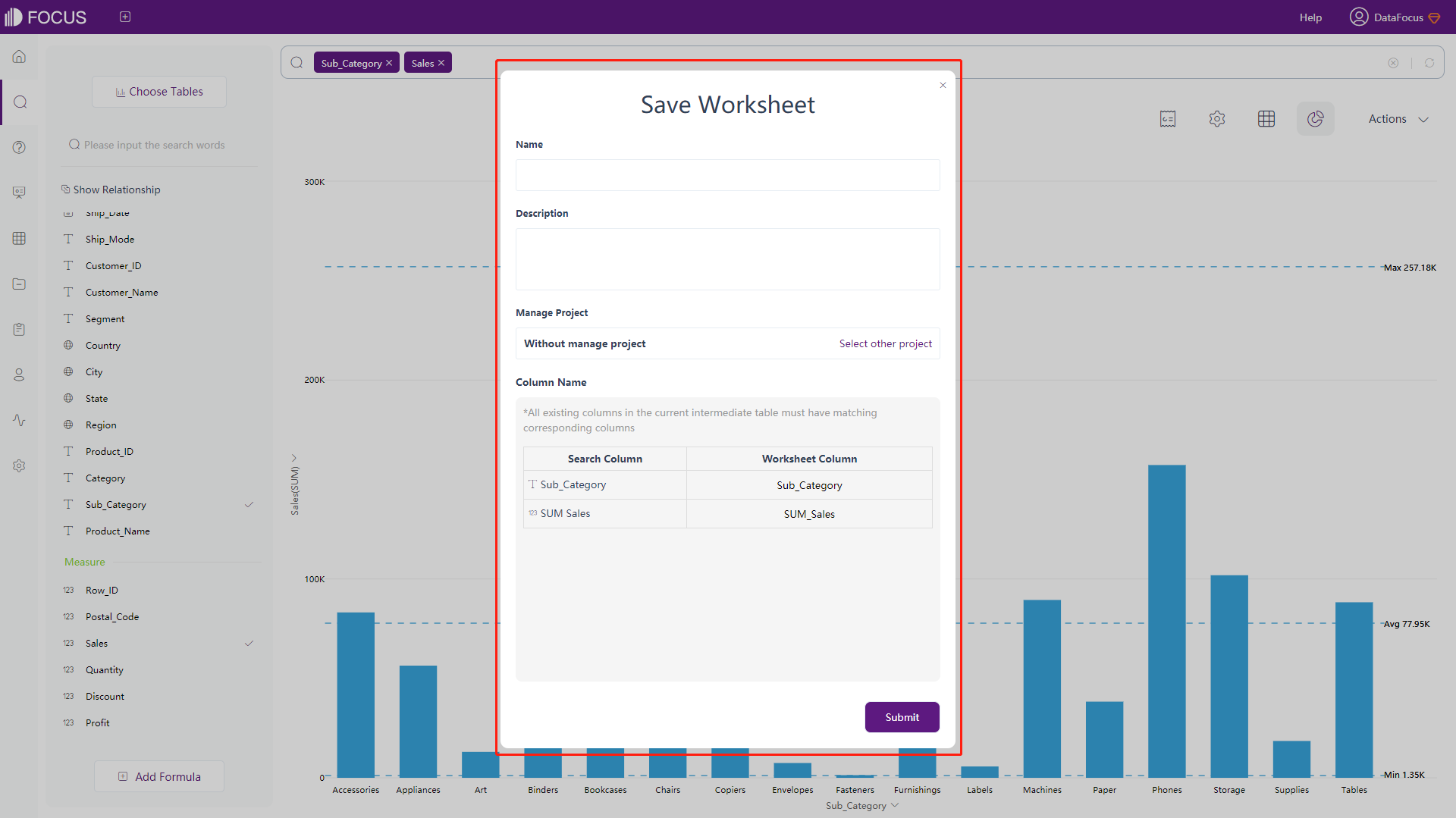
3.10 Export to CSV
On the search page, click “Actions” at the top right of the page, and click the “Export CSV” button, as shown in figure 3-10-1. You can export the current answer original data to a CSV format file and download it locally.
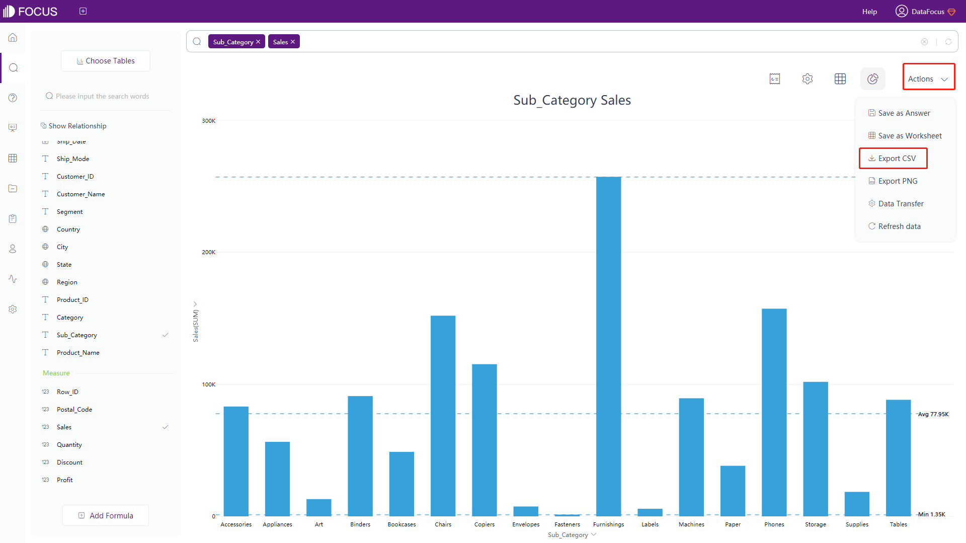
3.11 Export to Images
On the search page, click “Actions” at the top right of the page, and click the “Export PNG” button, as shown in figure 3-11-1. You can export the current answer original data to a PNG format file and download it locally.
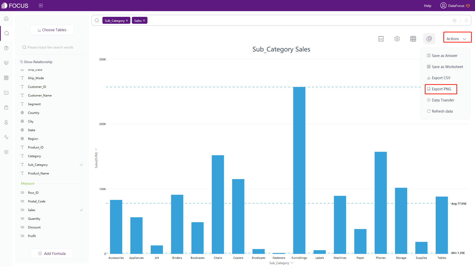
3.12 Join Brief Report
On the search page, click the “Join the brief report” button at the top right of the page, and an operation box will pop up, as shown in figure 3-12-1. Enter the name and remarks, and click “Submit” to go to the next step.
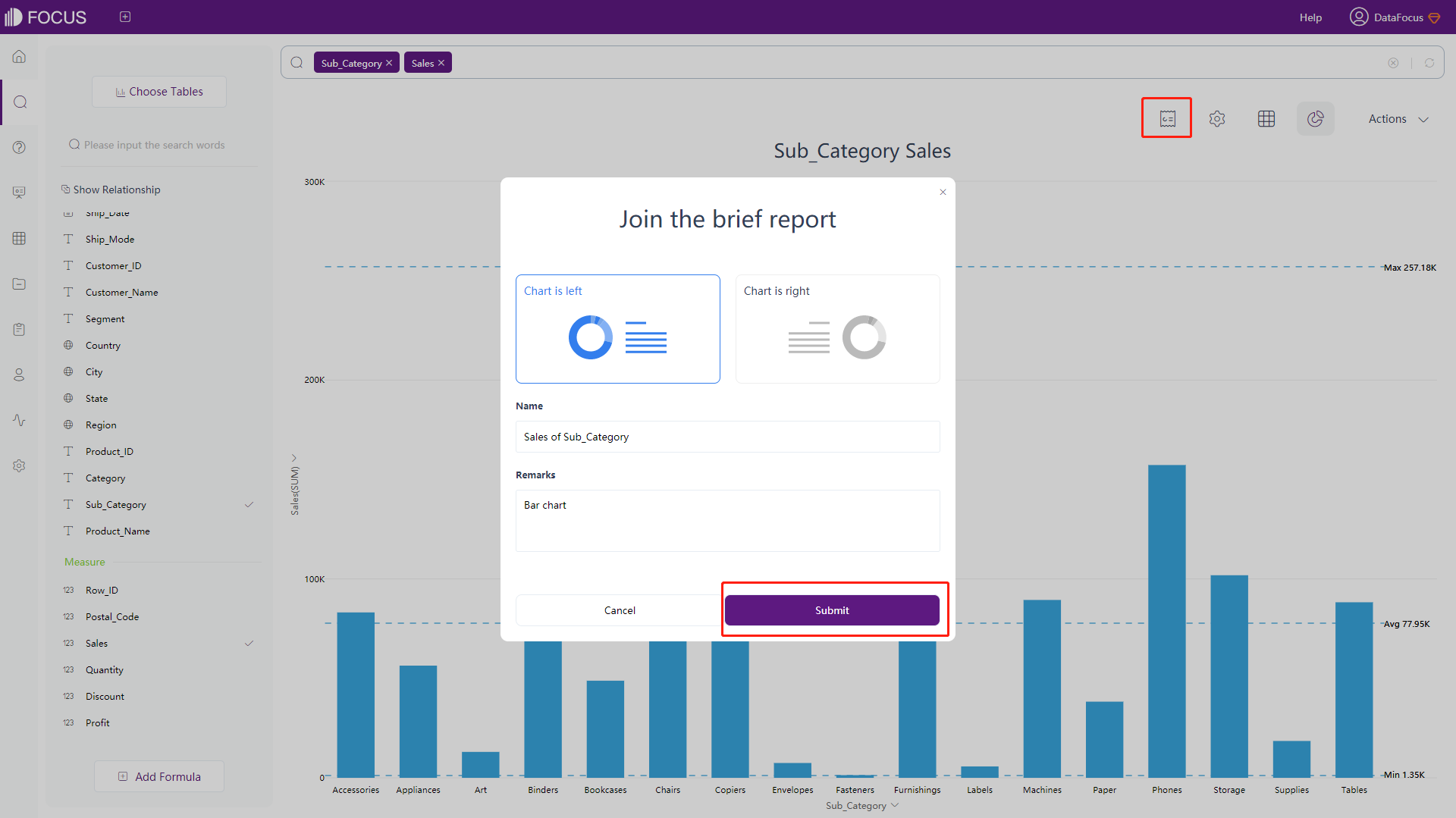
Add a receiving mailbox, you can save and send the briefing, as shown in figure 3-12-2.
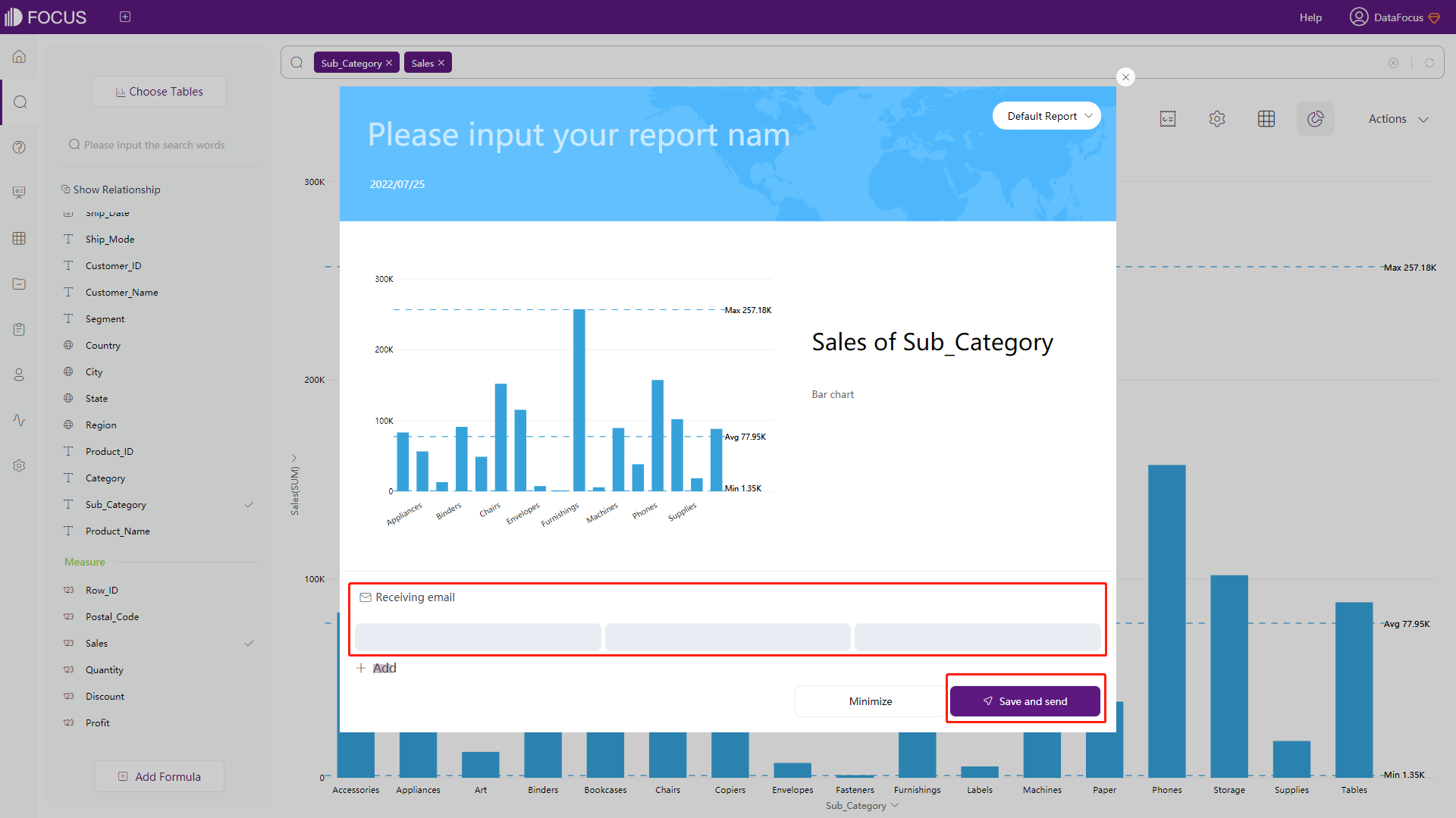
3.13 Data Conversion
3.13.1 Between Row & Column
When the data conforms to the data structure requirements of row-column conversion, you can find and operate the “Data Transfer” option from the “Actions”, as shown in figure 3-13-1.
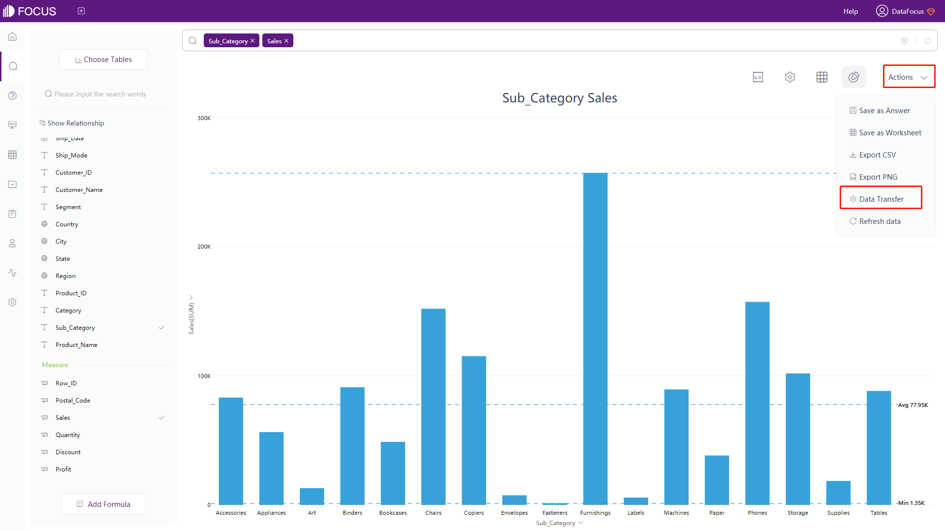
The row-column conversion in data conversion is mainly divided into two types: row-to-column and column-to-row:
Rows to Columns
Rows to columns are used to convert data into corresponding multiple columns according to the column median value of a certain column.
-
Click “Actions” button in the upper right corner and find “Data Transfer”;
-
Jump to the data conversion setting pop-up window, and select the conversion data. Here, choose “row to column”, and select the Attribute column and corresponding Measure column to be converted (one or more). Then click Next, as shown in figure 3-13-2.
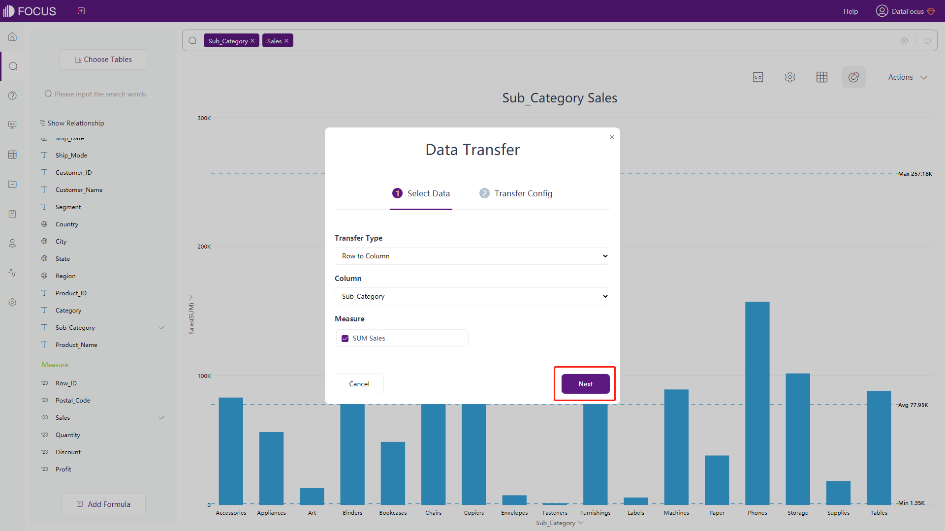
Figure 3-13-2 Row to column - select data -
Review the row-to-column configuration as shown in figure 3-13-3, click “Submit” to complete the conversion.
Figure 3-13-3 Row to column - transfer config
Columns to Rows
Column-to-row is used to convert a multi-column Measure column into 2 columns (1 Attribute column and 1 Measure column) with a single mapping relationship. For example, if a data table has the population from 2018 to 2021 every year, and it is divided into 4 Measure columns by year, we want to convert these 4 Measure columns into 1-year Attribute column and 1 Measure column of the population corresponding to the corresponding year.
The operation steps are as follows:
-
Click the “Actions” button in the upper right corner and find “Data Transfer”;
-
Jump to the data conversion setting pop-up window, and select the conversion data. Here, choose “column to row”, and select the Measure column to be converted. Then click the “Next”, as shown in figure 3-13-4.
Figure 3-13-4 Column to row - select data -
Redefine the names of the converted Attribute column and Measure column, as shown in figure 3-13-5, click the “Submit” to convert it into the target data.
Figure 3-13-5 Column to row - transfer config The result is shown in figure 3-13-6.
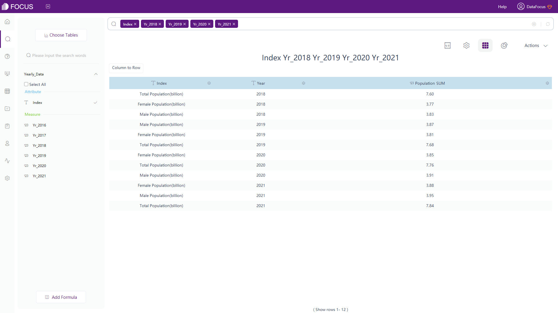
Figure 3-13-6 Column to row - result For row-to-column conversion, the number of Attribute columns cannot exceed 16 and the maximum number of Measure columns is 16, the maximum number of total columns is 32;
For column-to-row conversion, the maximum number of total columns is 32.
3.13.2 Split up Columns
Column splitting is used to split a row of data in search results by a specific delimiter. The operation steps are as follows:
-
Click the “Actions” button in the upper right corner and find “Data Transfer”;
-
Jump to the data conversion setting pop-up window, and select the conversion data. Here, choose “Column Split”, and select the column to be converted. Then click the “Next”, as shown in figure 3-13-7;
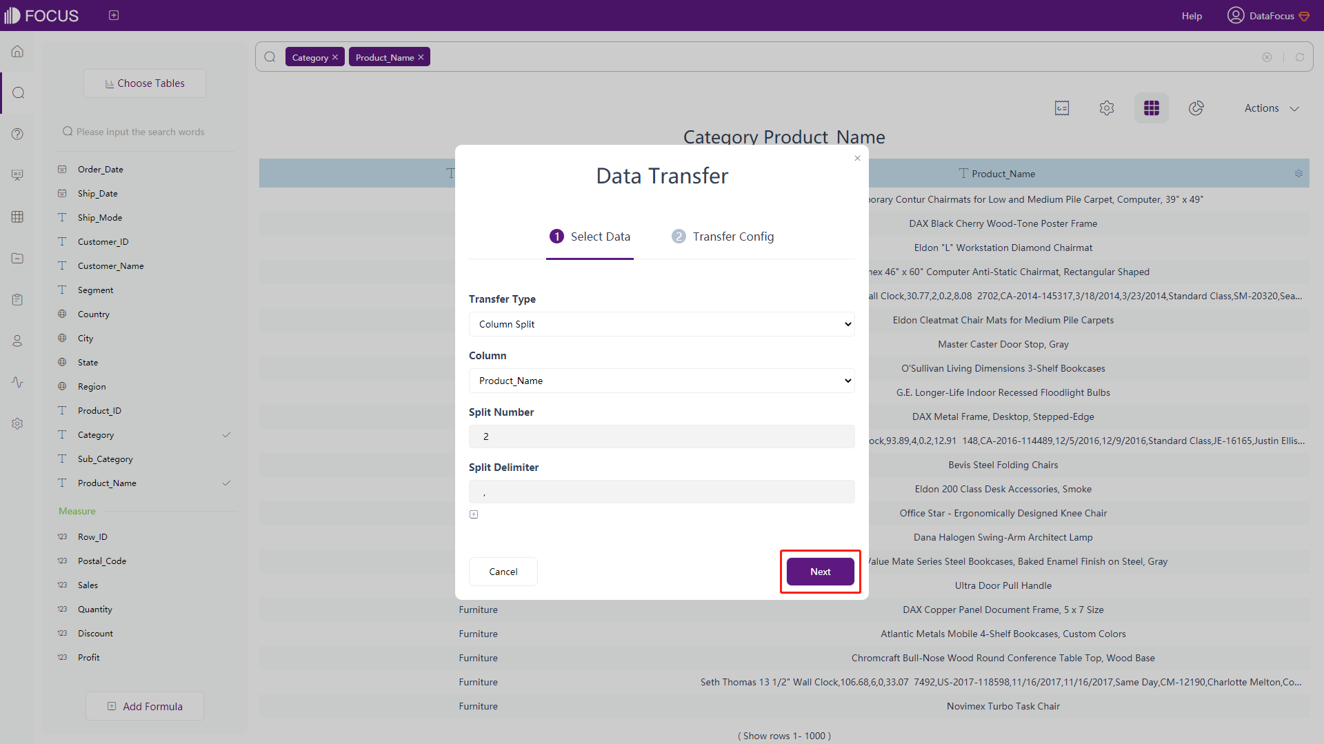
Figure 3-13-7 Column split - select data -
Define the name of each column after sorting, as shown in figure 3-13-8;
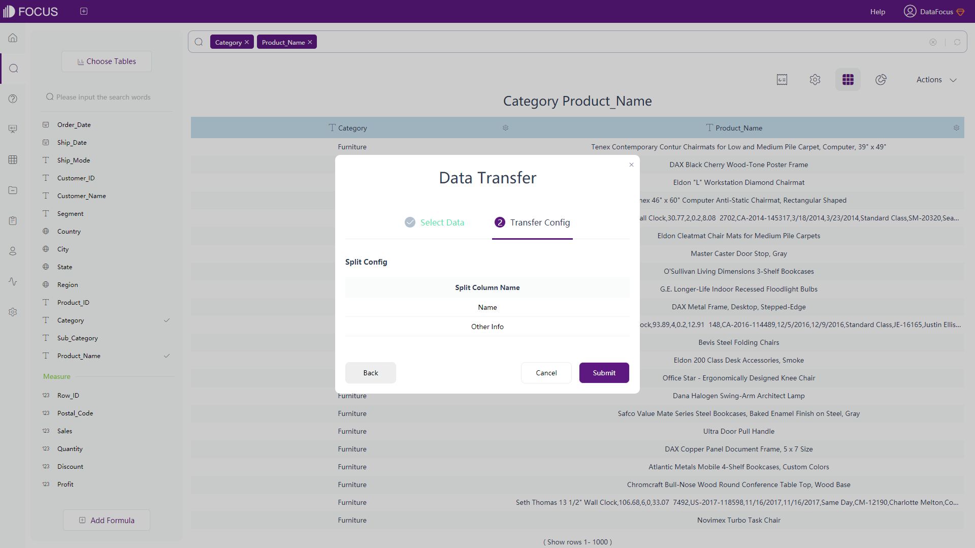
Figure 3-13-8 Column split - transfer config -
Click the “Submit” to complete the sorting, the result is shown in figure 3-13-9.
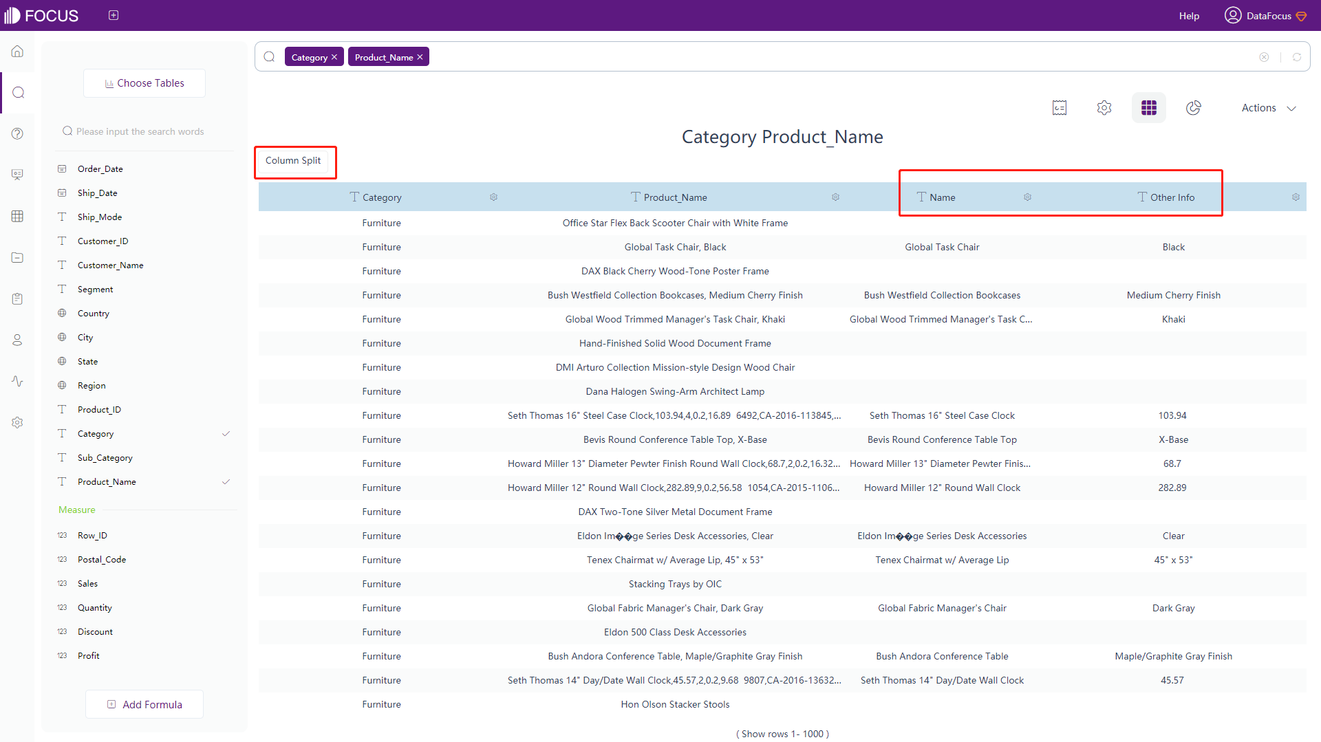
Figure 3-13-9 Column split - result
3.14 Refresh Data
On the search analysis page, click the “Actions” button in the upper right corner and find “Refresh Data”. As shown in figure 3-14-1, you can refresh data.