Power BI Online vs DataFocus Cloud
As two competitive BI (Business intelligence) as well as SaaS (software-as-a-service) tools, Power BI Online (PBIO below, other name: Power BI Service) and DataFocus Cloud (DFC below) help accomplish data processing, data analysis, and data visualization.
DFC provides a convenient interaction mode – search-based analysis, simple data processing, beautiful visualizations, comprehensive resource management, and collaboration across teams, all with a fair expense.
With certain learning costs, how can teams, organizations, or companies choose a more fitting tool? Read more to find out the differences between the two platforms.
1. Introduction
PBIO is a select & drag-and-drop visualization analysis tool. By utilizing existing Microsoft systems such as Azure, SQL, and Excel, PBIO processes data and creates visualizations to give a multi-perspective view of the data.
With full-stack functionality, DFC is a search-based analytics tool. DFC aims at making data understand human language and turning business people into data professionals. It is AI-driven, leading the cloud era of data analysis.
2. Power BI vs. DataFocus Cloud
2.1 Core Audience
PBIO targets users from all groups, including beginners, medium levels, and advanced levels. It is especially friendly to those who are familiar with Excel and other Microsoft products. However, compared to Power BI Desktop, PBIO fits the users of the analysis report instead of the designer of the report.
DFC is also suitable for business elites and data analysts with or without experience. Though it does not have a strong community Microsoft does, DFC has full-stack functionality that can satisfy all kinds of needs, from data visualization to report creation.
2.2 Data Source
PBIO supports limited data sources and has 2 main ways to get data:
-
Discover Content
Connect to various external services, and view dashboards and reports.
-
Create New Content
(1) Files
Import Excel and CSV files, with a limit of 1 GB (use Power Bi Premium for larger datasets). Other types of files need to be transformed and loaded as an Excel or Power Bi Desktop file before uploading;
For external data sources, use Power BI Desktop to query and import data;
(2) Databases
For Azure SQL Database, Azure Synapse Analytics (formerly SQL Data Warehouse), and Spark on Azure HDInsight, you can directly connect them. In terms of other types of databases, Power BI Desktop or Excel needs to be used. Direct query from databases with a limit of 1 million rows of data, and all tables should come from a single database. If a complex query is called, it may throw an error. Also, special operations towards time-related data in the tables are not supported;
There are 4 different ways of retrieving data in DFC:
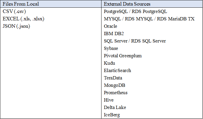
- Upload CSV, Excel, and JSON files from local;
- Upload data warehouse. It satisfies big data scenes like billions of data;
- Connect directly to databases. DFC is used as a data warehouse, and thus data and visualizations are updated in real-time. What’s more, you can connect to different databases concurrently, and join as well as analyze tables from different databases in real-time;
- External users can upload data by using API interfaces after utilizing data access API to license external resources.
2.3 Ease of Use
2.3.1 Interaction Mode
PBIO utilizes the select & drag-and-drop operation to create charts and dashboards. Though drag-and-drop can create special interactions, it will cost a lot of time especially when the visualization is sophisticated.
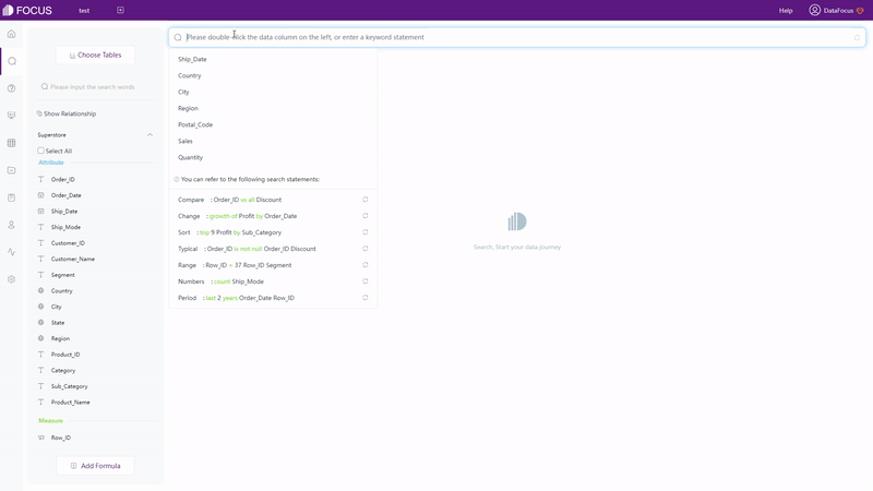
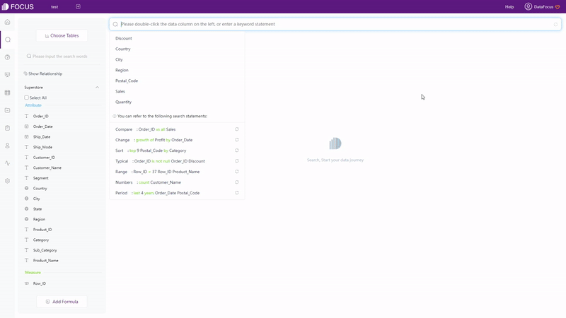
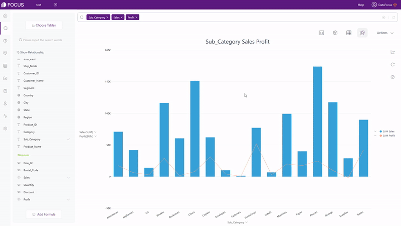
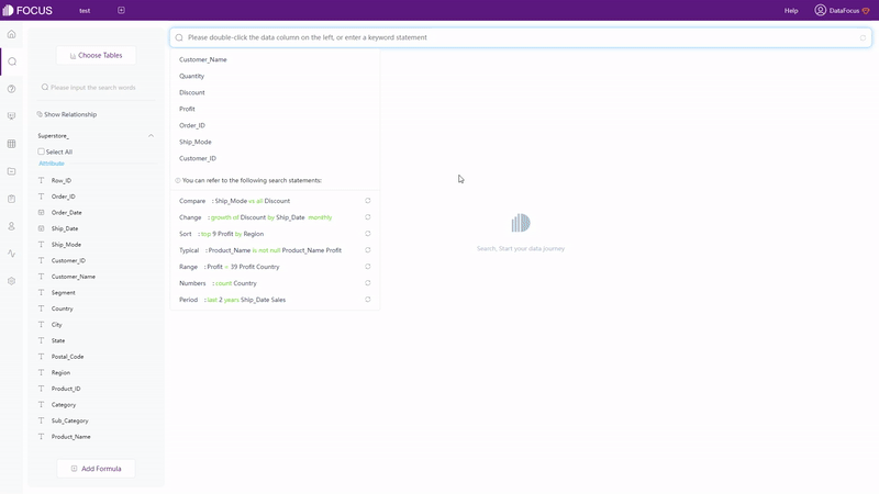
DFC applies search-based analysis which is straightforward. As shown in gif figure 2-2, by entering needs in the search box, the result will be returned automatically, then you can choose to change the type of the graphic.
The interaction modes target different emphases. Drag-and-drop focuses on creating graphics, and thus users will concentrate on visualization realization. Search-based interaction aims at data analytics, and thus users can search and evaluate whatever appeared in their minds.
2.3.2 Filter
PBIO mainly has 3 types of filters:
-
Highlighting
Highlighting does not remove those irrelevant data but makes them dimmed. Also, related values in all visualizations on the page can be highlighted at the same time using cross-highlight.
-
Filters
Filters for a single chart, the entire page, or the entire report are added and edited through the filter pane, where the format of the filter pane can be customized. There are many different types of filters in the filter pane, including automatic filters, manual filters, include and exclude filters, etc.
-
Slicers
Slicers are added to the dashboard to narrow the proportion of the dataset. As part of the visualization, slices filter among all of the charts in the page/report.
DFC has overall 5 ways to add filters:
-
Highlight
By hovering over the data or part of the chart (answer) or clicking a data point, a suspend text would appear or the point/area would be highlighted.
-
Filters
(1) Filter Keywords
On the search analysis page, add filter keywords when typing needs, as shown in gif figure 2-3. See the full list of (filter) keywords supported by DataFocus here: keywords.
GIF Figure 2-3 Filter keywords (2) Select
Click and select areas to include data and click the “Reset” button to show the hidden data, as shown in gif figure 2-4.
GIF Figure 2-4 Select to include (3) Filters on table / graphics
For tables (grid table & pivot table), click the setting button to add filters, as shown in gif figure 2-5. For graphics (including cross table), as shown in gif figure 2-6, add filters on the axes of the graphical interface. Filters can be added in batches for non-time Attribute columns.
GIF Figure 2-5 Filter - tables 
GIF Figure 2-6 Filter - graphics -
Filters on Dashboard
On the viewing page of dashboards, by clicking the data point/area, all of the charts on the dashboard will be filtered simultaneously, as shown in gif figure 2-7. By clicking the “Revert” button, the filter effect would be removed.
GIF Figure 2-7 Filter - dashboards
Both PBIO and DFC provide various kinds of filters. DFC is more convenient and simple to use, with just one click, filter on the dashboard is accomplished.
2.3.3 Formula
DAX (data analysis expressions) is powerful and can analyze some complex situations such as calculating the year-on-year growth rate. However, currently, DAX is only not supported on PBIO. You’ll have to write DAX formula or M query in Query Editor in Power BI Desktop.
To analyze advanced indexes, like the year-on-year growth rate, there are 2 ways to fulfill these needs in DFC:
-
Keywords
Keywords of DFC are comprehensive enough to analyze complicated business needs. Take the example above, by using the growth keyword, the year-on-year growth rate can be calculated immediately, as shown in gif figure 2-8. The keywords are listed here: keywords.
GIF Figure 2-8 Growth keywords -
Formulas
DFC provides various formulas. For advanced situations, you can write your own formulas. Here is the formula list.
2.3.4 Deployment
There are several different forms of Power BI, including desktop, service (online), mobile, report builder, report server, and embedded. Though PBIO can be used on any system, Power BI Desktop can not be used on macOS or Linux systems, and thus a lot of functions can not be used, including data processing. Business elites using these two systems may find it inconvenient.
DataFocus Cloud is a SaaS platform providing a one-stop service that can be used on any system. Data processing, data analyzing, visualization creation, and resource sharing with other collaborators can be accomplished anywhere anytime. DataFocus Cloud provides a well-organized and tidy cooperation system, which helps collaborations be more convenient and more systematic.
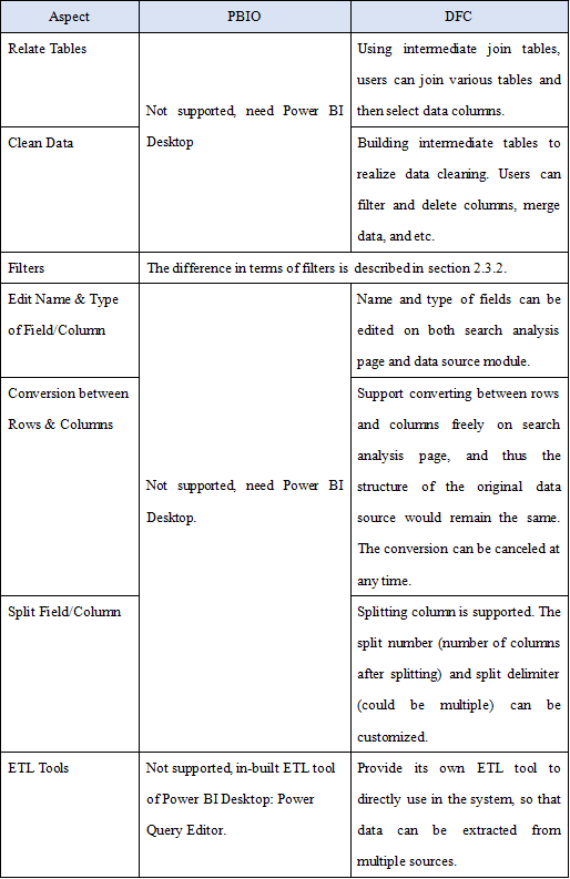
2.4 Data Processing
With regard to process data, the table below displays the differences in multiple aspects.
2.5 Visualization
Regarding visualization, the differences between PBIO and DFC are listed in three prospects: table, chart, and visualization dashboard.
2.5.1 Table
Within PBIO, there is only one kind of table. Various formats can be customized including background color, font size, alignment, and conditional formatting.
There are 3 different kinds of tables in DFC.
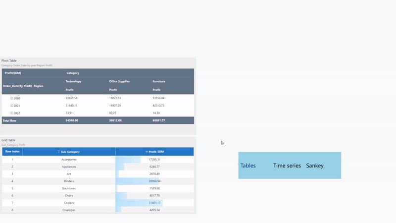
-
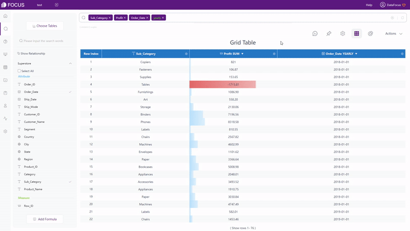
Grid Table
Grid table shows data in a 2-dimensional table format. As shown in figure 2-10, you can add indexes, total rows, display in heatmap mode, etc.
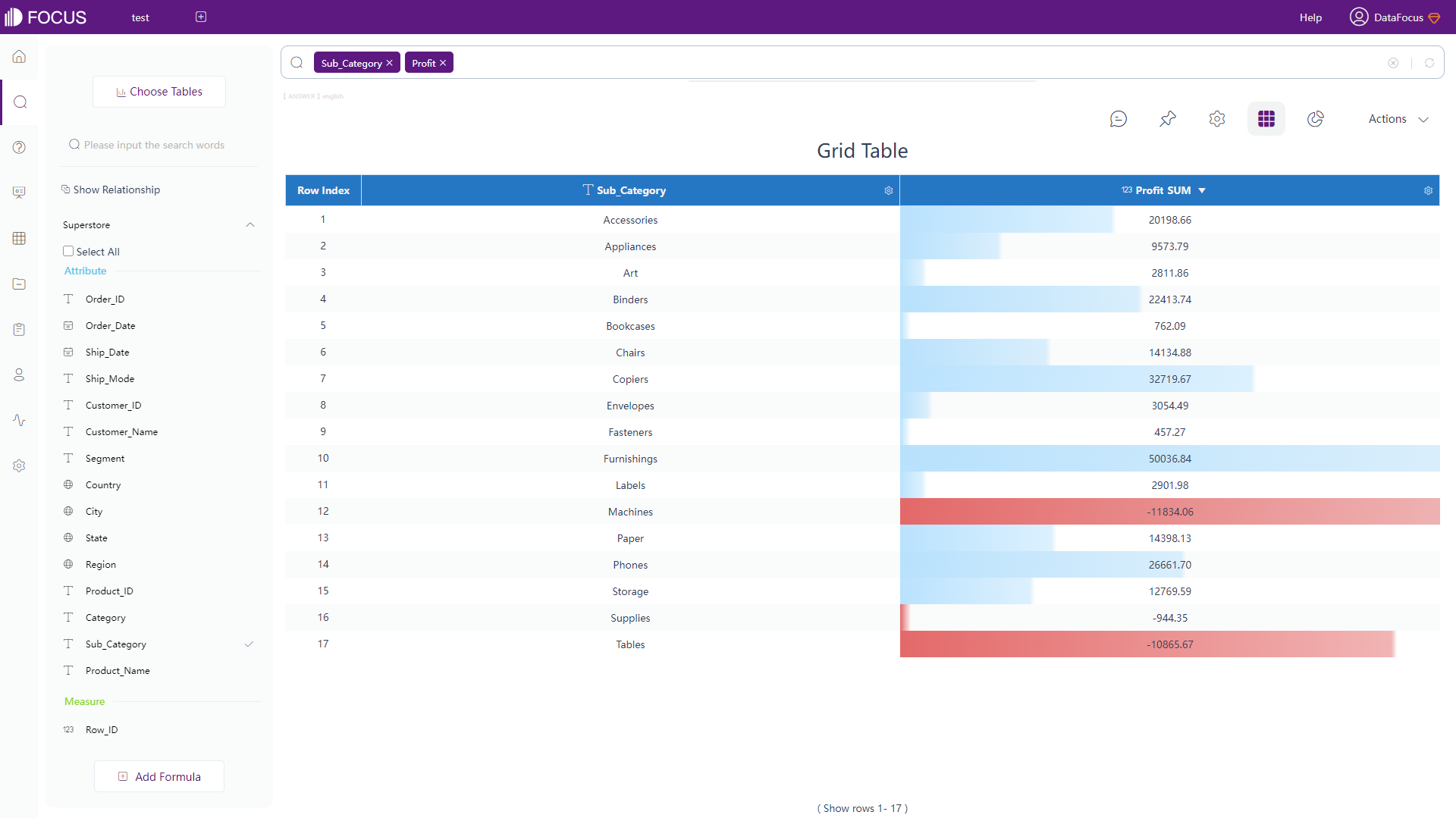
Figure 2-10 Grid table -
Pivot Table
Pivot table displays data in a tree structure. Similarly, as shown in figure 2-11, you can add a total row, subtotal row, change colors, display negative numbers in red, etc.
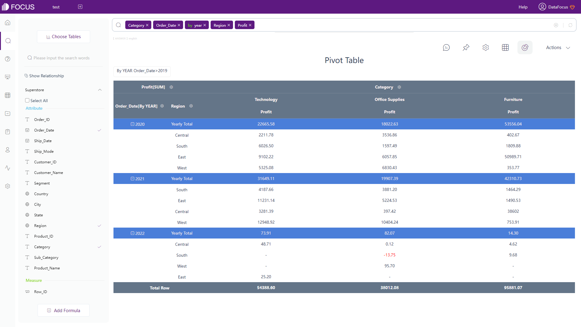
Figure 2-11 Pivot table -
Cross Table
Cross table exhibits data in a multiple-dimensional table format, which fits the majority of complex table structure demands. As shown in gif figure 2-12, you can choose to pin specific columns as well as rows. You can also add top and left header, add summarized rows, etc.
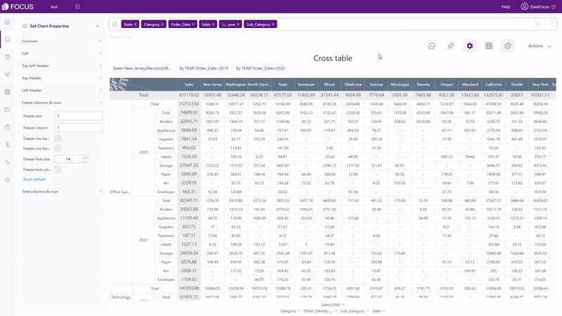
GIF Figure 2-12 Cross table
2.5.2 Chart
There are more than 20 different chart types in PBIO, which can be directly used. Except for the existing common graphs inside PBIO, you can download various visuals to the visualization pane created by Microsoft and its partners. You can also build your own visual or import it from a coworker.
There are more than 50 types of charts supported by DFC. Besides the common graphics like bar chart and pie chart, the variations of these charts are also supported, such as matchstick chart, Pareto chart, polar bar chart, sunburst diagram, etc. Therefore, you can build various graphs directly within the system without importing from external resources.
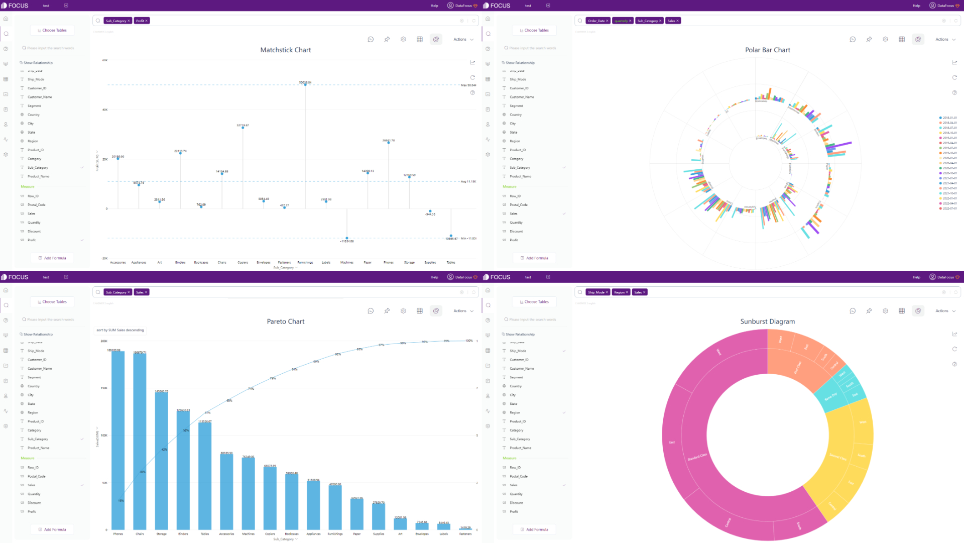
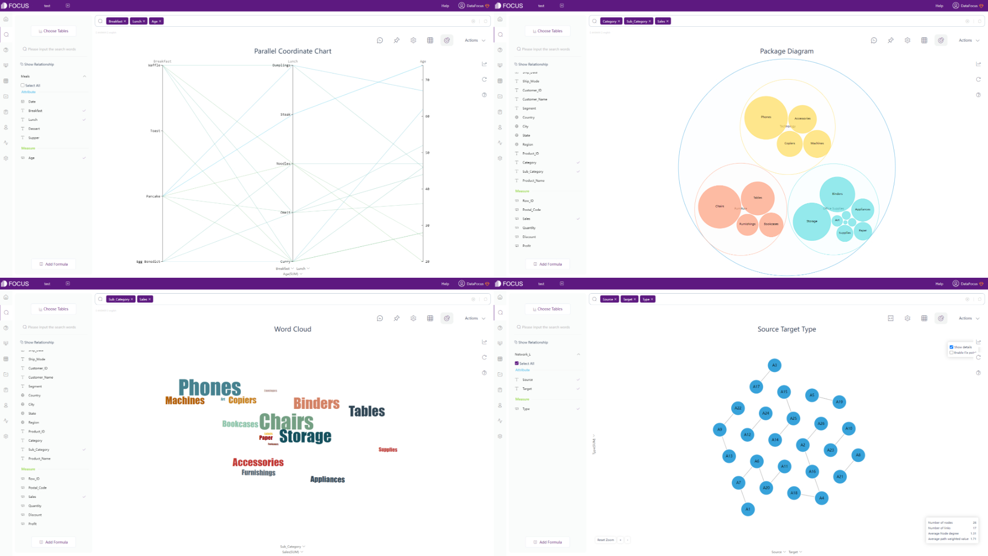
DFC also provides many advanced charts, such as parallel coordinate chart, package diagram, word cloud, network diagram, etc.
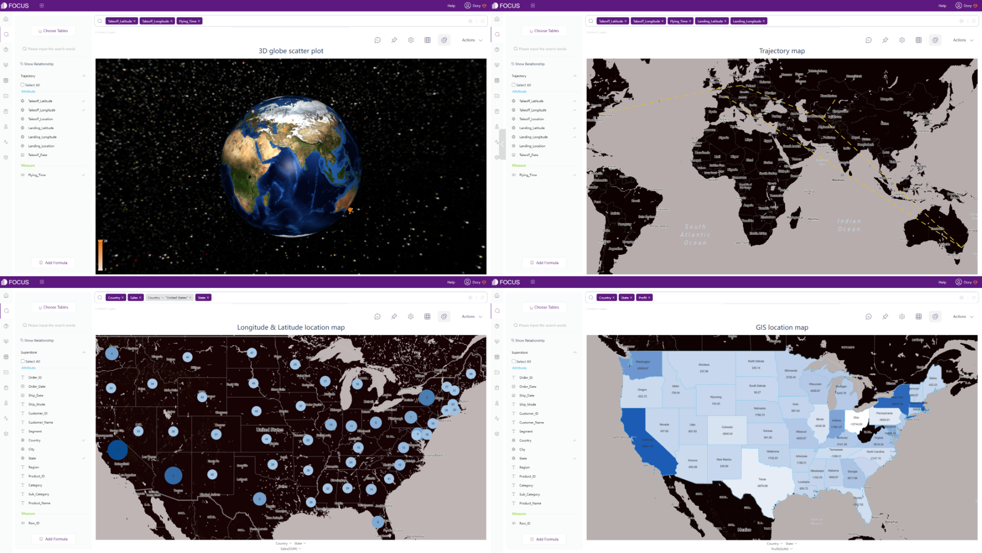
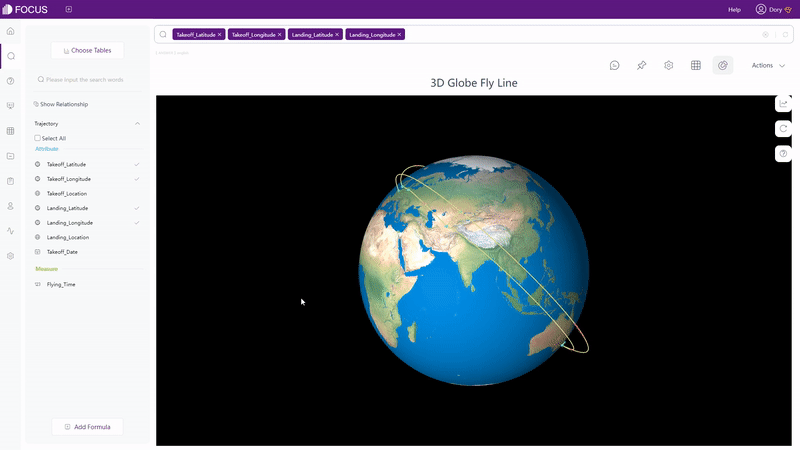
With regards to maps, there are a few different types of maps supported by DFC, including 3D globe scatter plot, trajectory map, longitude & latitude location map, GIS location map, etc. Also, you can import your own maps or geographical data to the system.
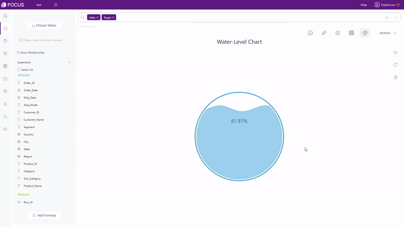
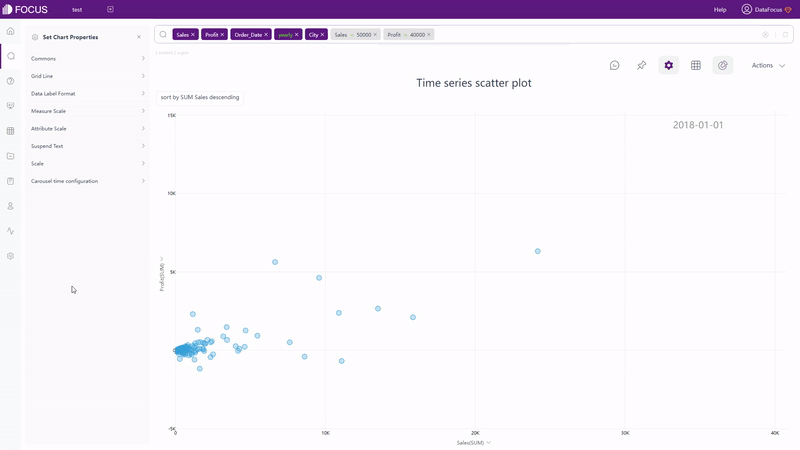
Besides static charts, DFC also supports dynamic ones, such as water-level chart, time series scatter plot, 3D globe fly line, etc.
2.5.3 Dashboard
For visualizations, Power BI has dashboards and reports, where dashboard is a single canvas that does not contain any tile or widget, and report is an interactive view that can contain several pages and visuals.
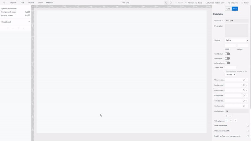
DFC does not separate the concept of dashboard and report clearly, but provides dashboard carousel to set multiple dashboards and dashboard menu to arrange dashboards. Dashboard in DFC is also a single canvas, but the size can be customized to fit various devices.
Also, there is a high degree of customization with two types of layout. The first is grid layout, where you can utilize grids to place answers (charts). The second is free layout, in which you can lay the answers freely.
DFC also provides dashboard templates for users to directly use when creating a new dashboard, including Youtube KPI, financial KPI, etc.
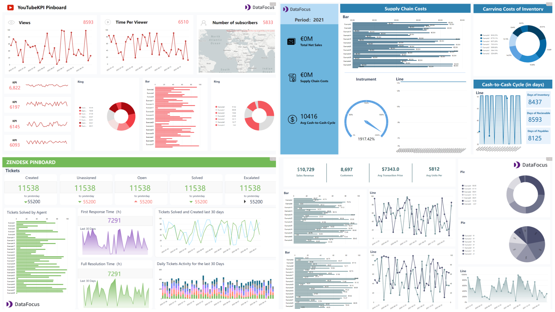
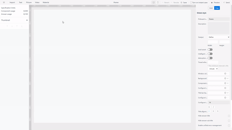
Other than what was mentioned above, DFC provides several material components, such as tabs and Iframe (to add a website). These material components can be used in the dashboard to make the visualization more vivid.
2.6 Resource Management
Resources including dashboards, reports, workbooks, and datasets are listed under “My workspace” on the navigation pane. On the workspace page, users can use “filters” to select different types of resources. For example, view all dashboards.
DFC has a comprehensive system for resource management where tags are used to arrange and quickly locate resources. Tags can be used in the answer module, dashboard module, table module, and overall resource module. What’s more, resources can be allocated to different owners, and with role management, resources can be managed uniformly.
2.7 Collaboration
In terms of collaboration, users can choose to collaborate with coworkers in workspaces, where the coworkers also need PBIO accounts. Or users can collaborate in Microsoft Teams, where Microsoft Teams is used, and the reports from PBIO need to be embedded there.
With regards to sharing, data and resources can be shared in multiple ways inside or outside the organization. However, the recipients do not have the access to edit the report or dashboard, they can only view or interact with it.
DFC provides comprehensive management, including user, role, and resource management. Packaged resources can be allocated to certain users/departments by adding roles to users and assigning resources to different users/departments. Then, each different user can view and manage different kinds of resources.
There are 2 ways to share resources in DFC. The first is sharing inside the system, where the recipient needs to have a DFC account. The second is sharing through an external viewing address, where external users can view and interact with the resource using the web link or QR code.
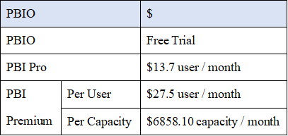
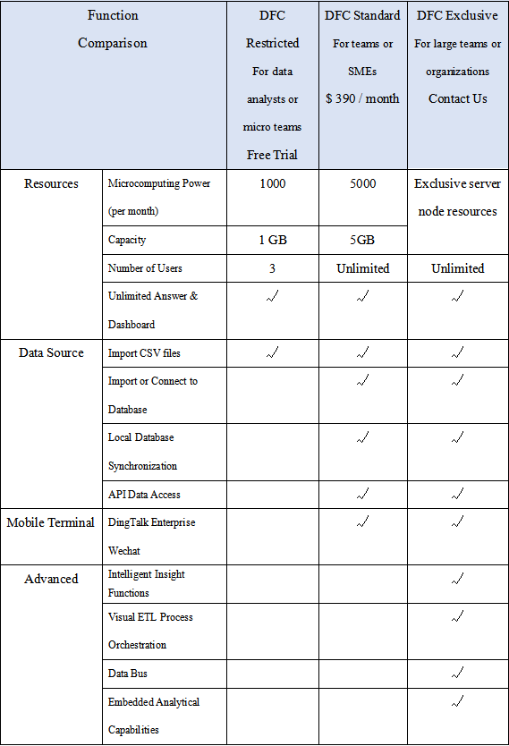
2.8 Cost
The comparison of prices is listed below in the tables, where PBIO charges per user as well as per capacity and DFC charges only by capacity.
On the one hand, it is expensive and hard to scale across a huge amount of users (expenses rise linearly) through charging by users. On the other hand, users may find it difficult to evaluate the expense.
It is fairer to charge by capacity, more convenient to promote inside the team, and much less sensitive to the number of users.
3. Conclusion
Power BI Online and DataFocus Cloud are both excellent data analysis platforms from the cloud side.
PBIO is not as strong as Power BI Desktop in terms of many ways, especially with regard to data processing. While Power BI Desktop is very powerful, yet it is not compatible with macOS or Linux systems. However, Power BI has complete communities offering help and sharing ideas as well as visualization work.
DFC is simple to use and has comprehensive data processing functions. It provides more than 50 types of graphics within the system for users to build beautiful visualizations. With a fair cost, DFC provides an exhaustive system for teams to arrange resources and cooperate. Though there are still many limits, DFC keeps upgrading and optimizing the system. Free trial here: DFC.
