Qlik Cloud vs DataFocus Cloud
Self-service BI (Business intelligence) has become the preferred data analysis tool for business personnel in enterprises, and SaaS (software-as-a-service) products are the future of software. As two BI&SaaS products, Qlik Cloud as well as DataFocus Cloud (DFC) provides data analyzing and data visualization.
With analytics based on search, DFC offers convenient procedures of realize visualizations, as well as systematic resources management and convenient collaboration for users to have fun data analyzing.
Learn about the key differences between Qlik Cloud and DFC to help you assess these two tools and select the suitable one based on your own business needs and expectations.
1. Introduction
Qlik Cloud is a drag-and-drop platform, aiming at turning raw data into informed actions within one platform. It is an interaction tool that can create dynamic dashboards and stories using data from different sources.
DataFocus Cloud is a search-based cloud platform, targeting on making business elites into data professionals by making data interpreting human language. With a tidy and comprehensive system, DFC makes collaboration easier and more systematic.
2. Qlik Cloud vs DataFocus Cloud
2.1 Apps
Apps in the two systems are built for classifying different resources. While both of the apps in the two systems can have multiple resources, including data tables, dashboards, etc., there are differences between them.
There are two kinds of apps in Qlik Cloud, Qlik Sense apps and QlikView apps.
| Aspects | Qlik Sense Apps | QlikView Apps |
|---|---|---|
| Creation | Create in Qlik Cloud hub;Upload from other deployments | Distribute from QlikView AccessPoint;Upload from other deployments |
| Capability | With access, can explore the entire app including sheets and stories | View-only, interact with visualizations |
| Share | Can be shared with other members |
Cloud apps within DataFocus Cloud can also be divided into 2 kinds, created and invited.
| Aspects | Created | Invited |
|---|---|---|
| Creation | Automatically created after login | Invited by other members |
| Capability | User is the admin, and can do everything freely, including creating/editing/sharing resources, and etc. | According to the permissions, different users can view/edit different resources. |
| Share | Can be shared with other members (with permissions) |
Users can create and own multiple apps in Qlik Cloud, while there is only one main cloud app for each user of DFC (as admin). How does the apps influence the resources management as well as collaboration will be introduced at section 2.7 and section 2.8.
2.2 User Interface
On the cloud hub of Qlik Cloud, there are 4 sections: “Getting Started”, “Home”, “Catalog” and “Collections”, where all of the sections list resources in different ways.
On the data processing page and visualization page, the navigation bar is on the top, where users can switch between the “Prepare”, “Analyze” and “Narrate” pages quickly.
Also, there are many different items on the editing page of dashboard, such as fields, properties, filters, preview source table, etc. New users may find it overwhelming. Besides, the visualization area will be relevantly small in this case, though it can be shown in “Full screen”. Overall, some users may find the interface a bit messy.
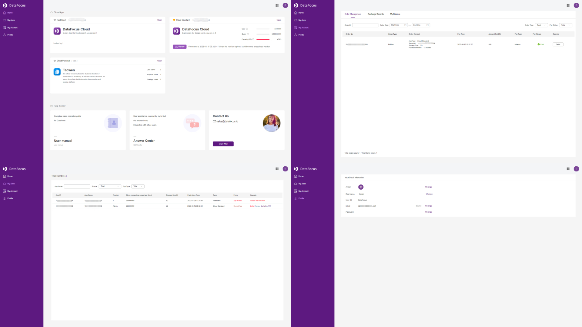
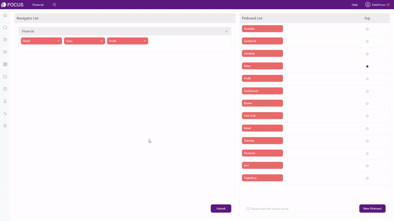
On the console page of DataFocus Cloud, there are also 4 sections: “Home”, “My Apps”, “My Account”, and “Profile”, as shown in figure 2-1. The “home” page lists the apps and information about help center. “My Apps” shows the detailed information of each apps, and “My Account” lists the orders. Users can change avatar, displayed name, etc on the “Profile” section.
Inside the app, there are 10 different modules, the detailed information can be viewed here: modules. The navigation bar is on the top and left, users can switch between different modules quickly, such as from table module to dashboard module.
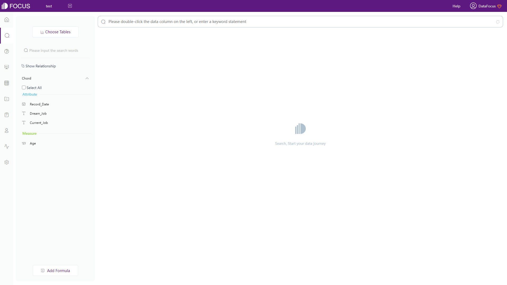
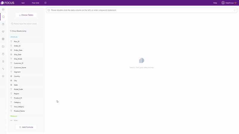
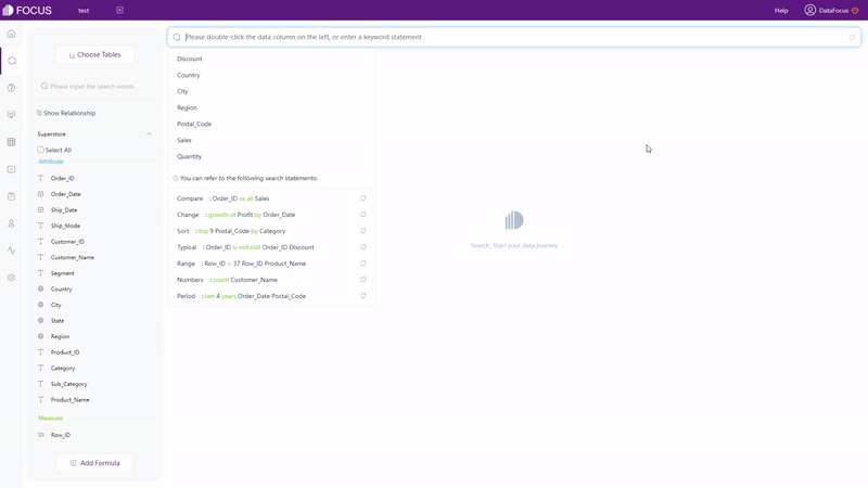
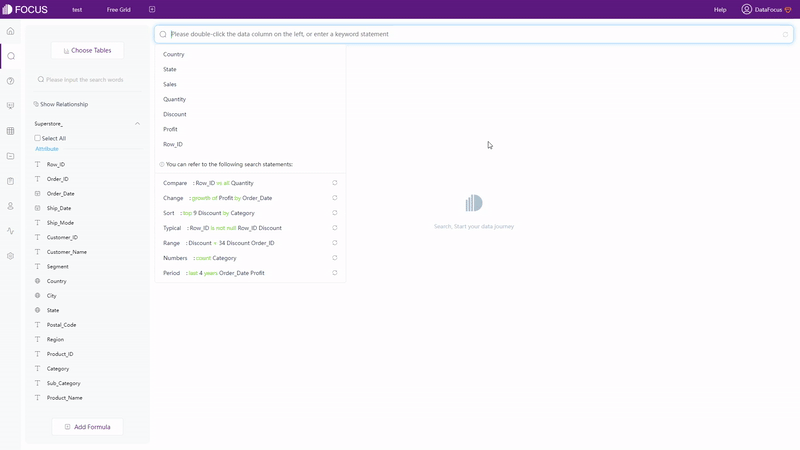
On the search-based analysis page, other than navigation bars, there are mainly three parts, columns, search box, and the visualization area, where the visualization area takes up most of the page, so that users can focus on making charts, as shown in figure 2-2. In terms of the fields display, Qlik Cloud chooses to place them in alphabetical order, while DFC divides columns into 2 kinds, attribute and measure.
2.3 Data Source
Qlik Cloud supports 2 kinds of data sources:
-
Datasets
Upload data files, supported file types including Text files, HTML tables, Excel files, and etc.
-
Data connections
By connecting to external data sources such as databases or files stored remotely, datasets can be created.
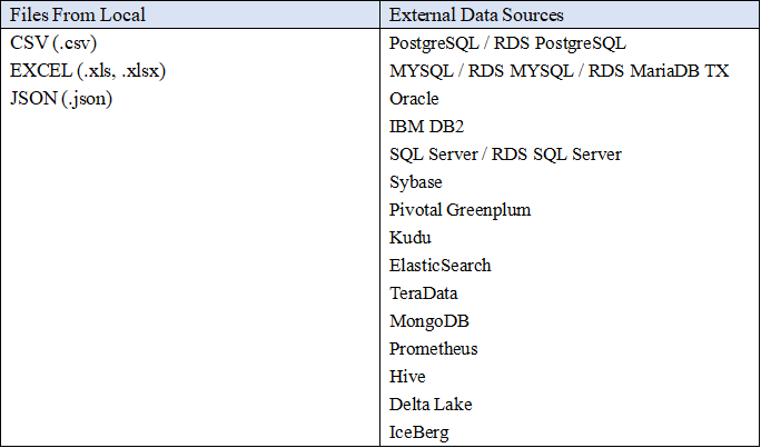
There are 4 ways to require data in DataFocus Cloud:
- Upload local files;
- Import data warehouse, which satisfies big data scenarios like billions of data;
- Connect to databases. Used as a data warehouse, DFC updates resources such as data and visualizations in real-time. Moreover, different databases can be connected concurrently, and thus you can joinas well as analyze tables from various databases at the same time;
- API can be used to access data after authorizing external resources;
The supported data sources are listed here:
2.4 Ease of Use
2.4.1 Interaction Mode
With drag-and-drop operation, users need to drag filed to specific area (property pane or the middle of the visualization chart) to start analysis. When the visualization is complicated, drag-and-drop may be time consuming.
In terms of adding columns (fields), there are three ways in DataFocus Cloud.
- Double click the column name;
- Select the column(s) and click the arrow button. This suits the situation where many columns need to be added;
- Type the column name in the search box.
With search-based analytics, as shown in gif figure 2-4, the system would automatically give the analysis result after entering needs in the search box.
With different focuses, the two interaction modes have different effects.Focusing on creating charts, Drag-and-drop lead the users to focus on realizing visualization. While search-based interaction targets on data analysis, making users realize data analysis by searchwhatever occurred in their minds.
2.4.2 Filter
There are mainly 4 ways of filtering in Qlik Cloud.
-
Select
By clicking or selecting areas, charts can be filtered together.
-
Filters
Filters can only be applied in standard editing mode, and each of them are applied to a single graph.
-
Lasso Selection
By drawing a freehand circle, specific data can be selected. When lasso selection is applied, all of the visualization on the page will be filtered together.
-
Filter Pane
Filter pane can be added on the dashboard to filter in several dimensions at once.
There are 5 ways tofilter in DataFocus Cloud:
-
Select
Similar to Qlik Cloud, click or select areas to include data. By clicking the “Reset” button, the hidden data will show up again, as shown in gif figure 2-5.
-
Filters
(1) Keywords
On the search analysis module, use filter keywords on the search box, as shown in gif figure 2-6. View the entire list of (filter) keywords supported by DFC here: Keywords.
GIF Figure 2-6Keywords (2) Filters on Table
For grid table and pivot table, filters can be added under the setting button, as shown in gif figure 2-7. For non-time Attribute columns, filters can be added in batches.
GIF Figure 2-7 Filter - tables (3) Filters on Graphics
For graphics (including cross table), as shown in gif figure 2-8, filters can be added onthe axes. Similarly, users can filter non-time Attribute columns in batches.
GIF Figure 2-8 Filter - graphics (4) Filters on Dashboard
Click the data point or select an area of a chart on the viewing page of dashboards, and then all of the visualization will be filtered at once, as shown in gif figure 2-9. The filter effect would be cleaned by clicking the “Revert” button.
GIF Figure 2-9 Filter - dashboards
2.4.3 Formula
Qlik Cloud provides various functions, including text functions, convert functions, date functions, and etc. Users can use formulas to add a calculated field in “Data Manager”, and the field would be part of the table. The interface provides preview to view the result while utilizing formulas. However, the prompt of the expression is relevantly weak, since it does not prompt the syntax.
DataFocus Cloud also offers various functions, and also it provides custom formulas, so that users can write their own formulas. There are 2 ways of adding formulas:
-
Search Box
Directly typing the formulas on the search box, as shown in gif figure 2-10.
GIF Figure 2-10 Formulas in search box -
Formulas
Click the “Add Formula” button on the bottom. On the pop-up window, as shown in gif figure 2-11, formulas can be added. With description as well examples provided by the formula assistant, it is much easier and quicker to write a formula. What’s more, the prompt will display the syntax as well to make adding formulas more convenient. View the entire formula list supported by DFC.
GIF Figure 2-11 Add formulas
2.5 Data Processing
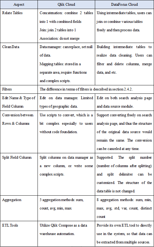
With regard to process data, the table below displays the differences in multiple aspects.
2.6 Visualization
2.6.1 Table
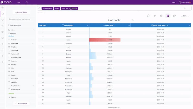
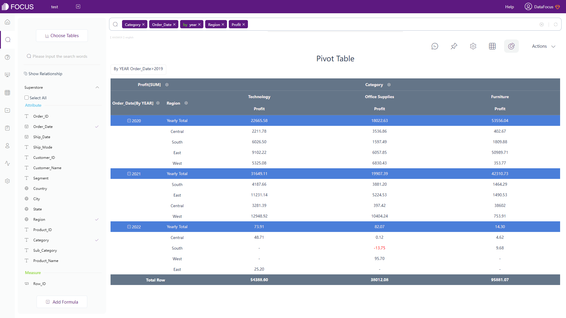
Both Qlik Cloud and DataFocus Cloud provide table (called grid table in DFC) and pivot table, where table shows data in 2-dimension and pivot table displays data in a tree format.
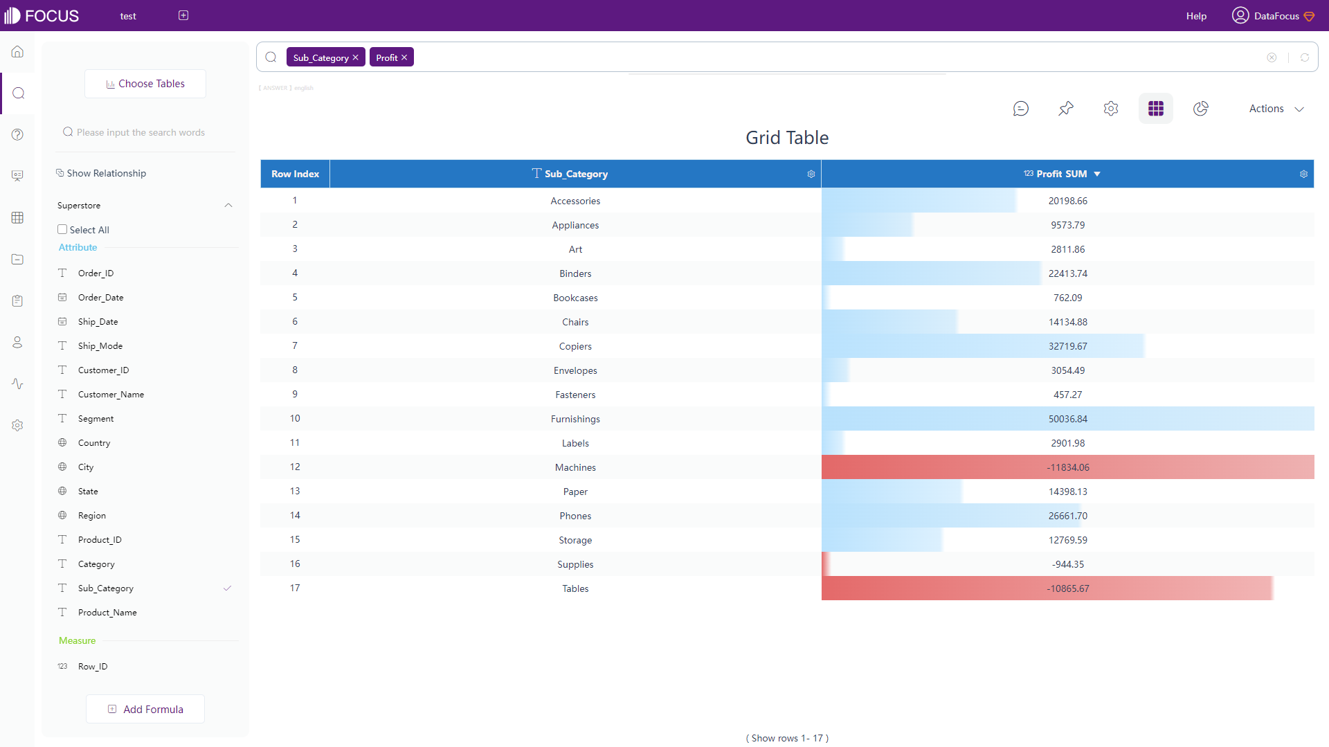
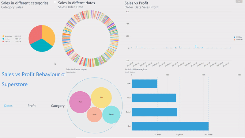
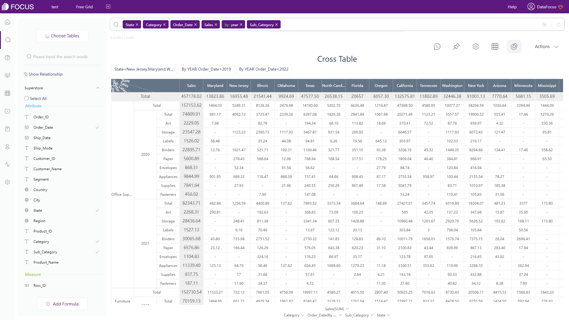
DFC has an additional type of table: cross table, which presents data in multi-dimension and can fulfill complex business needs, as shown in figure 2-15.
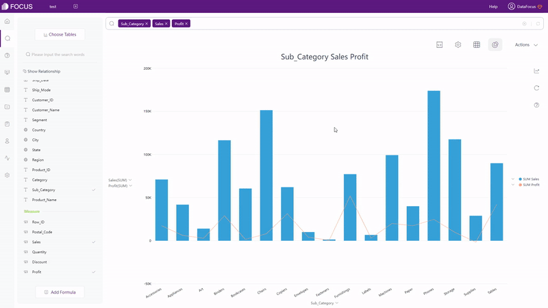
2.6.2 Chart
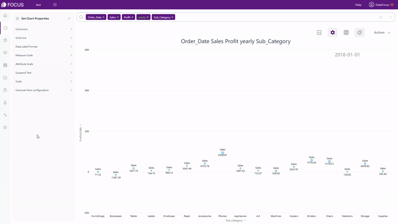
Qlik Cloud has around 20 types of visualization charts, and several advanced charts under advanced edit mode. The type of the charts can be switched freely in Qlik Cloud. However, if the originally selected fields do not meet the data requirements of the newly selected chart type, the fields will be cleared out. While in DFC, chart types that can be selected are restricted. Only if the data selected meets the requirement, can the chart type be chosen, as shown in gif figure 2-16. The detailed prerequisites can be seen here: prerequisite.
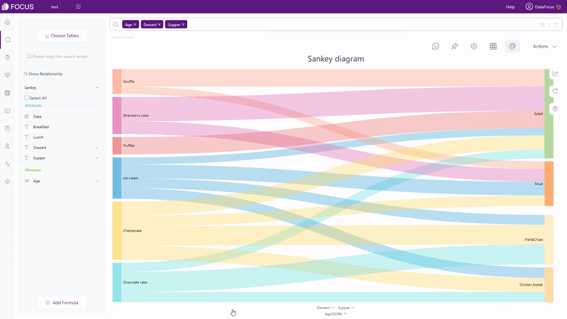
DataFocus Cloud has more than 50 types of charts. It not only supports regular types of graphics such as bar chart and heat map, but also provides the variation of these graphics, such as polar bar chart, Pareto chart, calendar heat map, correlation heat map, etc. Therefore, as long as the data types match the data requirements of graphs, visualization charts can be created easily.
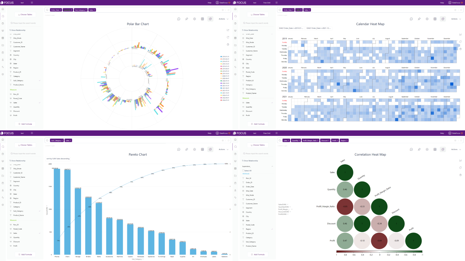
DFC also provides many advanced charts, such as parallel coordinate chart, matchstick chart, package diagram, chord diagram, etc.
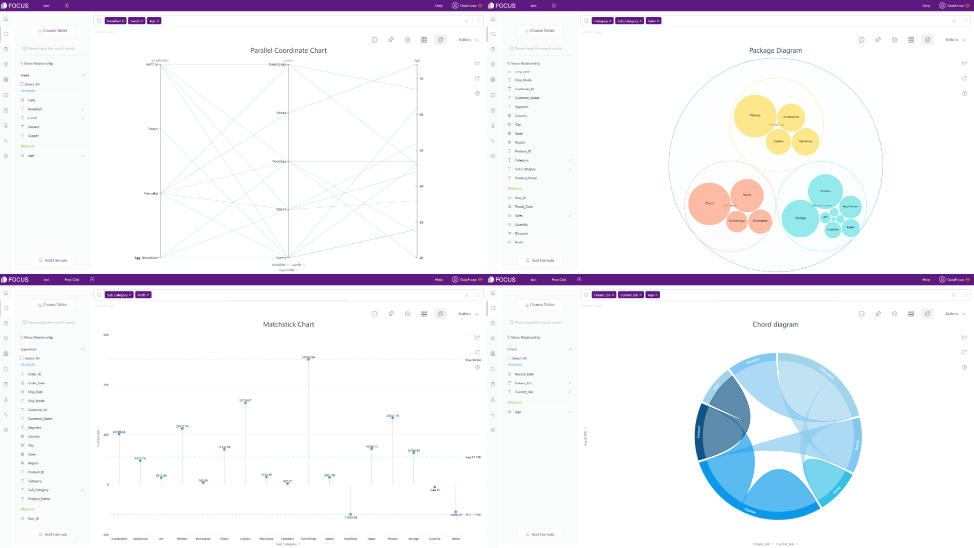
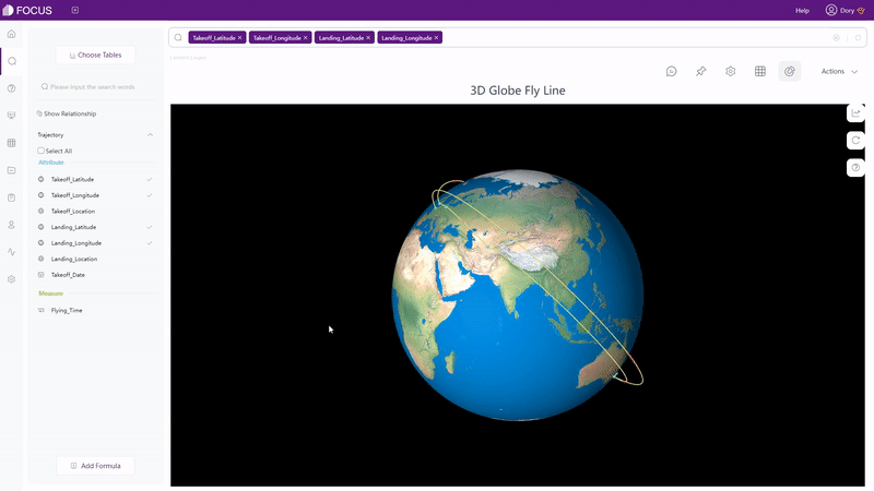
In respect of maps, Qlik Cloud has 1 kind of map, but supports multiple advanced settings. Therefore, the visualization can be varied. DFC supports several different kinds of maps, such as trajectory map, longitude & latitude location map, GIS location map, 3D globe scatter plot,etc. Without complex settings, maps can be created easily. Moreover, maps or geographical data can be imported to the system.
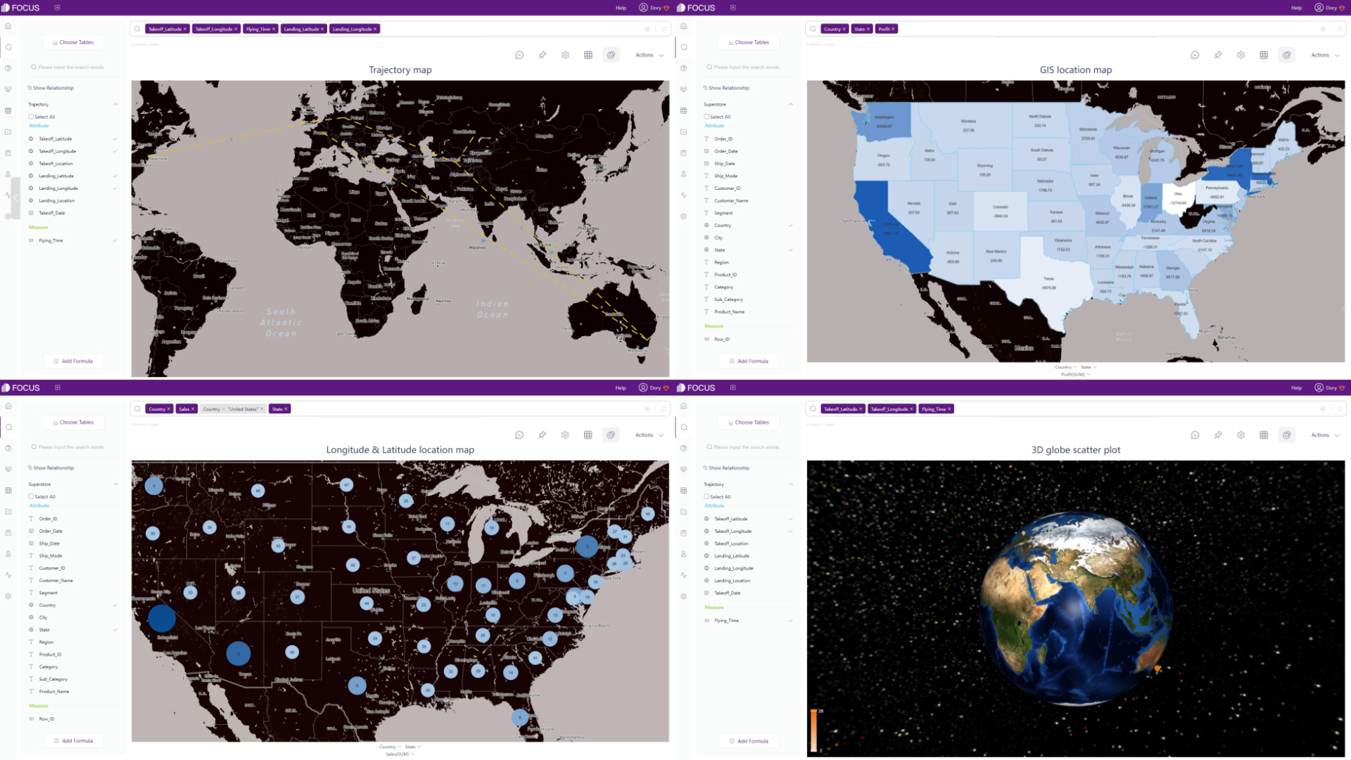
Except static charts, there are also dynamic ones supported by DFC, such astime series bubble chart, 3D globe fly line, etc.
2.6.3 Dashboard
Differences between dashboards are explained in these aspects:
| Aspect | Qlik Cloud | DataFocus Cloud |
|---|---|---|
| Charts | Created within the dashboard | Saved separately |
| Dashboard size | Customized | Customized, provides common used sizes. |
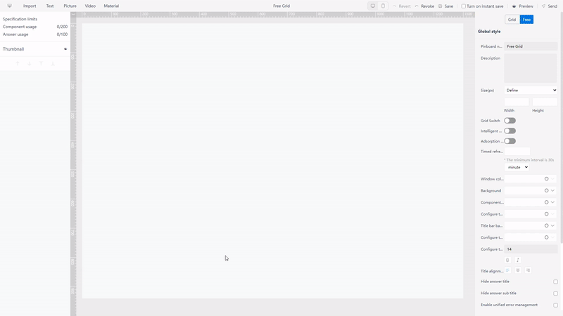
| Layout | Fixed grids | 2 kinds of layouts: free, grid |
| Interaction objects | Text, shapes, media… | Text, images, video, media… |
| Templates | Not supported | Various |
| Dashboard display | Storytelling | Dashboard carousel |
-
Charts
In Qlik Cloud, charts are directly created within the dashboard. Though charts can be copied and pasted, they will change according to the dataset, and thus may cause some problems.
DFC saves each chart as a single answer, and thus charts can be added to any dashboard without dataset problems.
-
Dashboard size
Sheet size can be customized under sheet properties in Qlik Cloud. Users can directly type in the width as well as height of the sheet.
Similarly, users can also directly enter width and height of the dashboard. Also, DFC provides a series of preset device sizes, such as iPhone, Pad, Google Pixel, and etc. Therefore, users can quickly build dashboards to view on other devices.
-
Layout
In Qlik Cloud, dashboards are separated into grids and the sizes of the grids can be modified. Charts can be moved among the grids freely.
While in DFC, there are 2 kinds of layouts. Users can utilize the grids to help place the charts under grid layout, and can move charts arbitrarily under the free layout, as shown below in gif figure 2-22.
GIF Figure 2-22 Different layouts -
Interaction objects
Both Qlik Cloud and DFC provide various interaction objects, including text, pictures, medias, and etc. These objects make the visualization richer.
Except the objects mentioned above, DFC also provides video objects and some material components, such as Iframe, which adds a website into the dashboard.

GIF Figure 2-23Video objects 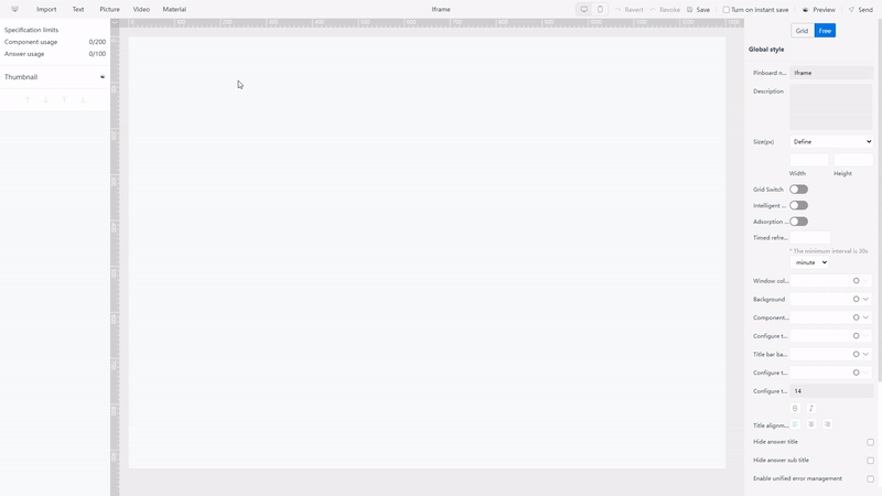
GIF Figure 2-24 Material components - Iframe -
Templates
There are a lot of Qlik Sense dashboard examples online, which can give users thoughts about the dashboard design. However, users have to create charts one by one and place them but can not directly use or copy the examples.
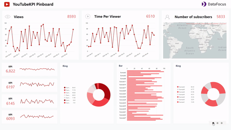
Dashboard templates like YouTube KPI provided by DFCcan be directly used when making a new dashboard. After selecting a template, users only need to substitute the answers (charts) into the dashboard.
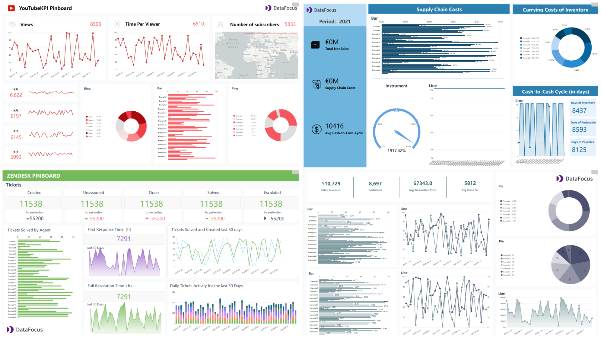
Figure 2-25 Dashboard templates -
Report
Qlik Cloud utilizes storytelling to narrate the data analysis, while DFC exhibits the analytics by dashboard carousel. Multiple dashboards are added and shown, as shown in gif figure 2-26.
GIF Figure 2-26 Dashboard carousel
2.7 Resource Management
2.7.1 Apps
Under the management console of Qlik Cloud, apps are divided according to the tabs: source, published and staged.
There are 2 types of apps in DataFocus Cloud, one is created by the user self, others are invited by other users. Usually, the number of apps is limited, if there are many apps, users can locate the app quickly by the name of the inviter.
2.7.2 Charts
Charts are not saved separately in Qlik Cloud, and thus there is no management of charts in Qlik Cloud.
Charts can be organized on the answer module or the resource module in DFC. Also, tags can be added to classify different kinds of answers (charts), as shown in gif figure 2-27.
2.7.3 Dashboards & Display
Within a Qlik Cloud app, all of the sheets can be viewed under the “Sheets” tab, storytellings are shown under the “Stories” tab. Users may find it hard to locate a sheet/storytelling when there are plenty of sheets/storytellings.
Similar to charts, dashboards and dashboard carousels in DFC can be arranged on the dashboard module or the resource module. Also, tags can be applied here.
Overall, resources are mainly arranged by different apps in Qlik Cloud, while resources are separated in different modules within each app in DFC and tags can be applied to quickly search for the resource. Furthermore, dashboards can be pinned on the top navigation bar, so that the most important ones can be accessed with just one click, as shown in gif figure 2-28.
2.8 Collaboration
2.8.1 Roles
Both Qlik Cloud and DataFocus Cloud utilize roles to give different users different permissions.
Qlik Cloud also uses status to classify users that can create contents and users that only consume some contents created by others. Roles in Qlik Cloud are mainly used for space management, each role can manage some parts of contents and governance (TenantAdmin can manage all).
DFC provides system roles and custom roles. Custom roles can be created by the admin user or the user with system manager role to give custom permissions. For example, a “Sales” role that only have access to resources related to sales. The detailed information of user roles can be viewed here: Roles.
What’s more, DFC provides department structure, which allows users to be divided into different departments. Then, with assigned roles, different users can have access to different resources. For example, “Sales manager” in “Sales” department can create or modify contents related to sales, while “HR Ann” in human resource department can only view contents relevant to employee KPIs.
2.8.2 Share
Users can share charts in the dashboard in Qlik Cloud in three ways: images, link, and embed. Images are sent by emails, and embed means embed the chart as an Iframe in the web page. When use link to share, the shared one needs to have a Qlik account first.
Except answers (charts), dashboards as well as dashboard carousel can also be shared. There are mainly two ways of sharing in DFC. One is sharing within the app, by giving other users access. Another is external viewing address, where external users can access and interact with the visualizations through a link or a QR code without owning a DFC account.
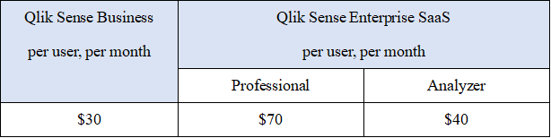
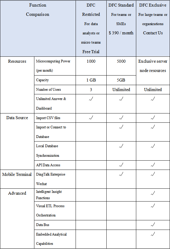
2.9 Cost
The comparing of prices is shown below in the tables, where Qlik Cloud charges per user and DataFocus Cloud charges by capacity.
Charging per useris expensive and hard to scale among a considerable amount of users (costs rise linearly). Also, users may find it hard to assess the expense.
Charging by capacityis fairer to users, easier to spread within the team, and much less sensitive to the usernumber.
3. Conclusion
Qlik Cloud and DataFocus Cloud are 2 outstanding self-service BI product on cloud. They differ by many features and capabilities, such as interface, data processing, visualization, etc.
Qlik Cloud based on drag-and-drop interaction operation, build visualization charts within dashboards. Though new users may find the interface complex, since it contains too much information, especially inside an app, Qlik Cloud provides beautiful visualizations and advanced interactions.
DFC based on search-analytics, separate charts and dashboards. With simple but comprehensive system as well as interface, users can create beautiful visualizations easily and quickly, teams can cooperate with each other conveniently. DataFocus Cloud will keep optimizing the system for users to have better experience realize data analysis. Welcome to use it here: DFC.
